Guatemala · 2026
JORGE
LETONA
View project →Ver proyecto →
View project →Ver proyecto →

View project →Ver proyecto →
View project →Ver proyecto →
View project →Ver proyecto →
View project →Ver proyecto →
IRON MAIDEN
THE BOOK OF SOULS
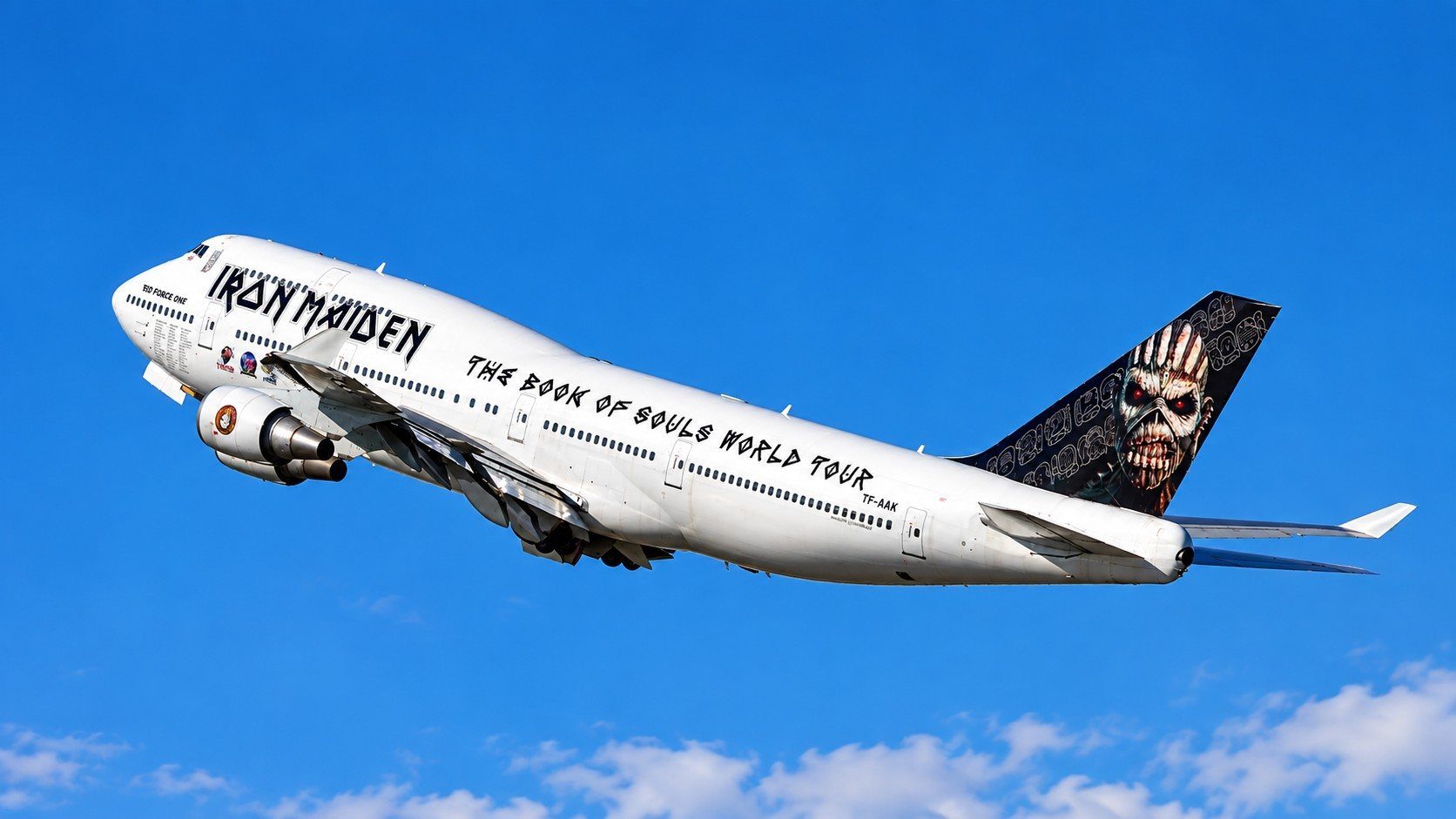
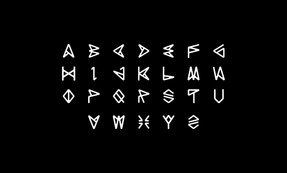
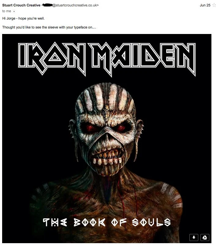
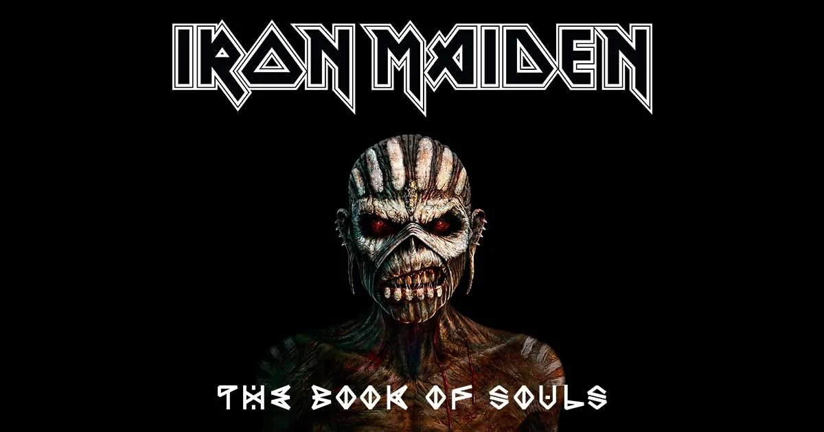
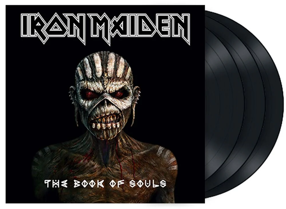
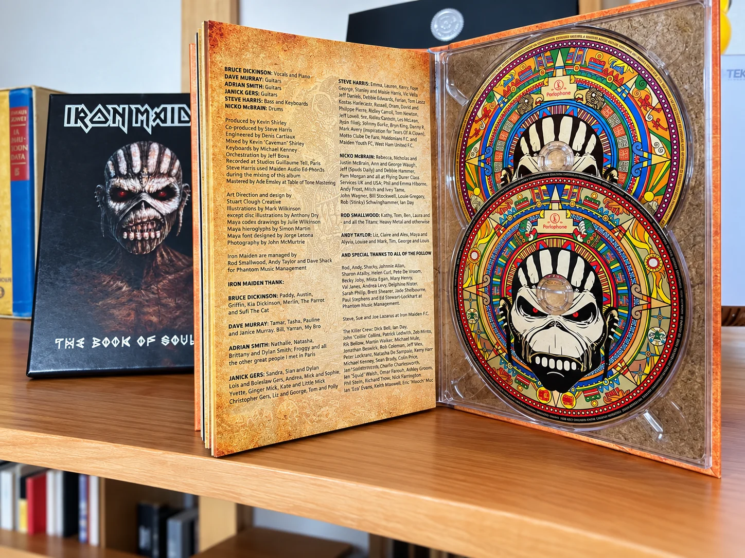
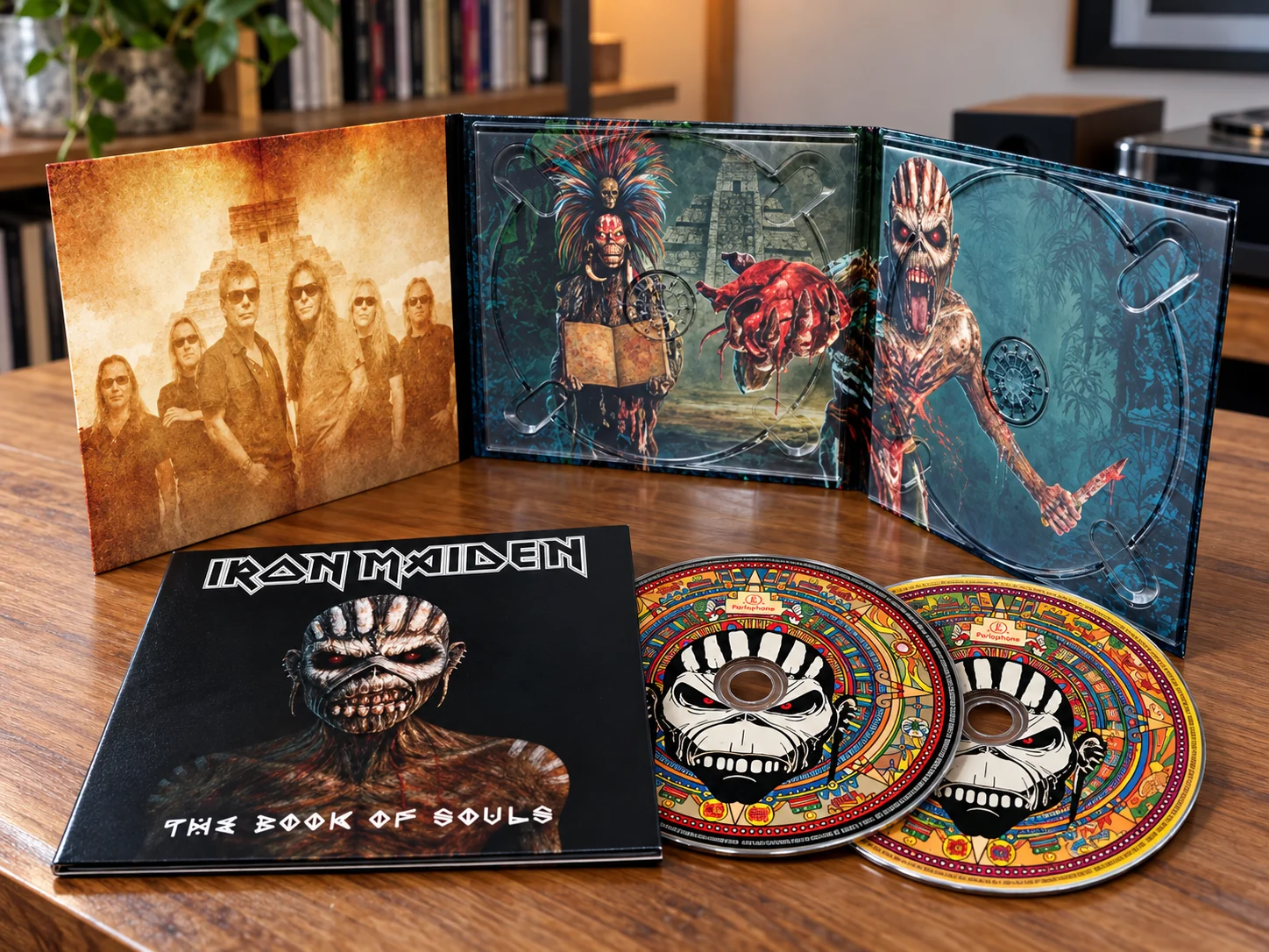
Hunab-Ku began as an independent typeface in Guatemala. In 2015, Iron Maiden’s team contacted Jorge Letona and the lettering became part of the visual language of The Book of Souls — from the album to Ed Force One and the world tour.Hunab-Ku nació como una tipografía independiente en Guatemala. En 2015, el equipo de Iron Maiden contactó a Jorge Letona y el lettering pasó a formar parte del lenguaje visual de The Book of Souls — desde el álbum hasta Ed Force One y la gira mundial.
MAYA FONT DESIGNED BY JORGE LETONAFUENTE MAYA DISEÑADA POR JORGE LETONA
CAME FIRST.LA TIPOGRAFÍA
VINO PRIMERO.
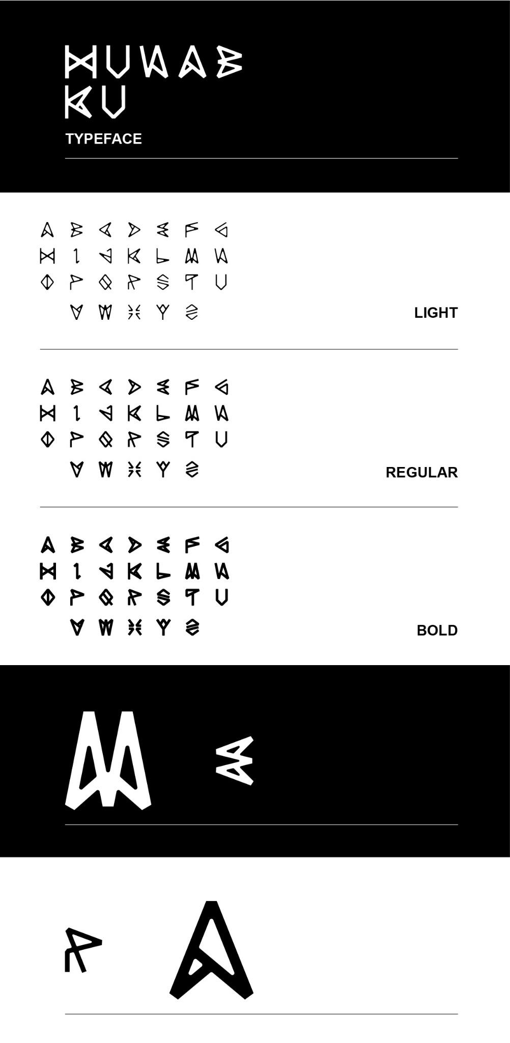
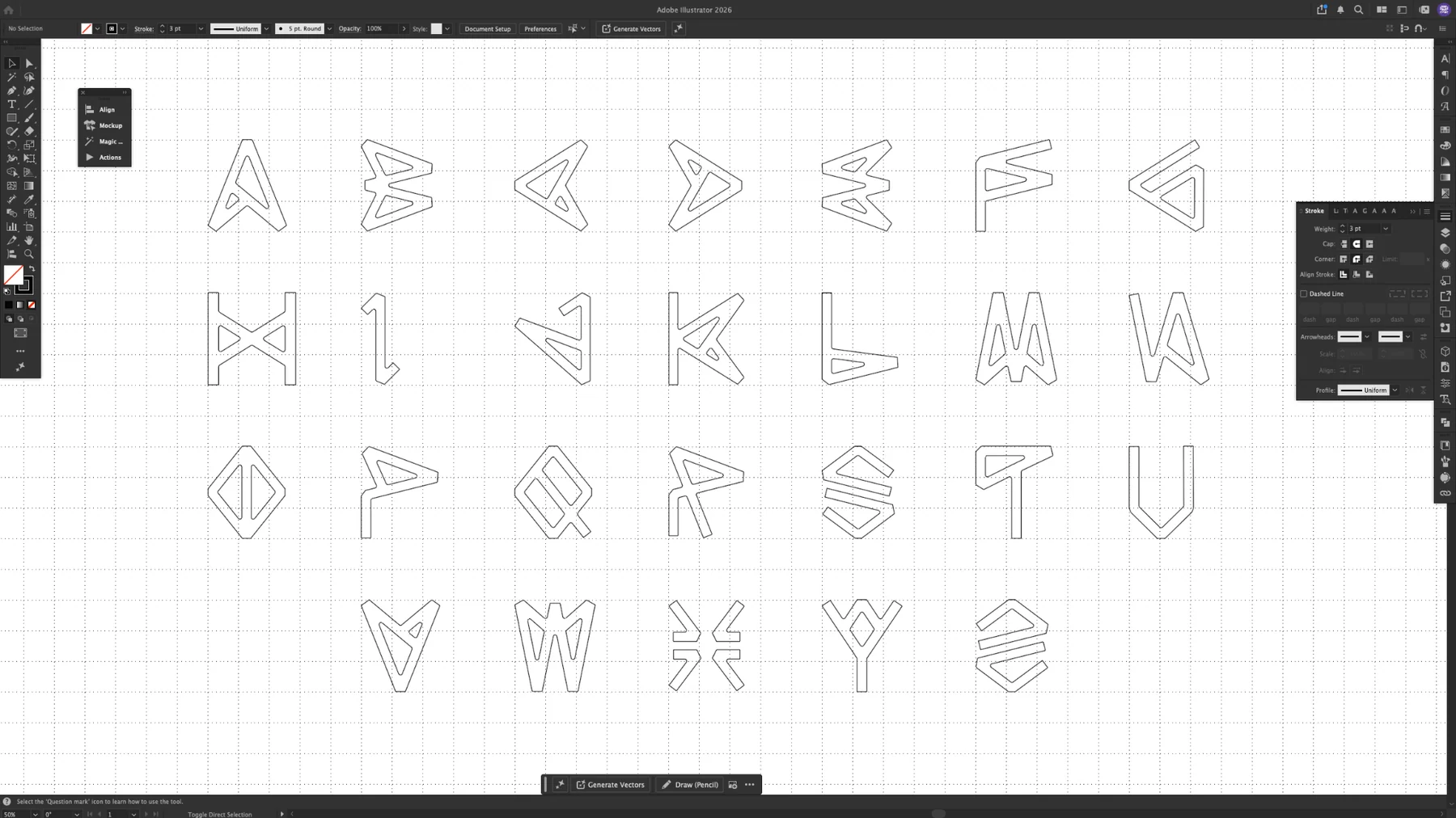
Hunab-Ku was conceived as a personal type experiment before Iron Maiden entered the picture. Its angular alphabet translated references from Maya visual culture into a contemporary display language.Hunab-Ku fue concebida como un experimento tipográfico personal antes de que Iron Maiden entrara en escena. Su alfabeto angular tradujo referencias de la cultura visual maya a un lenguaje display contemporáneo.
TO EXHIBITION PIECE.DE TIPOGRAFÍA DIGITAL
A PIEZA DE EXHIBICIÓN.
Hunab-Ku was later exhibited at Tipográfica in Guatemala City, bringing the project back into a local typography context after its international journey with Iron Maiden.Hunab-Ku fue expuesta posteriormente en Tipográfica, en Ciudad de Guatemala, devolviendo el proyecto a un contexto tipográfico local después de su recorrido internacional con Iron Maiden.
View Tipográfica projectVer proyecto Tipográfica→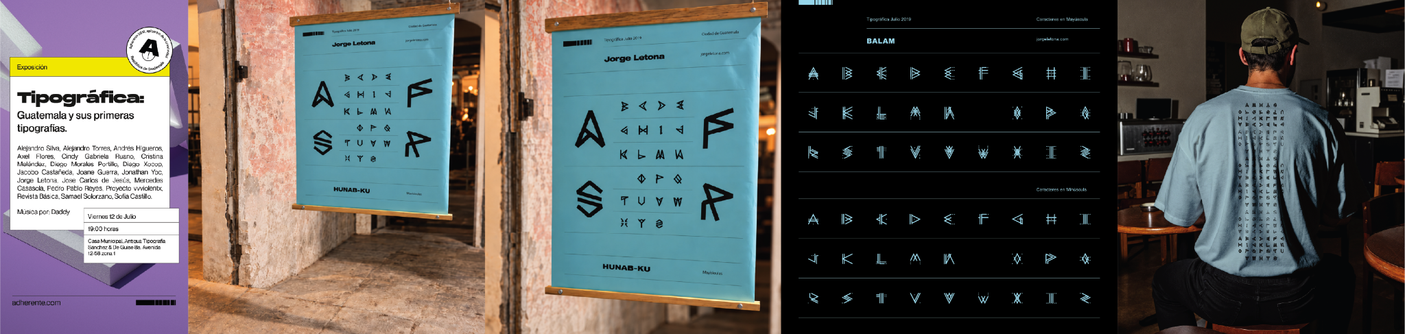
ENTERED AN ALBUM.DESPUÉS LA TIPOGRAFÍA
ENTRÓ A UN ÁLBUM.
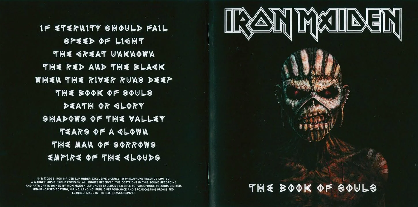
DESIGNED BY
JORGE LETONA”
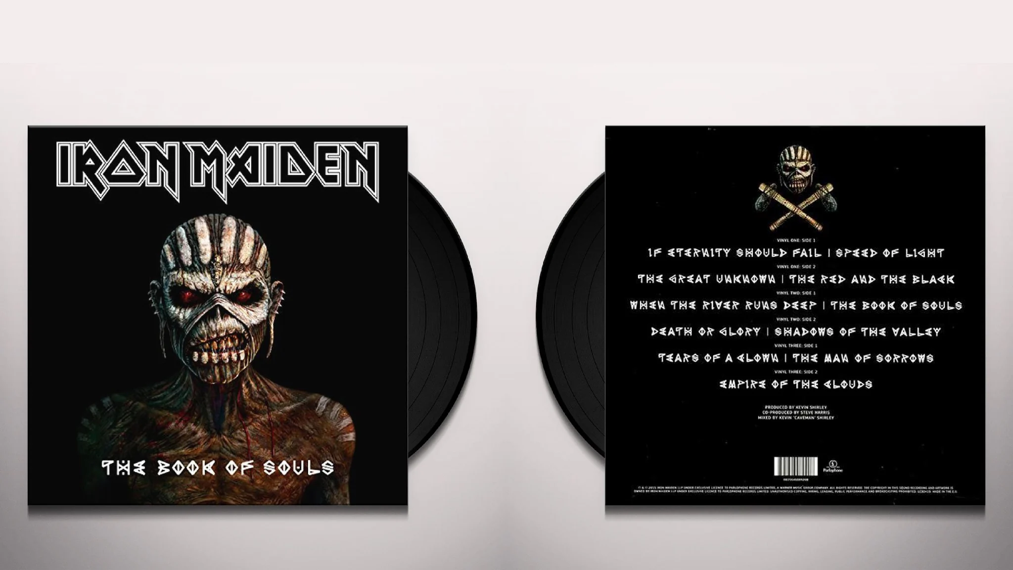
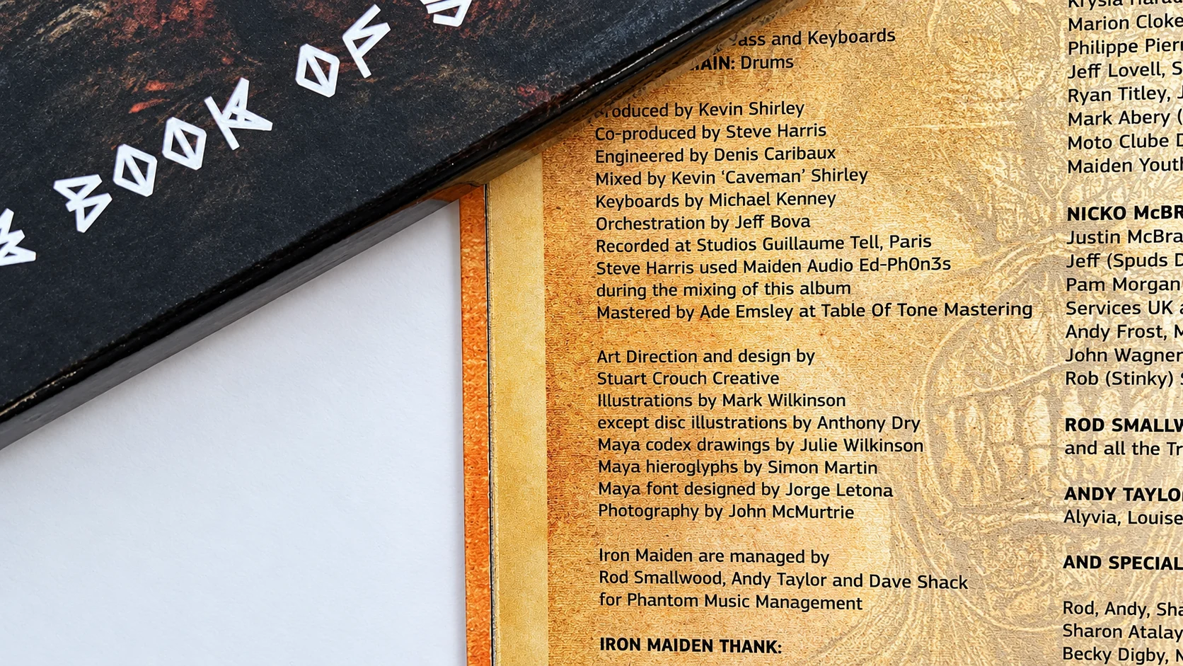
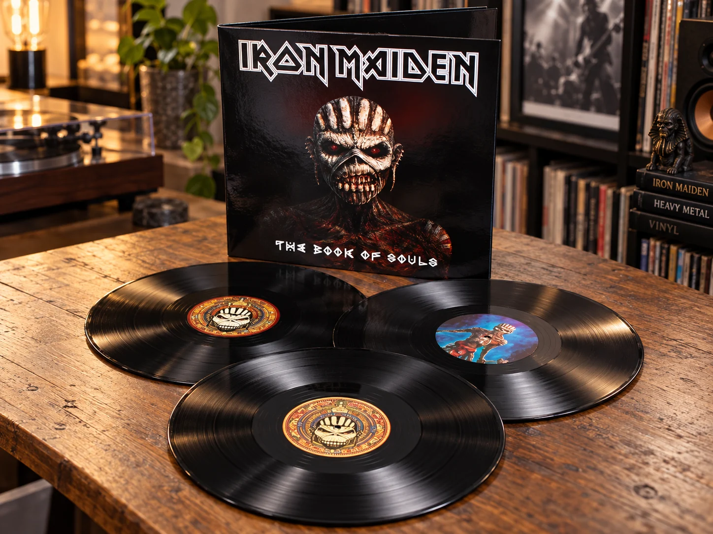
The official booklet credits the typeface directly within the album’s art and design credits — the clearest record of Hunab-Ku’s role in The Book of Souls.El booklet oficial acredita directamente la tipografía dentro de los créditos de arte y diseño del álbum — el registro más claro del papel de Hunab-Ku en The Book of Souls.
LEFT THE PAGE.EL LETTERING
SALIÓ DE LA PÁGINA.
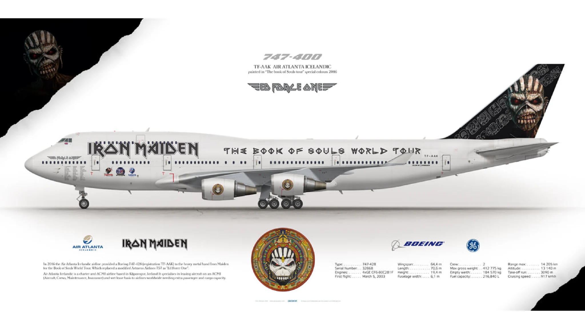
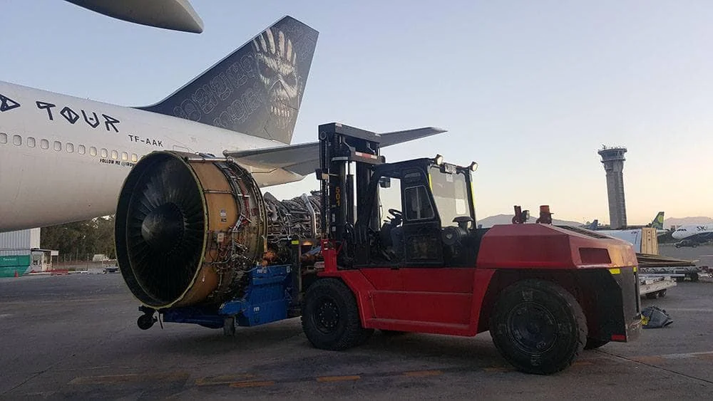
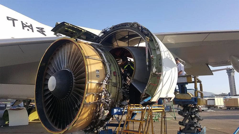
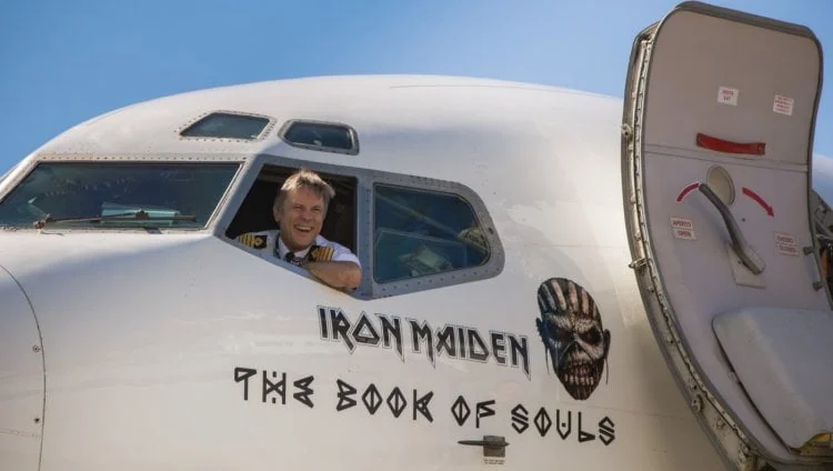
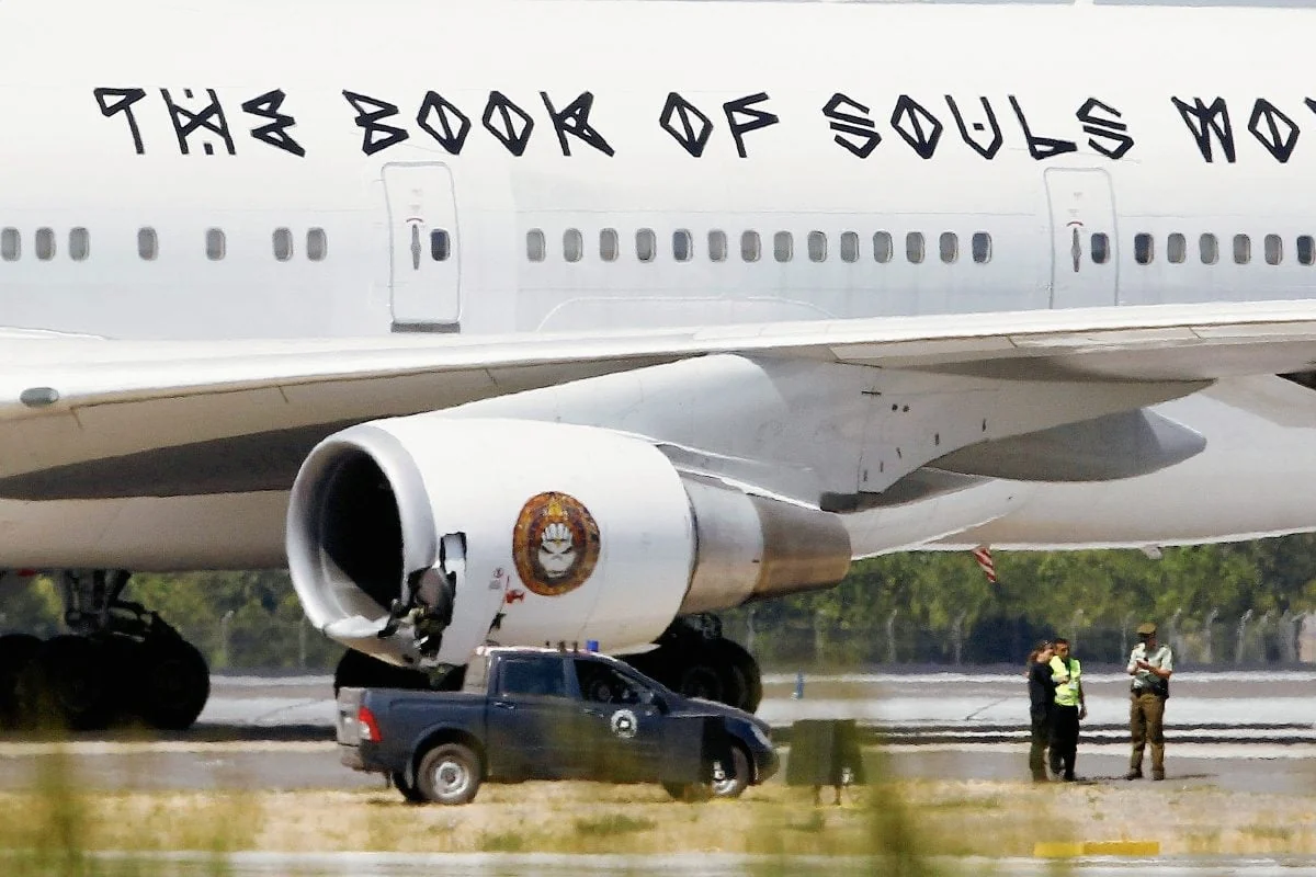
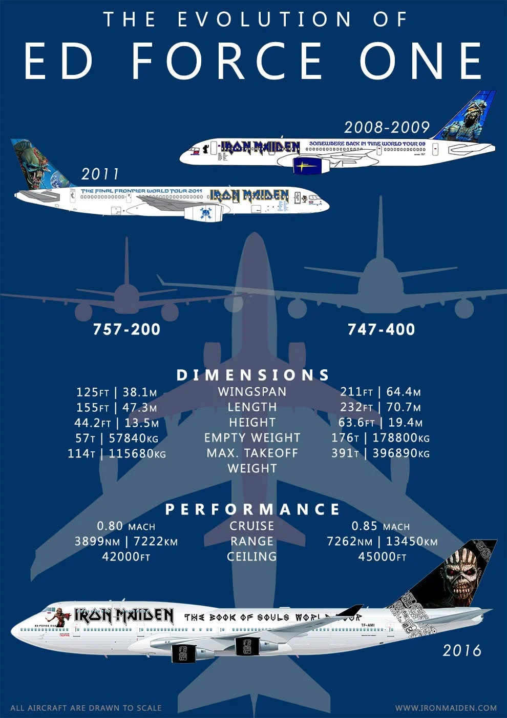
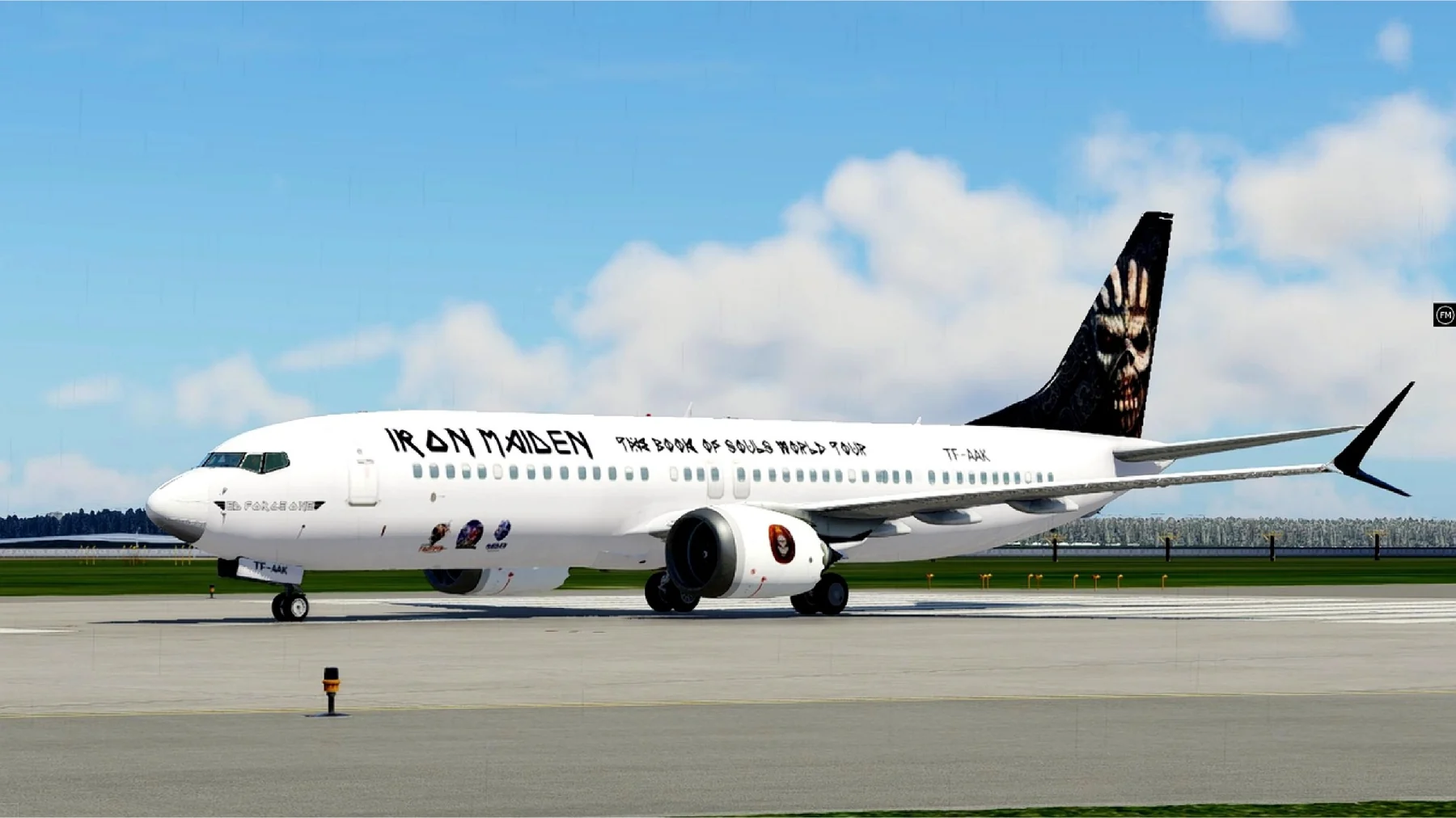
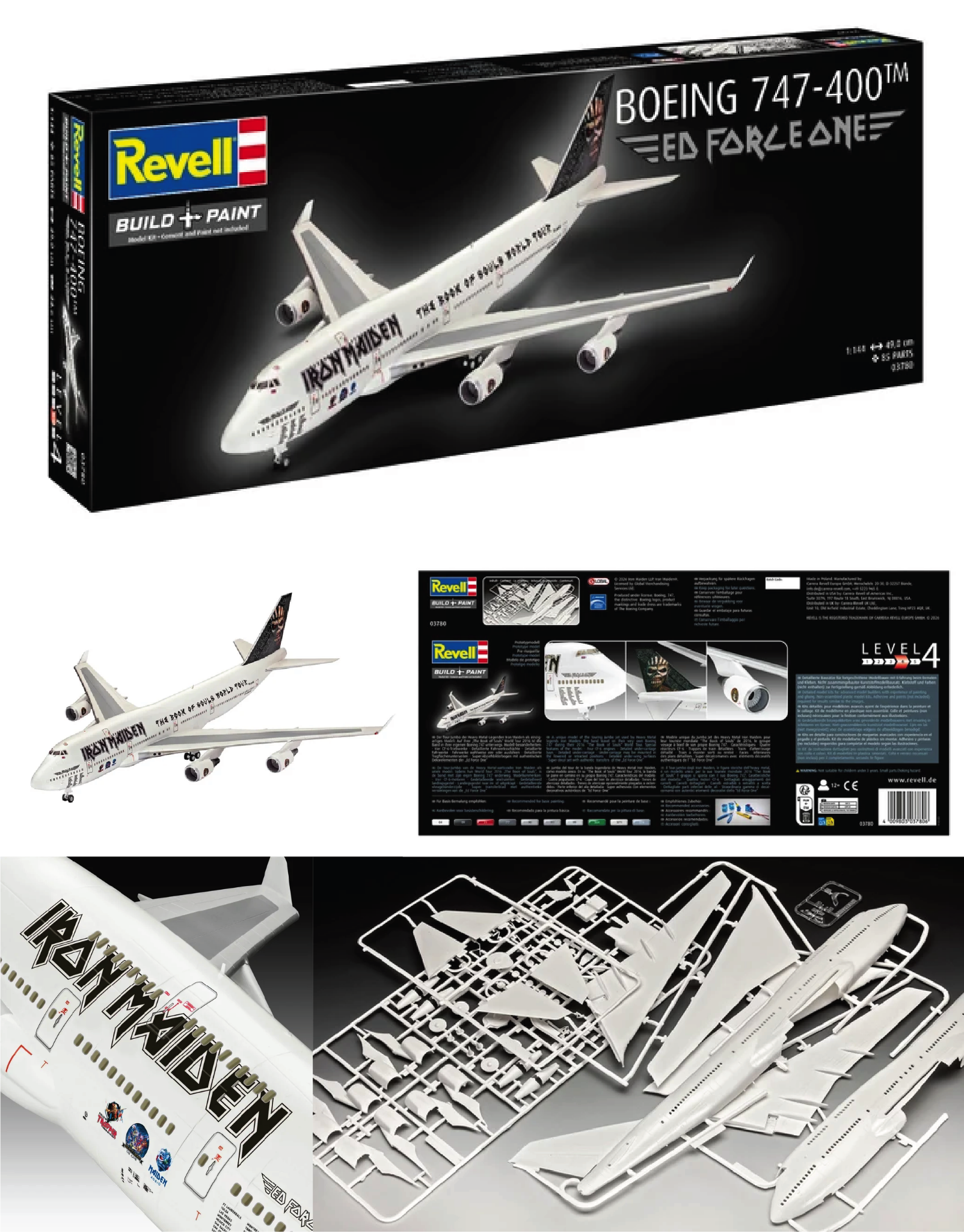
Hunab-Ku travelled around the world on Ed Force One, the Boeing 747 used by Iron Maiden during The Book of Souls World Tour. The project had moved from an independent alphabet to a piece of visual identity at aircraft scale.Hunab-Ku viajó alrededor del mundo en Ed Force One, el Boeing 747 utilizado por Iron Maiden durante The Book of Souls World Tour. El proyecto había pasado de ser un alfabeto independiente a formar parte de una identidad visual a escala de avión.

ED FORCE ONE
INTO A MODEL KIT.REVELL CONVIRTIÓ
ED FORCE ONE
EN UN MODELO.
Revell later released an officially licensed Boeing 747-400 “Ed Force One” model kit at 1:144 scale. The kit contains 85 parts and authentic Ed Force One decals.Revell lanzó posteriormente un modelo con licencia oficial del Boeing 747-400 “Ed Force One” a escala 1:144. El kit contiene 85 piezas y calcomanías auténticas de Ed Force One.
Jorge bought one, by the way. It is still waiting patiently to be assembled.Jorge compró uno, por cierto. Sigue esperando pacientemente a que algún día lo arme. :)
BECOMING OBJECTS.EL PROYECTO SIGUIÓ
CONVIRTIÉNDOSE EN OBJETOS.
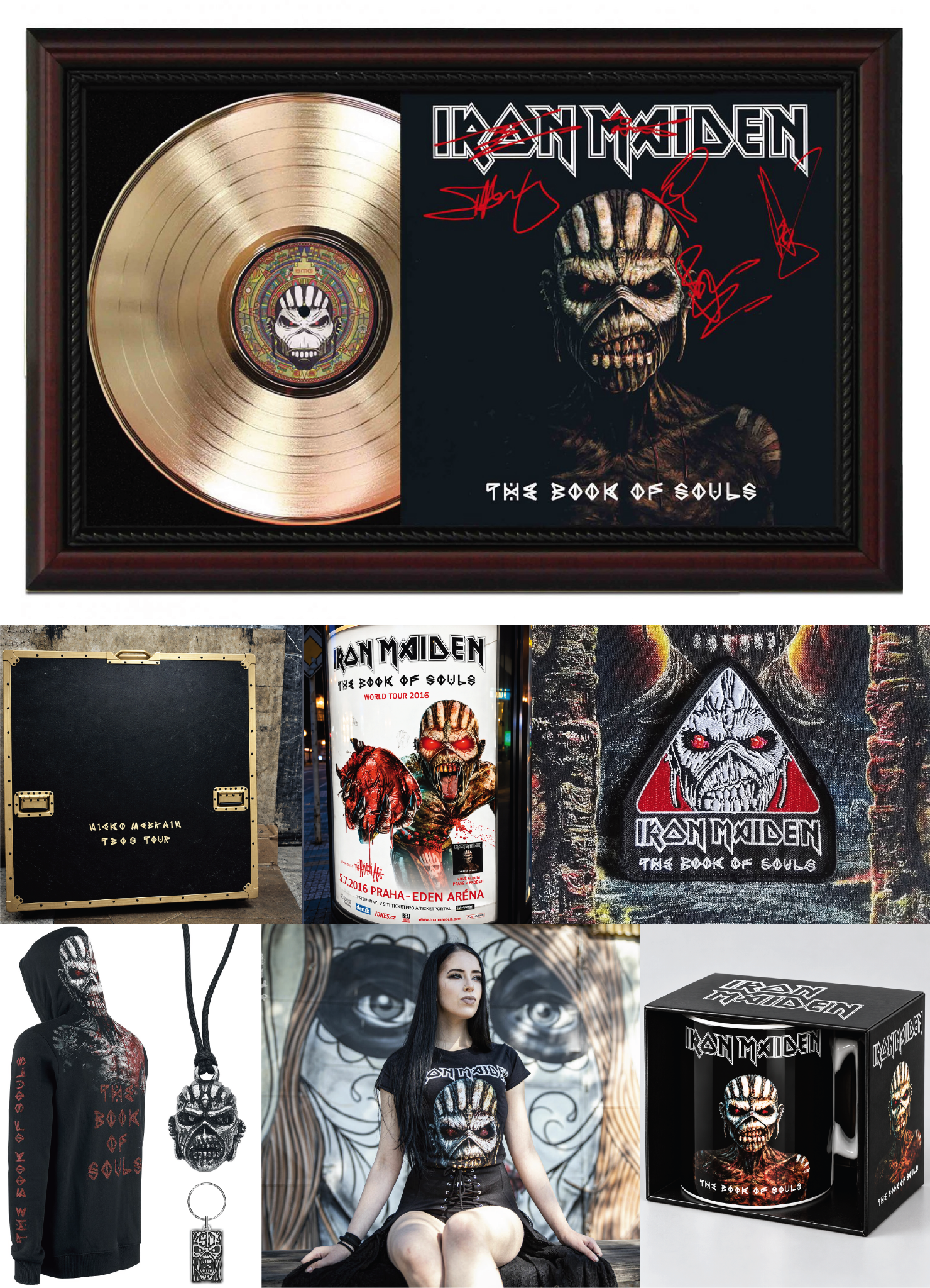
The visual language continued beyond the album and the tour, extending into memorabilia, merchandise and collectible objects that carried the identity into everyday physical culture.El lenguaje visual continuó más allá del álbum y la gira, extendiéndose a memorabilia, merchandising y objetos coleccionables que llevaron la identidad a una cultura física y cotidiana.
MANY LIVES.UNA TIPOGRAFÍA.
MUCHAS VIDAS.
HUNAB-KU
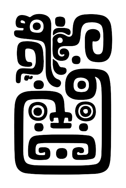
Hunab-Ku is a lettering project exploring a visual language inspired by Maya forms and contemporary graphic composition.Hunab-Ku es un proyecto de lettering que explora un lenguaje visual inspirado en formas mayas y en la composición gráfica contemporánea.
The project sits between lettering, image and visual experimentation.El proyecto se mueve entre lettering, imagen y experimentación visual.
BALAM
TYPEFACE
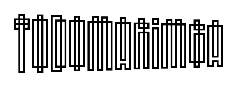
Balam is a typeface project developed from an interest in lettering, structure and the visual character of Maya-inspired forms.Balam es un proyecto tipográfico desarrollado a partir de un interés por el lettering, la estructura y el carácter visual de formas inspiradas en la cultura maya.
The typeface expands the ideas explored through the Hunab-Ku lettering work.La tipografía amplía las ideas exploradas a través del trabajo de lettering de Hunab-Ku.

NOSTALGIA
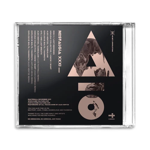
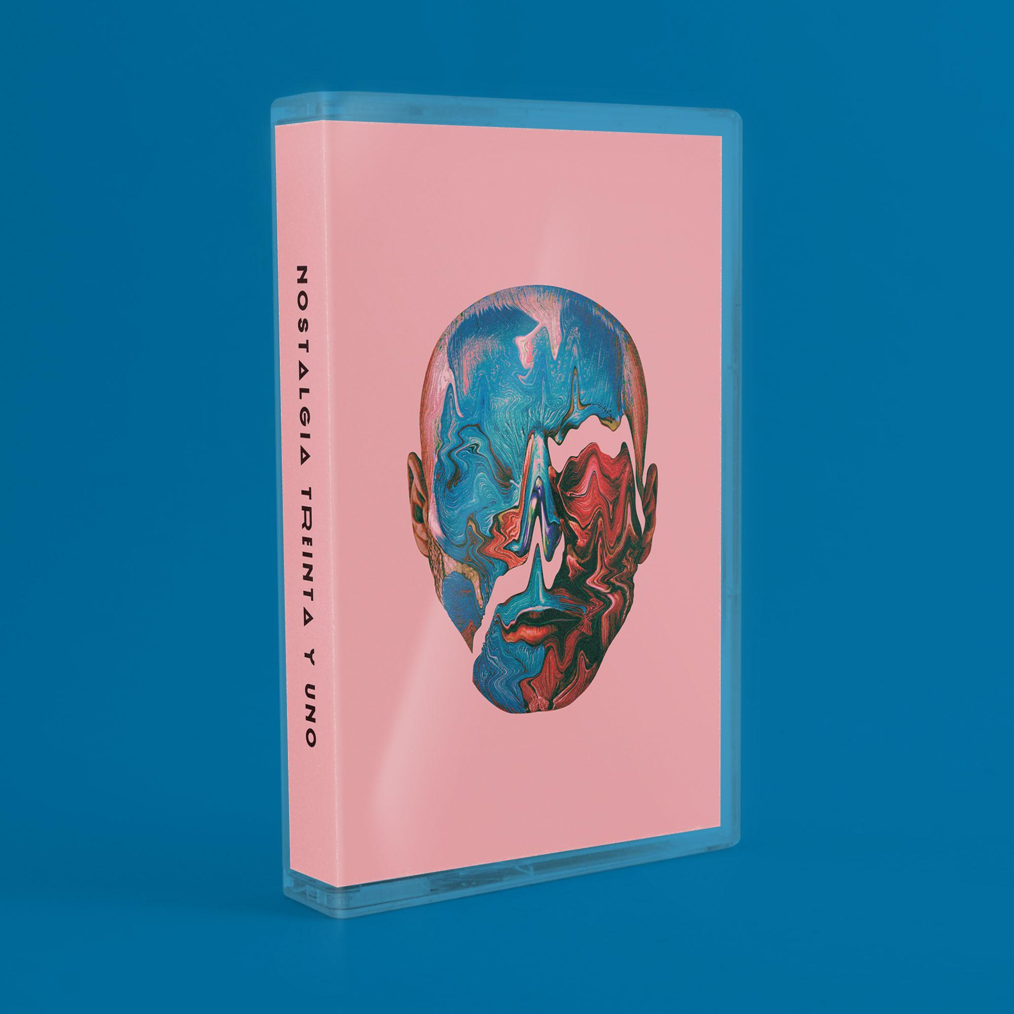
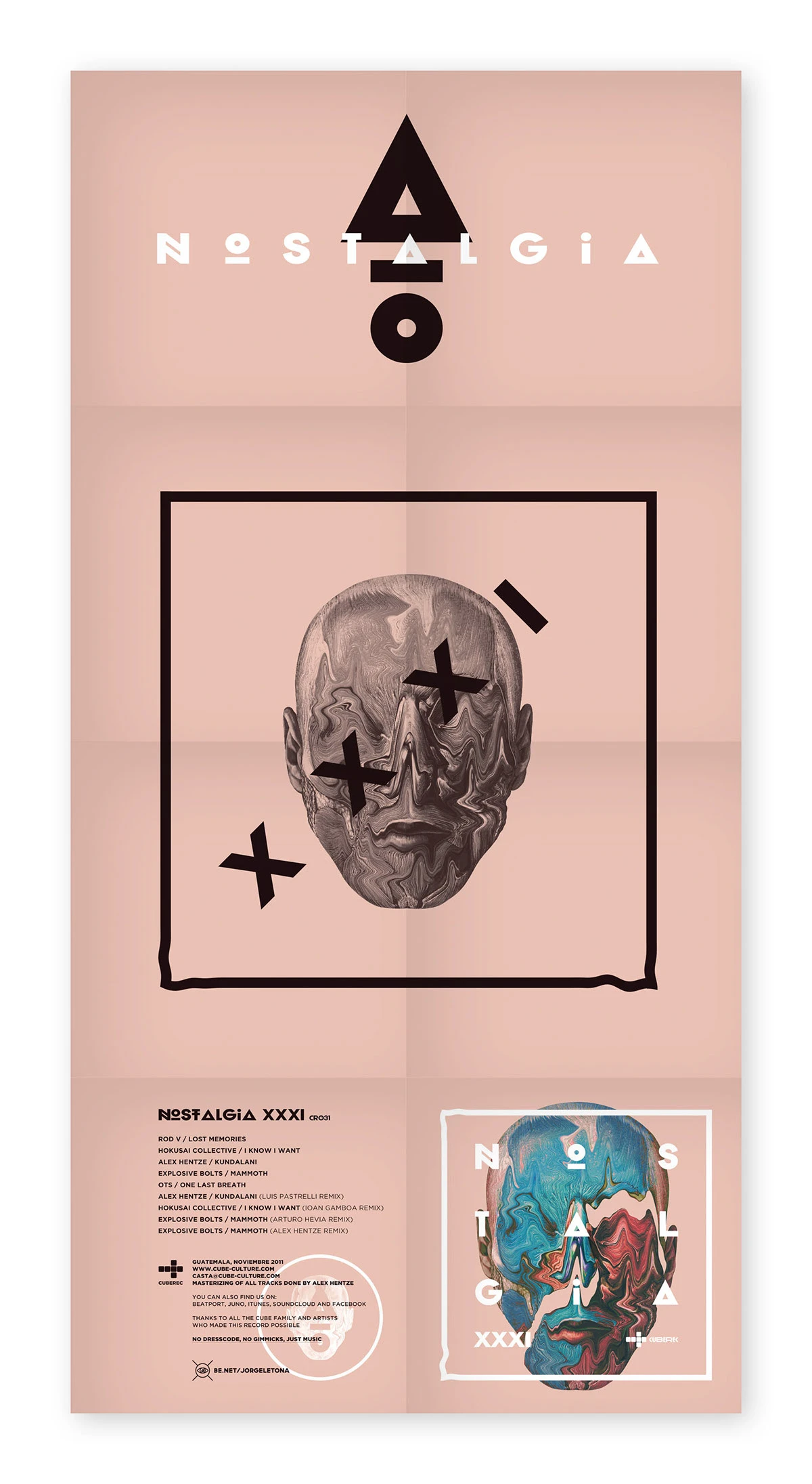
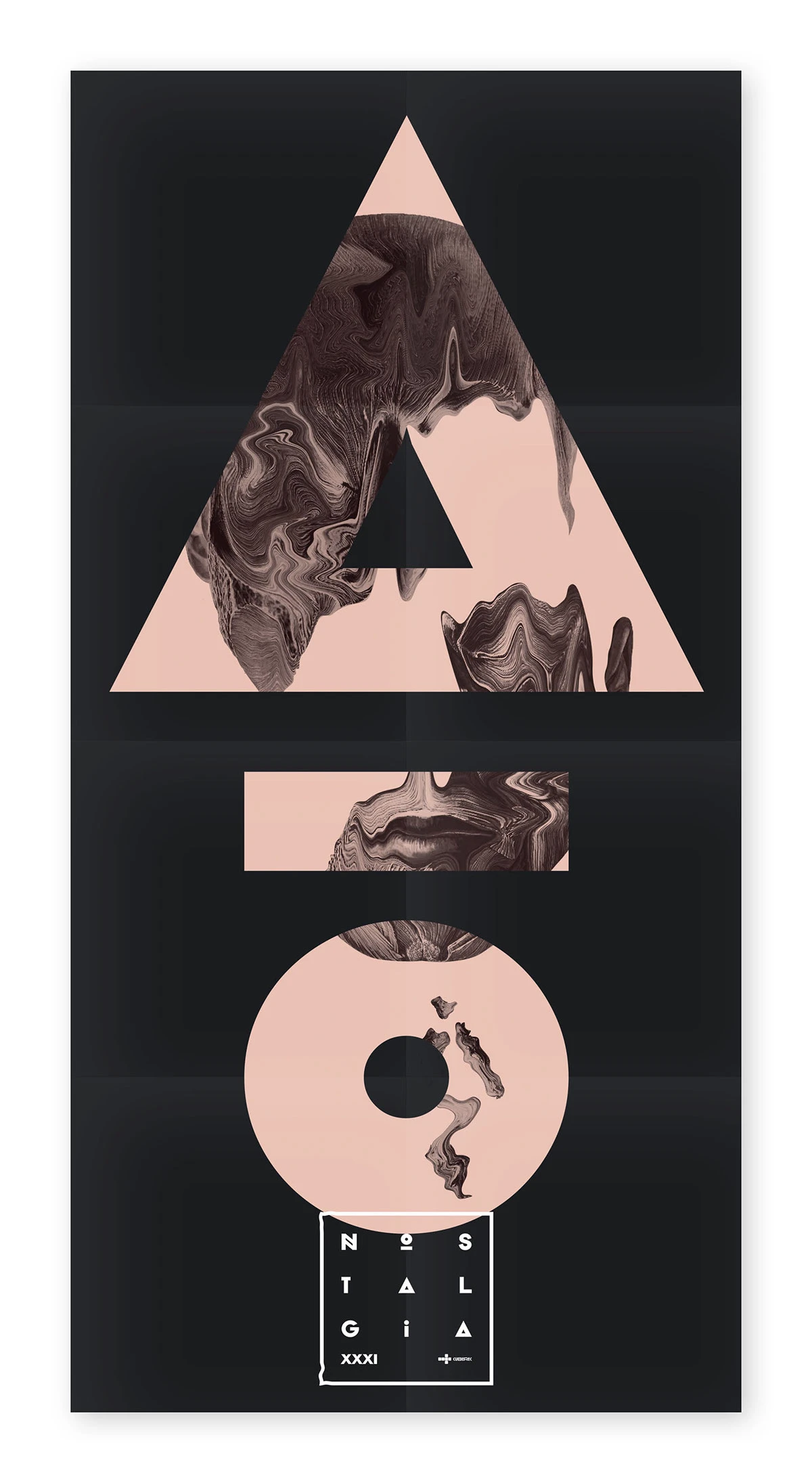
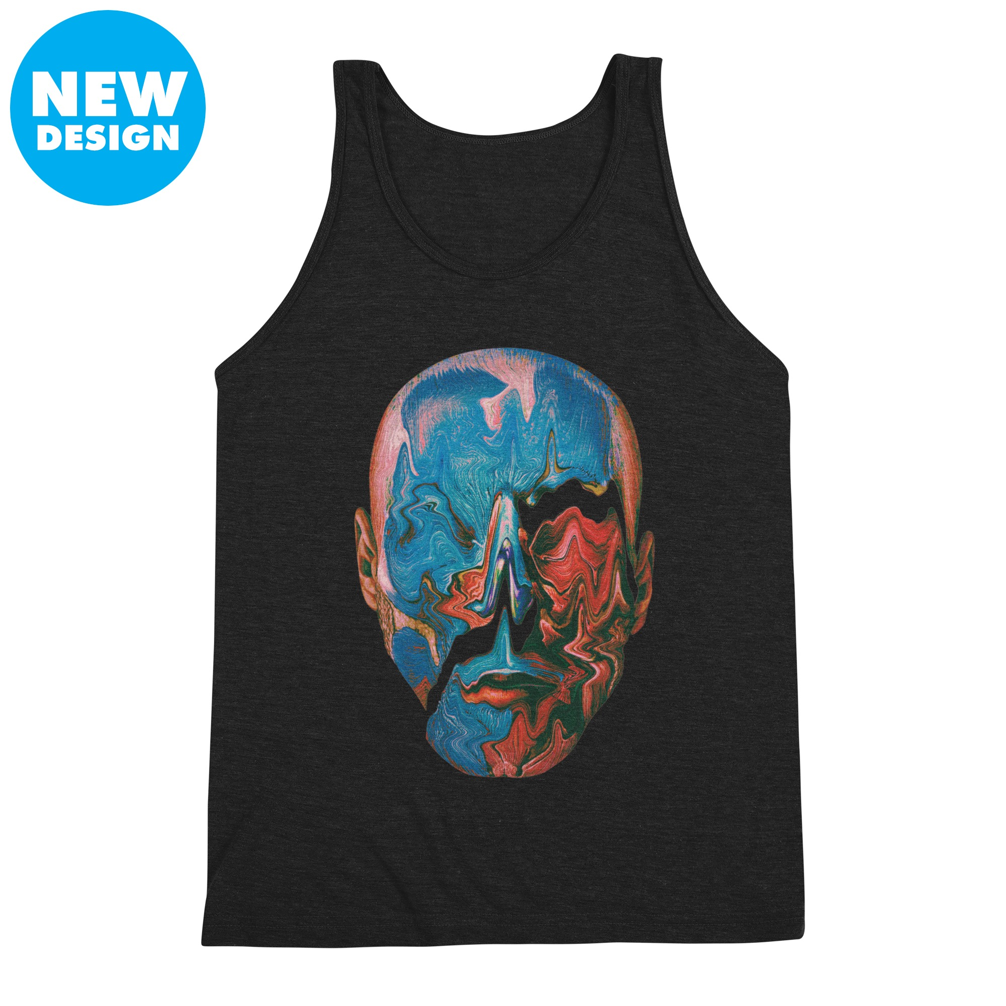
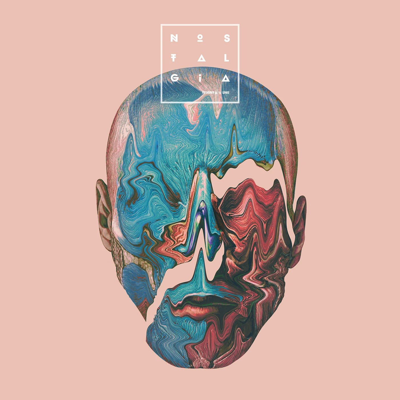
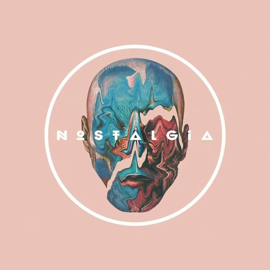
Nostalgia 3.1 was released by CUBEREC as a collection of electronic music featuring Hokusai Collective, Alex Hentze and other artists. The artwork was conceived as a visual extension of the release, translating its atmospheric character into an identity built around memory, distortion and texture.Nostalgia 3.1 fue lanzado por CUBEREC como una colección de música electrónica con Hokusai Collective, Alex Hentze y otros artistas. El arte fue concebido como una extensión visual del lanzamiento, traduciendo su carácter atmosférico en una identidad construida alrededor de la memoria, la distorsión y la textura.
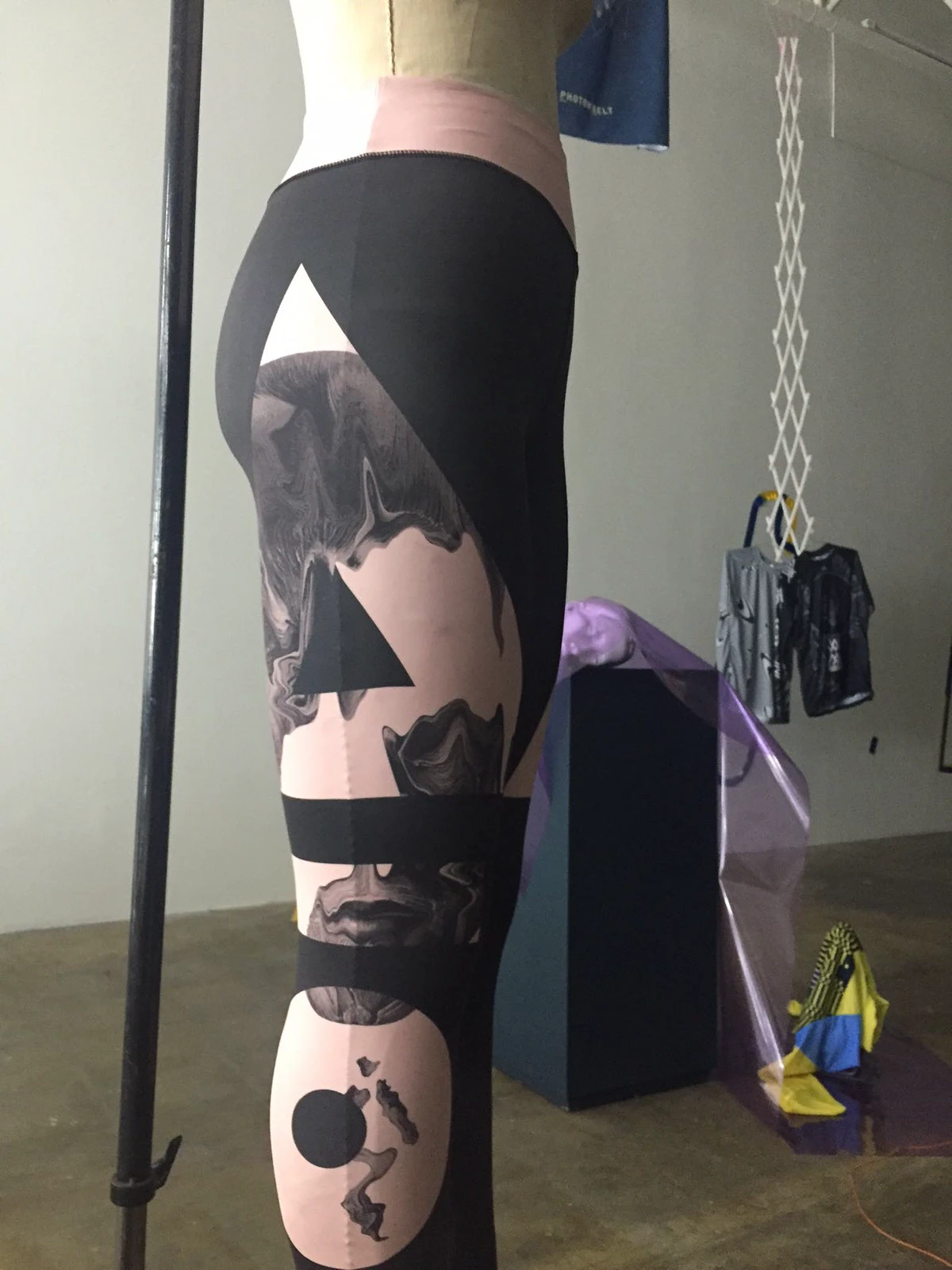
Rather than approaching nostalgia as a literal reference to the past, the visual language explores it as a fragmented sensation. Muted pinks, intense blues, distorted portraiture and geometric forms create an image that feels simultaneously familiar and unstable.En lugar de abordar la nostalgia como una referencia literal al pasado, el lenguaje visual la explora como una sensación fragmentada. Rosas apagados, azules intensos, retratos distorsionados y formas geométricas construyen una imagen que se siente al mismo tiempo familiar e inestable.
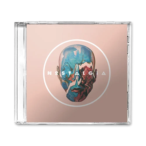
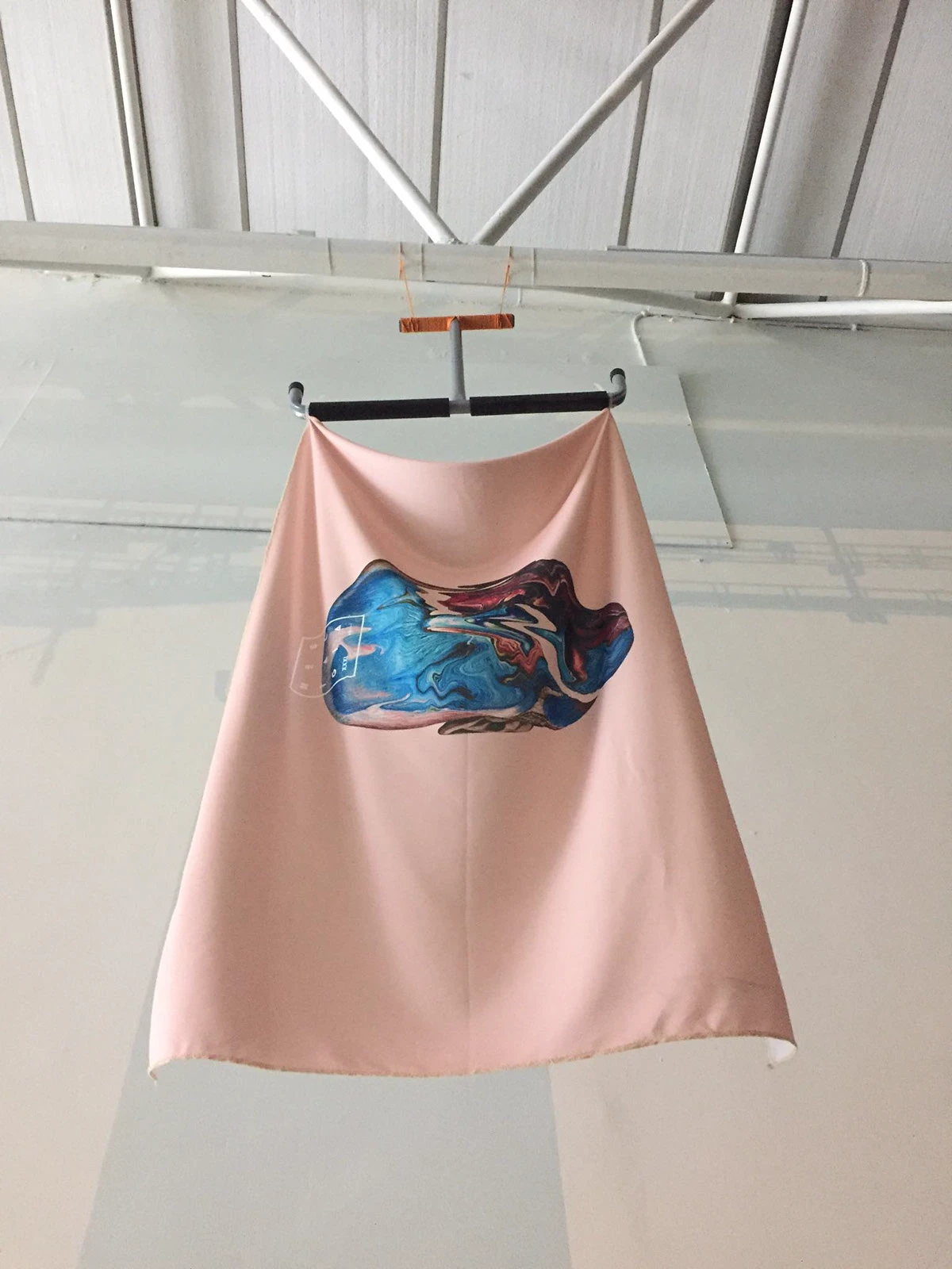
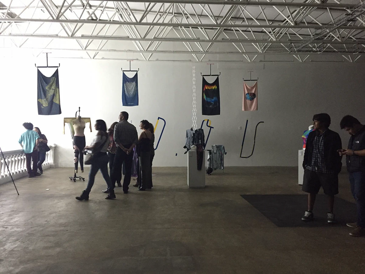
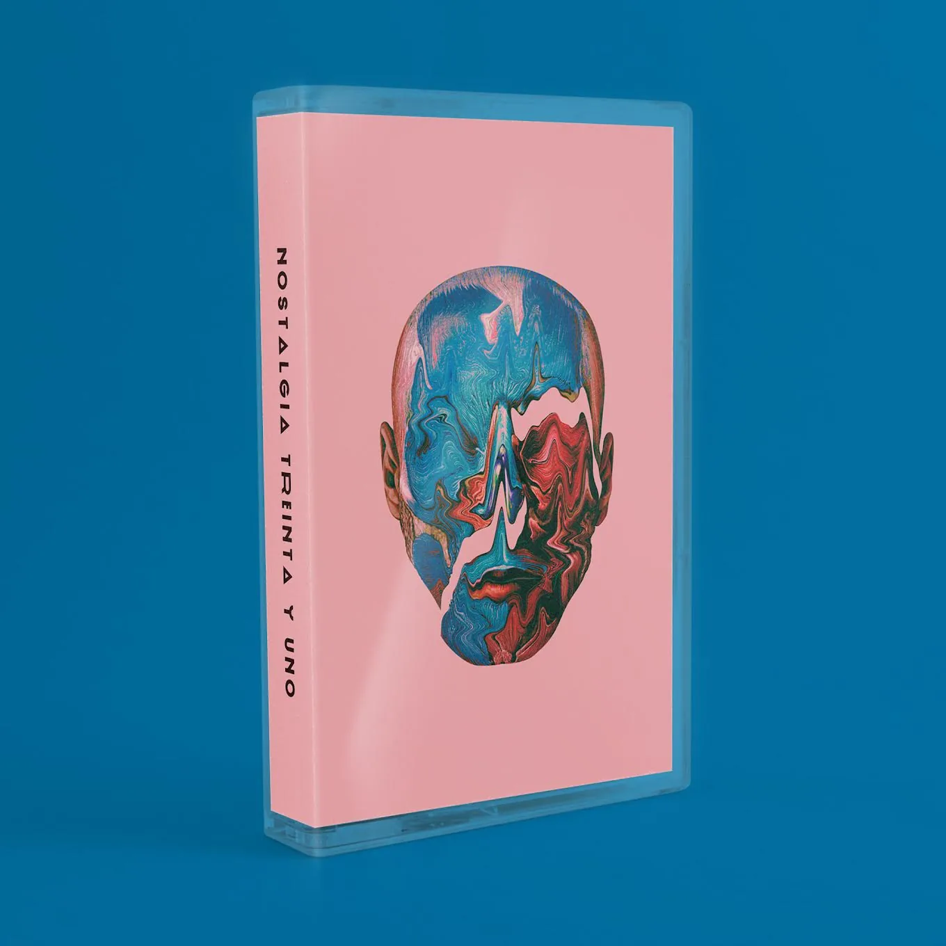
The system extended beyond the album artwork into CD and cassette editions, printed pieces, apparel and exhibition applications, allowing the identity to move between music, physical objects and space.El sistema se extendió más allá del arte del álbum hacia ediciones en CD y cassette, piezas impresas, indumentaria y aplicaciones de exhibición, permitiendo que la identidad se moviera entre la música, los objetos físicos y el espacio.
LISTEN ON BEATPORT →ESCUCHAR EN BEATPORT →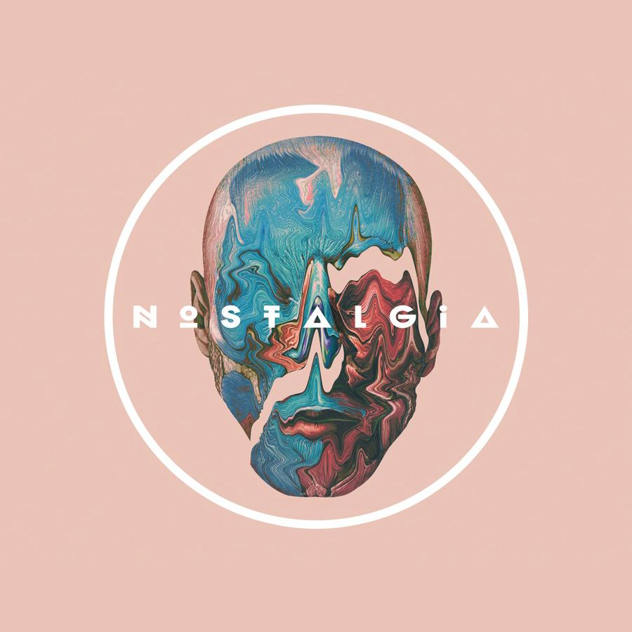
IXBALANQUÉ
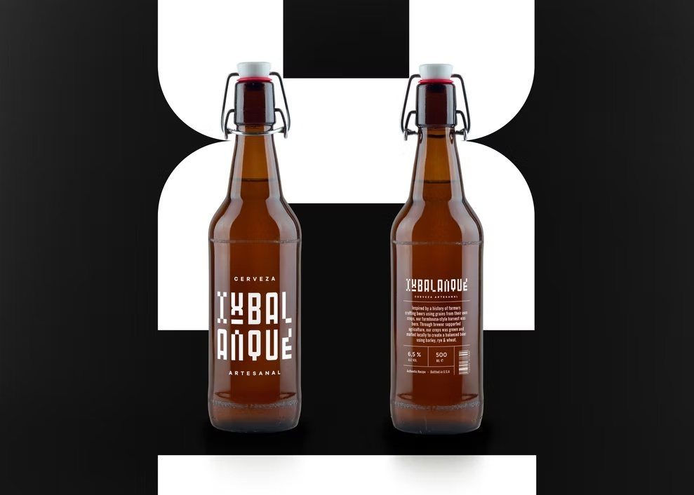
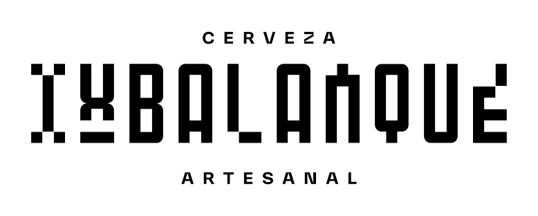
Visual identity and packaging for Ixbalanqué, a Guatemalan craft beer project.Identidad visual y packaging para Ixbalanqué, un proyecto de cerveza artesanal guatemalteca.
The visual language uses a custom typographic construction inspired by the geometry and rhythm of Guatemalan textiles.El lenguaje visual parte de una construcción tipográfica propia inspirada en la geometría y el ritmo de los textiles guatemaltecos.


CINE CON ORGULLO
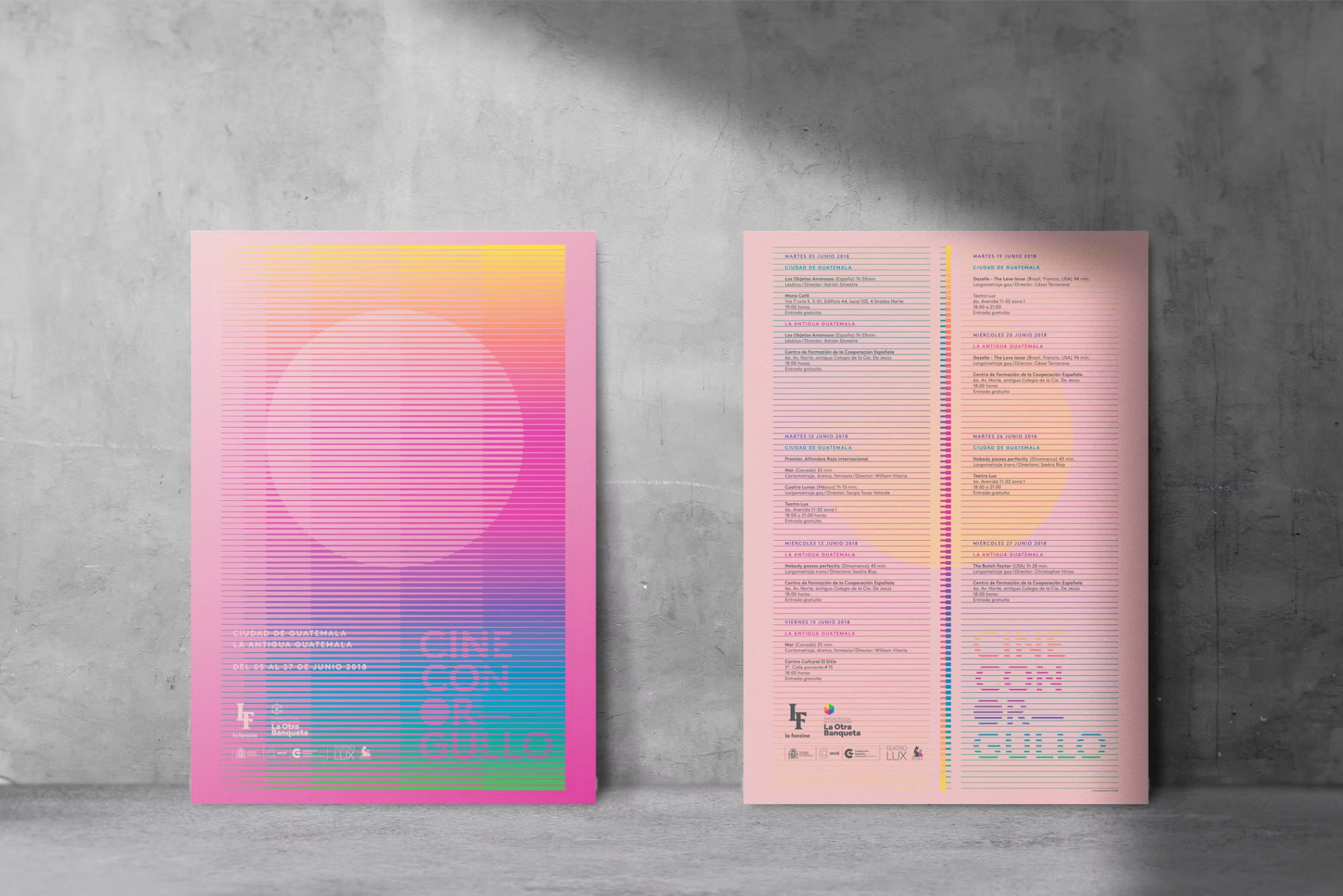
Visual identity for Cine Con Orgullo, developed across the festival editions of 2018 and 2023.Identidad visual para Cine Con Orgullo, desarrollada para las ediciones 2018 y 2023 del festival.
The system explores interference, resolution and horizontal scan lines as a way of building images and giving the festival a recognizable visual language.El sistema explora la interferencia, la resolución y las líneas de barrido horizontal como una forma de construir imágenes y darle al festival un lenguaje visual reconocible.


SMA
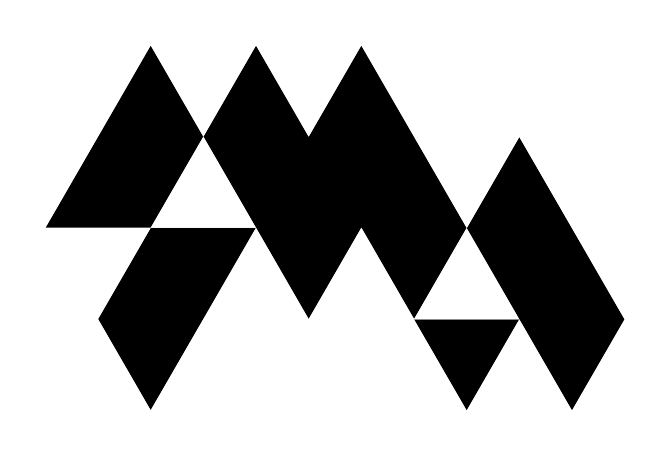
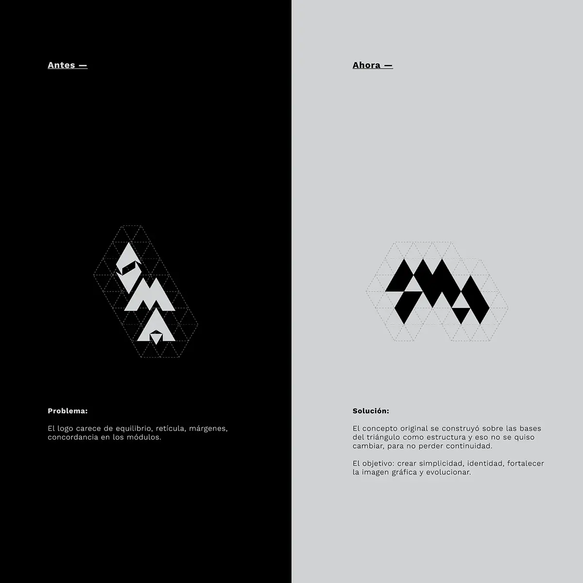
Rebranding and visual identity for Semana de Música Avanzada in Guatemala, developed around the relationship between sound, rhythm and visual structure.Rediseño e identidad visual para la Semana de Música Avanzada en Guatemala, desarrollados alrededor de la relación entre sonido, ritmo y estructura visual.
The identity evolved with the festival, from posters and printed matter to stage projections, notebooks and digital applications.La identidad evolucionó junto al festival, desde carteles y piezas impresas hasta proyecciones de escenario, libretas y aplicaciones digitales.


15 FESTIVAL CCMAA
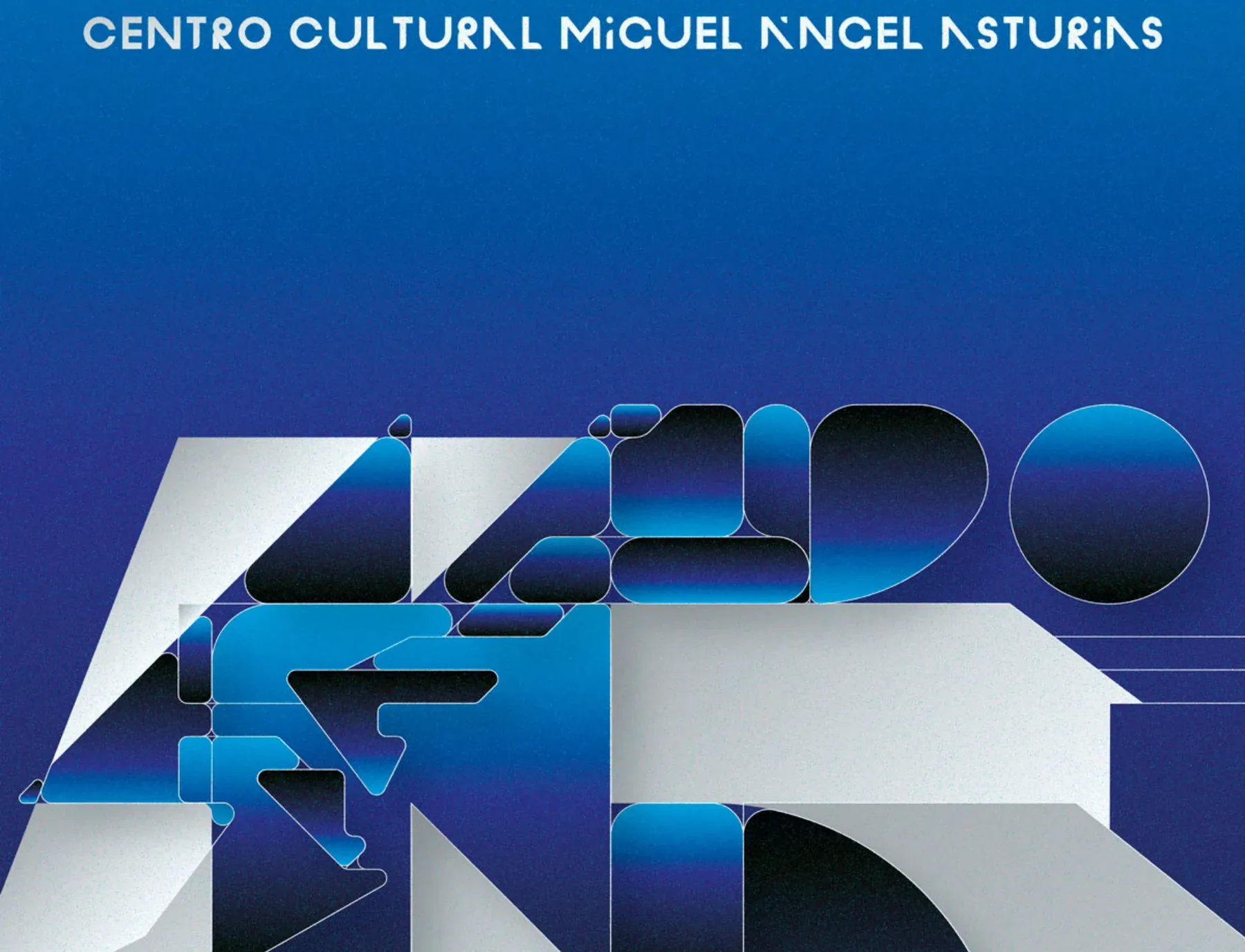
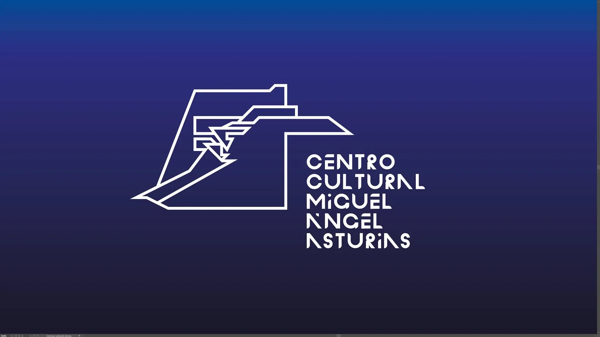
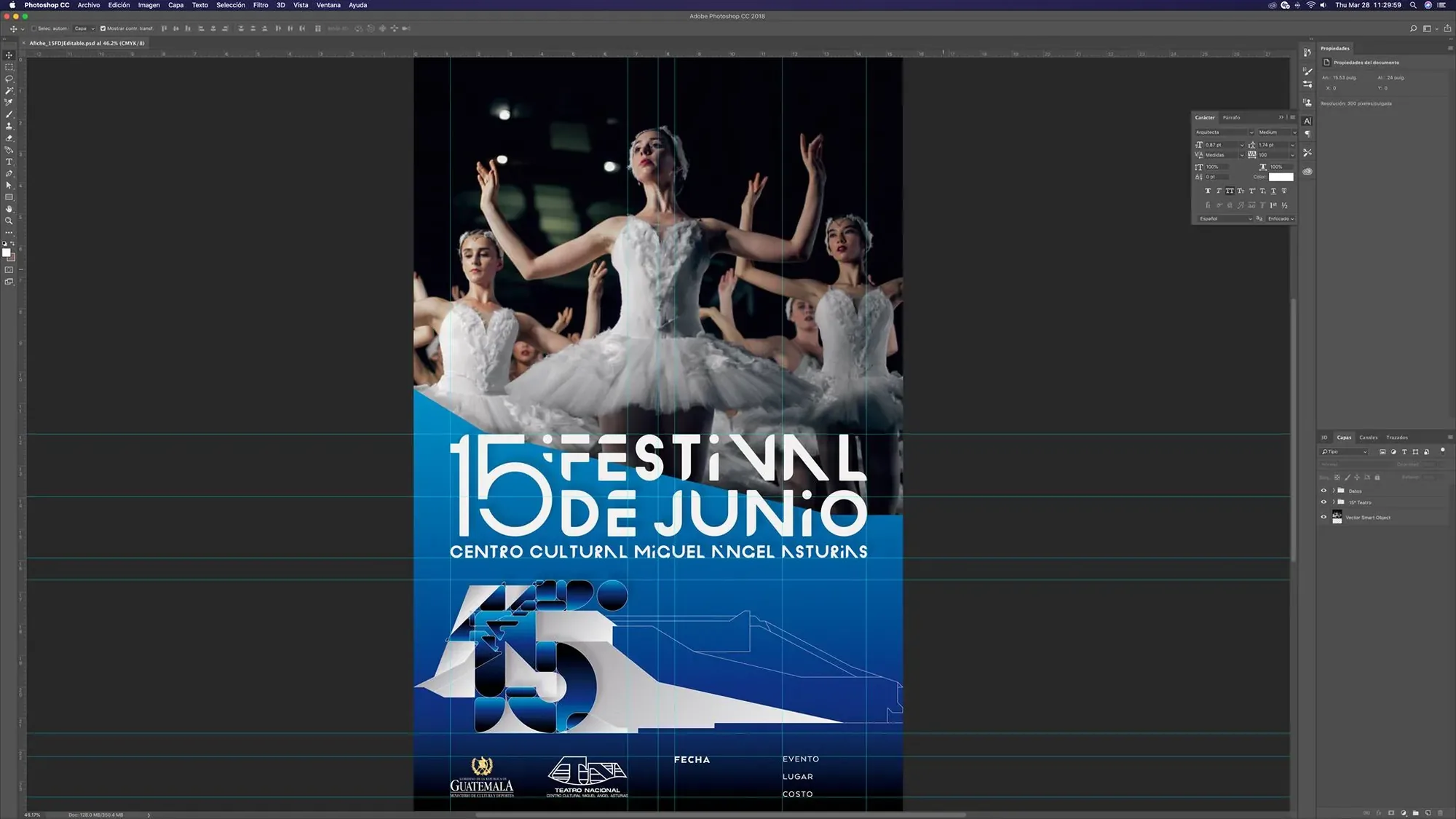
Identity for the 15th Festival of the Centro Cultural Miguel Ángel Asturias, developed from a close observation of the building and the visual universe of its creator, Guatemalan artist and architect Efraín Recinos. The project began by looking at the Cultural Center not simply as a venue, but as the source of the identity itself.Identidad para el 15 Festival del Centro Cultural Miguel Ángel Asturias, desarrollada a partir de una observación cercana del edificio y del universo visual de su creador, el artista y arquitecto guatemalteco Efraín Recinos. El proyecto comenzó viendo al Centro Cultural no simplemente como sede, sino como la fuente misma de la identidad.
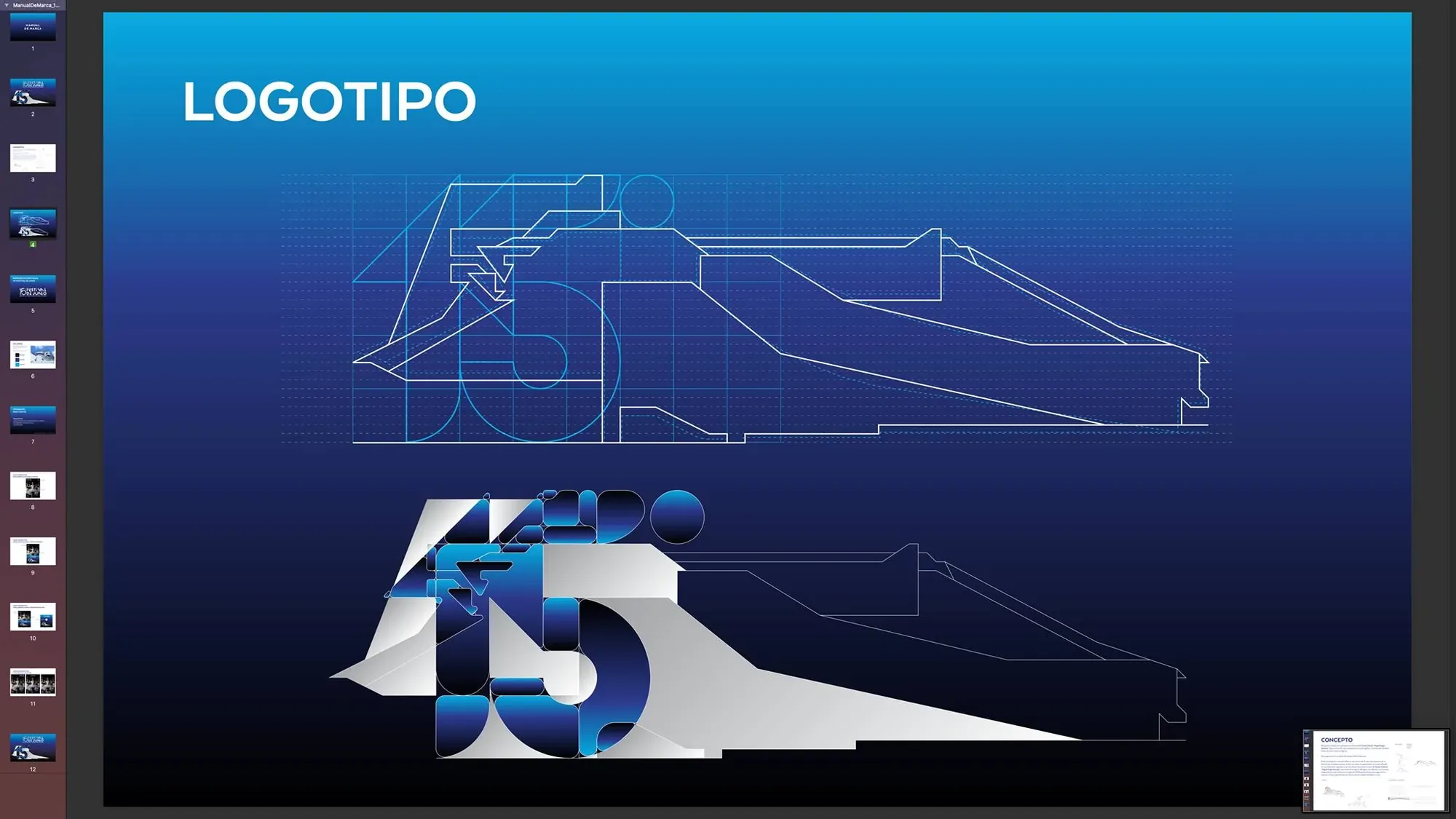
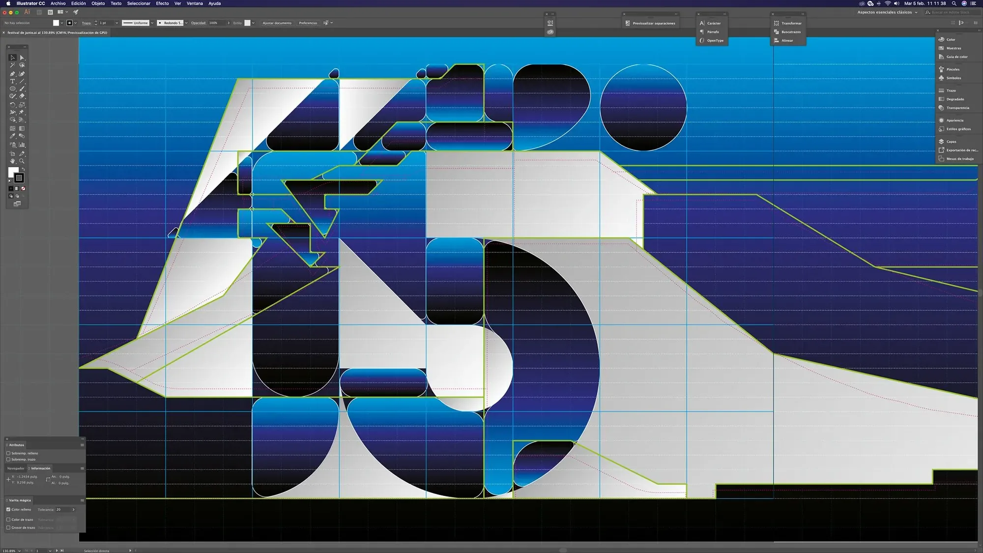
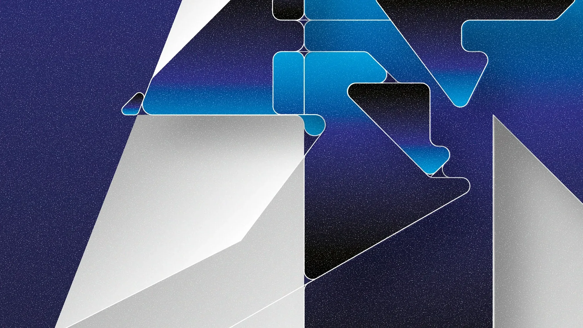
Its sweeping silhouettes, geometric details and characteristic curves were deconstructed and translated into the festival mark and a custom typographic language. The number 15 and the lettering emerge from the same architectural vocabulary, allowing the identity to retain a direct relationship with the building while becoming its own graphic system.Sus siluetas, detalles geométricos y curvas características fueron deconstruidos y traducidos en la marca del festival y en un lenguaje tipográfico personalizado. El número 15 y el lettering surgen del mismo vocabulario arquitectónico, permitiendo que la identidad mantenga una relación directa con el edificio y al mismo tiempo se convierta en un sistema gráfico propio.
Deep blues, white, metallic surfaces and luminous gradients reference the mosaics, textures and changing light of the Cultural Center. From that foundation, the system expands across posters, printed pieces and festival applications without reproducing the architecture literally.Azules profundos, blanco, superficies metálicas y gradientes luminosos hacen referencia a los mosaicos, las texturas y la luz cambiante del Centro Cultural. A partir de esa base, el sistema se extiende a afiches, piezas impresas y aplicaciones del festival sin reproducir literalmente la arquitectura.
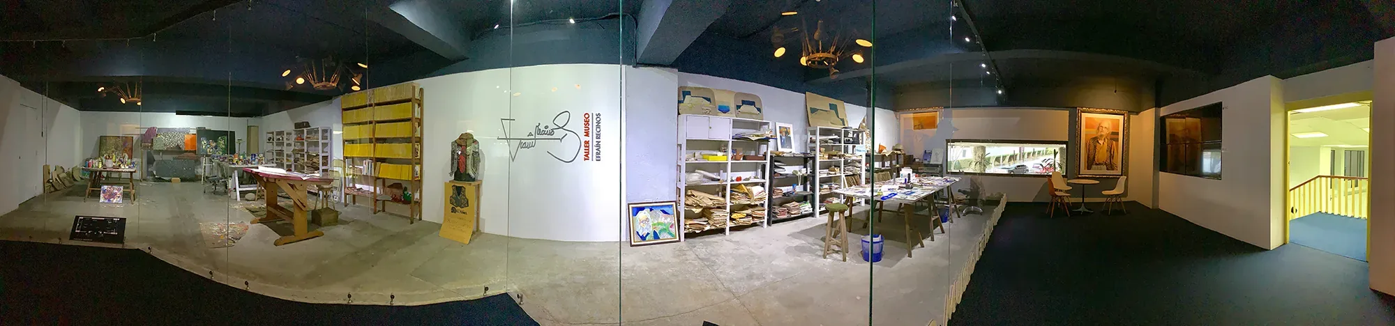
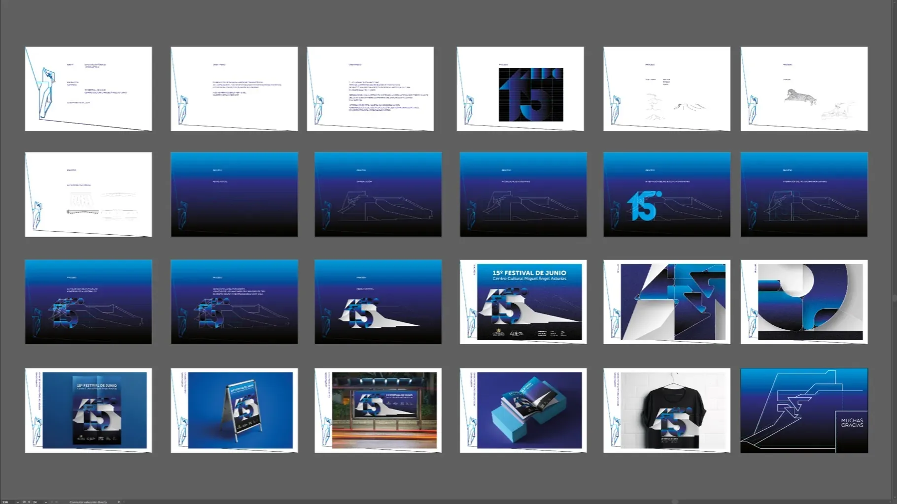
The identity begins with the Centro Cultural Miguel Ángel Asturias itself and with the visual universe of Efraín Recinos. Architecture, interior space, surface, color and small details become primary references for the project.La identidad parte del propio Centro Cultural Miguel Ángel Asturias y del universo visual de Efraín Recinos. La arquitectura, el espacio interior, las superficies, el color y sus pequeños detalles se convierten en referencias primarias del proyecto.
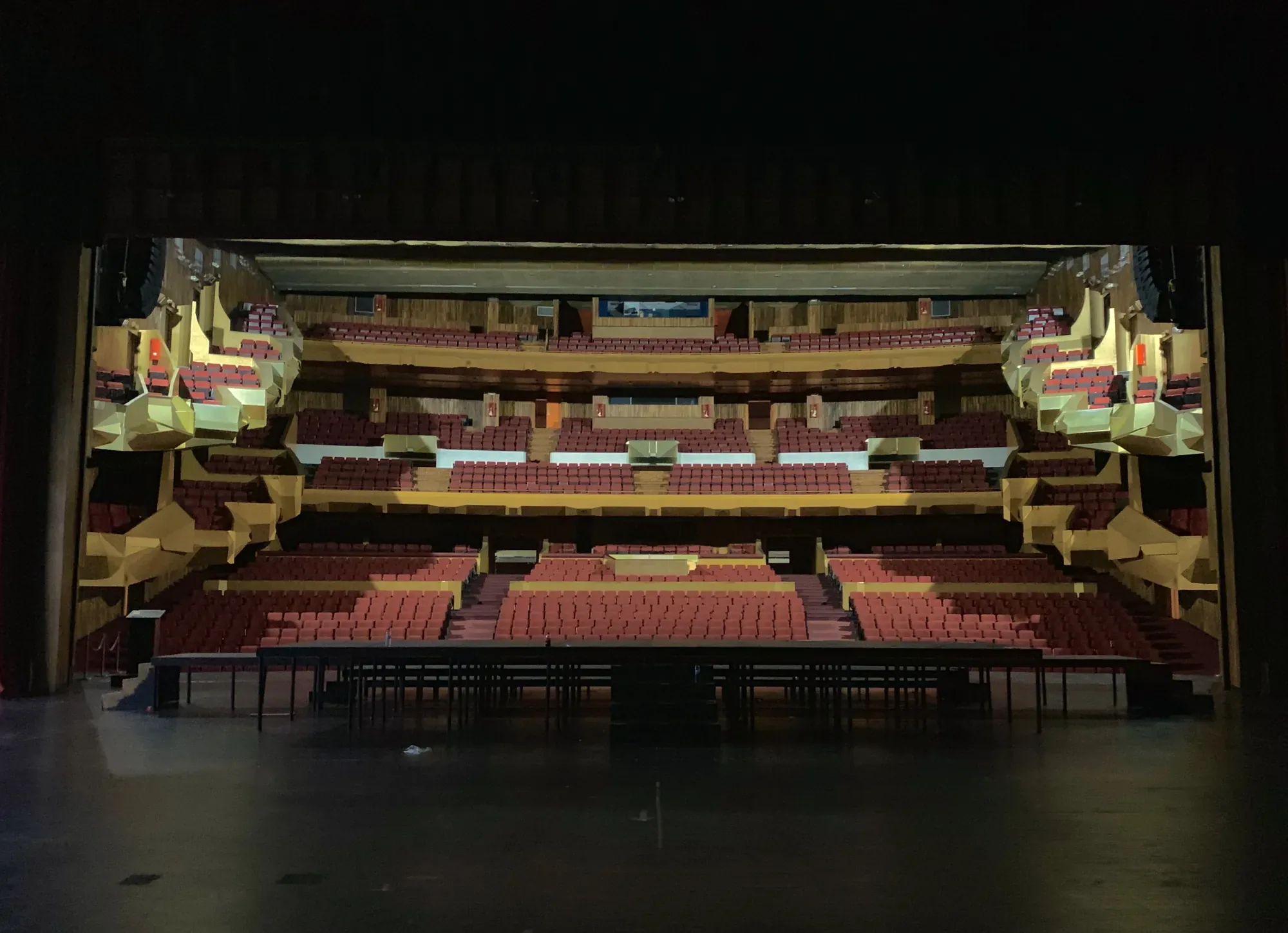
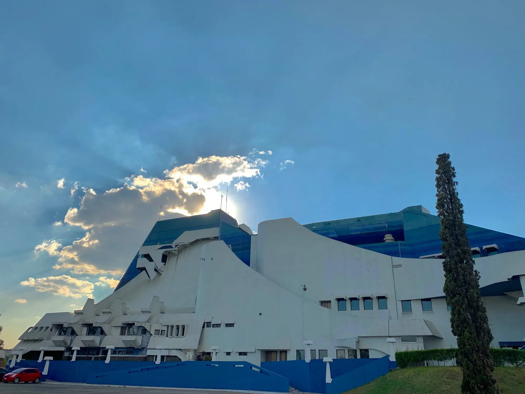
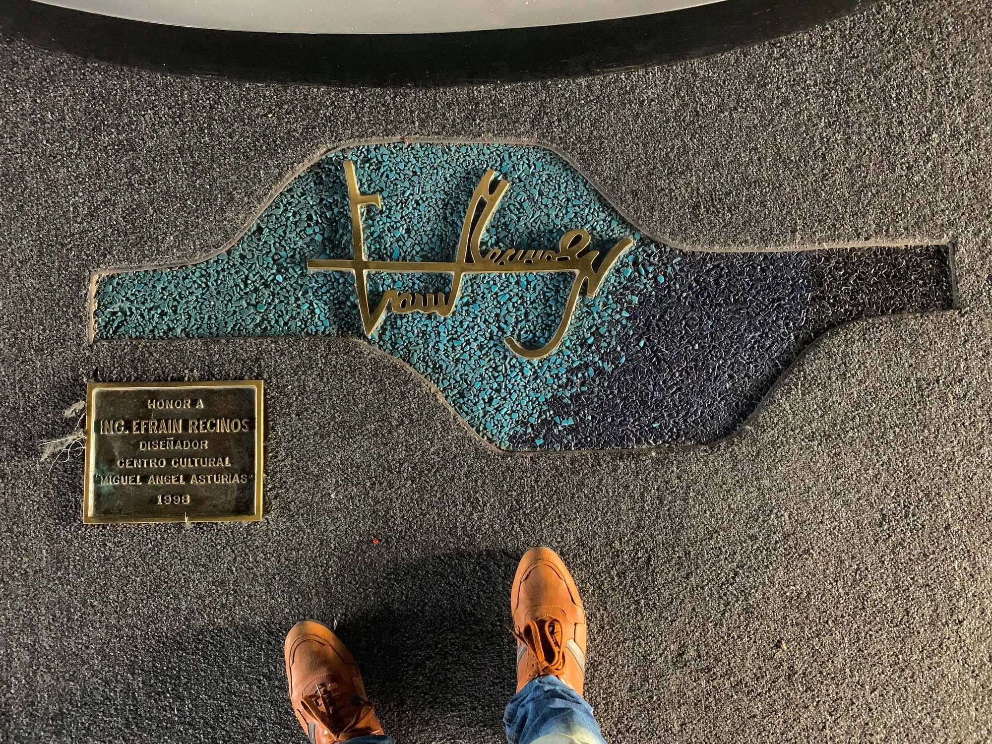
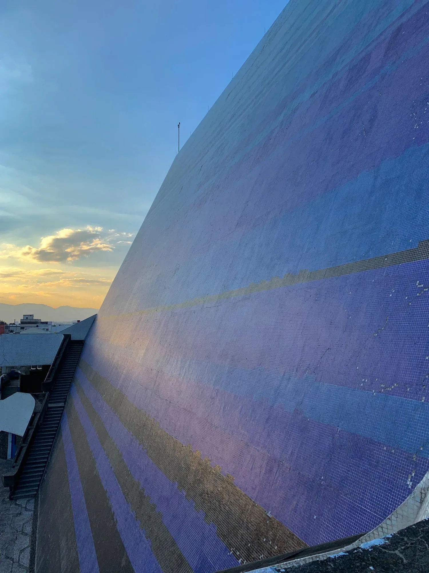
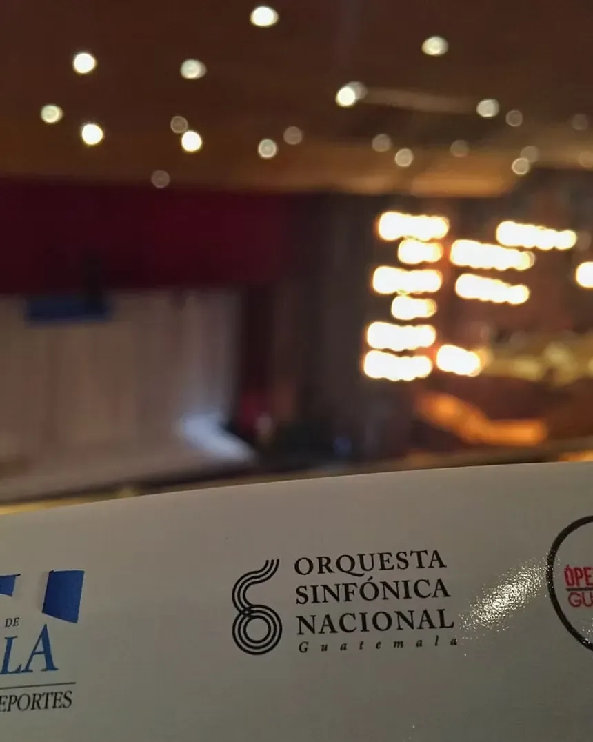
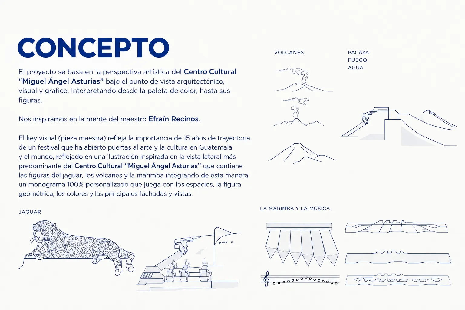
The concept brings together the building's architectural profile with references such as volcanoes, the jaguar, marimba and music. These elements form the visual vocabulary from which the festival identity is constructed.El concepto reúne el perfil arquitectónico del edificio con referencias como los volcanes, el jaguar, la marimba y la música. Estos elementos forman el vocabulario visual a partir del cual se construye la identidad del festival.
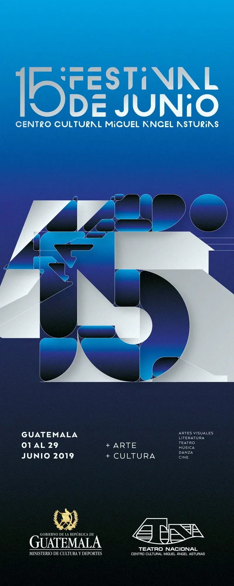
The number 15 follows the same geometric logic. The silhouette of the Cultural Center is traced, reduced and reorganized until architecture and anniversary mark become a single graphic form.El número 15 sigue la misma lógica geométrica. La silueta del Centro Cultural se traza, reduce y reorganiza hasta convertir arquitectura y aniversario en una sola forma gráfica.
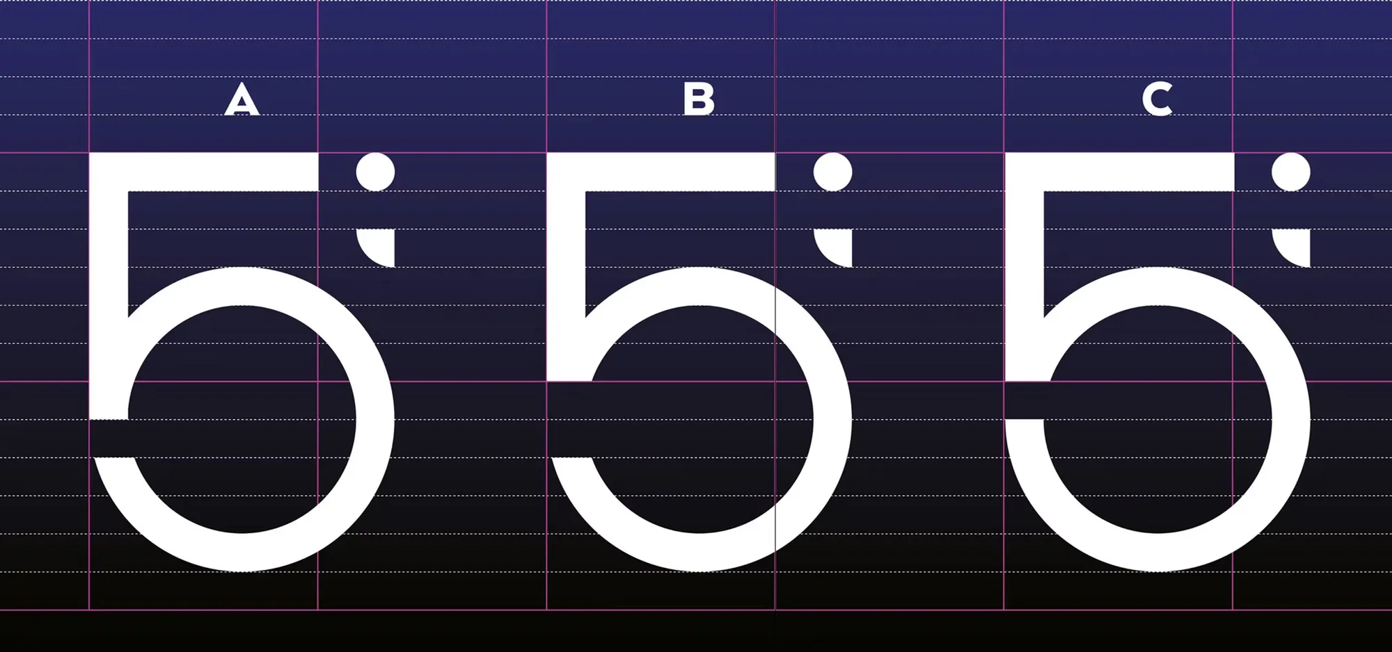
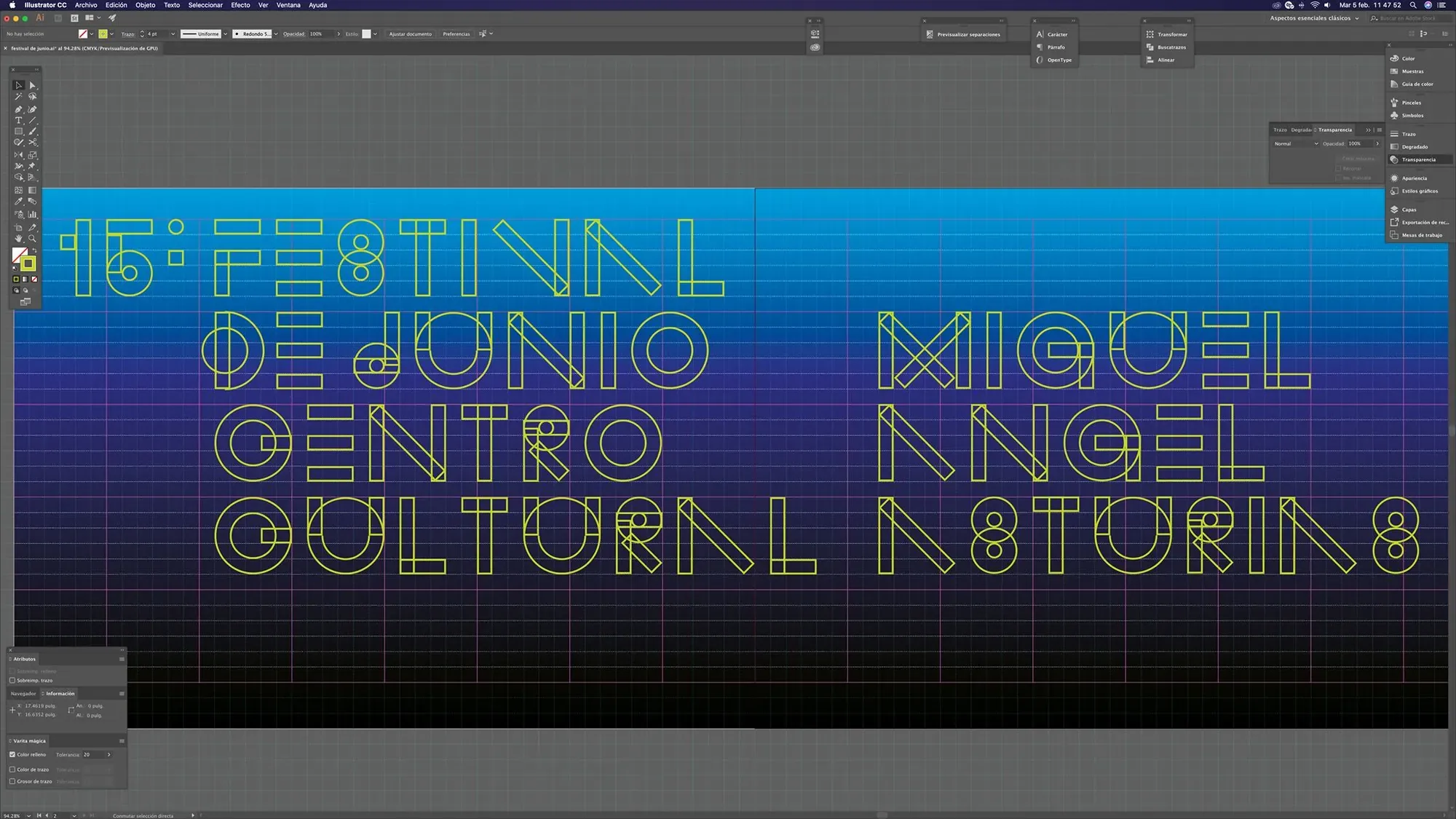
A custom lettering system extends the identity beyond the symbol. Modular strokes, interruptions and circular constructions echo the same formal language and give the festival its own typographic voice.Un sistema de lettering personalizado extiende la identidad más allá del símbolo. Trazos modulares, interrupciones y construcciones circulares retoman el mismo lenguaje formal y dan al festival una voz tipográfica propia.
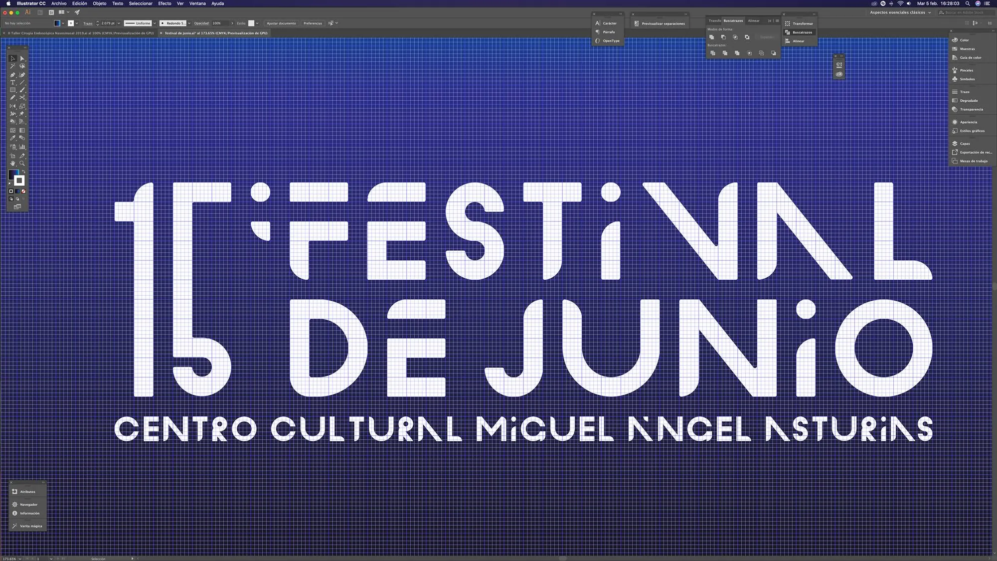
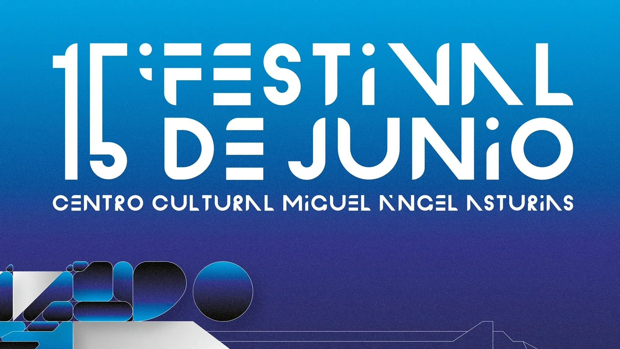
Deep blues, cyan, white and metallic gradients translate the building's atmosphere into a flexible visual system. Details of the architecture become surfaces, intersections and modular forms that can expand across formats.Azules profundos, cian, blanco y gradientes metálicos traducen la atmósfera del edificio en un sistema visual flexible. Los detalles de la arquitectura se convierten en superficies, intersecciones y formas modulares capaces de extenderse a distintos formatos.
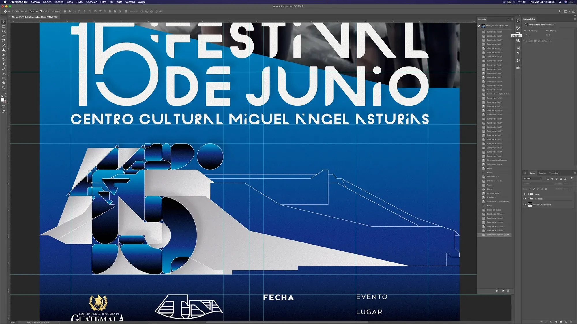
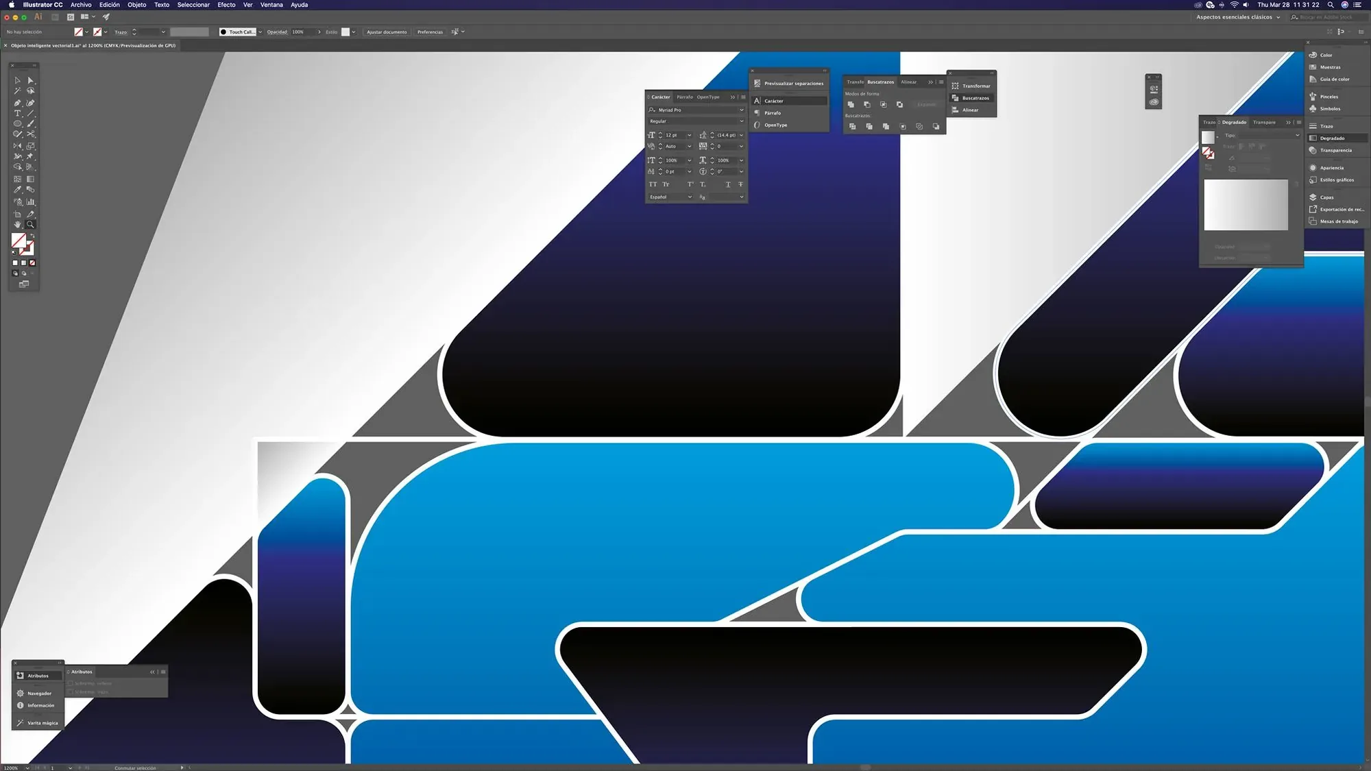

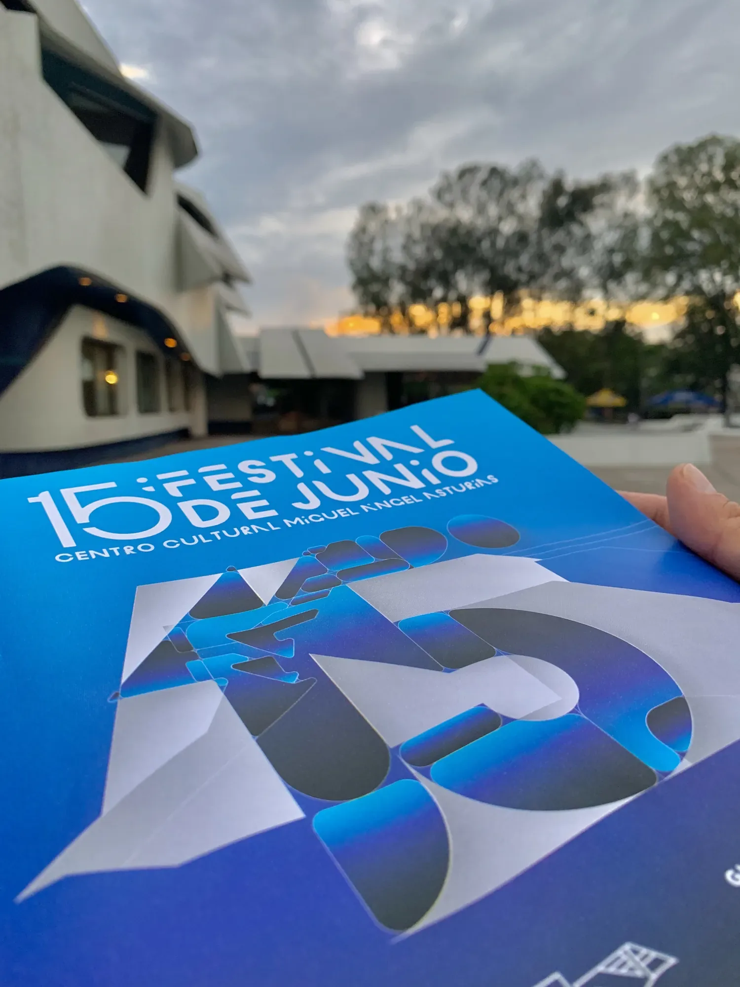
The identity moves from the master poster into printed pieces and communication applications while preserving the relationship between the 15, the custom lettering and the architectural graphic language.La identidad pasa del afiche maestro a piezas impresas y aplicaciones de comunicación, conservando la relación entre el 15, el lettering personalizado y el lenguaje gráfico derivado de la arquitectura.
OSN
The identity of Guatemala’s Orquesta Sinfónica Nacional began in 2011, when my proposal was selected through a national design competition to create the institution’s new official logo.La identidad de la Orquesta Sinfónica Nacional de Guatemala comenzó en 2011, cuando mi propuesta fue seleccionada mediante un concurso nacional de diseño para crear el nuevo logotipo oficial de la institución.
More than a decade later, I returned to the project through a self-initiated rebranding proposal. The 2023 study preserves the conceptual origin of the identity while exploring how the system could evolve for contemporary applications. This second proposal was not officially implemented.Más de una década después retomé el proyecto mediante una propuesta personal de rebranding. El estudio de 2023 conserva el origen conceptual de la identidad y explora cómo podría evolucionar el sistema para aplicaciones contemporáneas. Esta segunda propuesta no fue implementada oficialmente.
Translating music into a symbolTraducir la música en un símbolo
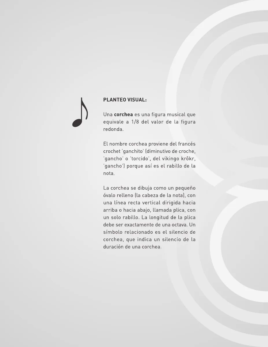
The competition called for an identity capable of representing the orchestra as a whole rather than relying on the image of a single instrument. The solution began with two fundamental elements of musical language: the quaver and the five-line staff.El concurso planteaba una identidad capaz de representar a la orquesta como un conjunto, evitando depender de la imagen de un solo instrumento. La solución parte de dos elementos fundamentales del lenguaje musical: la corchea y el pentagrama de cinco líneas.
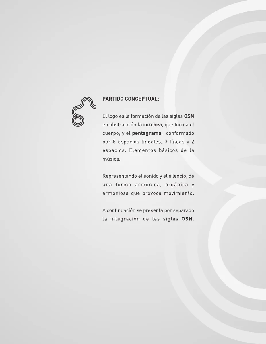
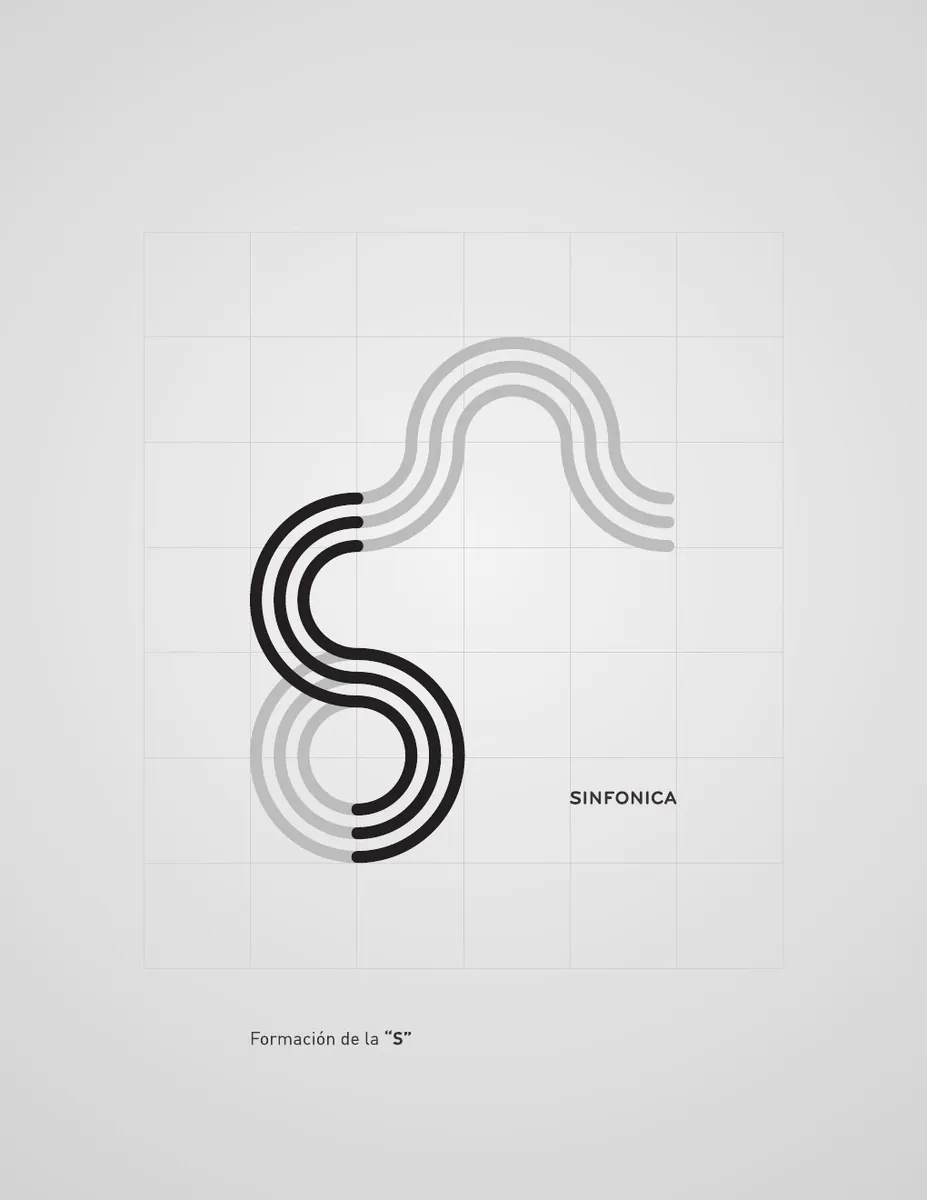
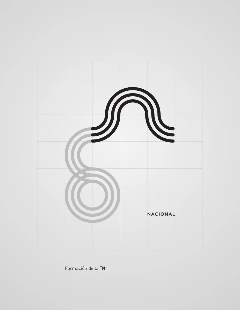
These elements were combined with the initials OSN. The continuous lines construct the O, S and N while simultaneously suggesting sound, silence, rhythm and movement, turning musical notation into the structure of the mark itself.Estos elementos se integraron con las siglas OSN. Las líneas continuas construyen la O, la S y la N y, al mismo tiempo, sugieren sonido, silencio, ritmo y movimiento, convirtiendo la notación musical en la propia estructura de la marca.
O · S · NO · S · N
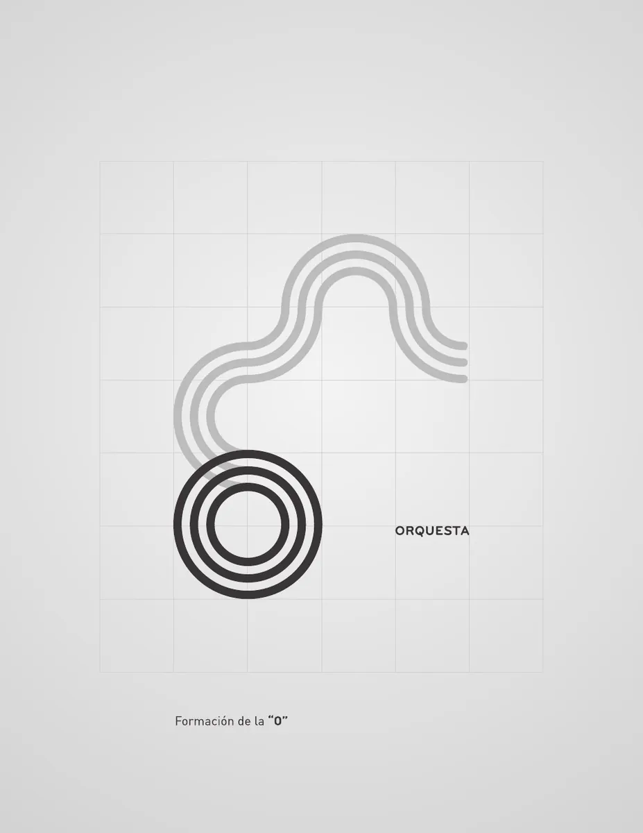
The identity is not an arbitrary drawing: each initial emerges from the same modular line system. The construction sequence shows how the three letters are isolated within a single continuous form before becoming the final symbol.La identidad no parte de un dibujo arbitrario: cada inicial surge del mismo sistema modular de líneas. La secuencia de construcción muestra cómo las tres letras se aíslan dentro de una sola forma continua antes de convertirse en el símbolo final.
A classical institution in a vivid registerUna institución clásica en un registro vibrante
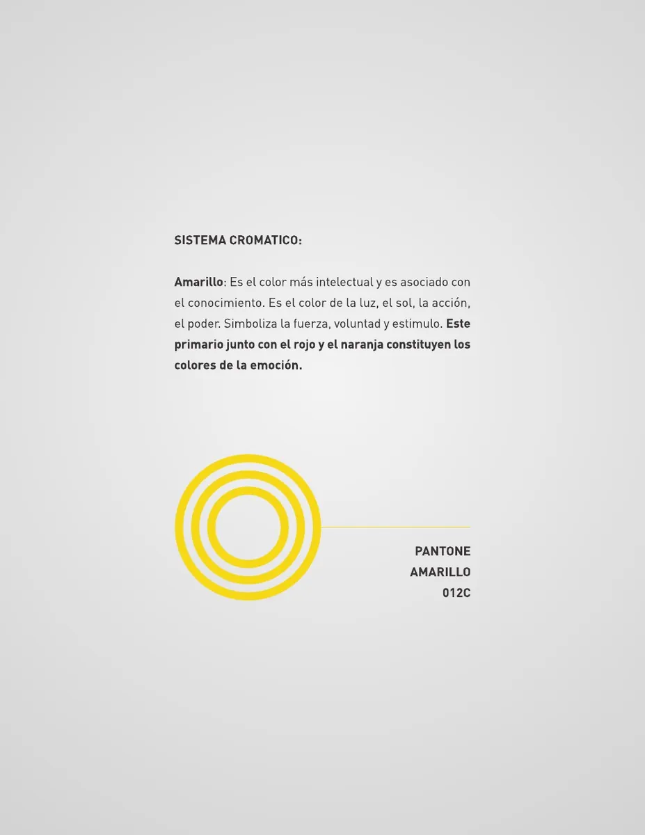
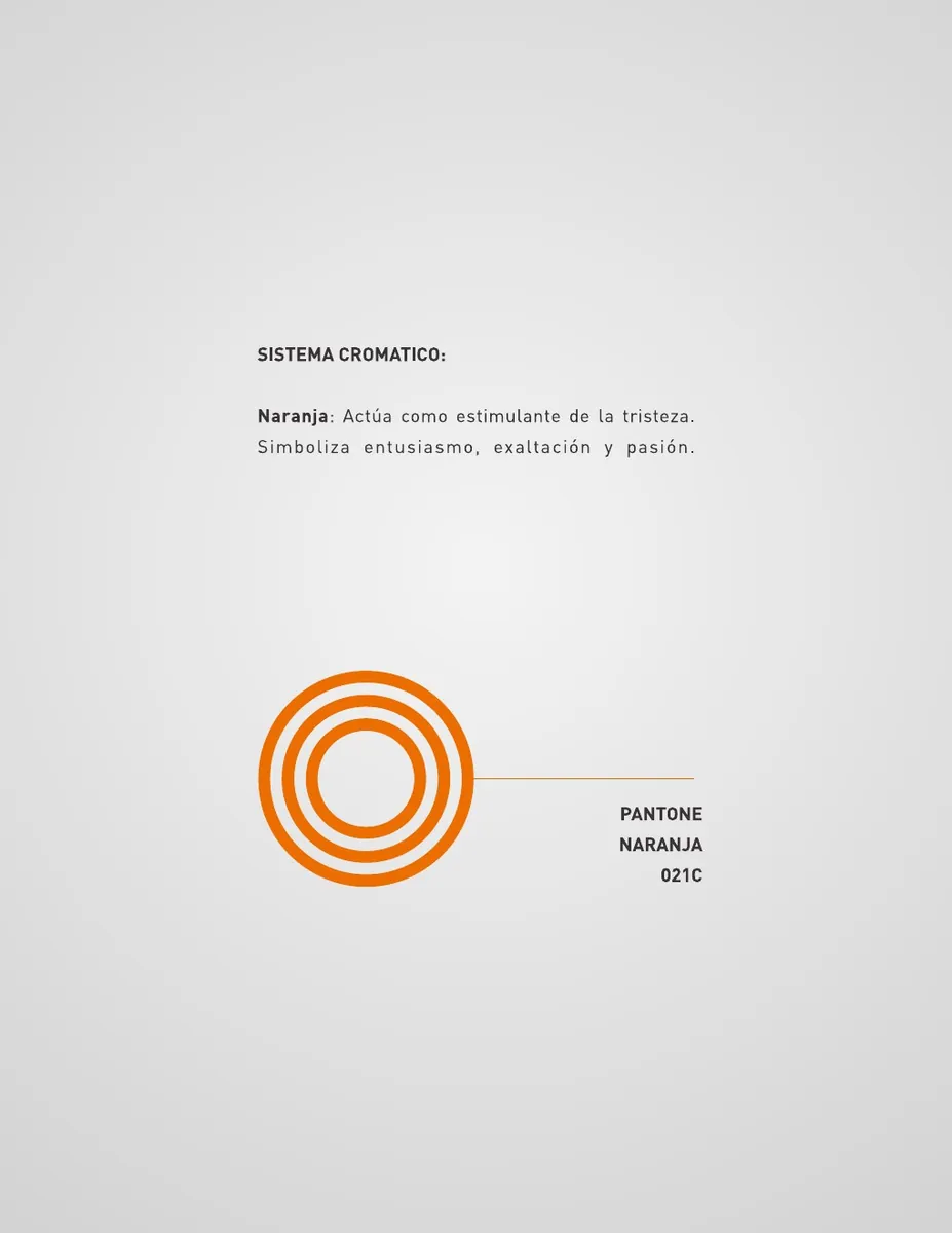
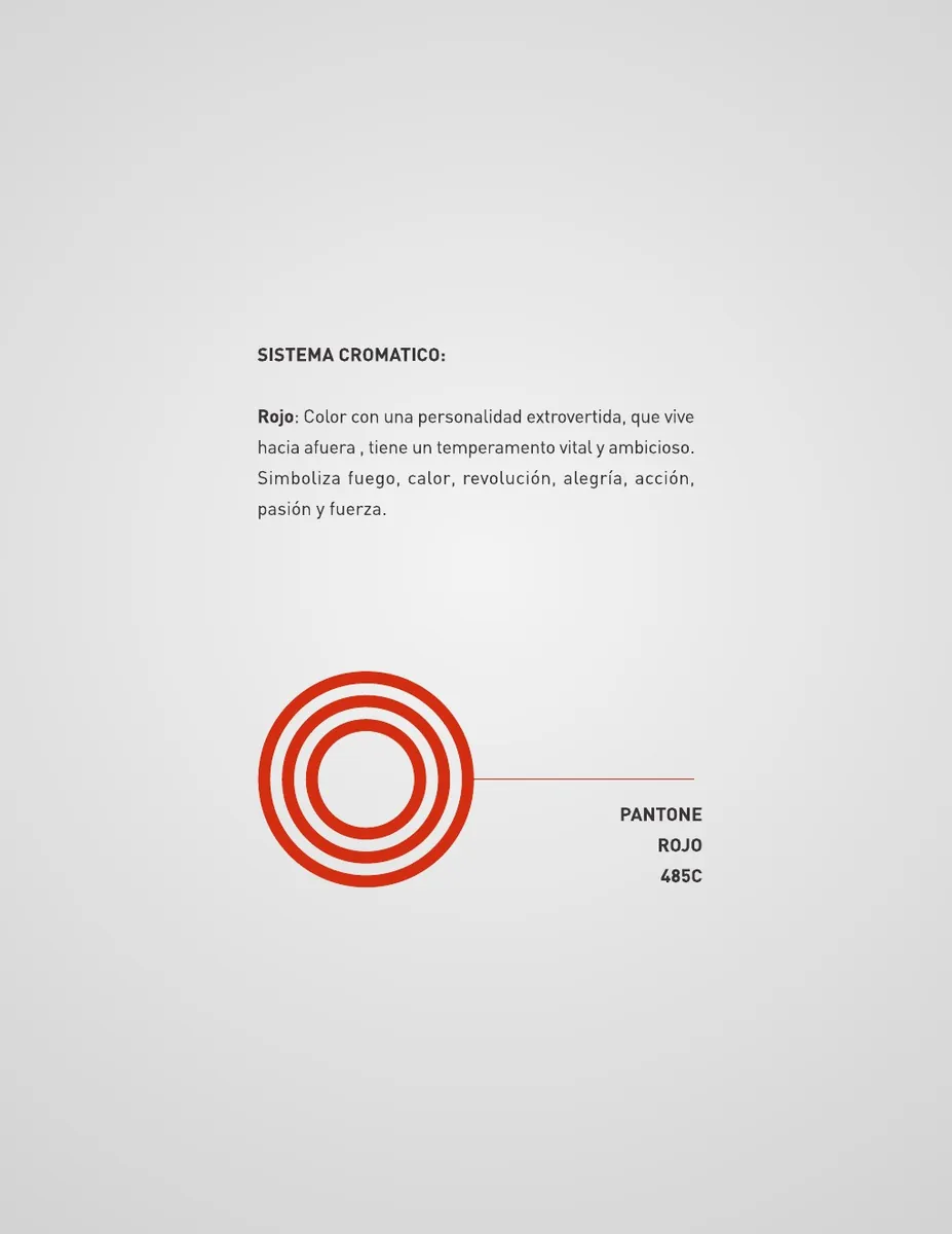
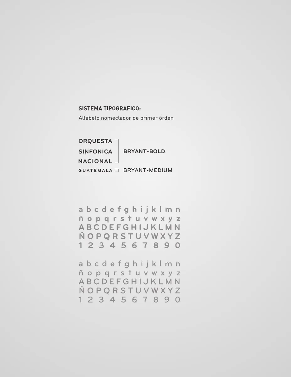
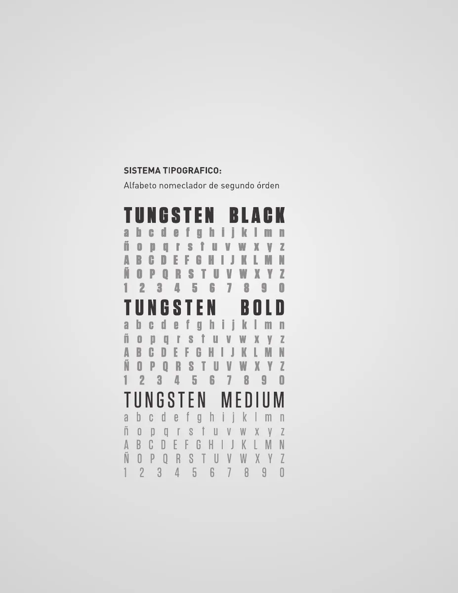
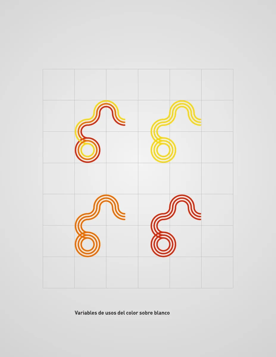
The chromatic system deliberately moves away from the expected black-and-white language of classical music. Yellow, orange and red introduce light, energy, emotion and strength, while Bryant and Tungsten establish the typographic hierarchy of the system.El sistema cromático se aleja deliberadamente del lenguaje blanco y negro asociado tradicionalmente con la música clásica. Amarillo, naranja y rojo introducen luz, energía, emoción y fuerza, mientras Bryant y Tungsten establecen la jerarquía tipográfica del sistema.
One mark, multiple voicesUna marca, múltiples voces
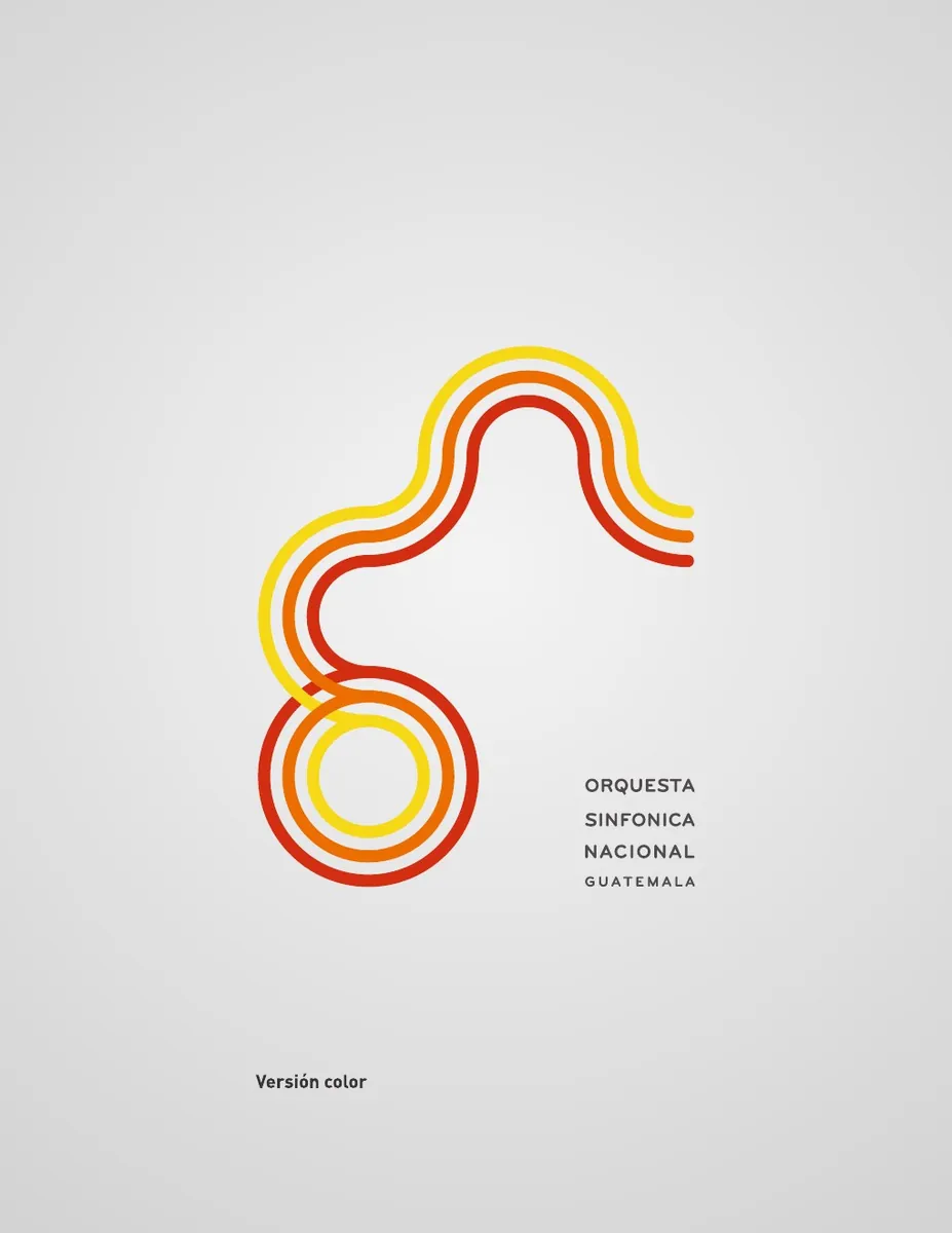
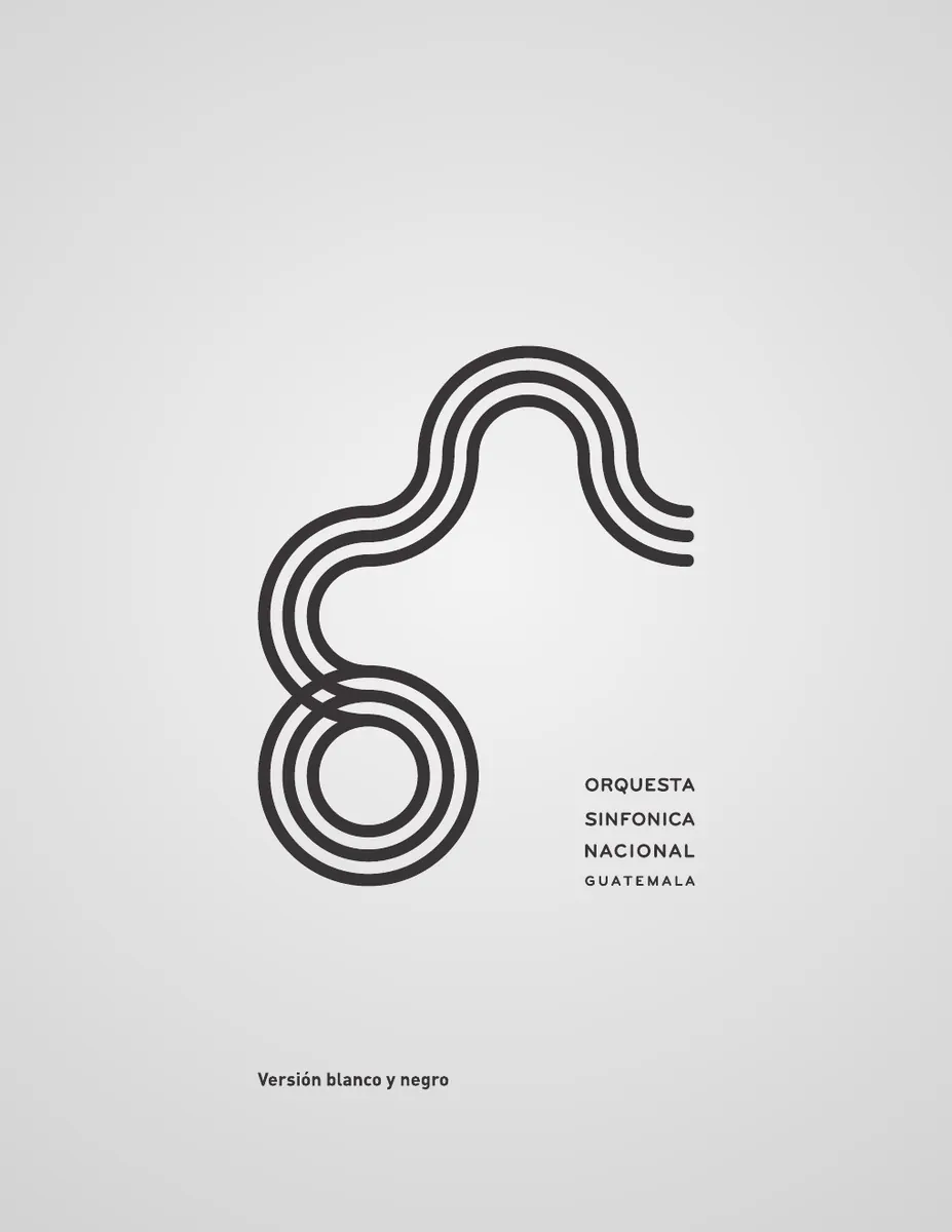
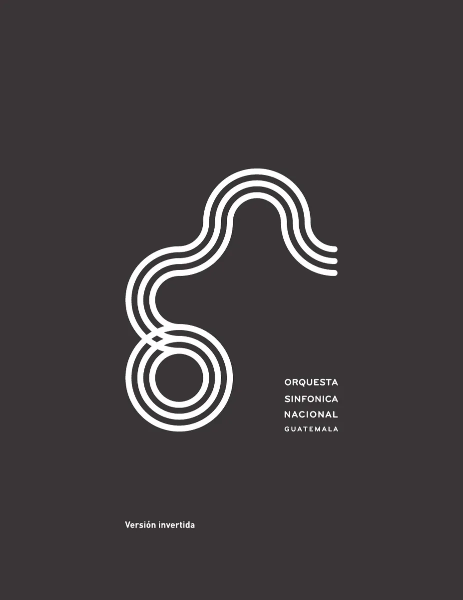
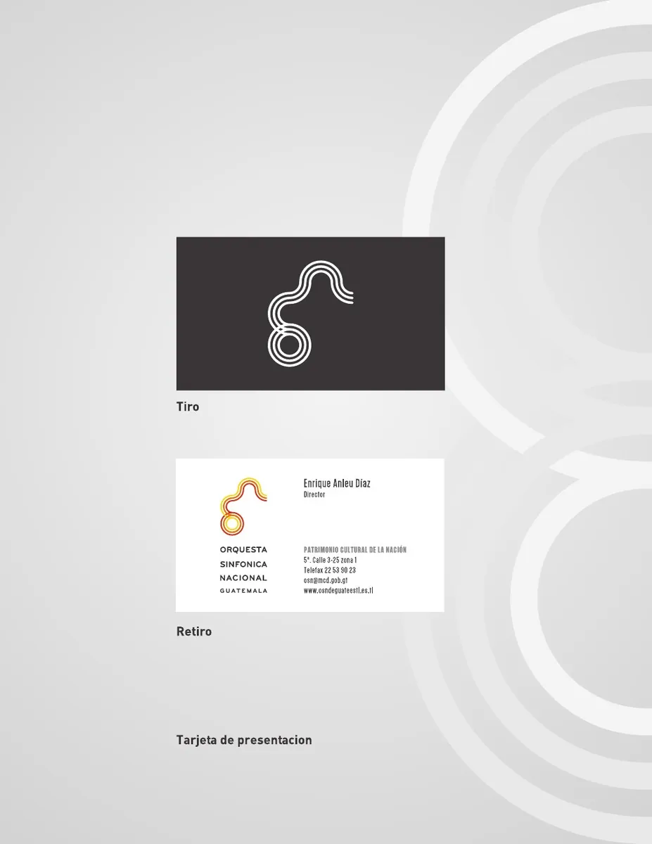
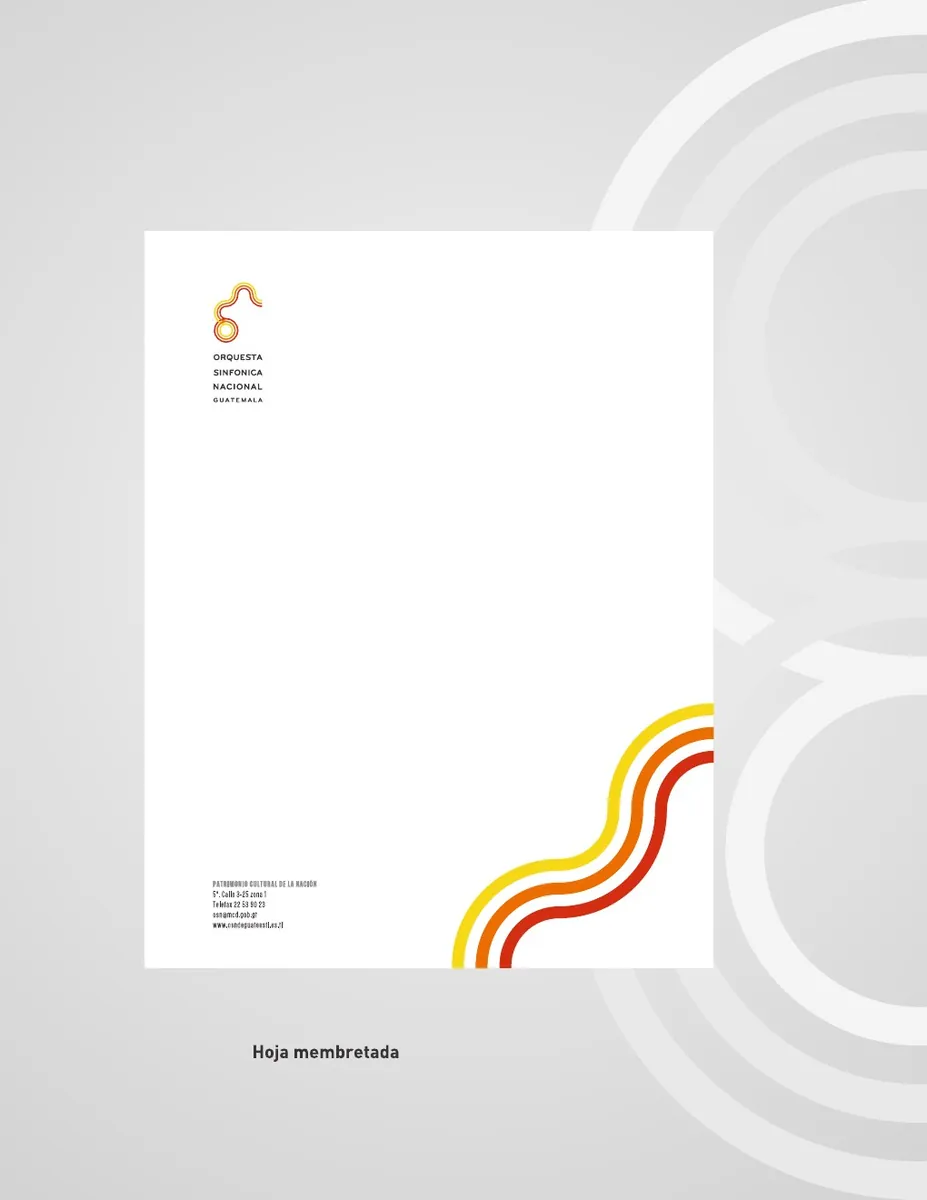
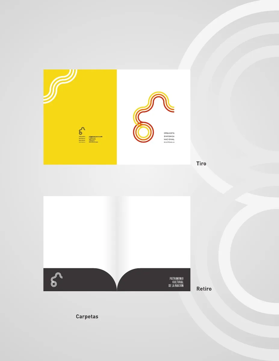
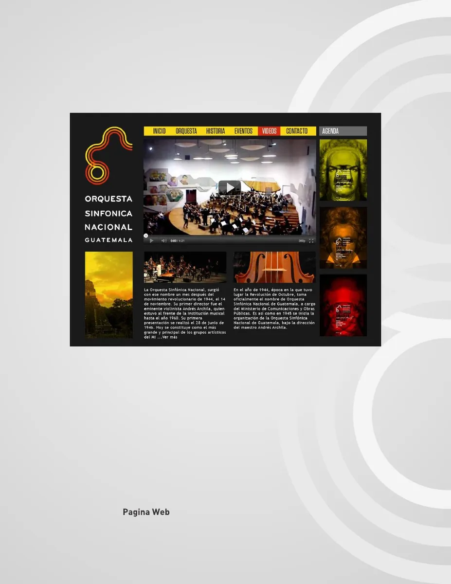
The symbol was designed to remain recognizable across color, monochrome and inverted versions. Its parallel lines become a graphic resource in their own right, allowing the identity to expand from the logo into stationery, folders and digital communication.El símbolo fue diseñado para conservar su reconocimiento en versiones a color, monocromáticas e invertidas. Sus líneas paralelas se convierten además en un recurso gráfico propio, permitiendo que la identidad se extienda del logotipo a papelería, carpetas y comunicación digital.
The identity in performanceLa identidad en escena
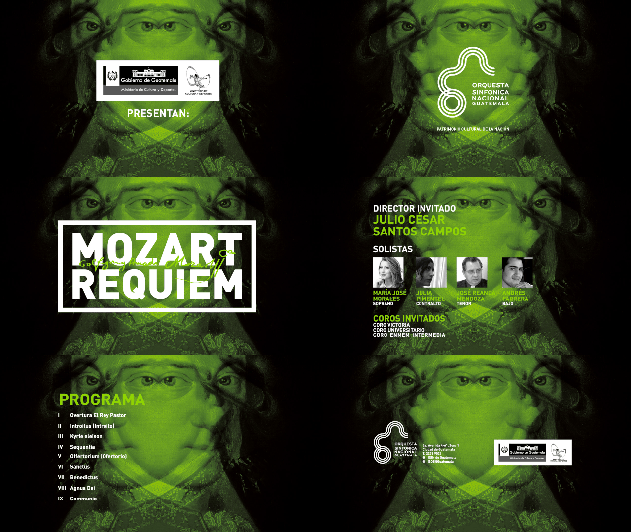
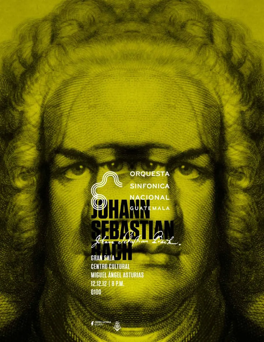
In concert communication, the mark operates as a signature while the color system transforms historical musical imagery into a contemporary campaign language.En la comunicación de conciertos, la marca funciona como firma mientras el sistema de color transforma imágenes históricas de la música en un lenguaje de campaña contemporáneo.
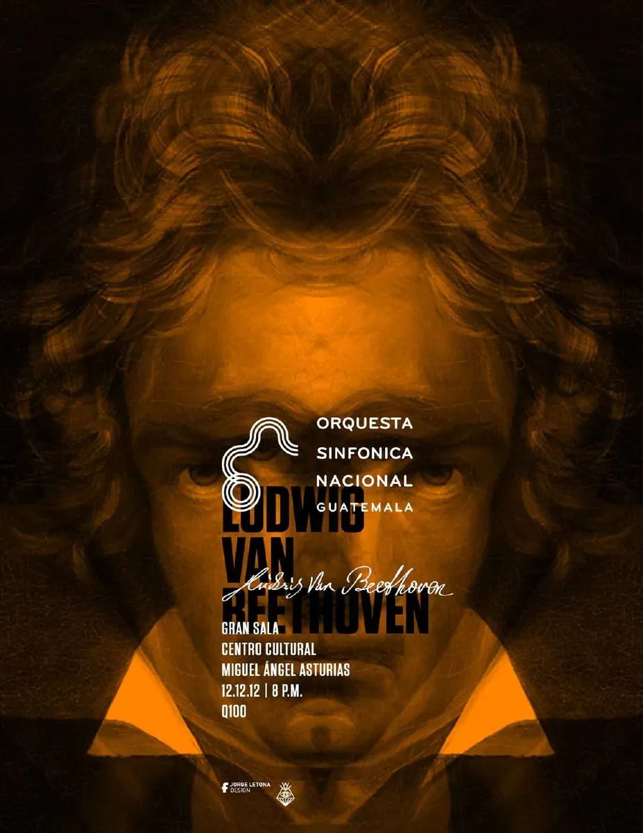
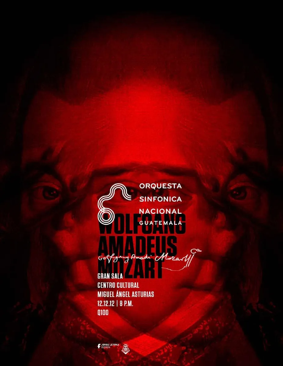
Revisiting the systemRevisitar el sistema
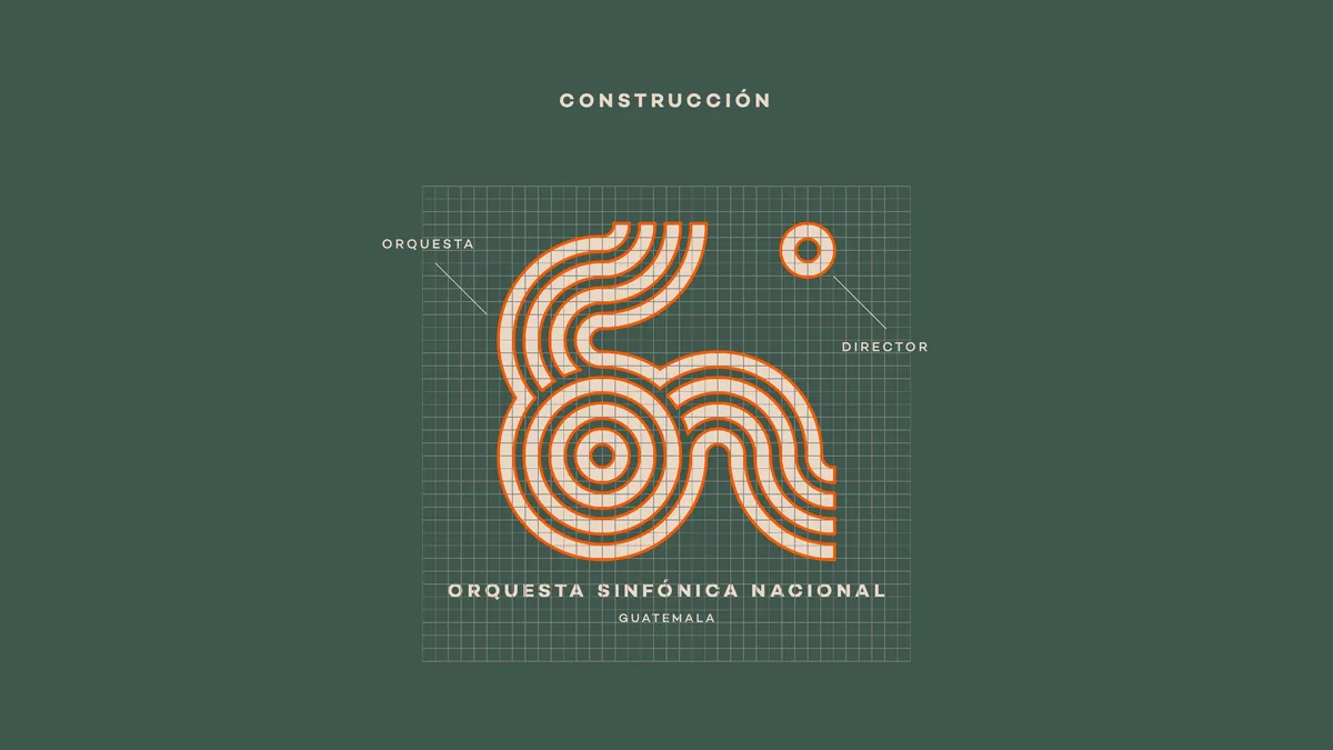
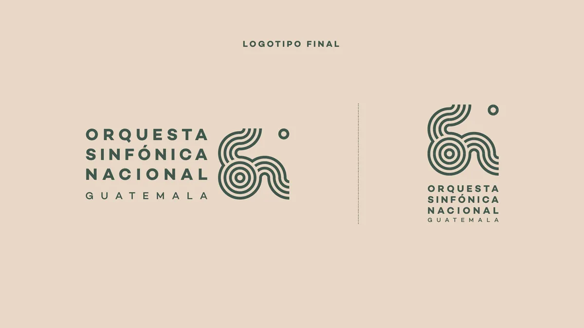
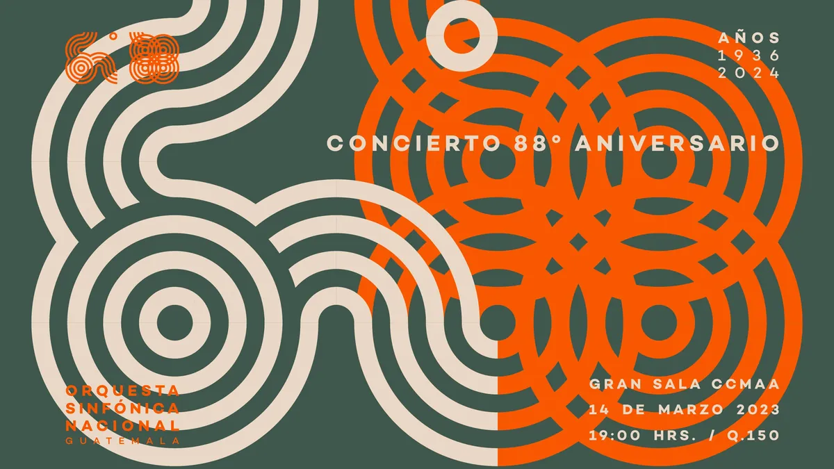
In 2023 I returned to the identity as a self-initiated design exercise. The objective was not to erase the 2011 concept, but to simplify, integrate, balance and update it: improving legibility, increasing visual impact and adapting the system to a more digital environment.En 2023 retomé la identidad como un ejercicio personal de diseño. El objetivo no era borrar el concepto de 2011, sino simplificarlo, integrarlo, equilibrarlo y actualizarlo: mejorar la legibilidad, aumentar el impacto visual y adaptar el sistema a un entorno más digital.
The proposal remained an exploration and was never officially implemented. Precisely for that reason, it documents an important part of the process: the possibility of looking critically at one’s own work years later and allowing the same idea to mature without losing its origin.La propuesta quedó como exploración y nunca fue implementada oficialmente. Precisamente por eso documenta una parte importante del proceso: la posibilidad de mirar críticamente el propio trabajo años después y permitir que una misma idea madure sin perder su origen.
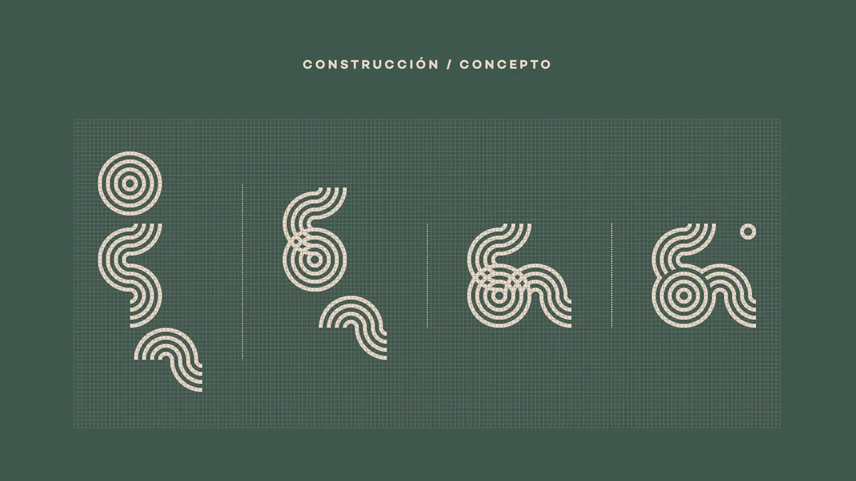
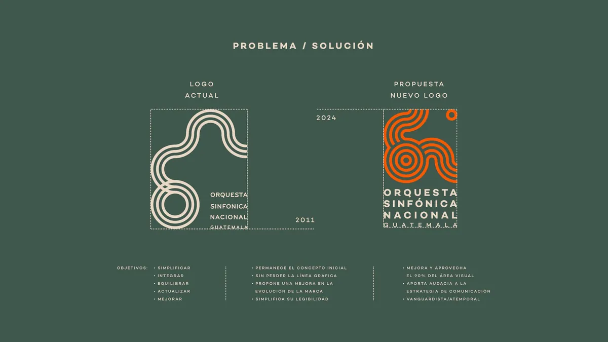
Structure, contrast and rhythmEstructura, contraste y ritmo
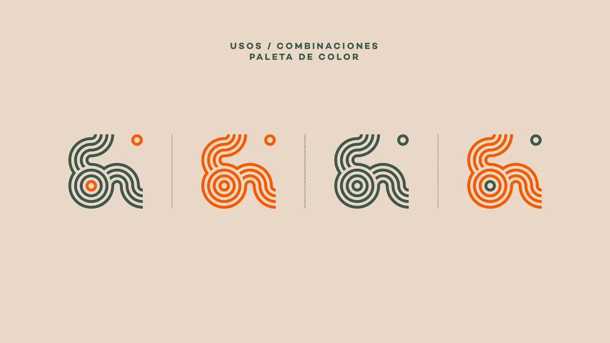
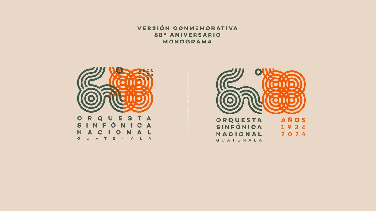
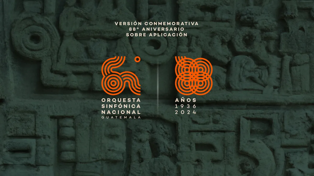
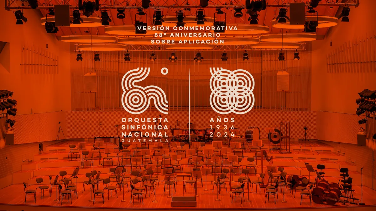
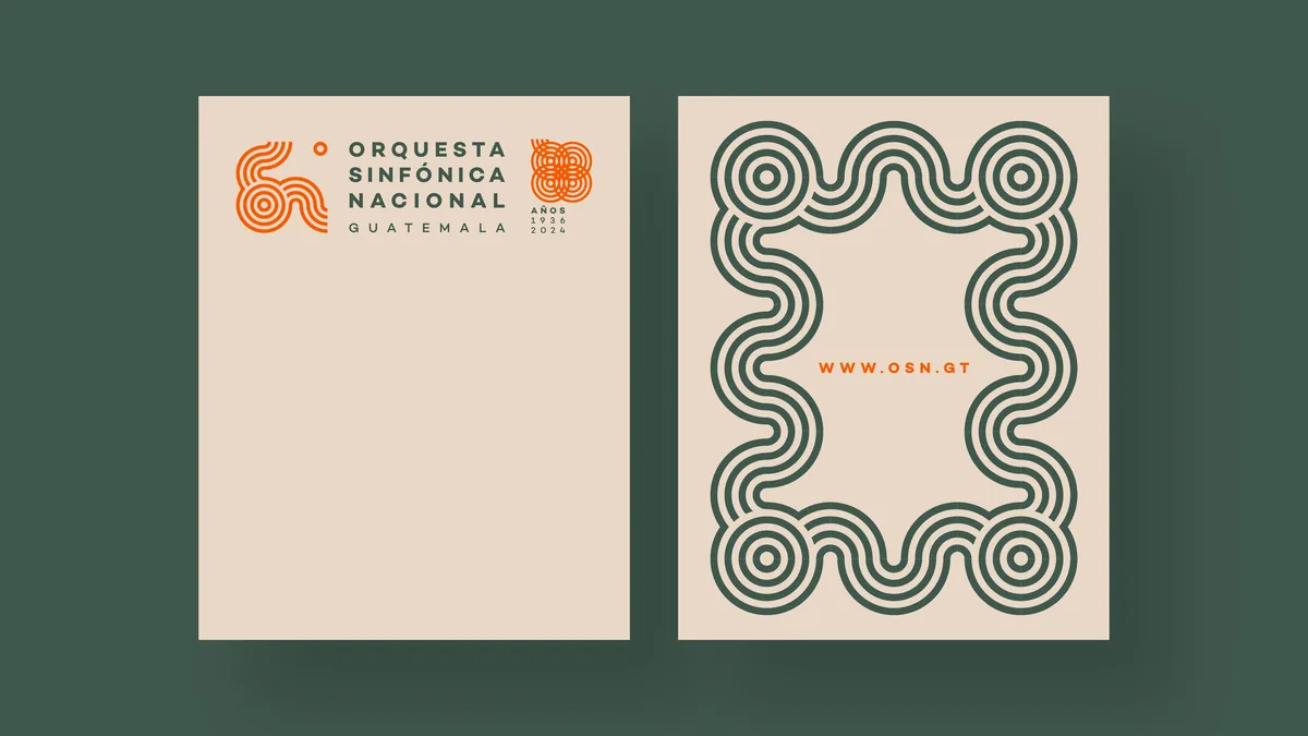
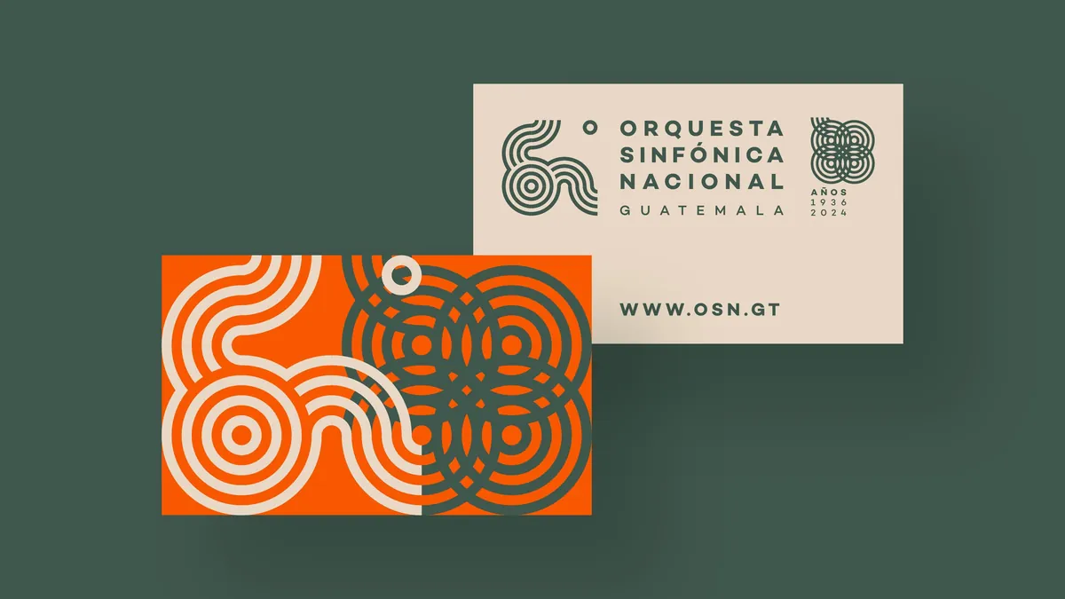
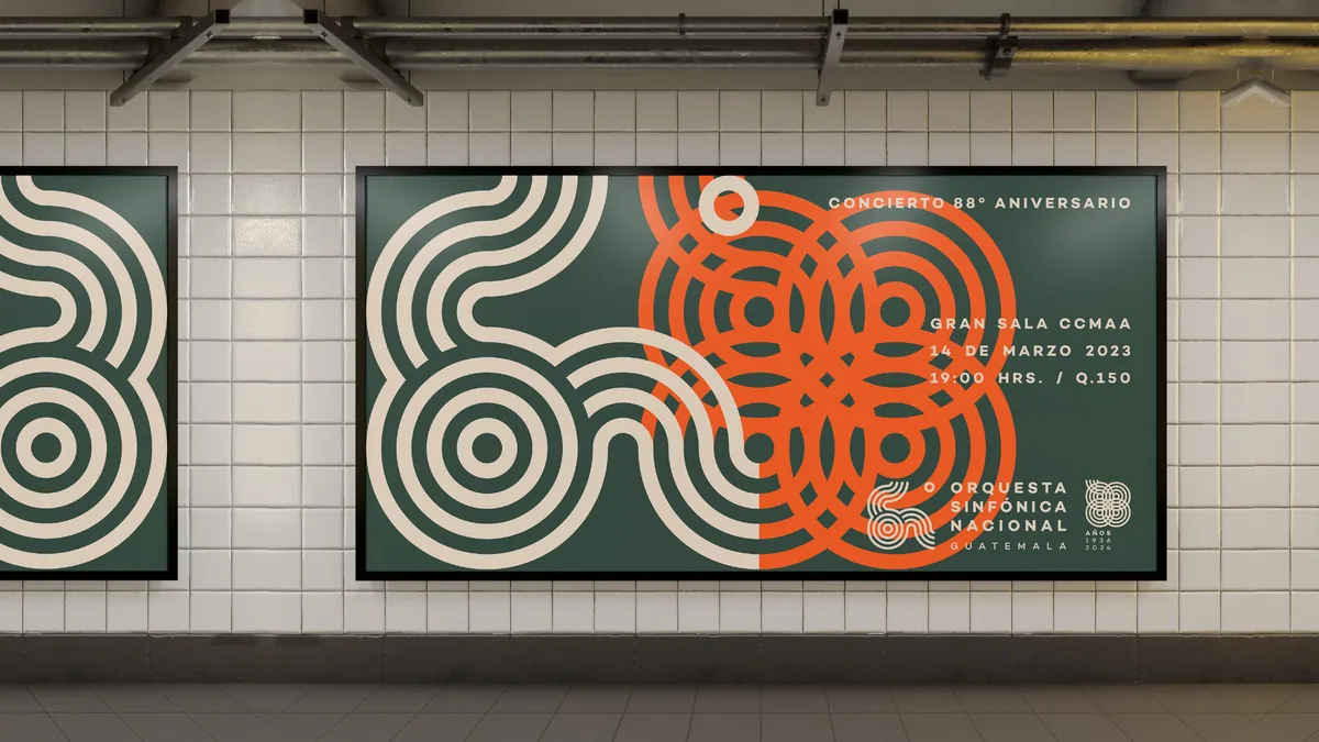
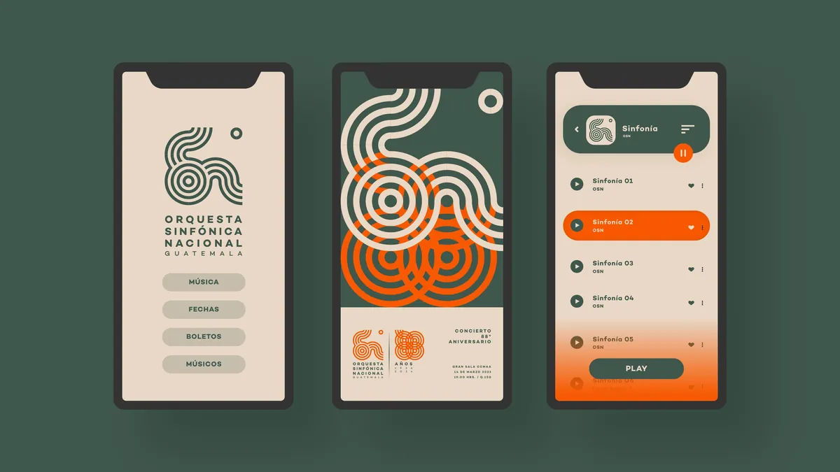
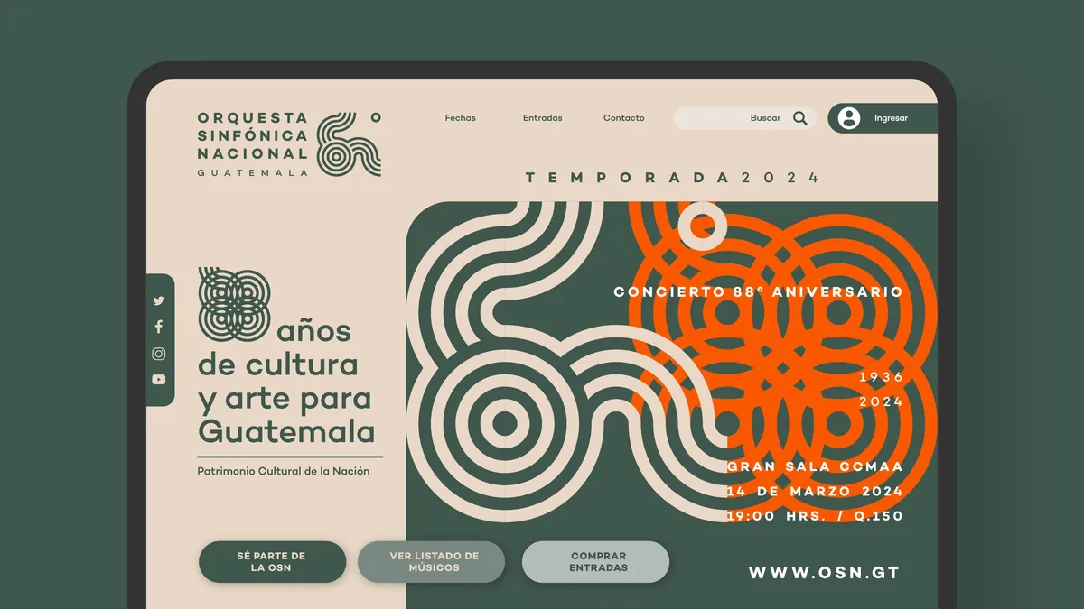
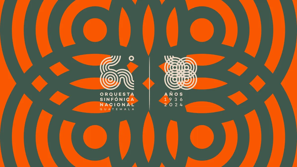
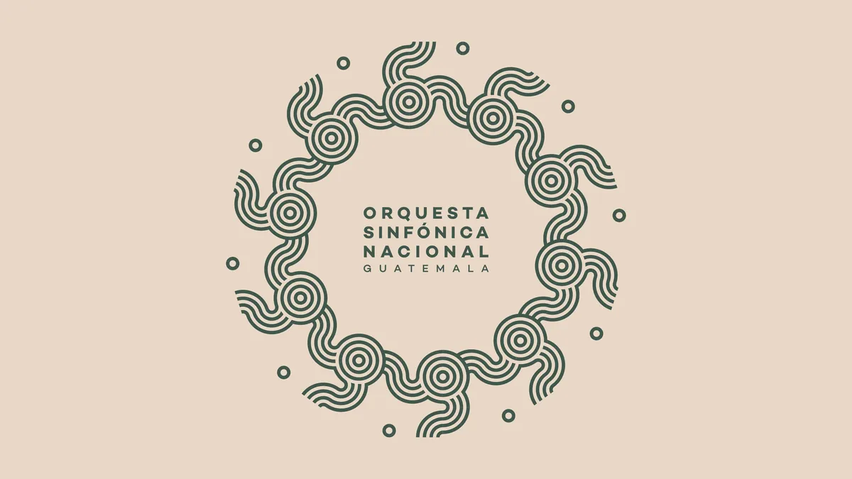
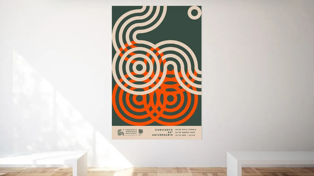
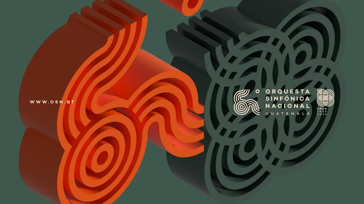
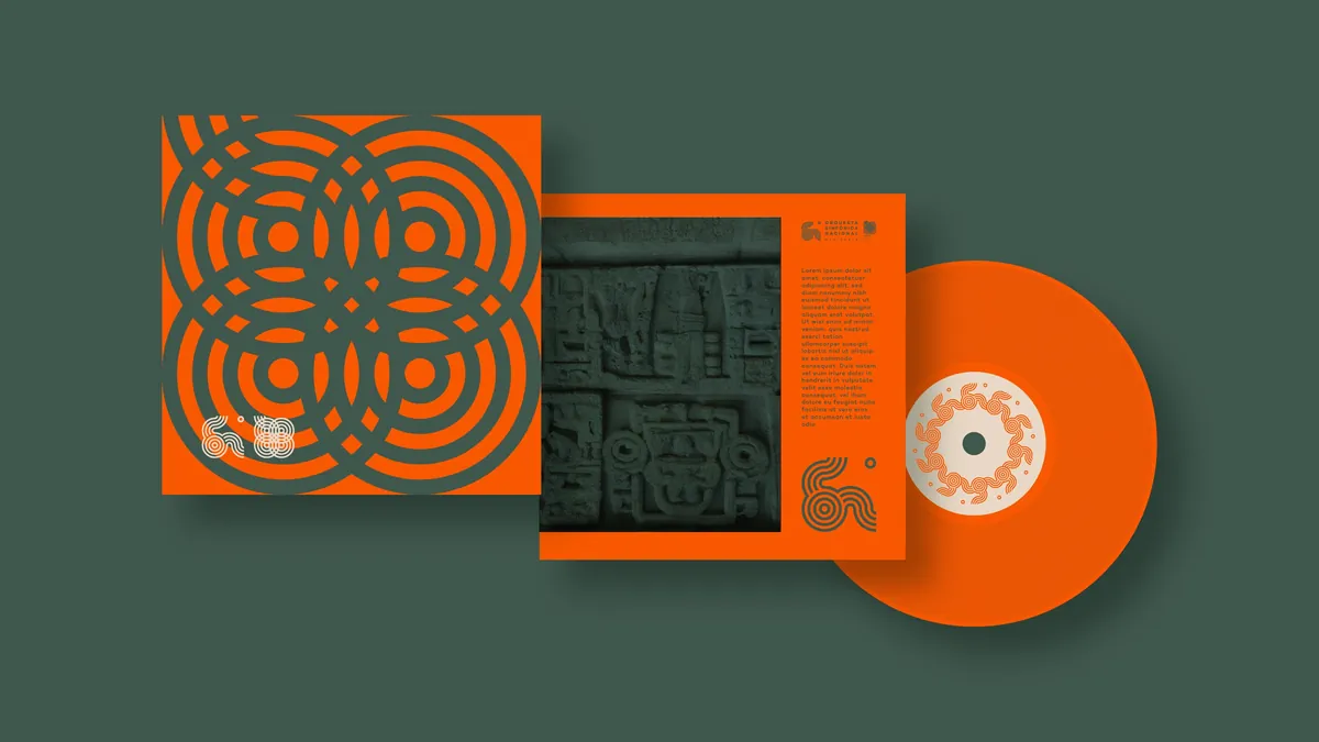
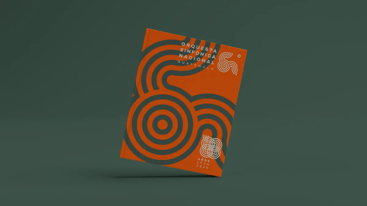
The redesign condenses the parallel-line vocabulary into a more compact geometric structure. A restrained palette of deep green, warm neutral and vivid orange creates a system with greater contrast, while the original rhythm of the identity remains visible in every application.El rediseño condensa el vocabulario de líneas paralelas en una estructura geométrica más compacta. Una paleta contenida de verde profundo, neutro cálido y naranja intenso crea un sistema de mayor contraste, mientras el ritmo de la identidad original permanece visible en cada aplicación.

A commemorative extensionUna extensión conmemorativa
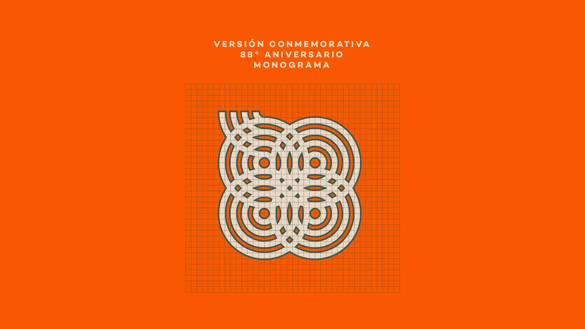
The proposal expands into an 88th-anniversary monogram built from the same rhythmic geometry. Rather than introducing a separate commemorative language, the anniversary becomes another expression of the core system.La propuesta se expande hacia un monograma para el 88 aniversario construido con la misma geometría rítmica. En lugar de introducir un lenguaje conmemorativo separado, el aniversario se convierte en otra expresión del sistema central.
From print to interfaceDel impreso a la interfaz
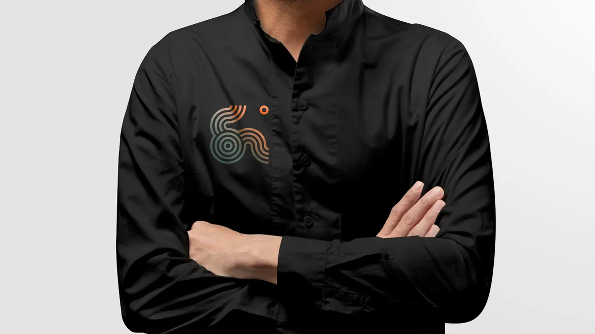
The study was developed as a complete visual ecosystem rather than a logo replacement. Printed pieces, posters, mobile interfaces and web layouts test how the system behaves at different scales and in both static and interactive contexts.El estudio se desarrolló como un ecosistema visual completo y no únicamente como un reemplazo de logotipo. Piezas impresas, afiches, interfaces móviles y propuestas web ponen a prueba el sistema en distintas escalas y en contextos tanto estáticos como interactivos.
Orquesta Sinfónica Nacional de Guatemala
The 2011 identity continues as the official visual reference of the institution. The link below leads to the orchestra’s official website.La identidad de 2011 continúa como referencia visual oficial de la institución. El enlace siguiente lleva al sitio oficial de la Orquesta.
VISIT OSN OFFICIAL SITE →VISITAR SITIO OFICIAL DE LA OSN →CUBEREC
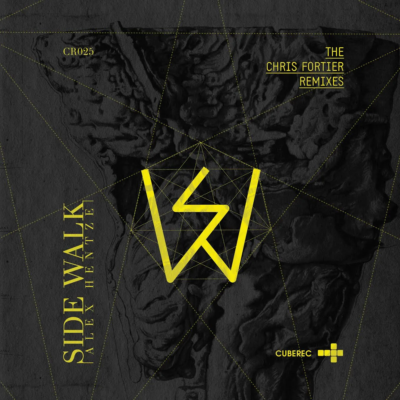
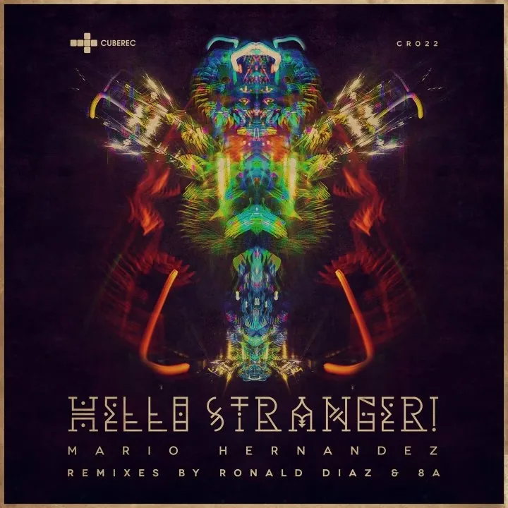
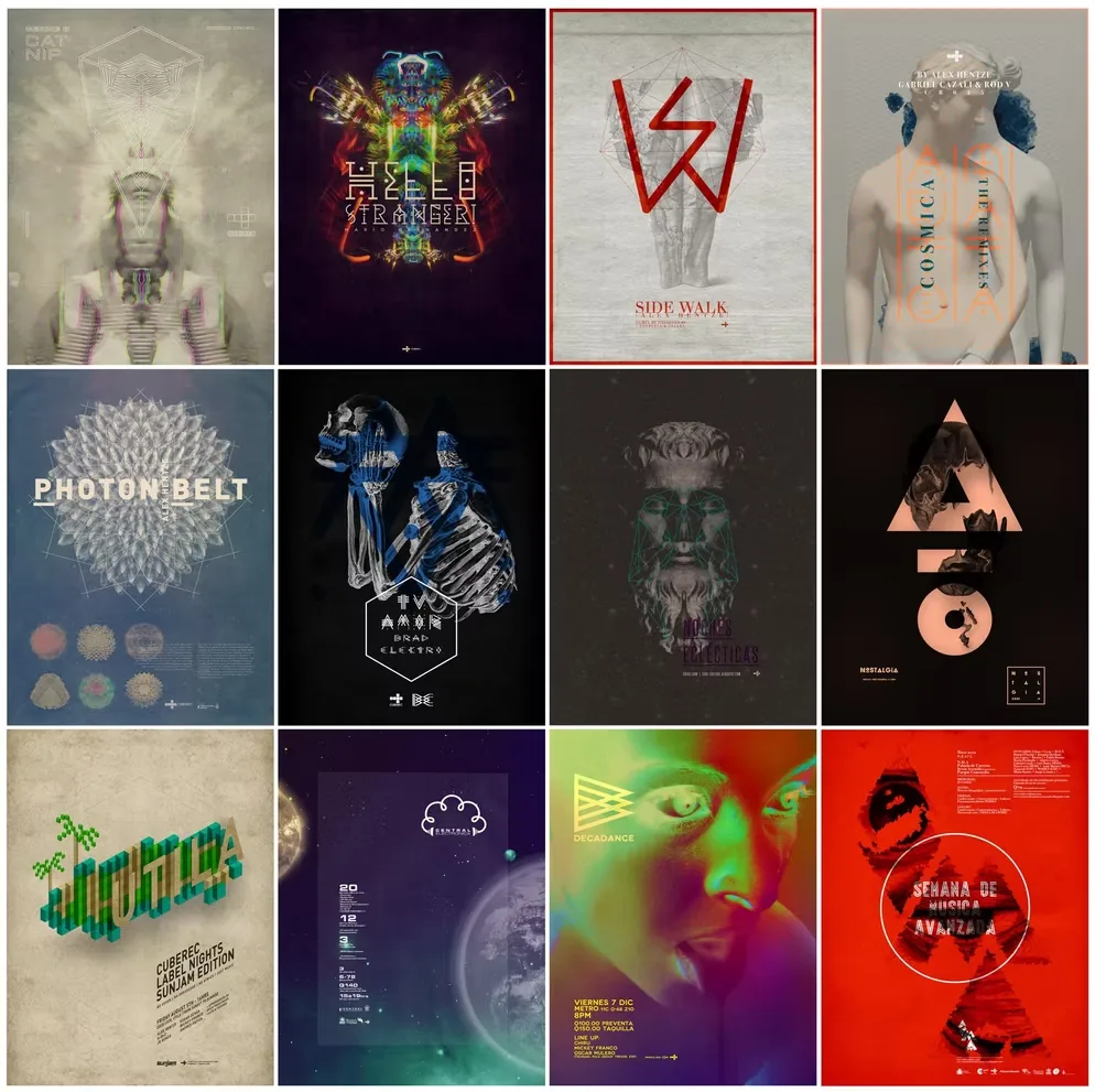
CUBEREC emerged in late 2009 as an independent Guatemalan electronic music label founded by Casta (Andrés Castaño) and Andrés Gatica. My work for the label developed across album and single covers, visual experiments and promotional pieces.CUBEREC surgió a finales de 2009 como un sello independiente guatemalteco de música electrónica fundado por Casta (Andrés Castaño) y Andrés Gatica. Mi trabajo para el sello se desarrolló entre portadas de álbumes y sencillos, experimentación visual y piezas promocionales.
Rather than imposing one fixed template, the project became an evolving visual archive: different releases could have their own character while remaining connected through an interest in geometry, contrast, texture and digital image-making.En lugar de imponer una plantilla fija, el proyecto se convirtió en un archivo visual en evolución: cada lanzamiento podía tener un carácter propio y, al mismo tiempo, mantenerse conectado por el interés en la geometría, el contraste, la textura y la imagen digital.
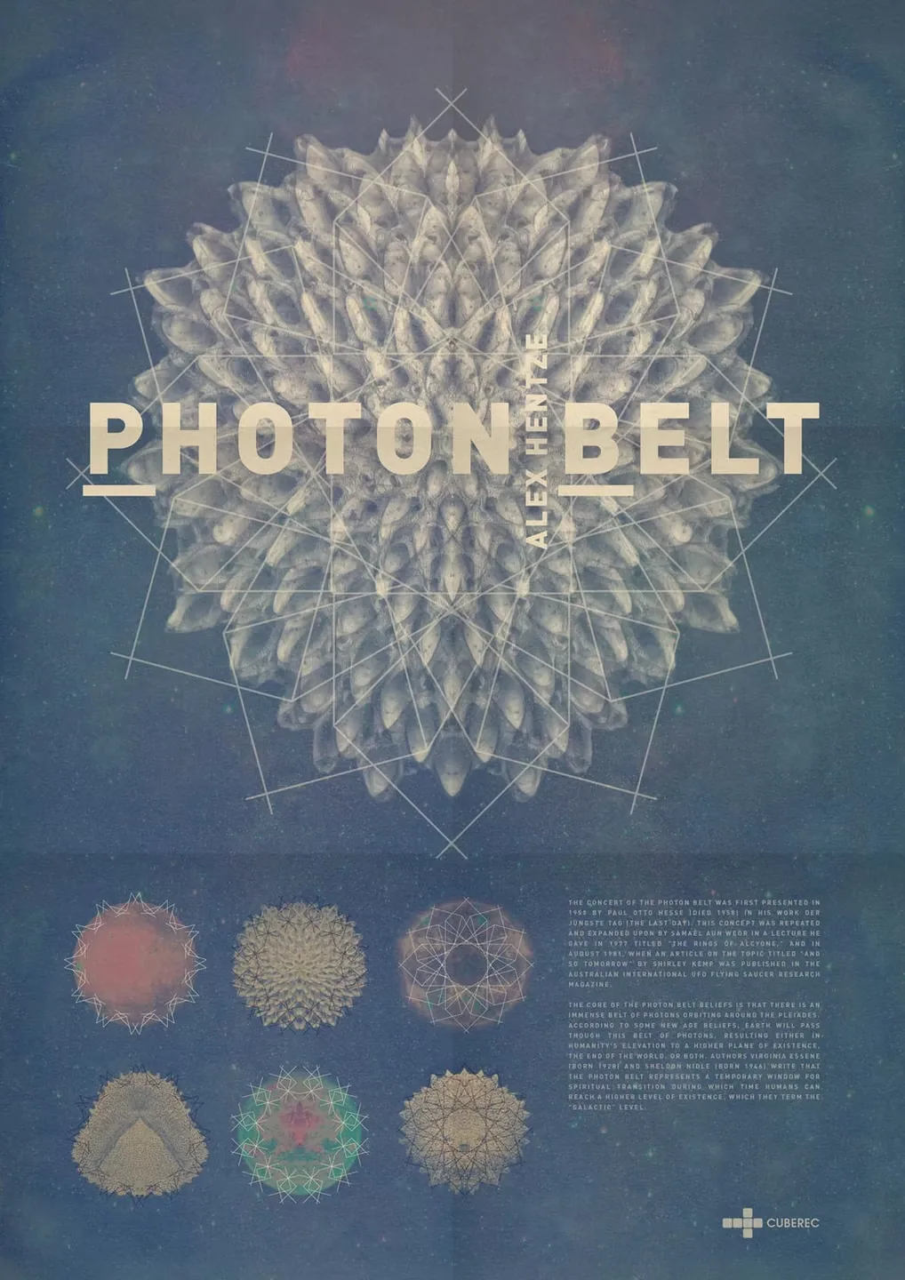
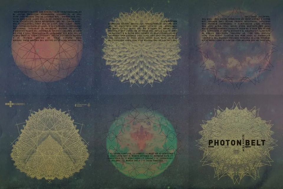
Photon Belt
The release moves between a dense typographic cover and a system of circular studies, allowing the same visual idea to expand beyond a single square artwork.El lanzamiento se mueve entre una portada tipográfica densa y un sistema de estudios circulares, permitiendo que una misma idea visual se expanda más allá de una sola portada cuadrada.
Nostalgia
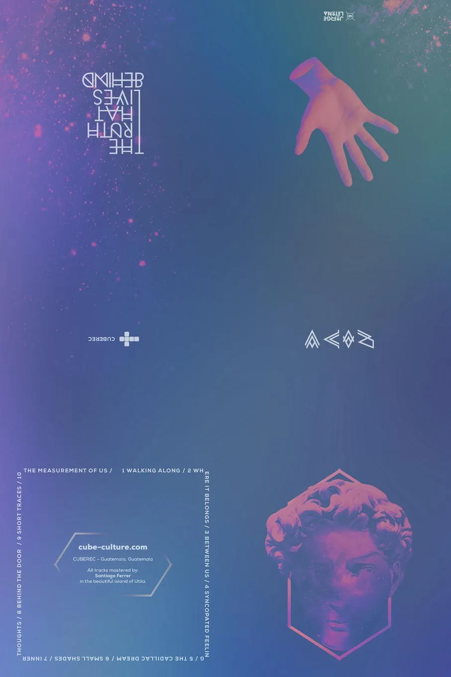
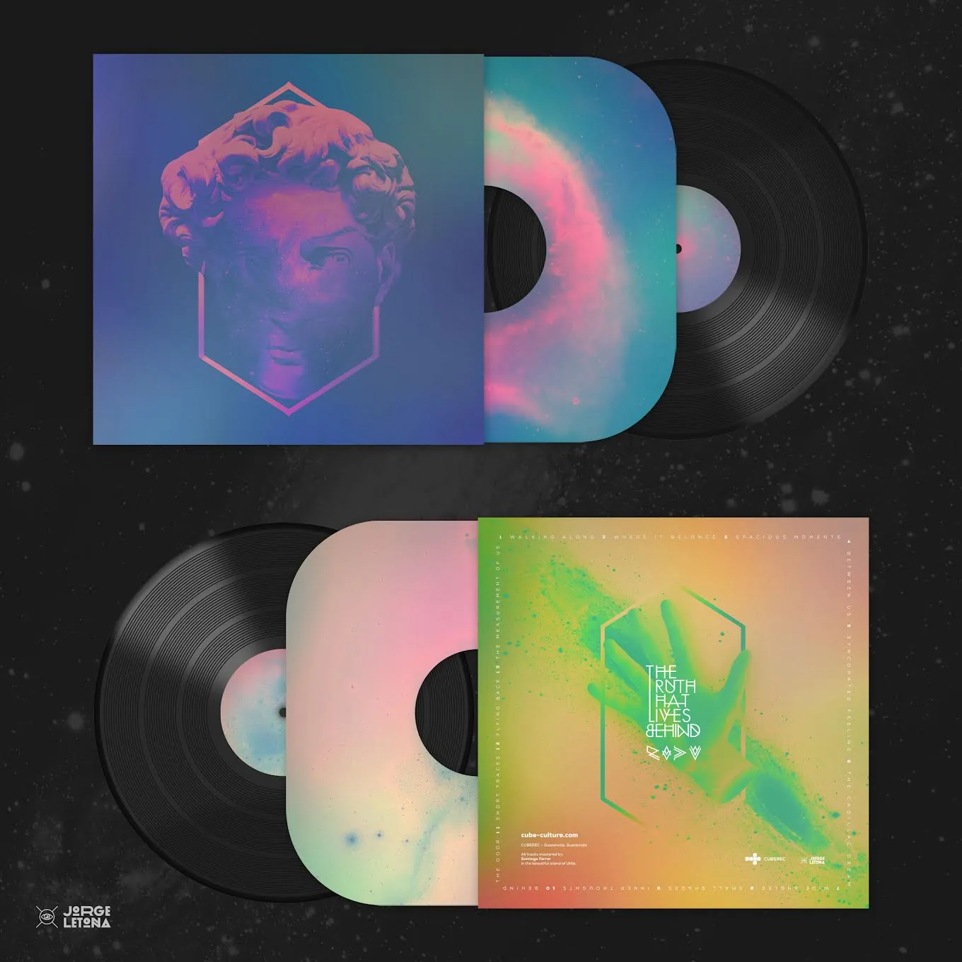
Portraiture, muted pinks and electric blues form one of the catalogue’s most recognizable visual families. The artwork extends from the cover into cassette and vinyl editions. The complete project is also documented separately in the Archive.El retrato, los rosas apagados y los azules eléctricos forman una de las familias visuales más reconocibles del catálogo. La gráfica se extiende de la portada a ediciones en cassette y vinilo. El proyecto completo también está documentado por separado en el Archivo.
Lower Your Speed
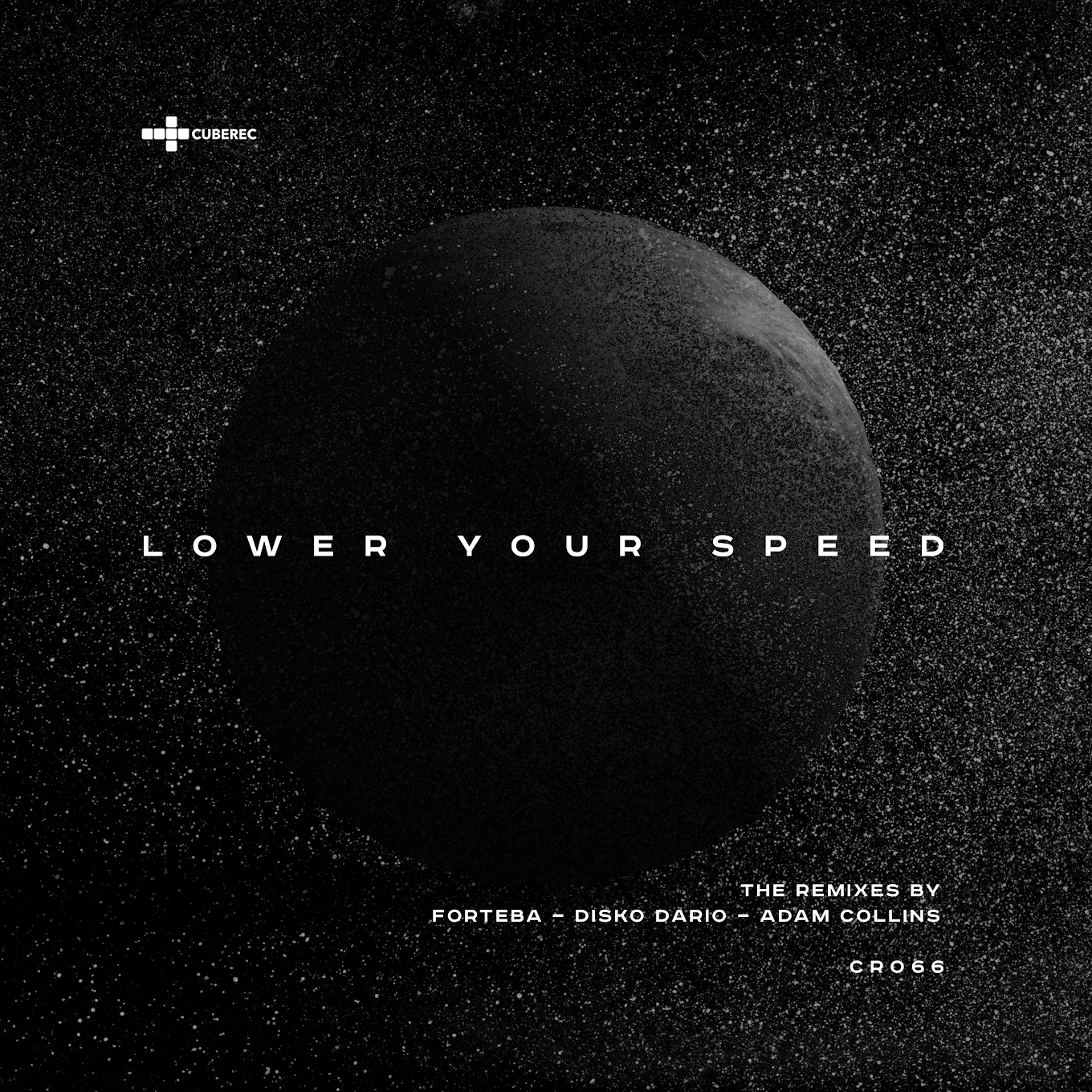
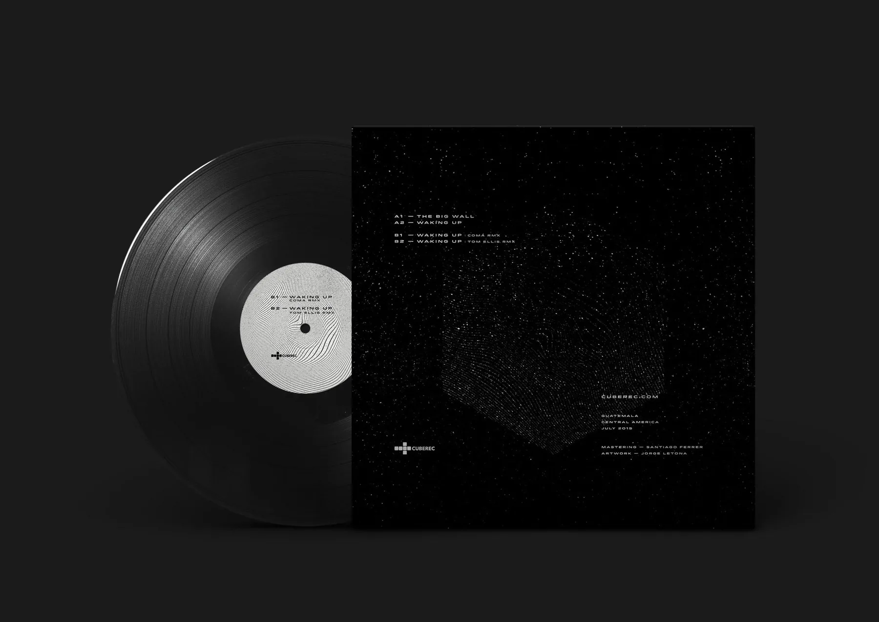
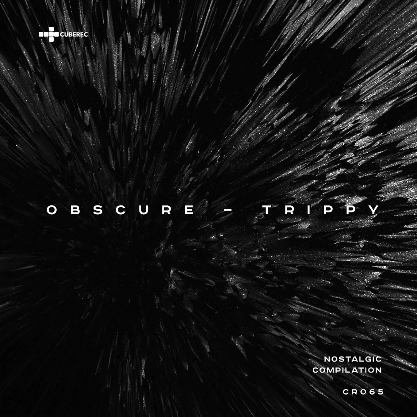
A restrained black-on-black system gives the release a quieter physical presence. The cover and vinyl applications rely on texture, scale and minimal typography rather than color.Un sistema contenido de negro sobre negro da al lanzamiento una presencia física más silenciosa. La portada y las aplicaciones en vinilo dependen de textura, escala y tipografía mínima en lugar del color.
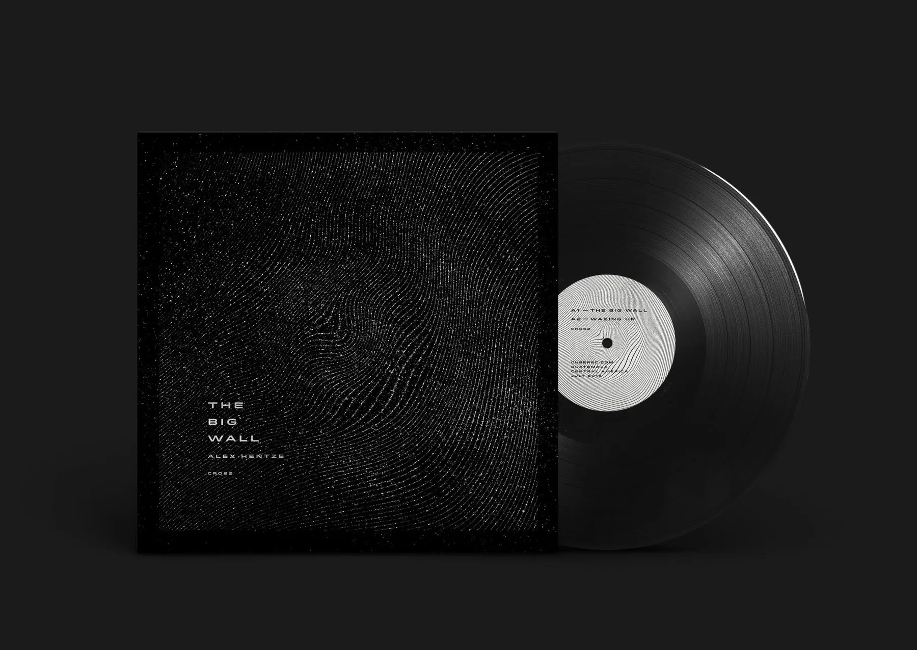
Type, image & distortionTipografía, imagen y distorsión
Other releases explore more independent visual languages: typography crossing photographic imagery, geometric abstraction, spectral color and digitally distorted surfaces.Otros lanzamientos exploran lenguajes visuales más independientes: tipografía atravesando fotografía, abstracción geométrica, color espectral y superficies distorsionadas digitalmente.
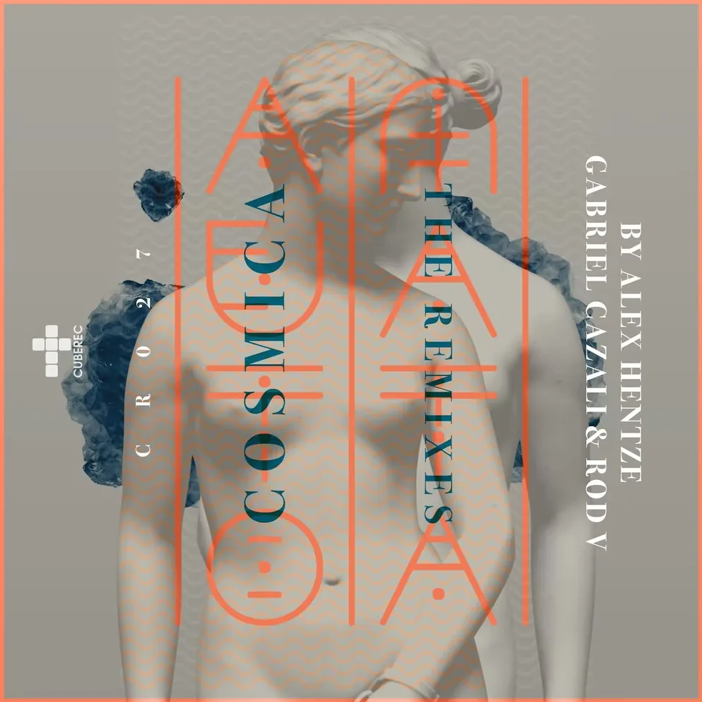
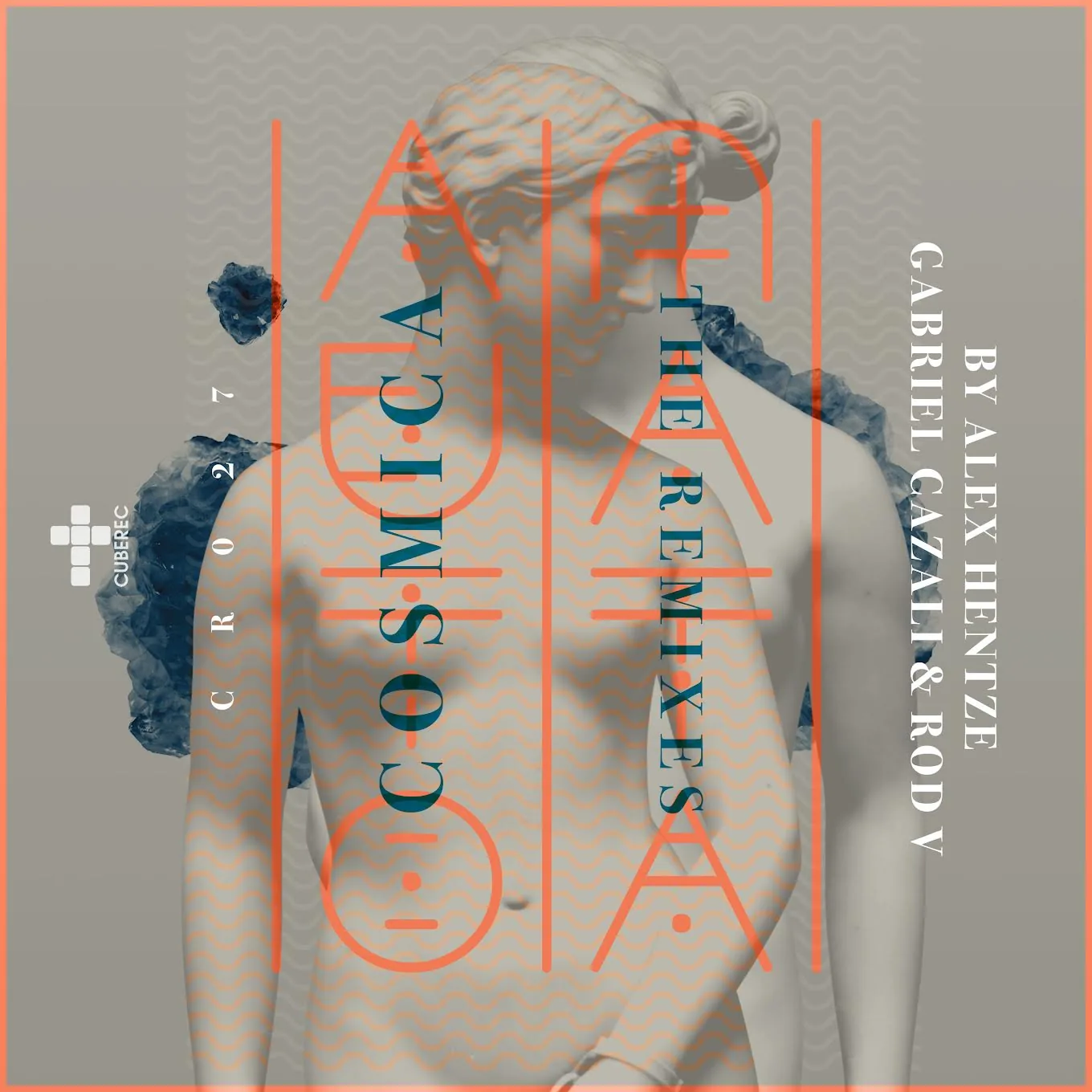
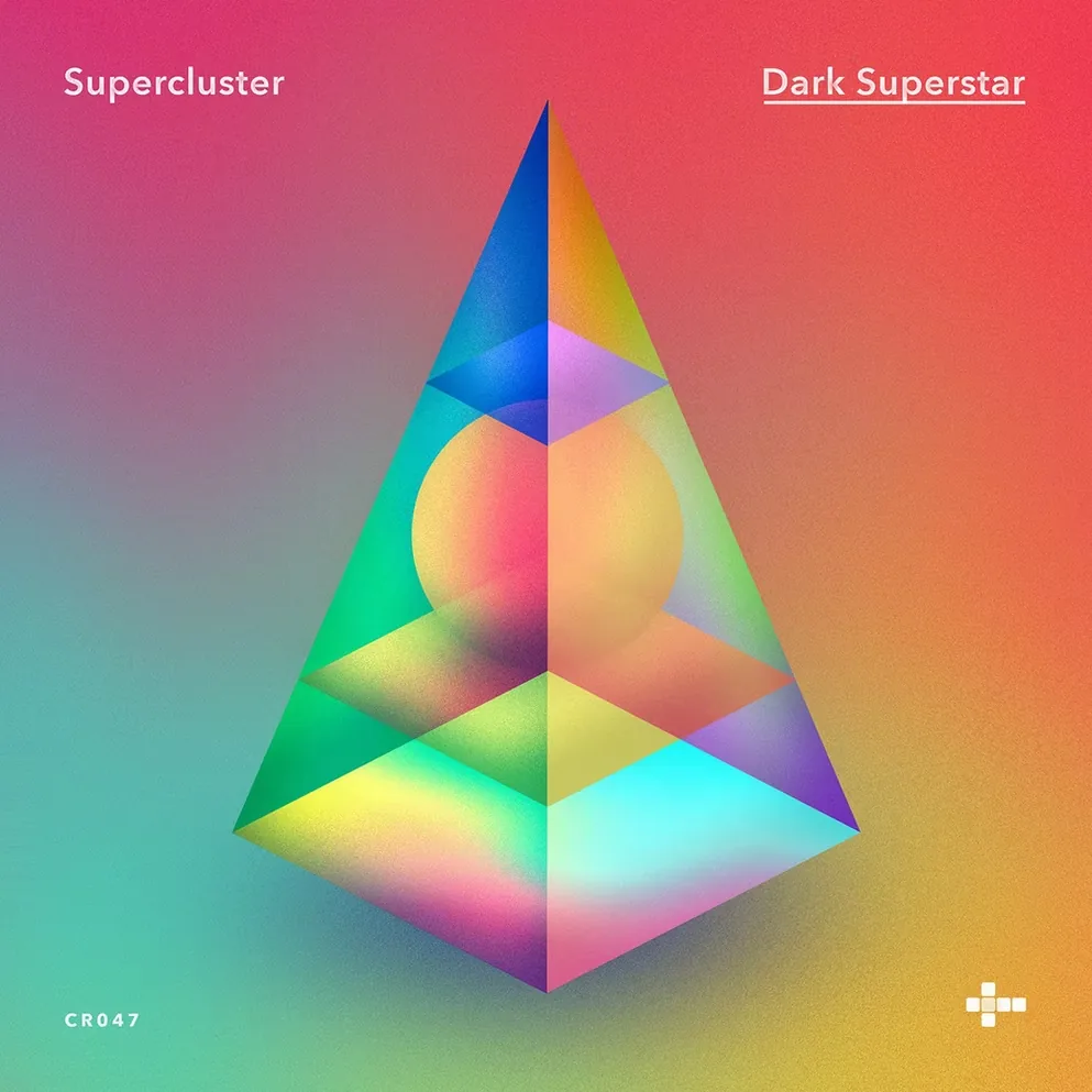
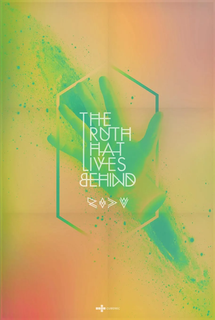
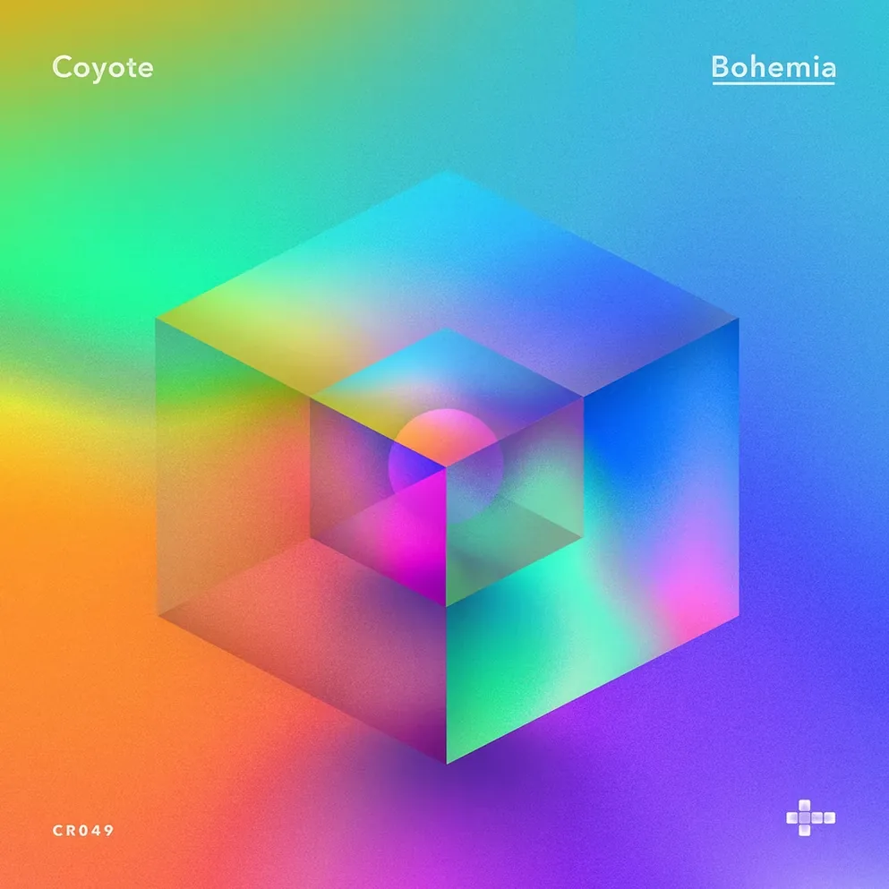
Geometry, texture & nightlifeGeometría, textura y vida nocturna
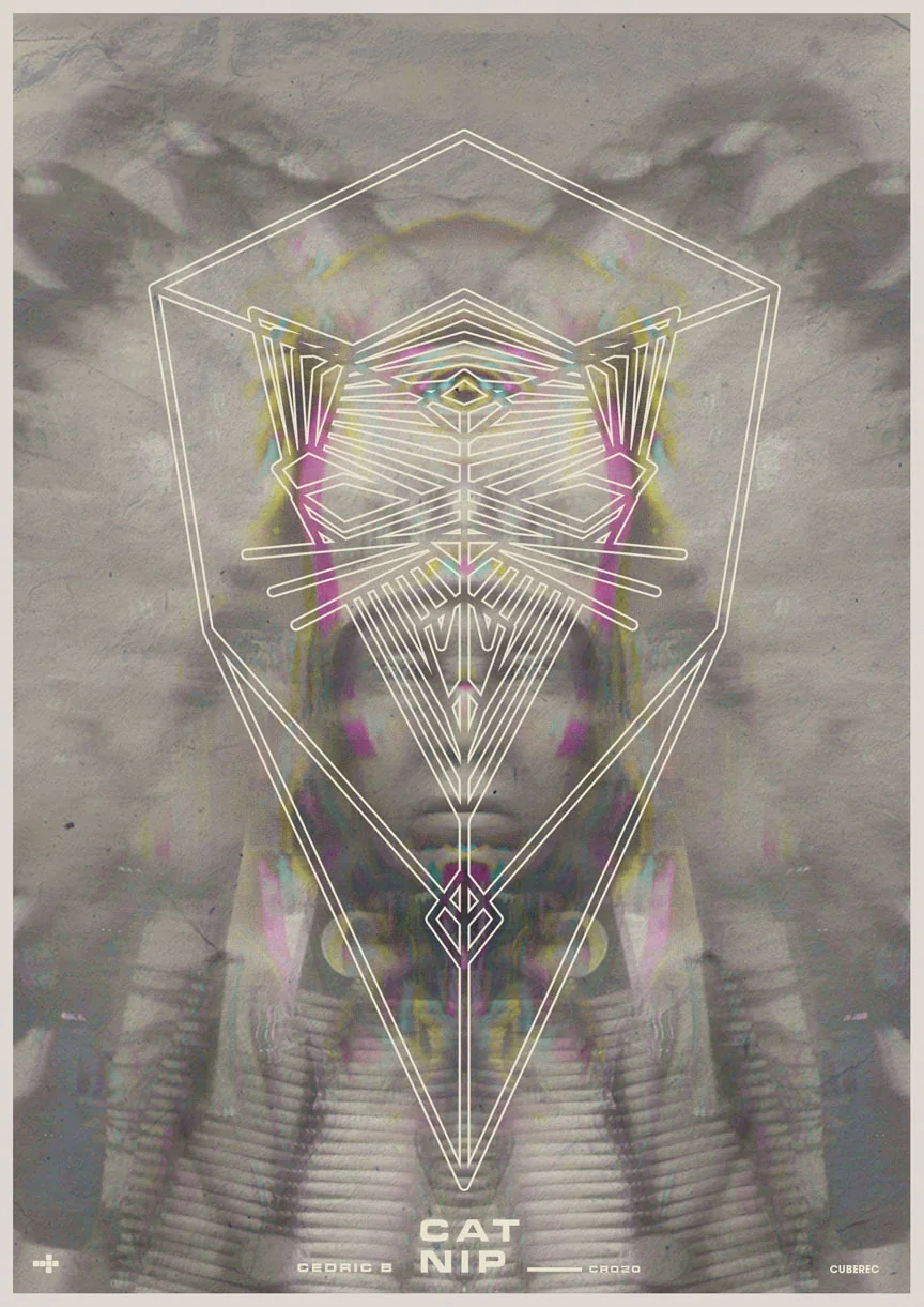
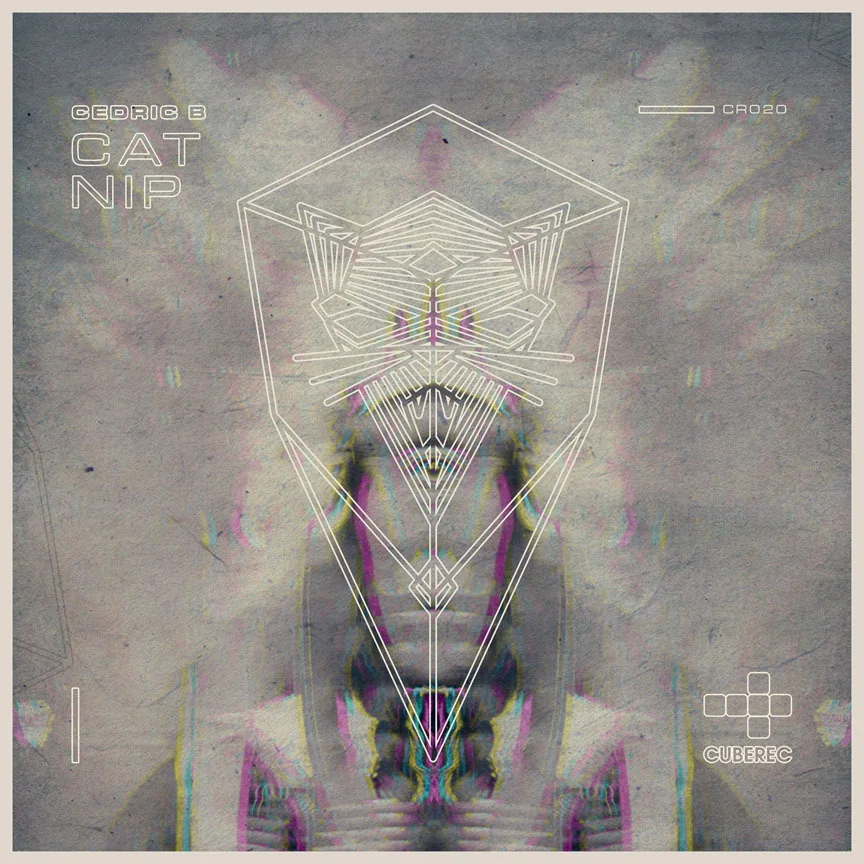
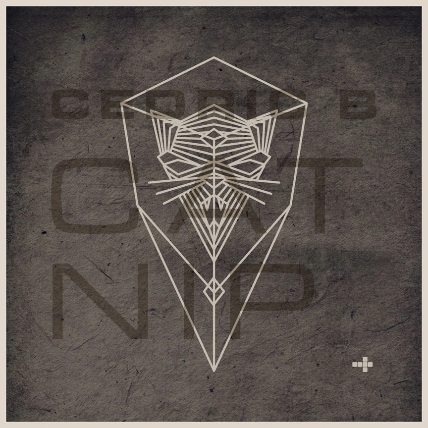
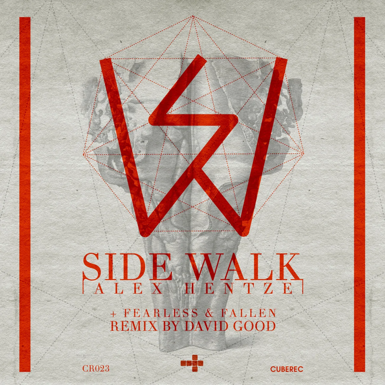
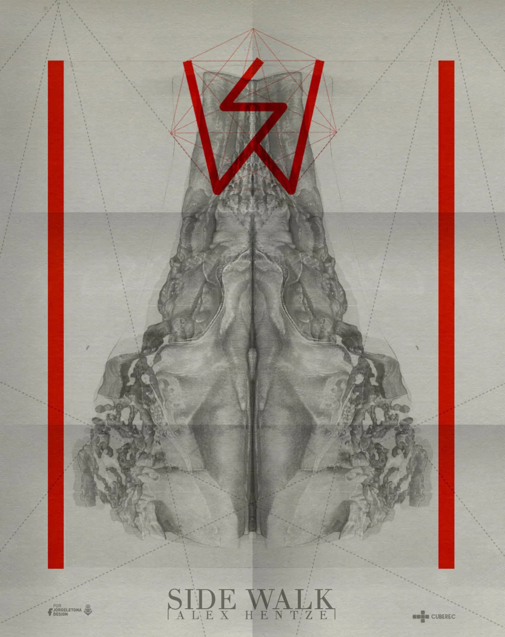
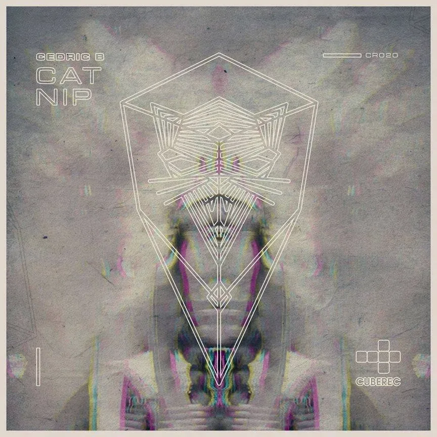
Earlier CUBEREC work explored a darker visual language built from mirrored imagery, geometric drawing, paper texture and restrained color. Release artwork and promotional pieces share the same experimental vocabulary.Los primeros trabajos para CUBEREC exploraban un lenguaje visual más oscuro construido a partir de imágenes espejadas, dibujo geométrico, textura de papel y color contenido. Las portadas y piezas promocionales comparten el mismo vocabulario experimental.
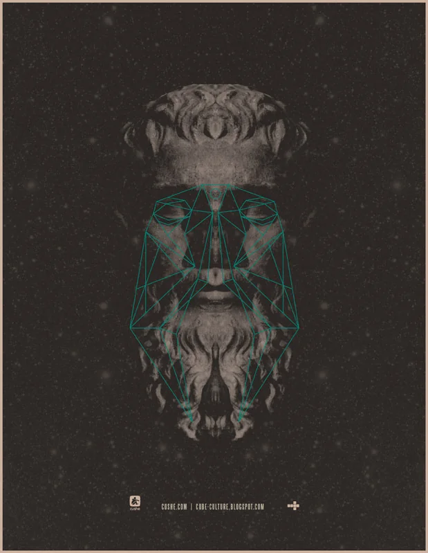
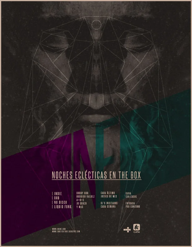
Cat Nip
Side Walk
One system, three releasesUn sistema, tres lanzamientos
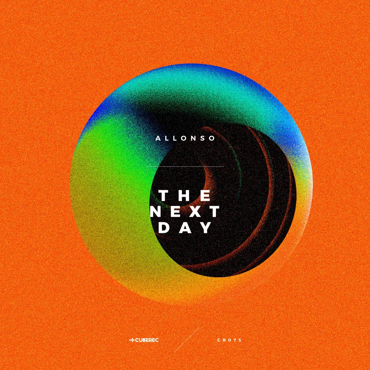
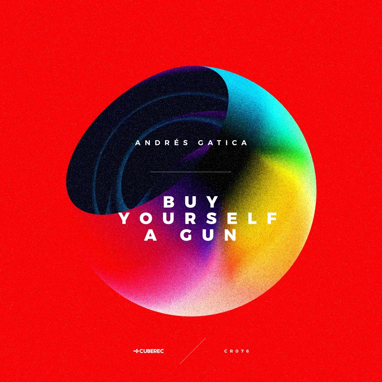
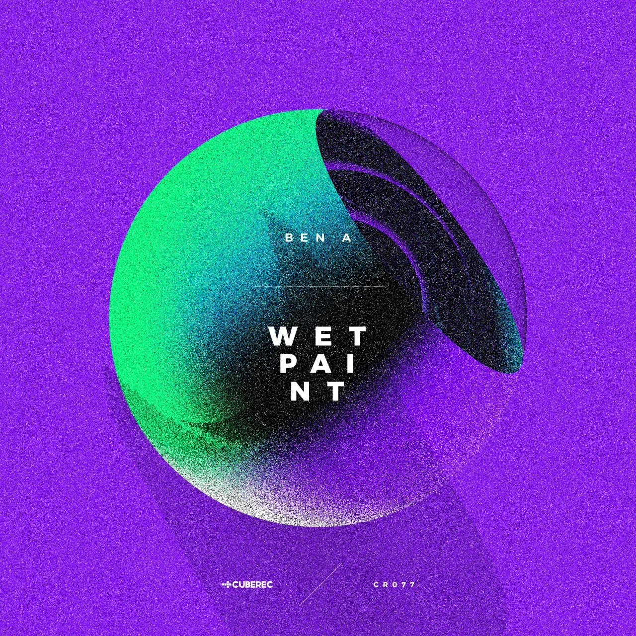
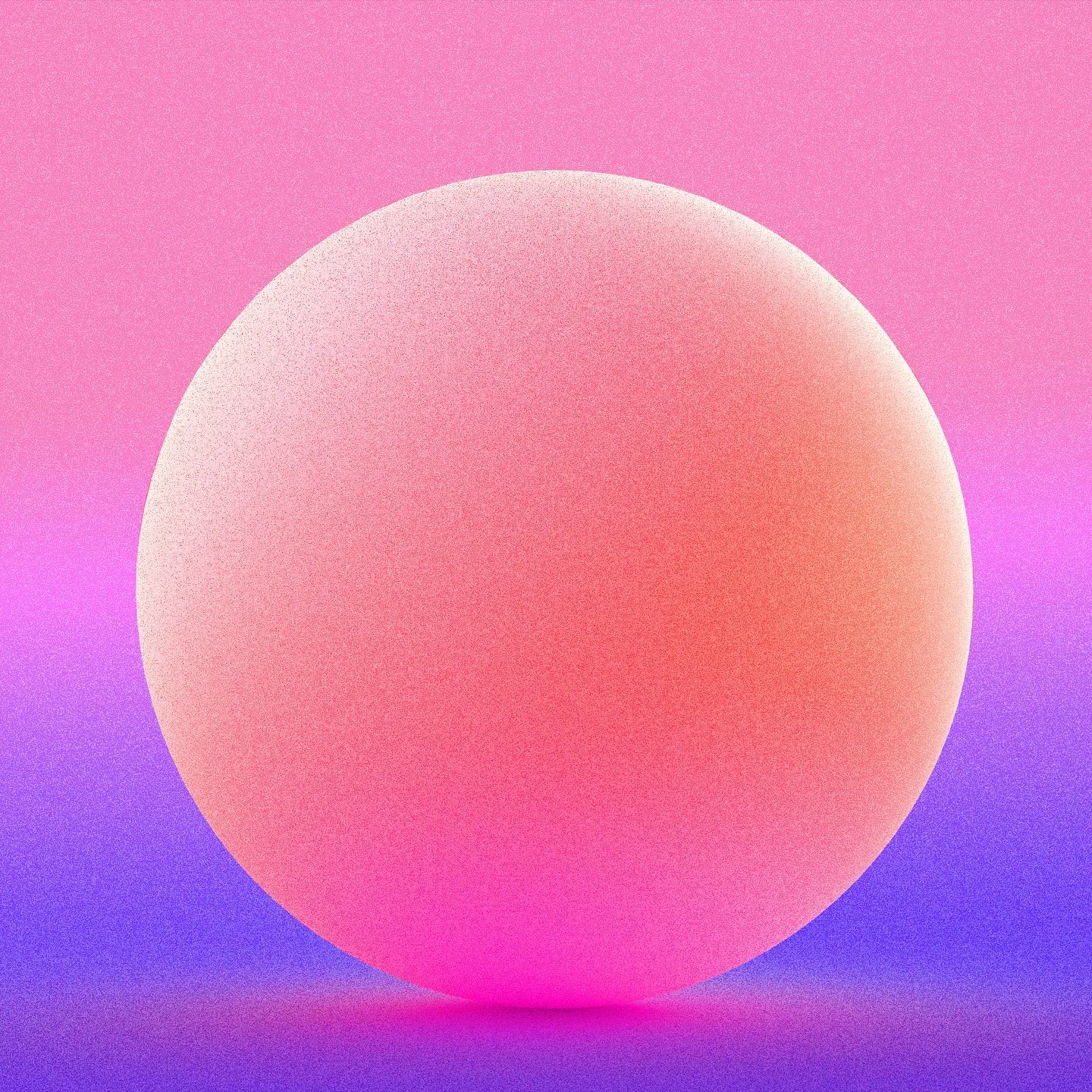
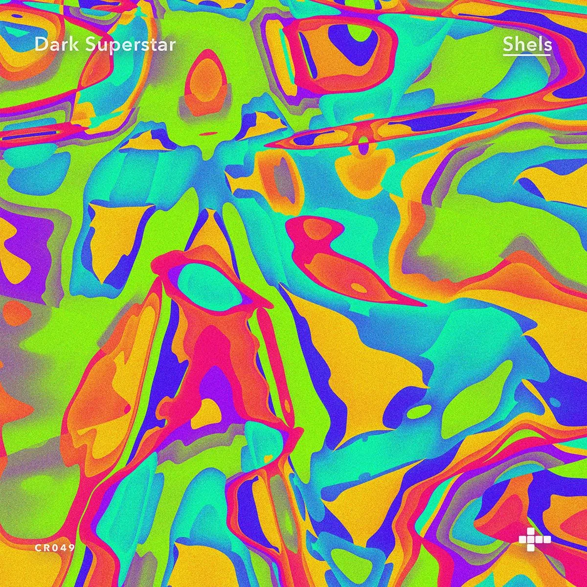
Three consecutive releases share a single visual grammar: circular forms, saturated fields, grain and restrained typography create continuity while each cover keeps its own color and composition.Tres lanzamientos consecutivos comparten una misma gramática visual: formas circulares, campos saturados, grano y tipografía contenida crean continuidad mientras cada portada conserva su propio color y composición.
A changing visual languageUn lenguaje visual cambiante
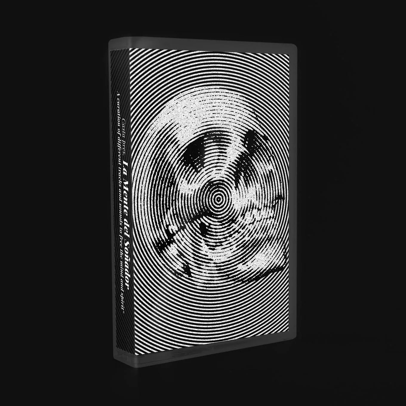
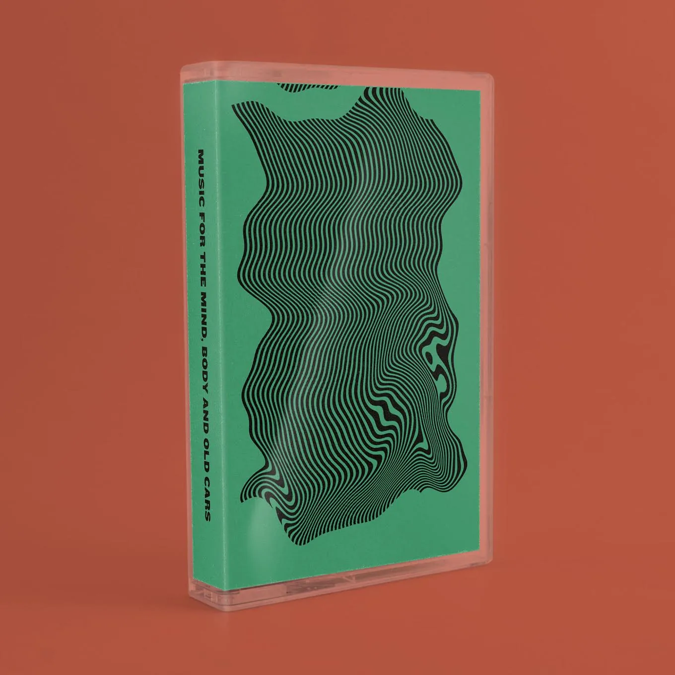
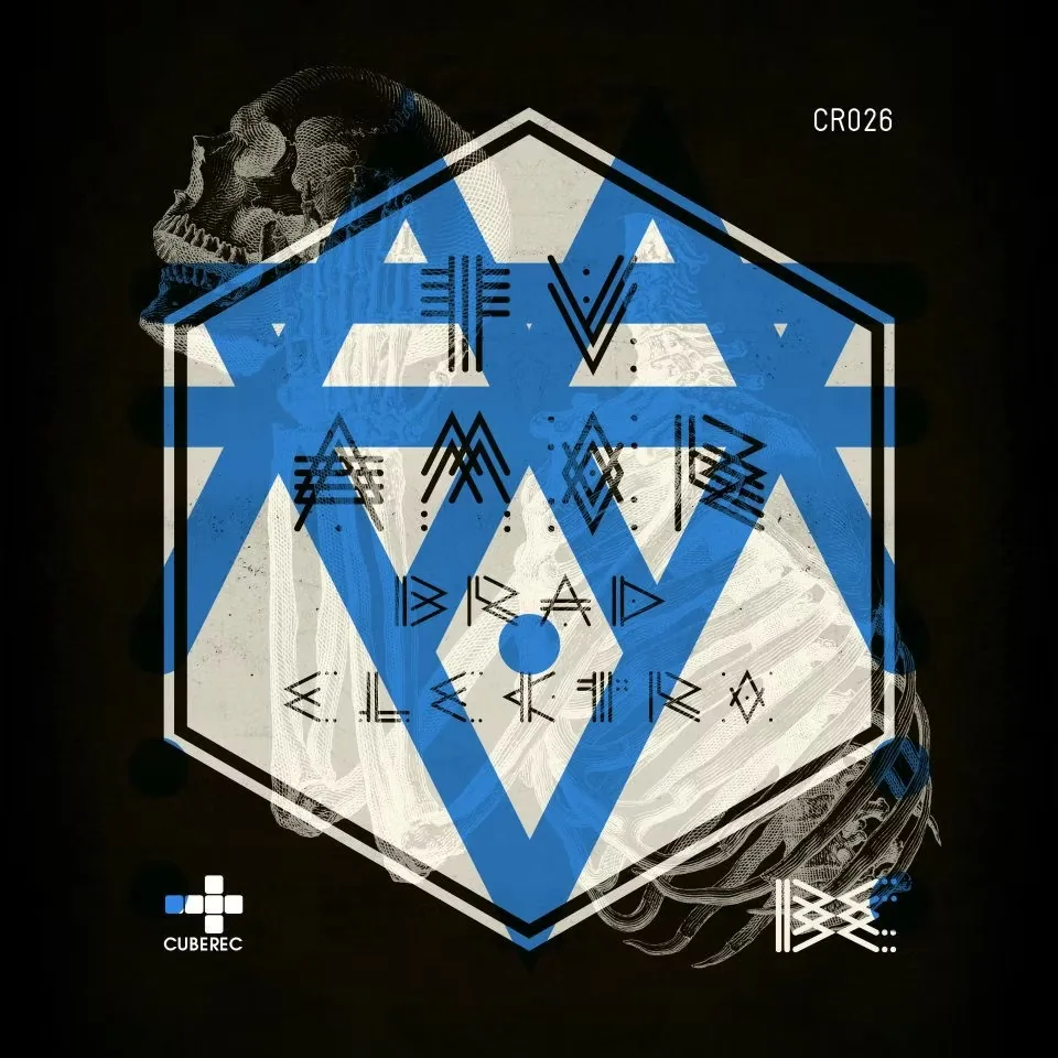
The remaining covers show the range of the catalogue rather than a fixed house style. Each release becomes an opportunity to respond to a different sound while keeping experimentation at the center of the collaboration.Las demás portadas muestran la amplitud del catálogo en lugar de un estilo fijo. Cada lanzamiento se convierte en una oportunidad para responder a un sonido distinto manteniendo la experimentación en el centro de la colaboración.
CUBEREC
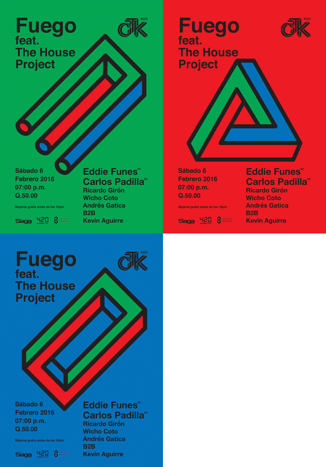
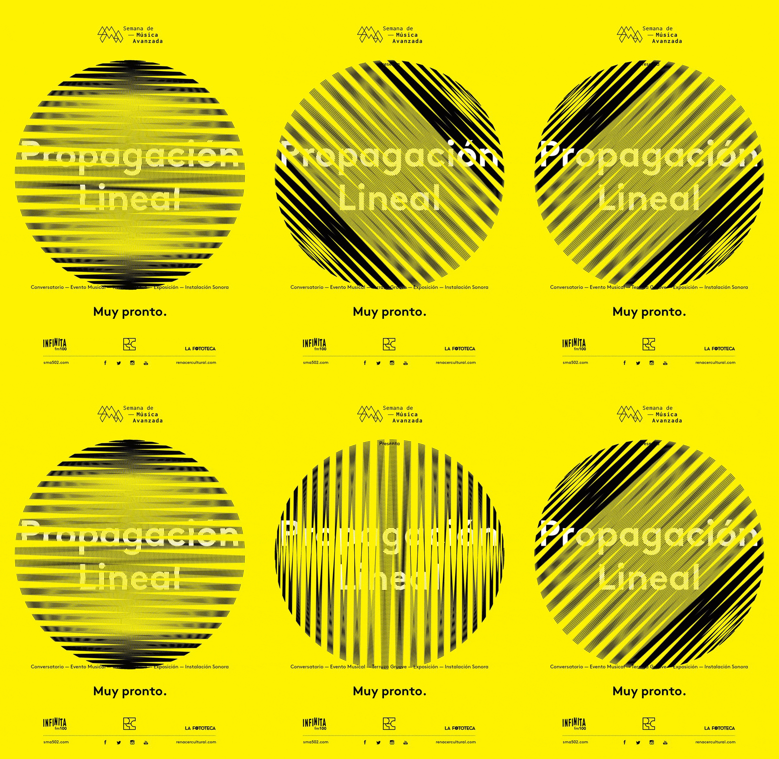
Alongside the releases, the collaboration also produced promotional material for the label and its events. Motion appears here as part of that communication rather than as a separate medium.Junto a los lanzamientos, la colaboración también produjo material promocional para el sello y sus eventos. El movimiento aparece aquí como parte de esa comunicación y no como un medio separado.
Listen to the catalogueEscuchar el catálogo
CUBEREC’s releases can be explored on Beatport.Los lanzamientos de CUBEREC pueden explorarse en Beatport.
LISTEN TO CUBEREC ON BEATPORT →ESCUCHAR CUBEREC EN BEATPORT →LETONA
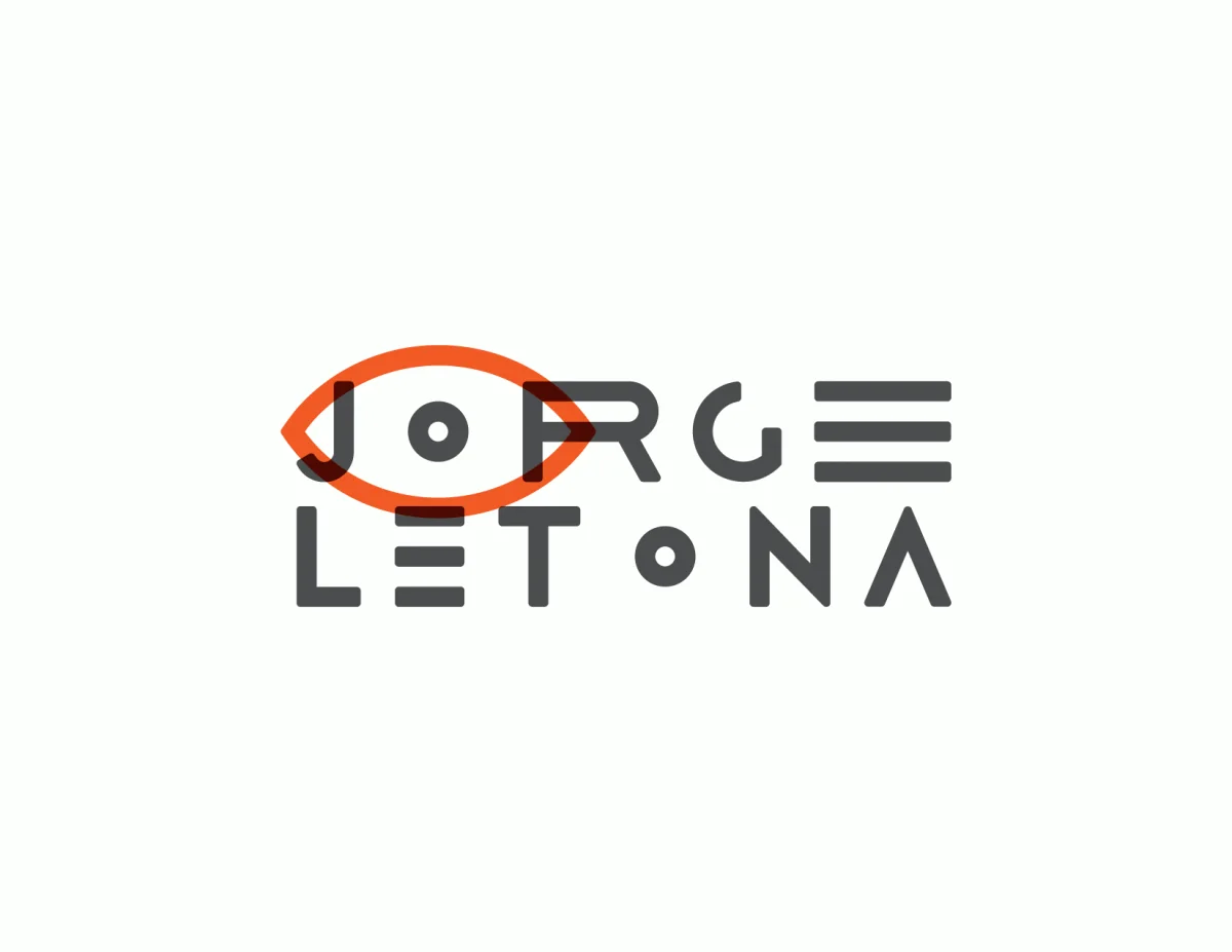
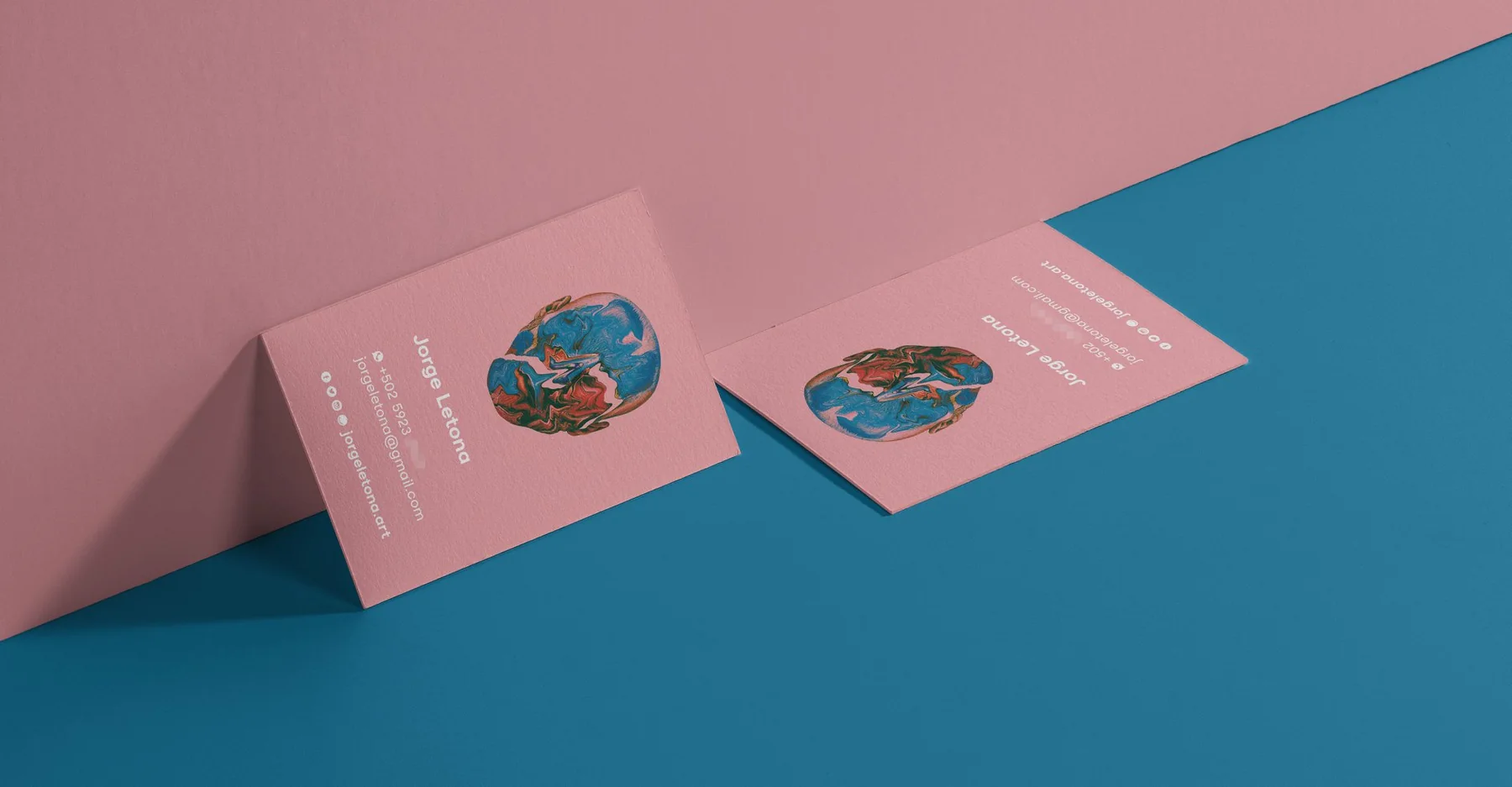
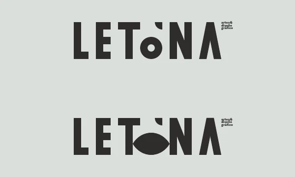
A personal identity is never really finished. Unlike a brand created for a client, my own identity has changed alongside my work: typography, eyes, geometry and experimentation appear, disappear and return in different forms.Una identidad personal nunca está realmente terminada. A diferencia de una marca creada para un cliente, mi propia identidad ha cambiado junto con mi trabajo: tipografía, ojos, geometría y experimentación aparecen, desaparecen y regresan de distintas formas.
This archive brings together different moments of that process. Some early pieces are undated; rather than forcing a chronology, they are presented as stages in an ongoing visual exploration.Este archivo reúne distintos momentos de ese proceso. Algunas piezas tempranas no tienen una fecha confirmada; en lugar de forzar una cronología, se presentan como etapas de una exploración visual continua.
The eye keeps returningEl ojo siempre regresa
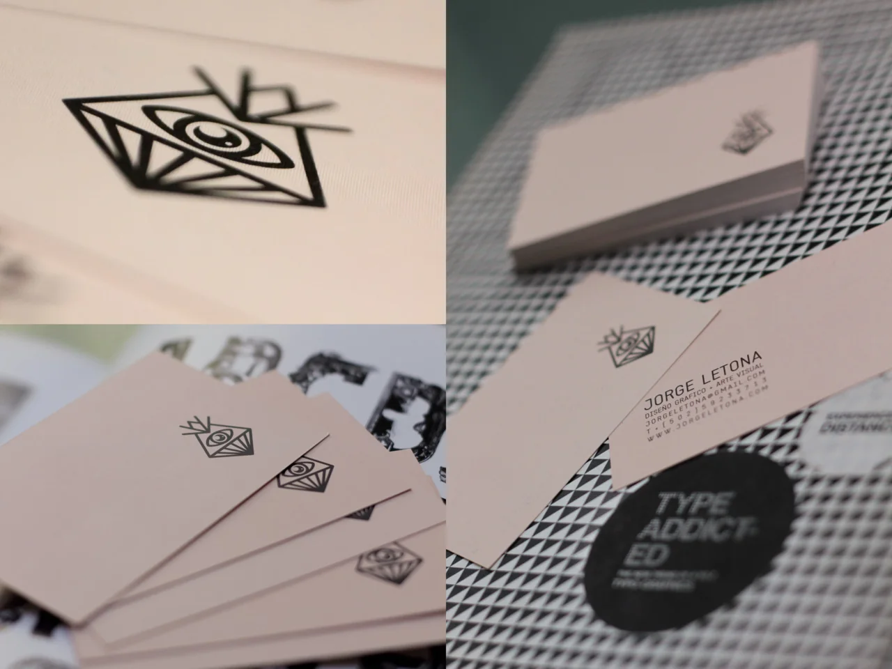
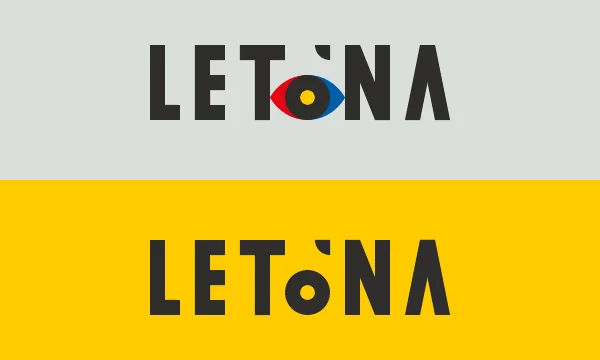
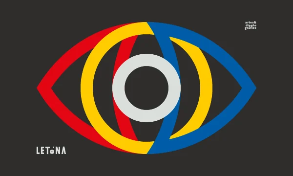
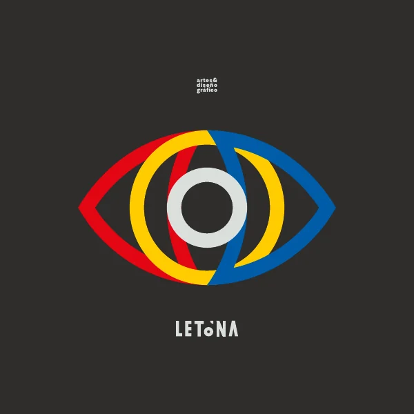
Before becoming a fixed system, the identity moved through lettering, symbols and personal applications. The eye already appears as a recurring device: sometimes literal, sometimes embedded in the name, sometimes reduced to geometry.Antes de convertirse en un sistema definido, la identidad pasó por lettering, símbolos y aplicaciones personales. El ojo ya aparece como un recurso recurrente: a veces literal, a veces integrado al nombre y a veces reducido a geometría.

A practice, not a fixed styleUna práctica, no un estilo fijo
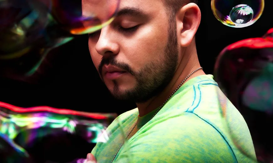
In a 2016 press document for the workshop “Visuals for Music,” I described myself as a self-taught graphic designer since age 14 and summarized my approach with three words: experimental, minimalist and conceptual. The workshop itself emphasized that creative work should not be tied to a single process.En un documento de prensa de 2016 para el taller “Visuals for Music”, me describía como diseñador gráfico autodidacta desde los 14 años y resumía mi enfoque en tres palabras: experimental, minimalista y conceptual. El propio taller planteaba que el trabajo creativo no debía atarse a un solo proceso.
Building a system around the nameConstruir un sistema alrededor del nombre
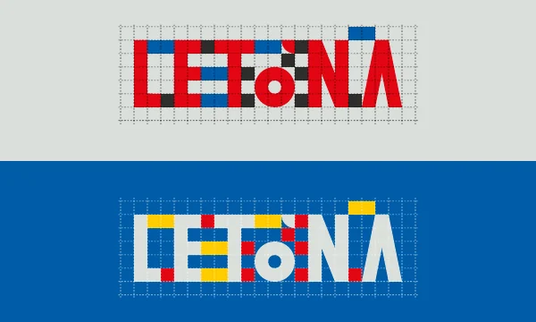
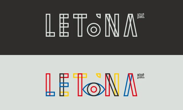
The 2019 identity study turns LETONA into a more systematic typographic exercise. Letterforms, construction grids, primary color and the eye are tested as interchangeable parts of the same identity rather than as a single locked logo.El estudio de identidad de 2019 convierte LETONA en un ejercicio tipográfico más sistemático. Las letras, las retículas de construcción, el color primario y el ojo se prueban como partes intercambiables de una misma identidad, en lugar de un único logotipo cerrado.
Identity beyond the logoIdentidad más allá del logotipo
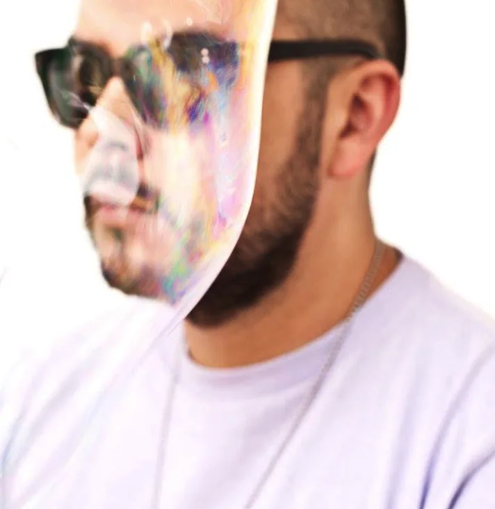
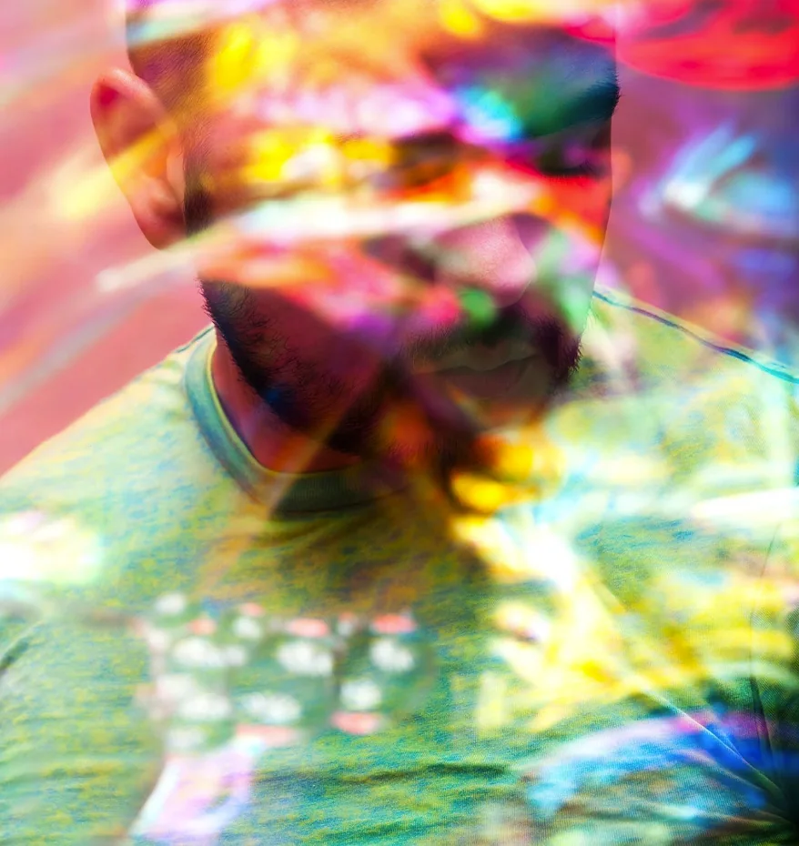
Personal identity also became a place for image-making. Portraits, overlays and distortions let the visual language move away from conventional branding and closer to the experimental work that runs through the rest of the portfolio.La identidad personal también se convirtió en un espacio para crear imagen. Retratos, superposiciones y distorsiones permiten que el lenguaje visual se aleje del branding convencional y se acerque al trabajo experimental que atraviesa el resto del portafolio.
Simplify, distort, rebuildSimplificar, distorsionar, reconstruir
Recent explorations alternate between a direct JORGE LETONA wordmark and more expressive versions of the LETONA name. The eye remains present, but no longer needs to appear in every application. The identity becomes less about one permanent mark and more about a recognizable attitude.Las exploraciones recientes alternan entre un wordmark directo de JORGE LETONA y versiones más expresivas del nombre LETONA. El ojo sigue presente, pero ya no necesita aparecer en cada aplicación. La identidad pasa de depender de una marca permanente a construir una actitud reconocible.
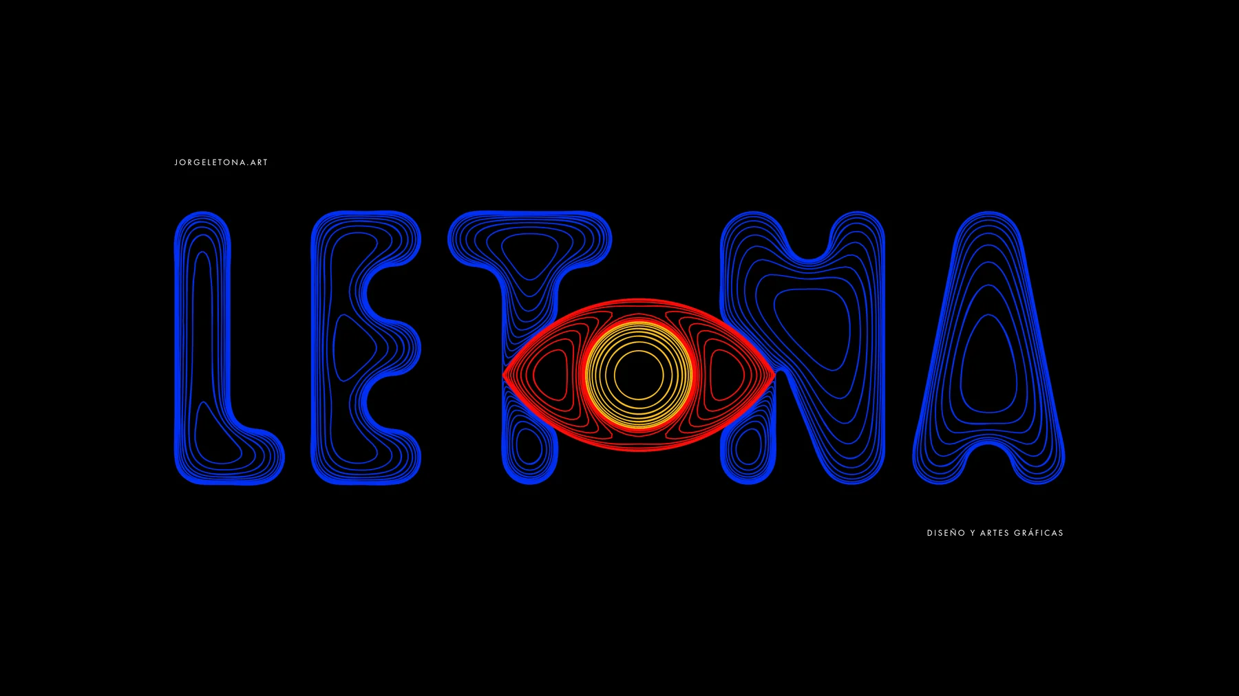
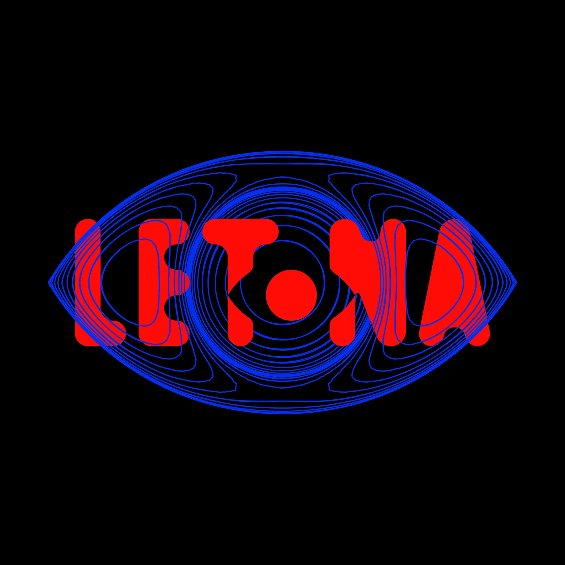

The chronology remains intentionally open: earlier versions can be added as more archive material is recovered.La cronología queda intencionalmente abierta: se pueden incorporar versiones anteriores conforme aparezca más material de archivo.
MURAL
LA TORRE
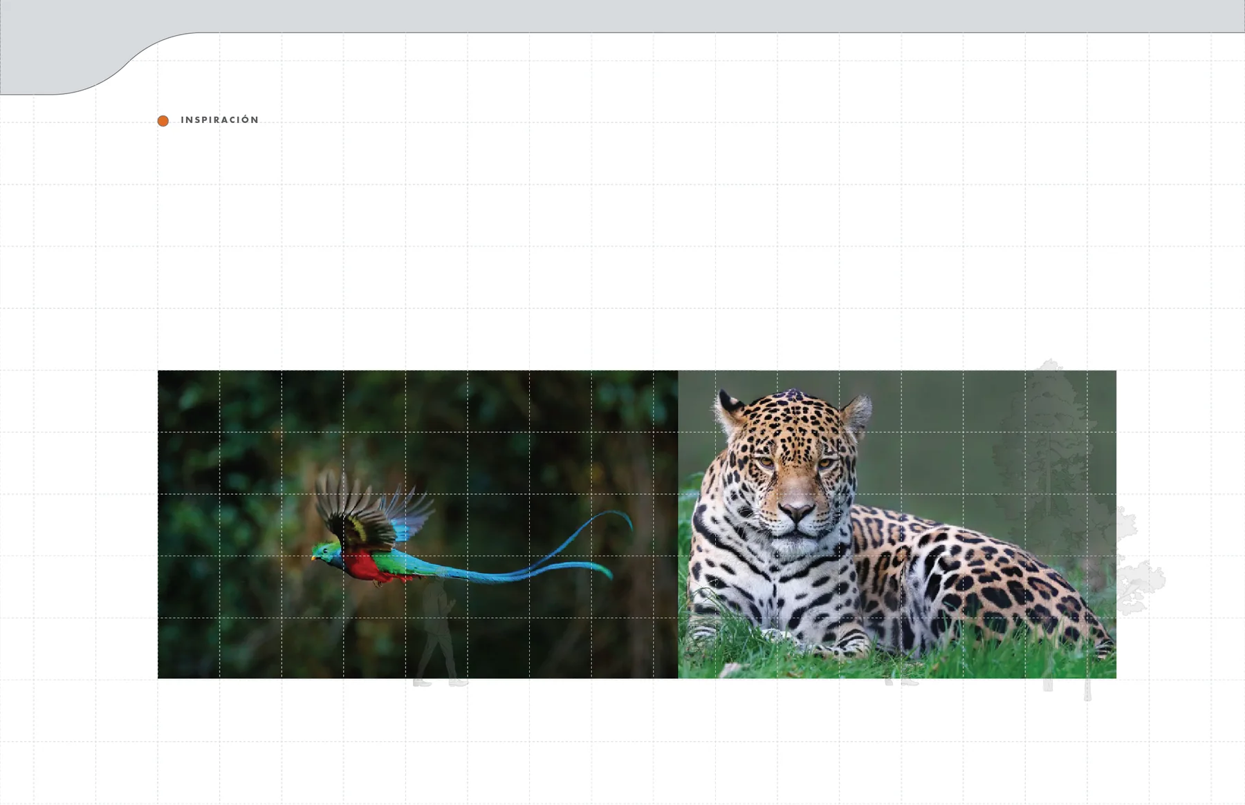
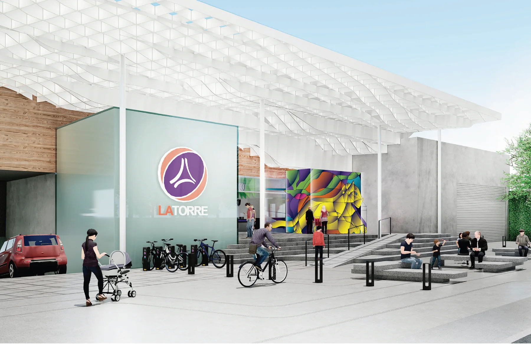
A mural proposal developed for Supermercados La Torre, using two emblematic animals of Guatemala—the quetzal and the jaguar—as the starting point for a large-scale geometric composition.Propuesta de mural desarrollada para Supermercados La Torre, tomando como punto de partida dos animales emblemáticos de Guatemala —el quetzal y el jaguar— para construir una composición geométrica a gran escala.
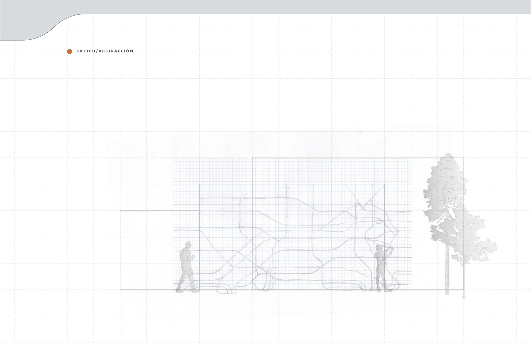
The project moves from observation and drawing to abstraction, volume, color and architectural application. Although the proposal was not selected for execution, the process became a complete exploration of how illustration can inhabit a public-facing commercial space.El proyecto pasa de la observación y el dibujo a la abstracción, el volumen, el color y la aplicación arquitectónica. Aunque la propuesta no fue seleccionada para ejecución, el proceso se convirtió en una exploración completa de cómo una ilustración puede habitar un espacio comercial de cara al público.
Designing for the wallDiseñar para el muro
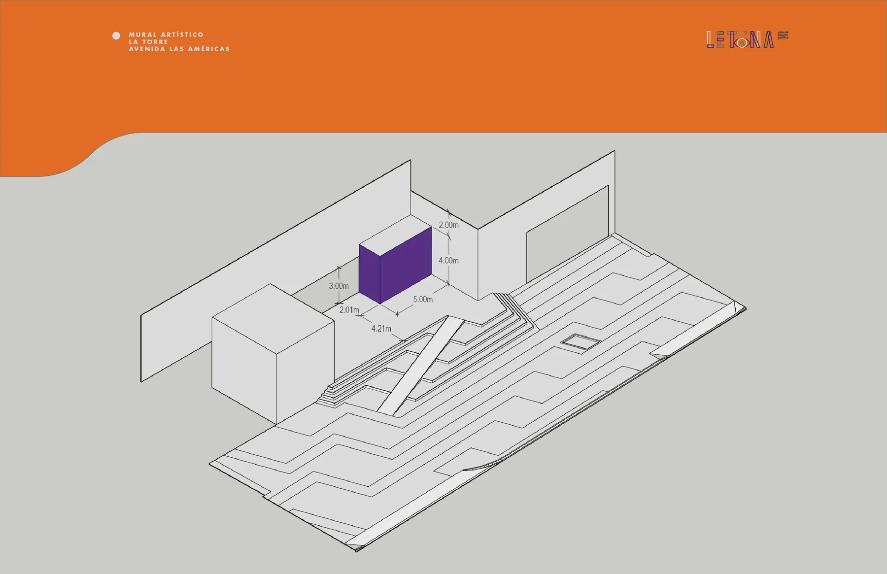
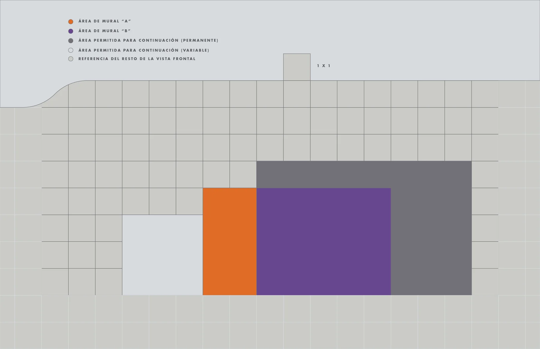
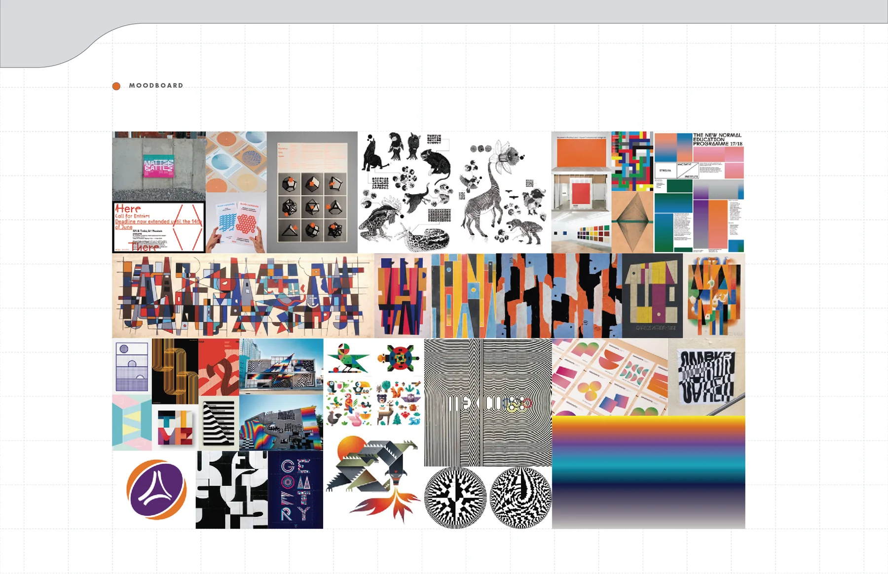
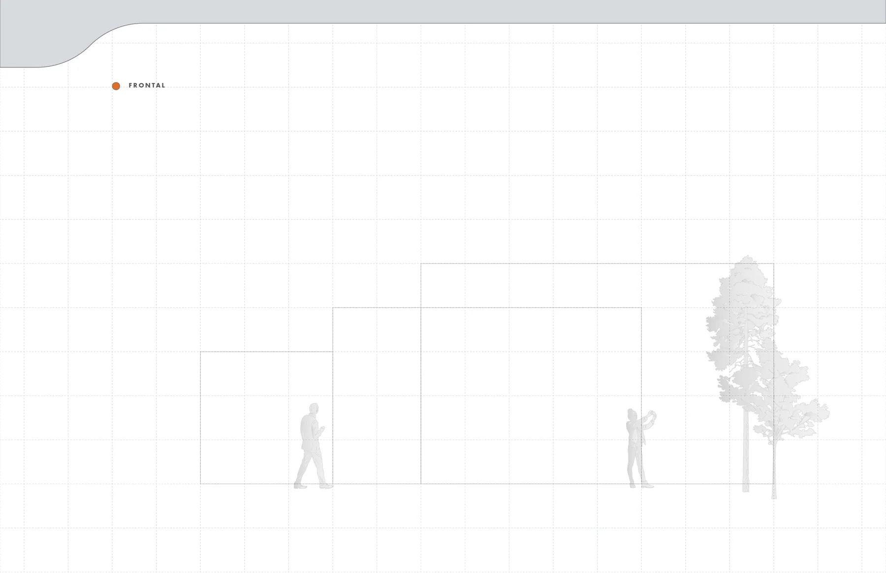
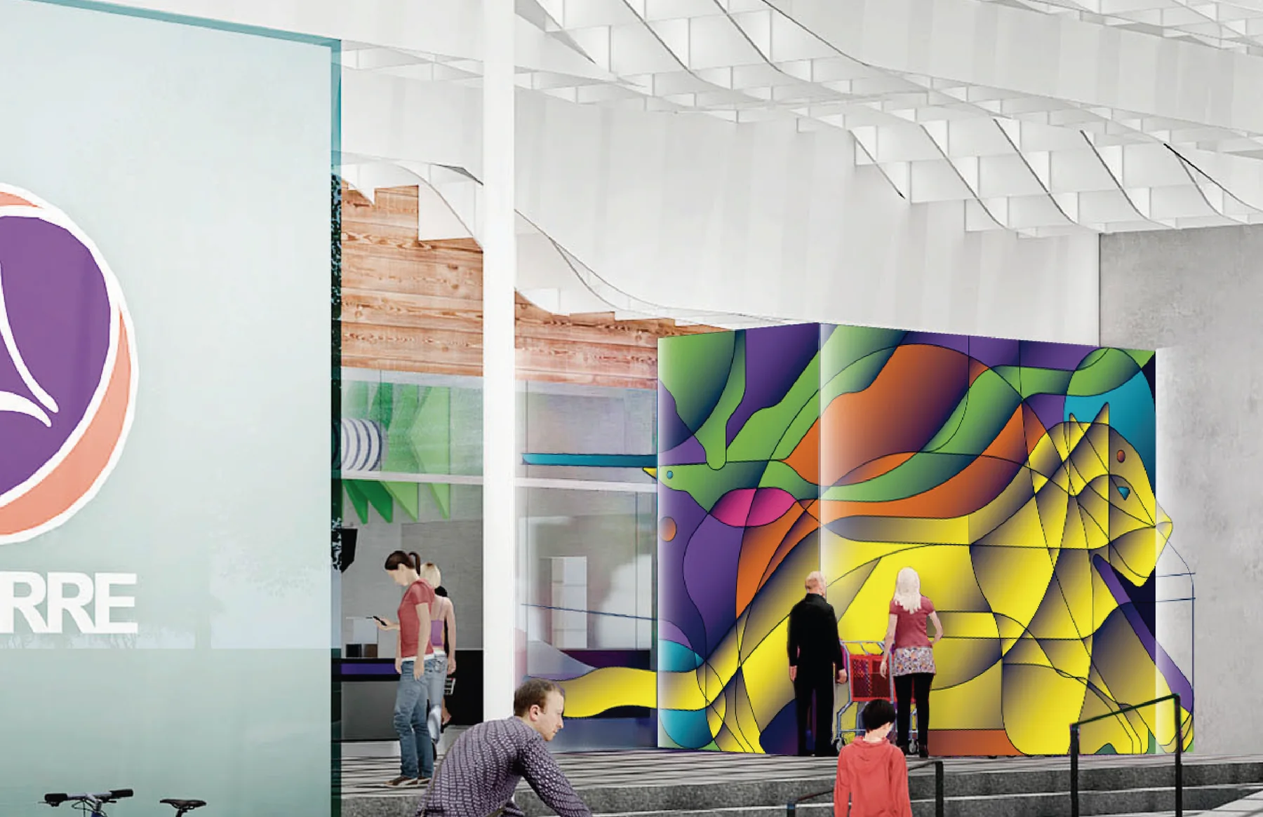
The starting point was not an isolated image but a specific architectural surface. The proportions of the wall, its relationship with the supermarket environment and the distance from which the piece would be seen defined the scale of the composition from the beginning.El punto de partida no fue una imagen aislada, sino una superficie arquitectónica específica. Las proporciones del muro, su relación con el entorno del supermercado y la distancia desde la que se vería la pieza definieron desde el inicio la escala de la composición.
Two forms, one compositionDos formas, una composición
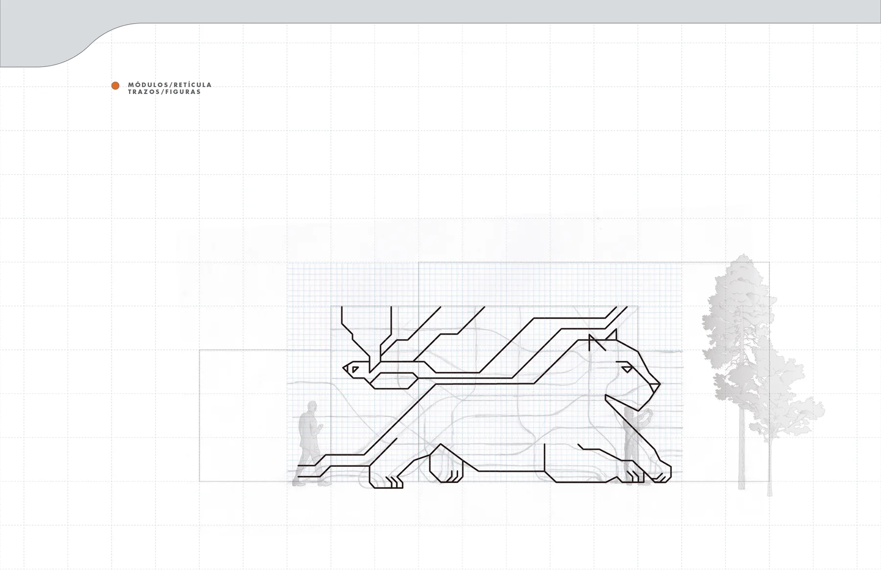
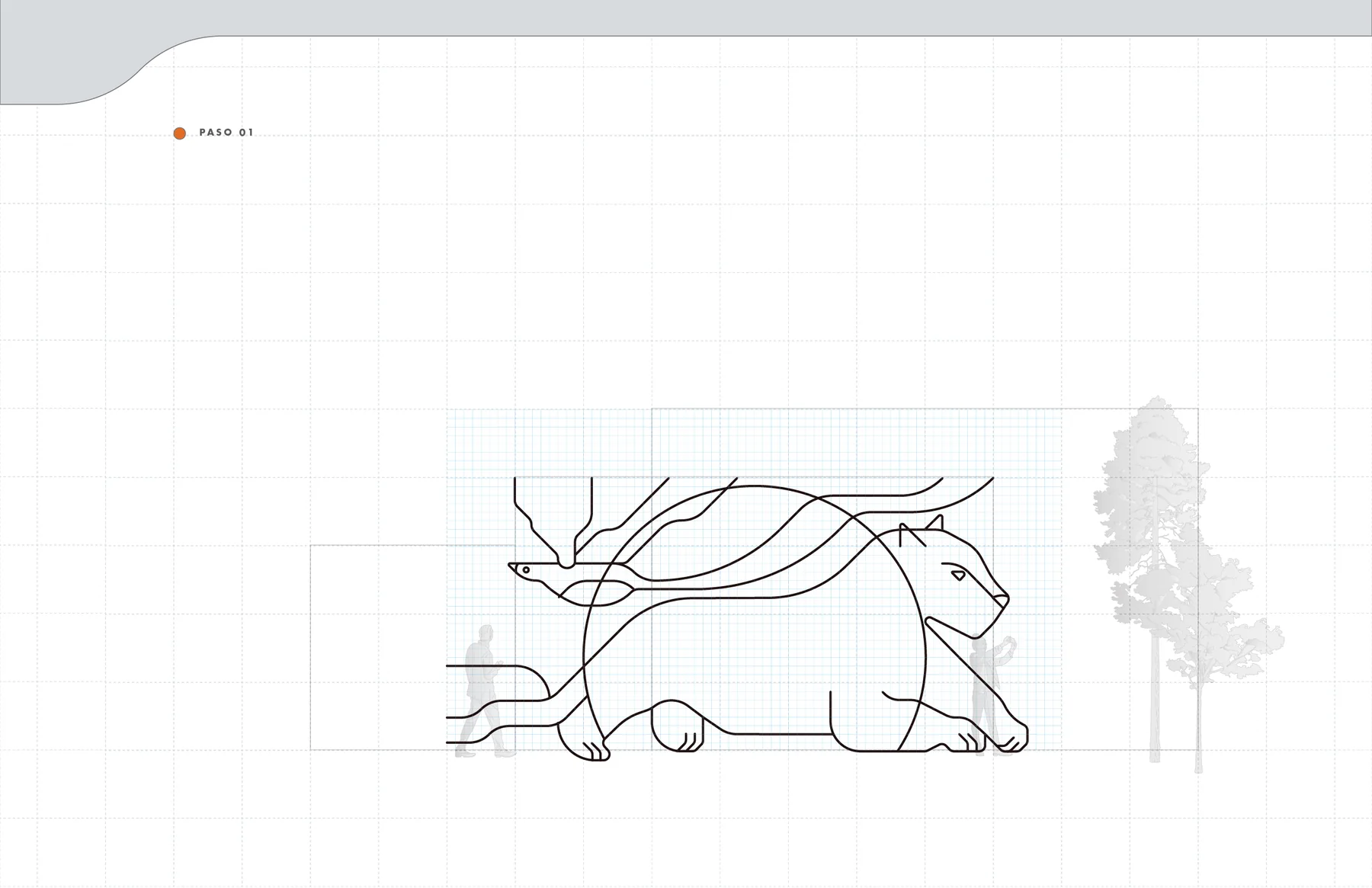
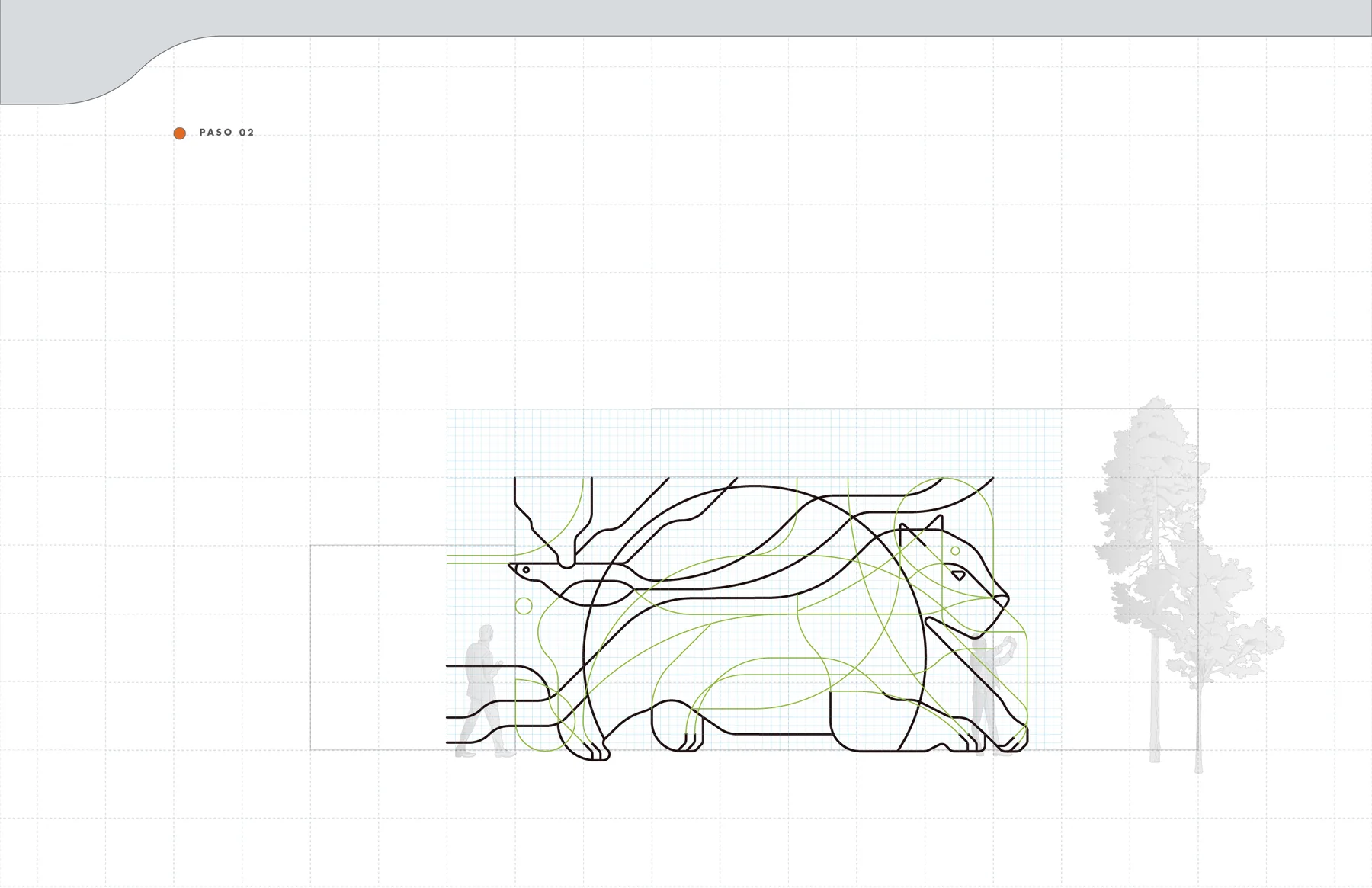
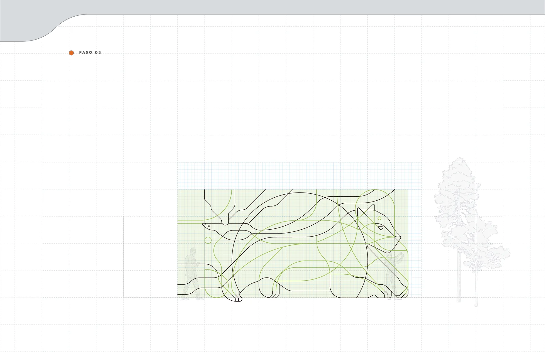
The visual concept brings together the quetzal and the jaguar. Rather than illustrating them literally, their silhouettes and characteristic structures are broken into lines, planes and mirrored geometries until both animals can coexist inside a single graphic language.El concepto visual reúne al quetzal y al jaguar. En lugar de ilustrarlos literalmente, sus siluetas y estructuras características se descomponen en líneas, planos y geometrías espejadas hasta permitir que ambos animales convivan dentro de un mismo lenguaje gráfico.
Constructing depthConstruir profundidad
The drawing gradually leaves the flat plane. Repetition, overlap and changes in scale transform the initial line work into a spatial structure, allowing the animals to be perceived through rhythm and depth rather than through conventional representation.El dibujo abandona gradualmente el plano. La repetición, la superposición y los cambios de escala transforman el trazo inicial en una estructura espacial, permitiendo percibir a los animales mediante ritmo y profundidad en lugar de una representación convencional.
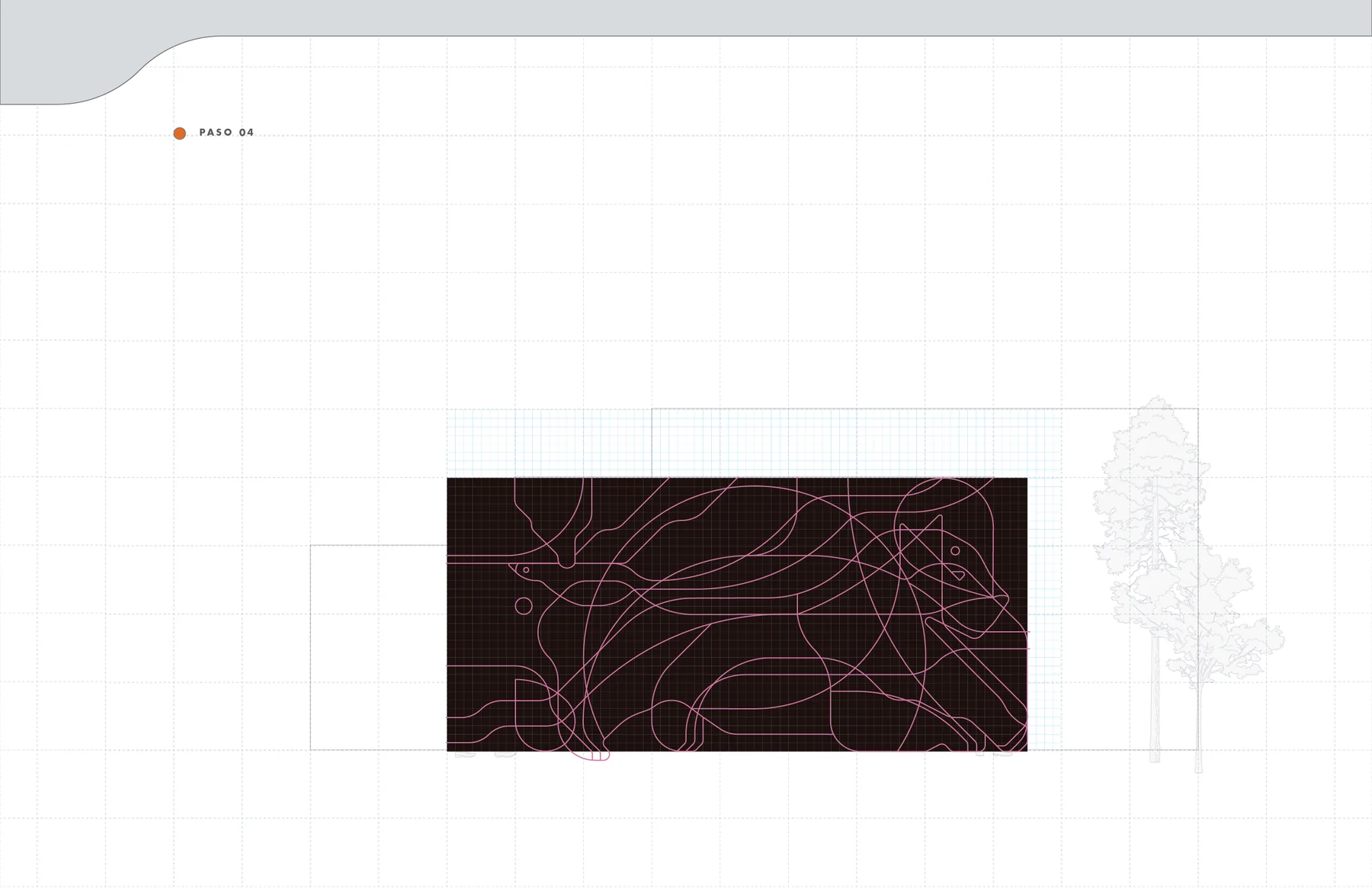
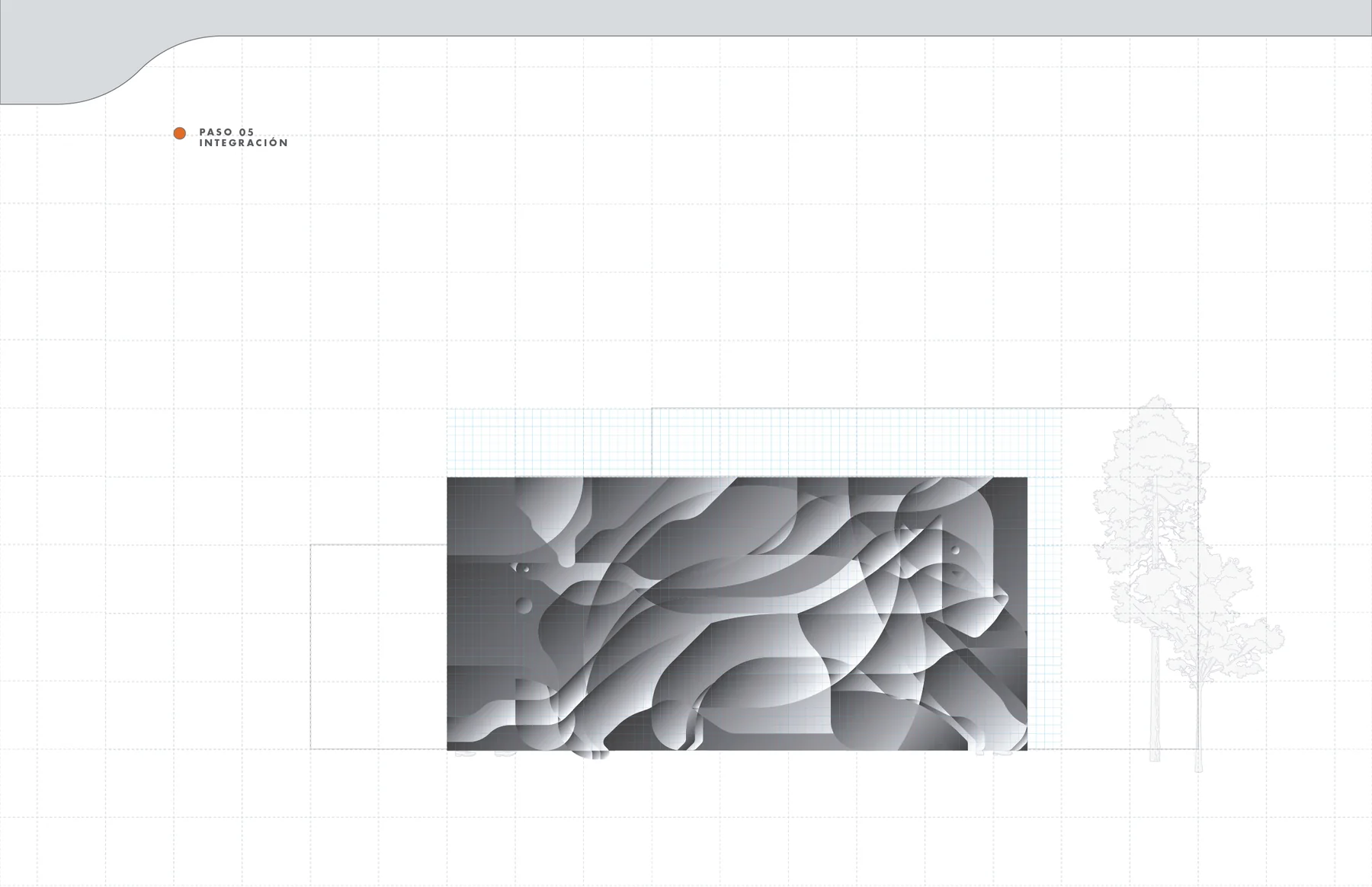
From structure to atmosphereDe la estructura a la atmósfera
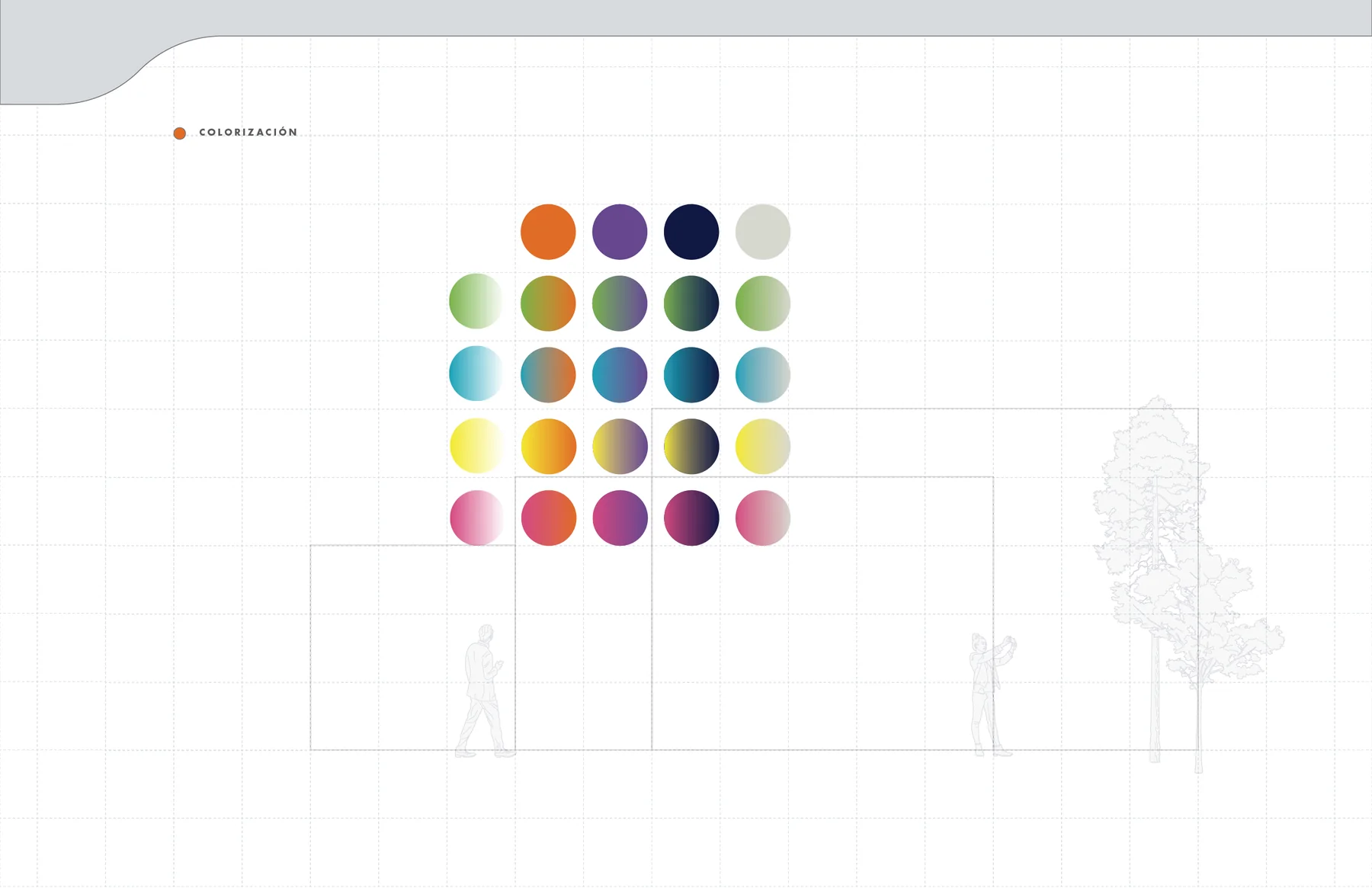
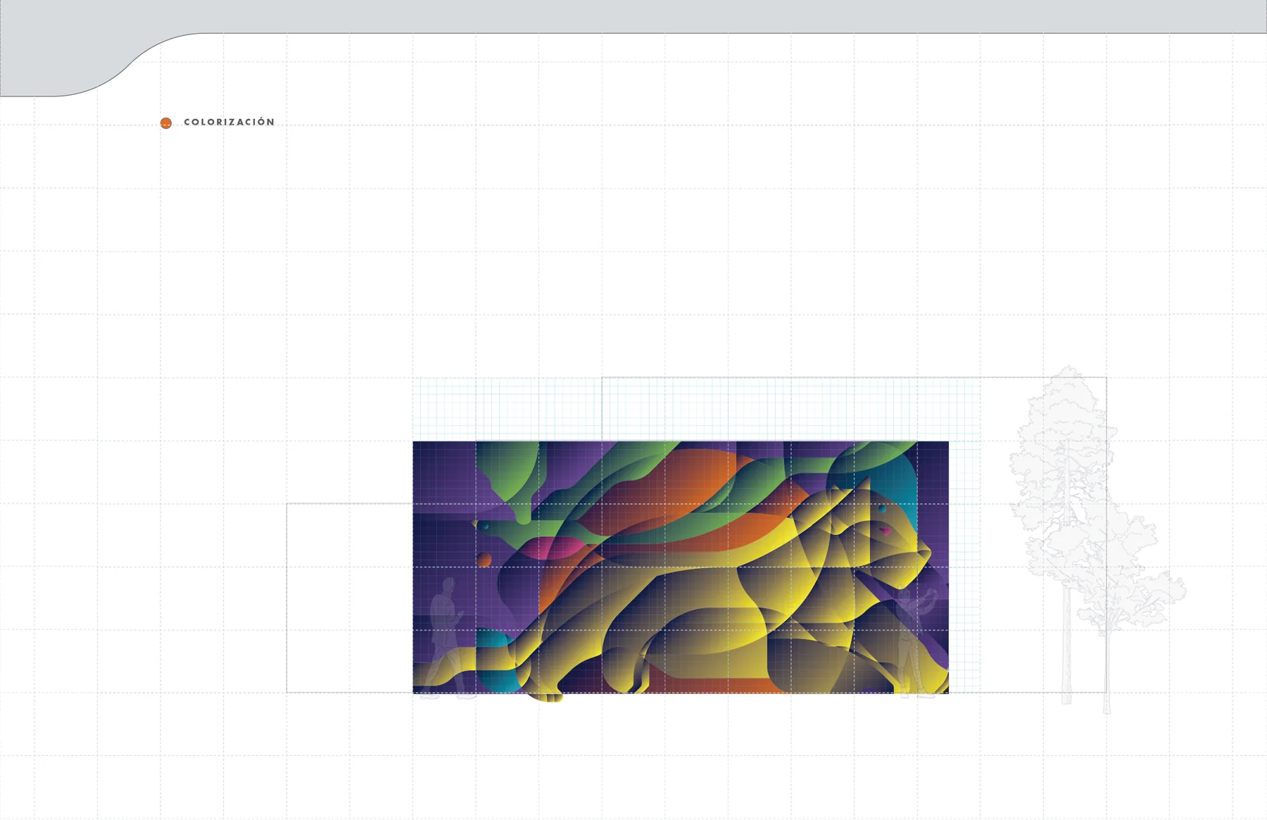
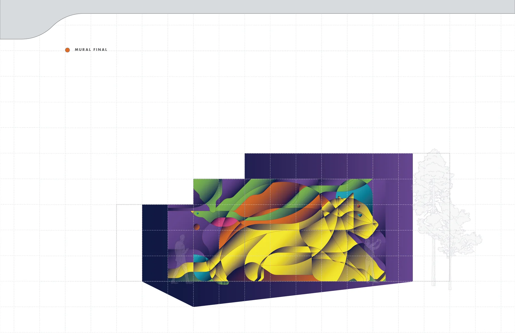
Color is introduced as another layer of depth. High-contrast combinations and translucent overlaps separate the planes while preserving the geometry, turning the drawing into a more kinetic image capable of holding a large wall.El color se introduce como una capa adicional de profundidad. Las combinaciones de alto contraste y las superposiciones translúcidas separan los planos sin perder la geometría, convirtiendo el dibujo en una imagen más cinética capaz de sostener un muro de gran formato.
Testing the idea at full scaleProbar la idea a escala real
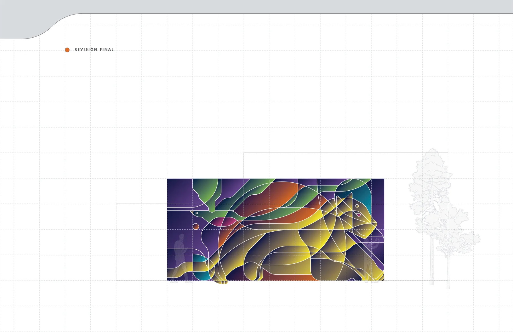
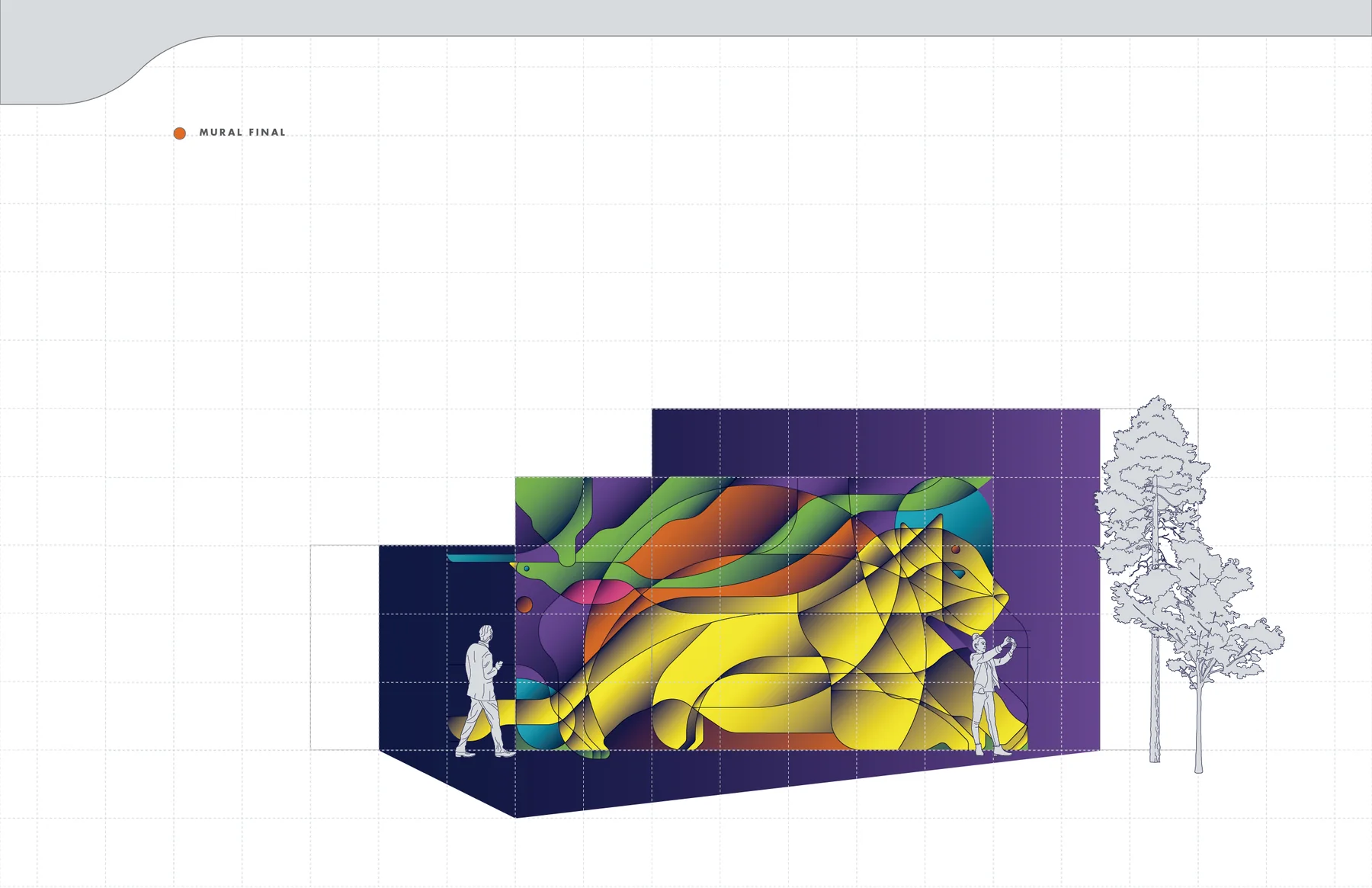
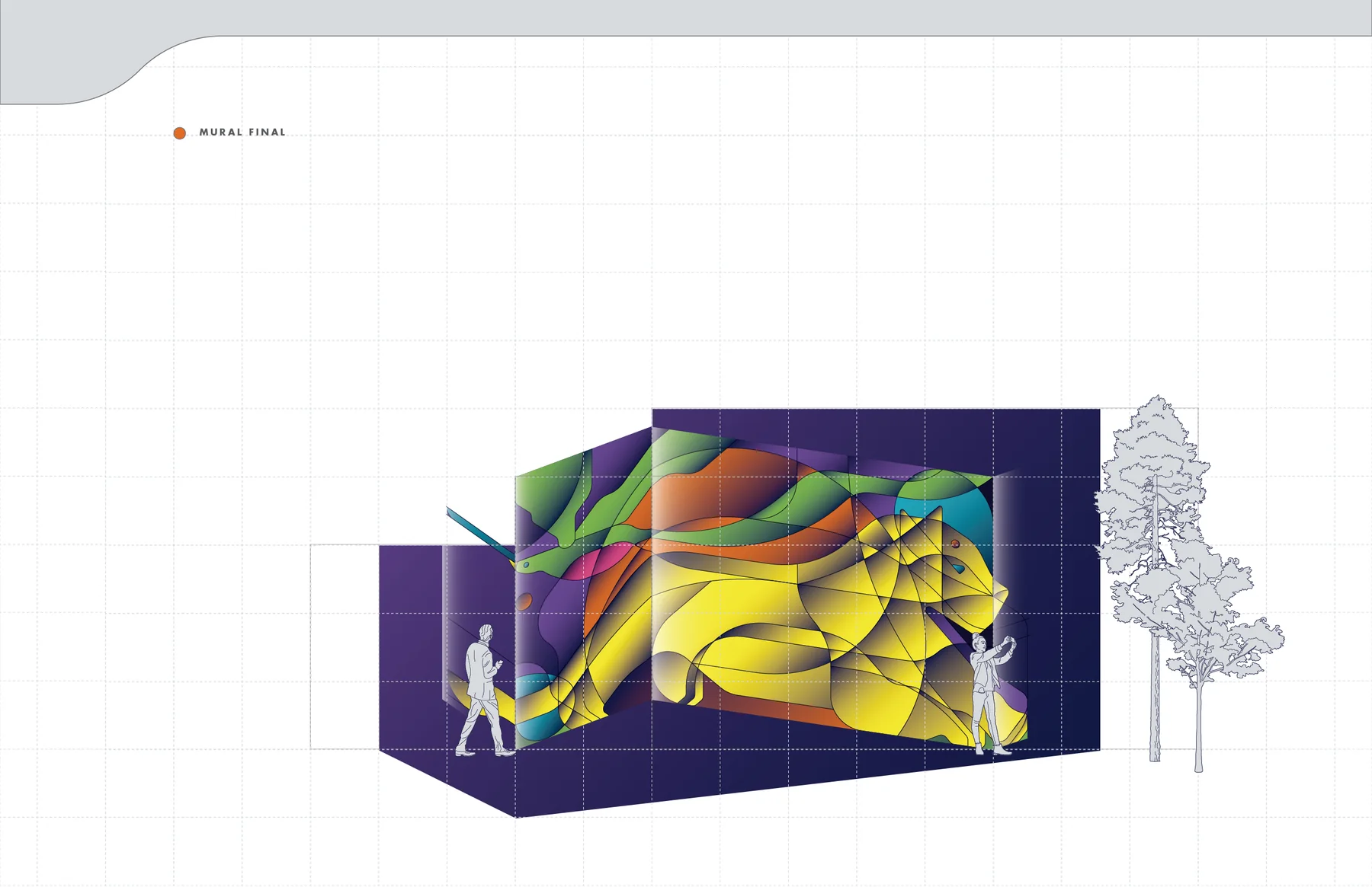
The final mockups return the artwork to the architecture. They test how the composition reads at a distance, how it interacts with circulation and how its color and geometry change the character of the wall without losing the original quetzal–jaguar concept.Los mockups finales devuelven la obra a la arquitectura. Permiten comprobar cómo se lee la composición a distancia, cómo interactúa con la circulación y cómo su color y geometría transforman el carácter del muro sin perder el concepto original quetzal–jaguar.
Quetzal / JaguarQuetzal / Jaguar
Removed from the presentation template, the final images reveal the illustration as an independent graphic piece: two animals translated into a shared system of line, volume and color.Fuera de la plantilla de presentación, las imágenes finales muestran la ilustración como una pieza gráfica independiente: dos animales traducidos a un mismo sistema de línea, volumen y color.
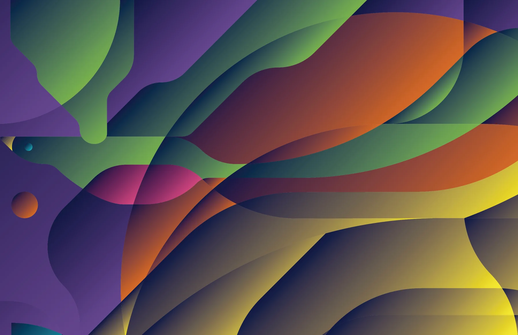
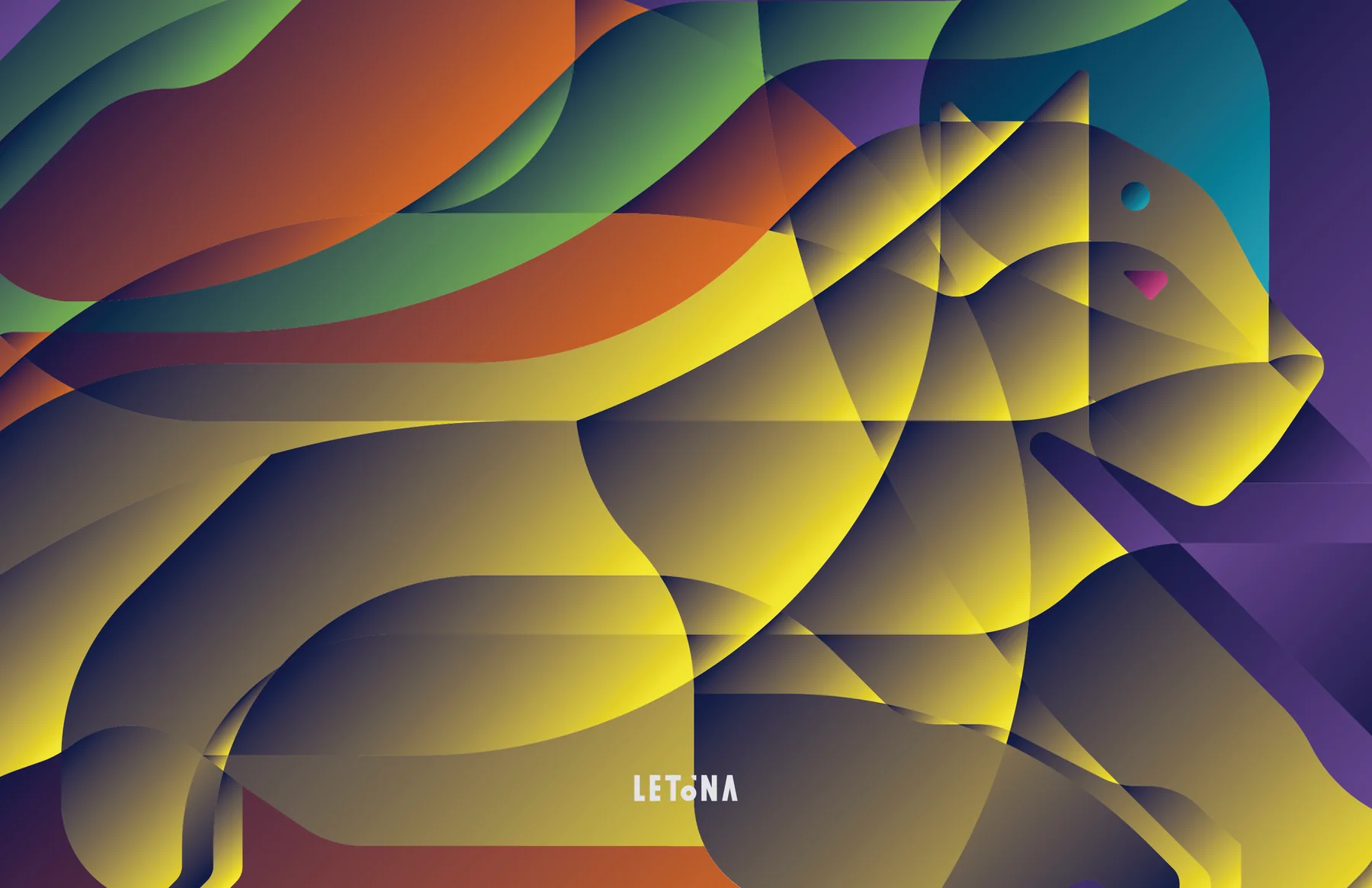
Concept proposal for Supermercados La Torre. The project was submitted as part of a call for mural proposals and was not selected for execution.Propuesta conceptual para Supermercados La Torre. El proyecto fue presentado como parte de una convocatoria de propuestas para mural y no fue seleccionado para ejecución.
MILCO
NERIMA
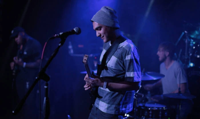
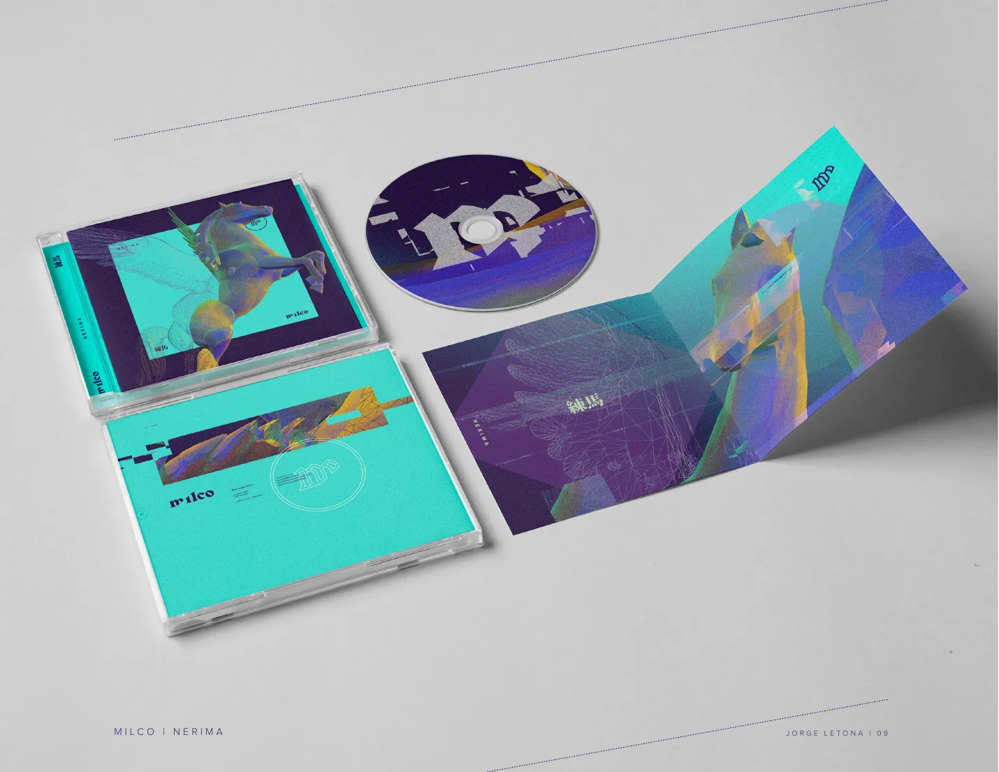
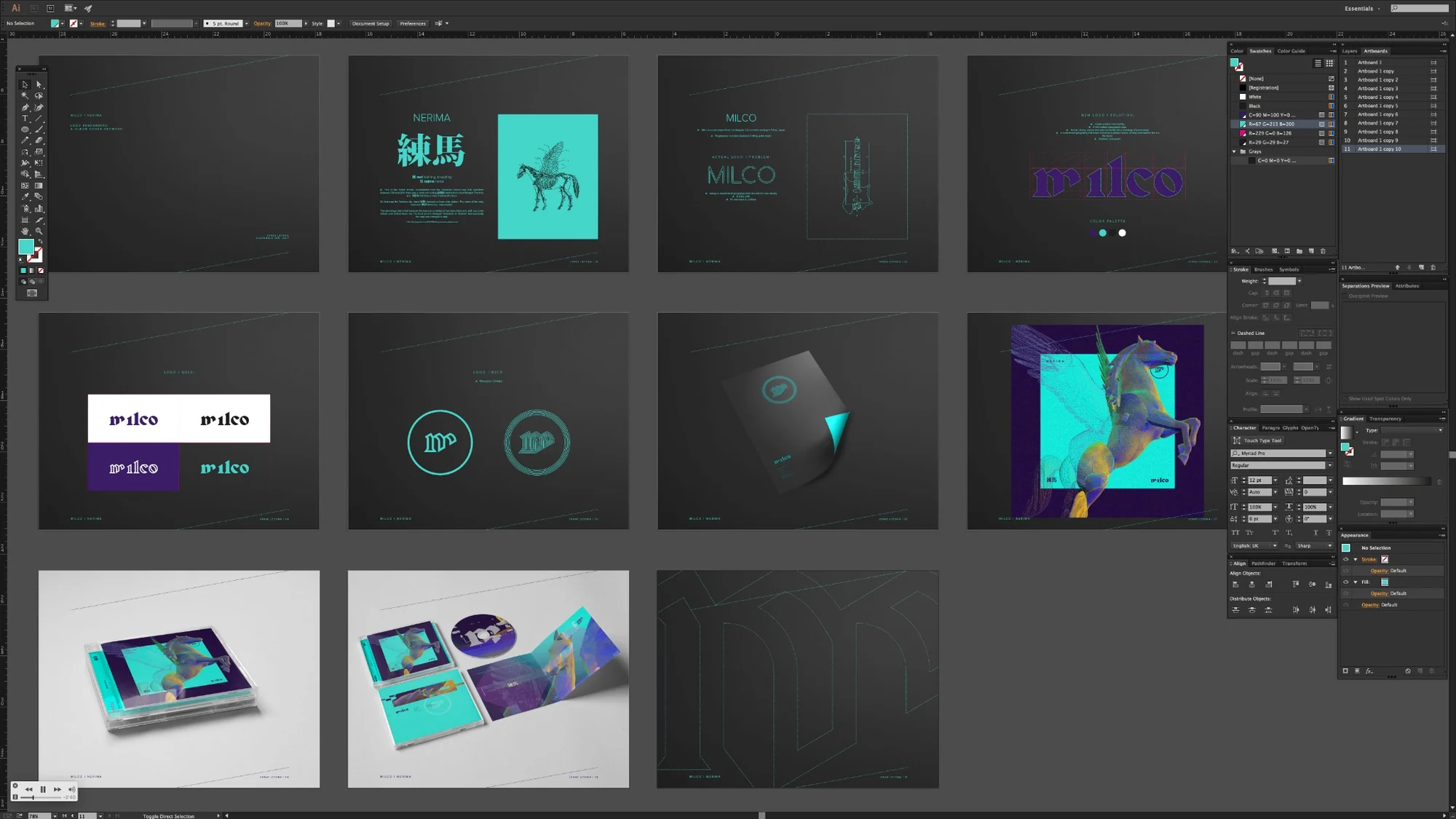
In January 2017 I developed a new visual identity and album artwork for MILCO's Nerima. The project began as a conversation with the musician and grew into a complete system: custom lettering, monogram, color, imagery and a physical CD edition.En enero de 2017 desarrollé una nueva identidad visual y el arte del álbum Nerima de MILCO. El proyecto comenzó como una conversación con el músico y creció hasta convertirse en un sistema completo: lettering personalizado, monograma, color, imagen y una edición física en CD.
Rather than designing a cover first and explaining it later, the visual language came directly from the brief, the meaning of Nerima and the character of the music.En lugar de diseñar primero una portada y explicarla después, el lenguaje visual surgió directamente del brief, del significado de Nerima y del carácter de la música.
Understanding the musicianEntender al músico
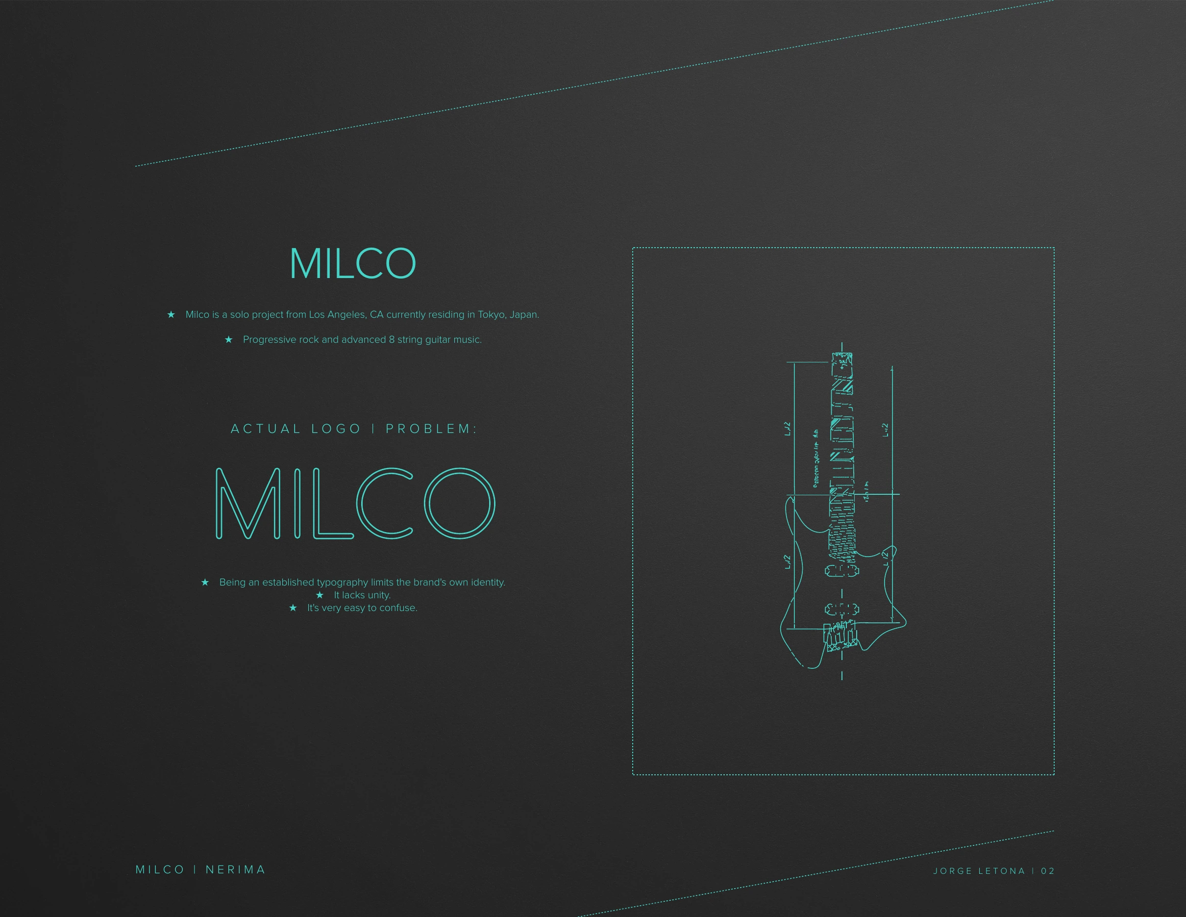
The project started with questions, not images. A short brief explored the music, the album title, formats, color, references and the existing identity. The answers established the territory: progressive rock / advanced guitar music, a five-song album called Nerima, digital and physical releases, and a preference for teal or purple.El proyecto comenzó con preguntas, no con imágenes. Un breve brief exploró la música, el nombre del álbum, los formatos, el color, las referencias y la identidad existente. Las respuestas definieron el territorio: progressive rock / advanced guitar music, un álbum de cinco canciones llamado Nerima, lanzamiento digital y físico, y una preferencia por teal o púrpura.
The name becomes an imageEl nombre se convierte en imagen
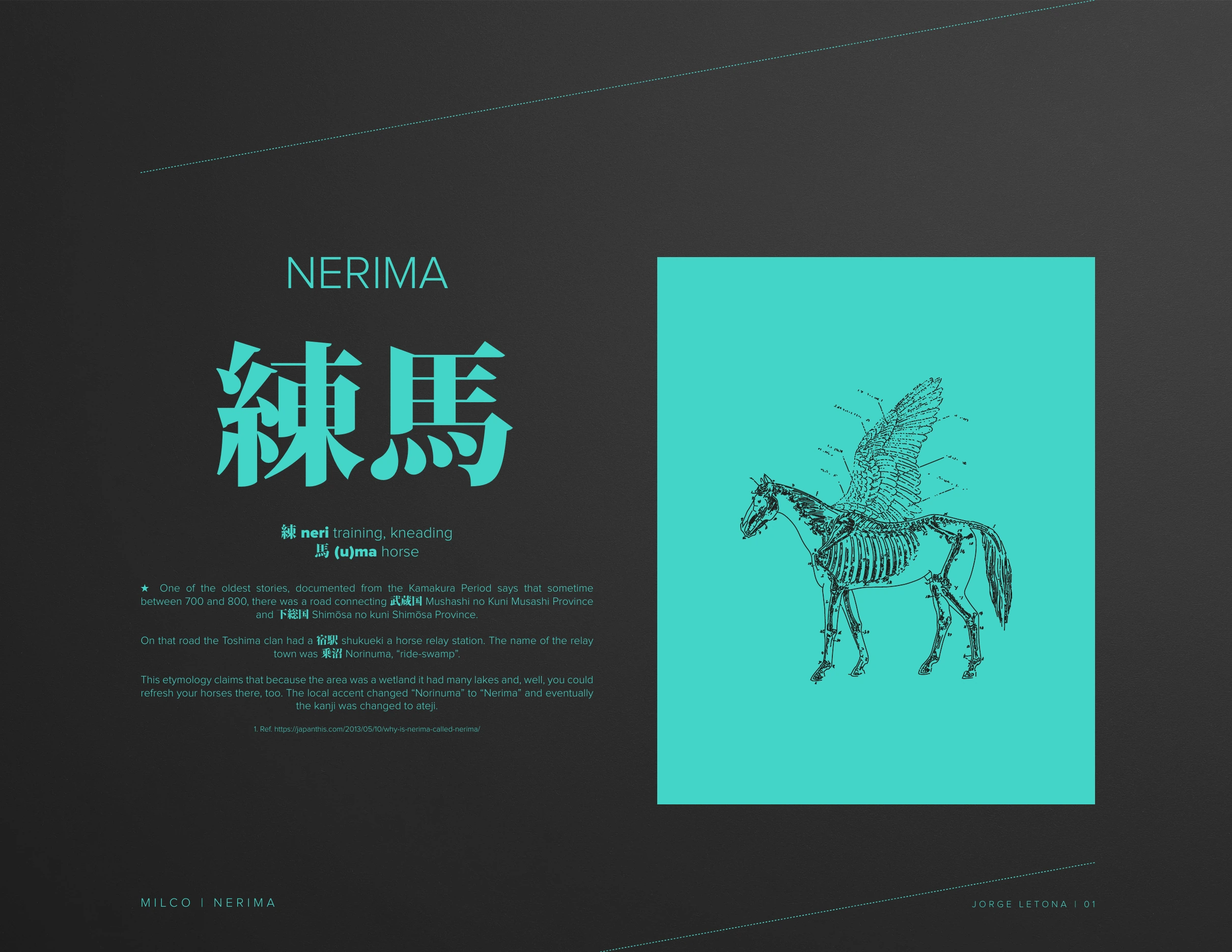
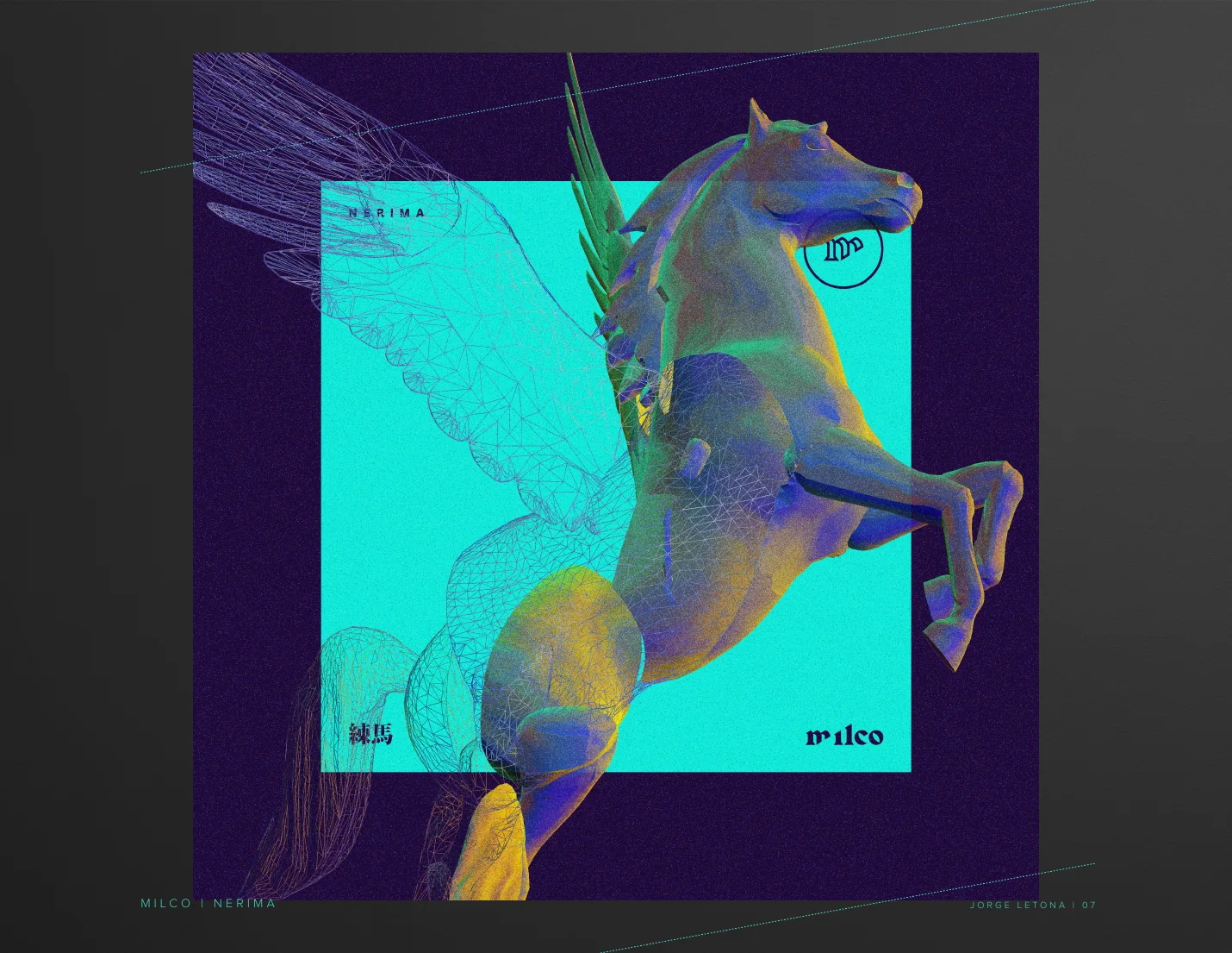
Research into the name Nerima led to an old account connecting the place with a horse relay station. That association became the conceptual bridge between the album title and its central image. The horse grows from the name itself rather than being added as decoration.La investigación sobre el nombre Nerima llevó a un antiguo relato que relaciona el lugar con una estación de relevo de caballos. Esa asociación se convirtió en el puente conceptual entre el título del álbum y su imagen central. El caballo nace del propio nombre en lugar de añadirse como decoración.
A mark built for the musicUna marca construida para la música
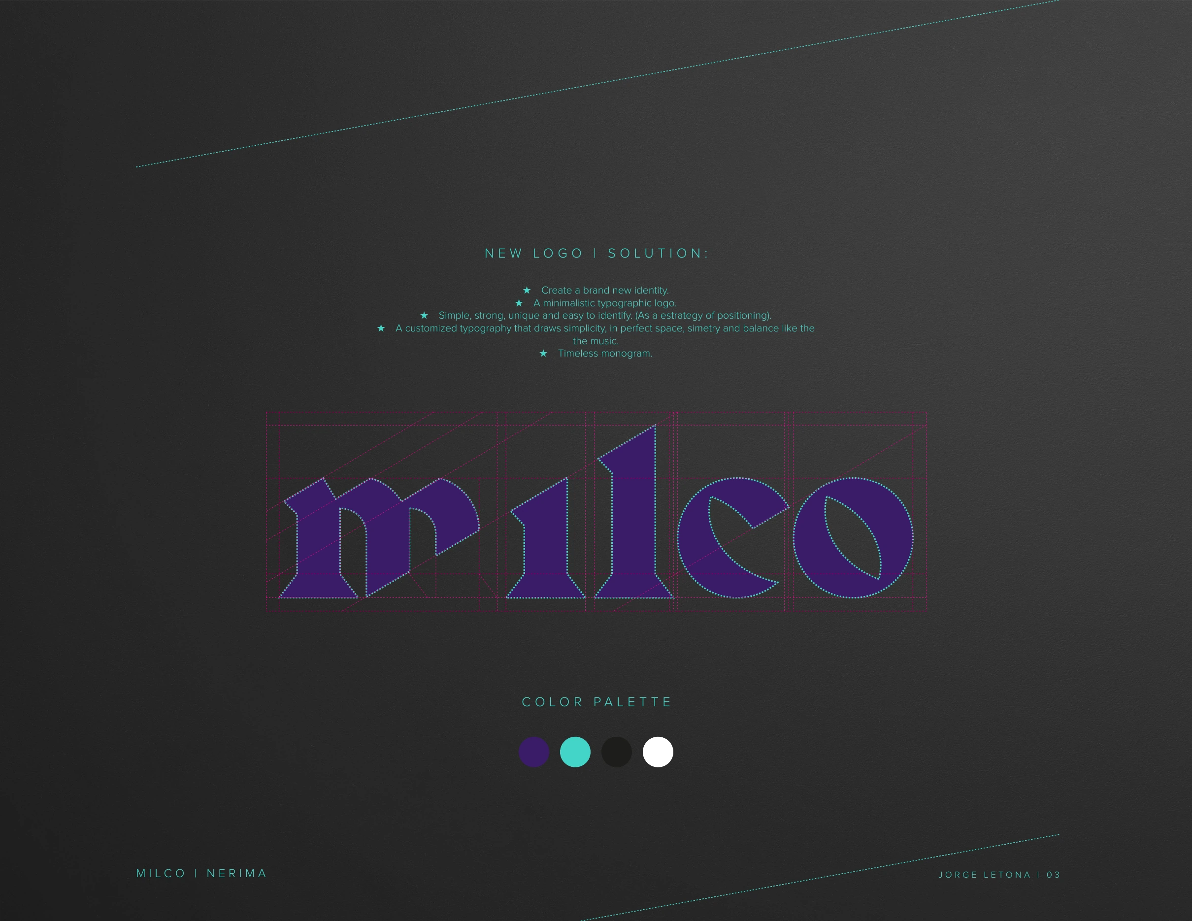
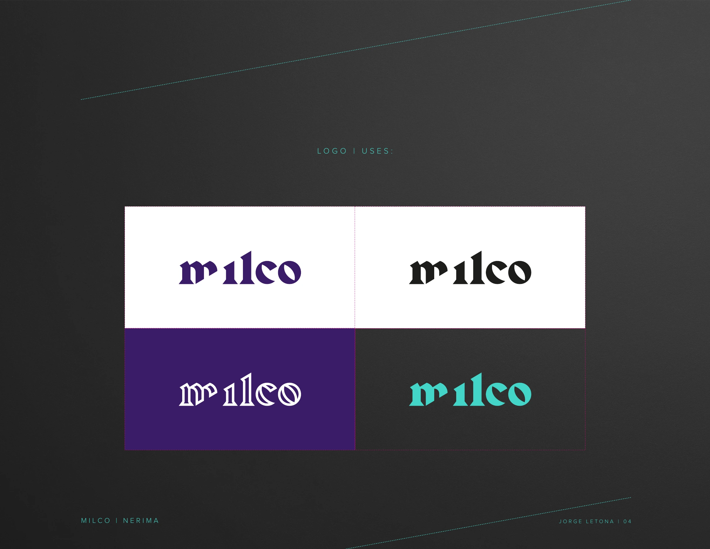
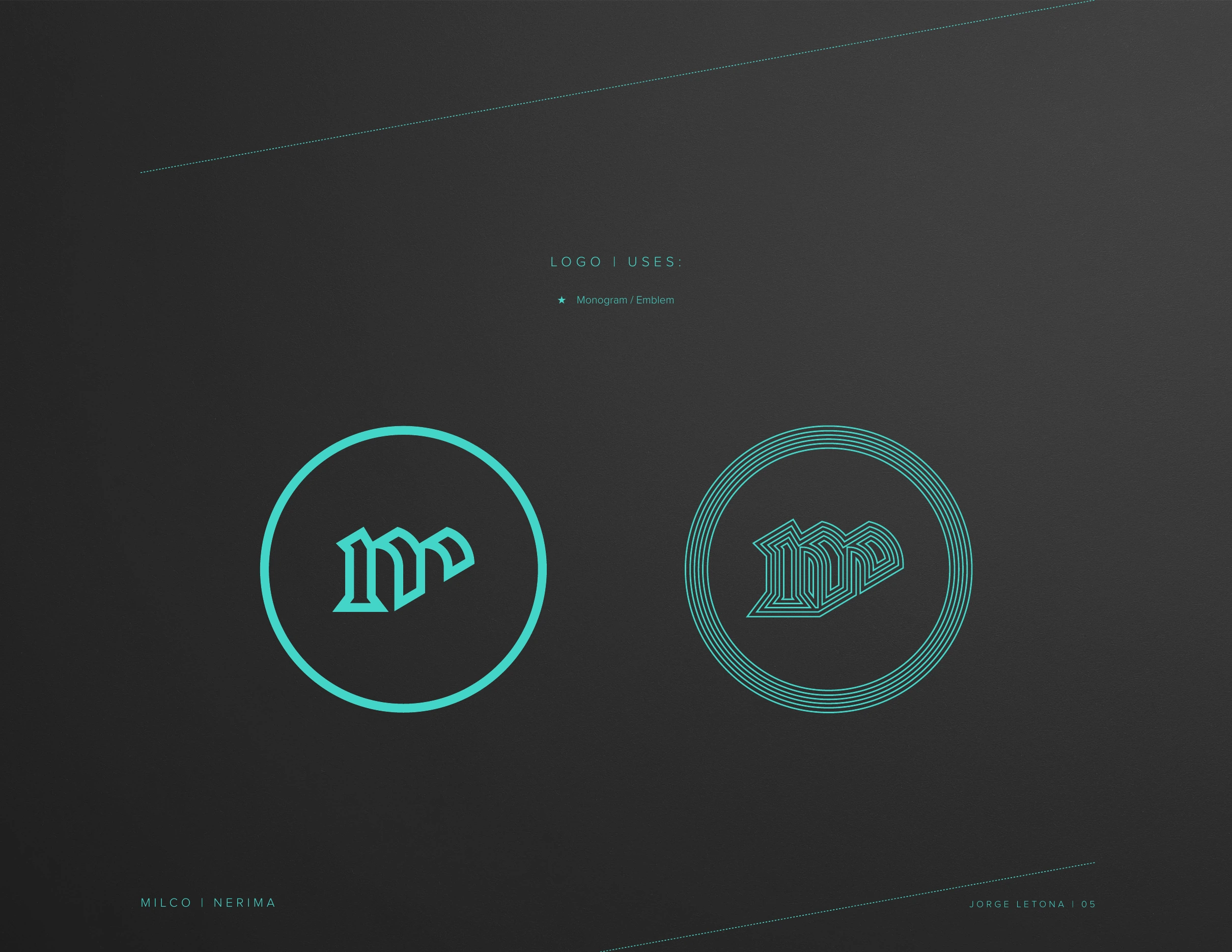
The MILCO name was retained, but its identity was rebuilt around custom typography: a simpler, stronger wordmark with controlled spacing, symmetry and balance, accompanied by a compact monogram able to work independently.Se conservó el nombre MILCO, pero su identidad se reconstruyó alrededor de una tipografía personalizada: un wordmark más simple y fuerte, con espaciado, simetría y balance controlados, acompañado por un monograma compacto capaz de funcionar de manera independiente.
Geometry, color and distortionGeometría, color y distorsión
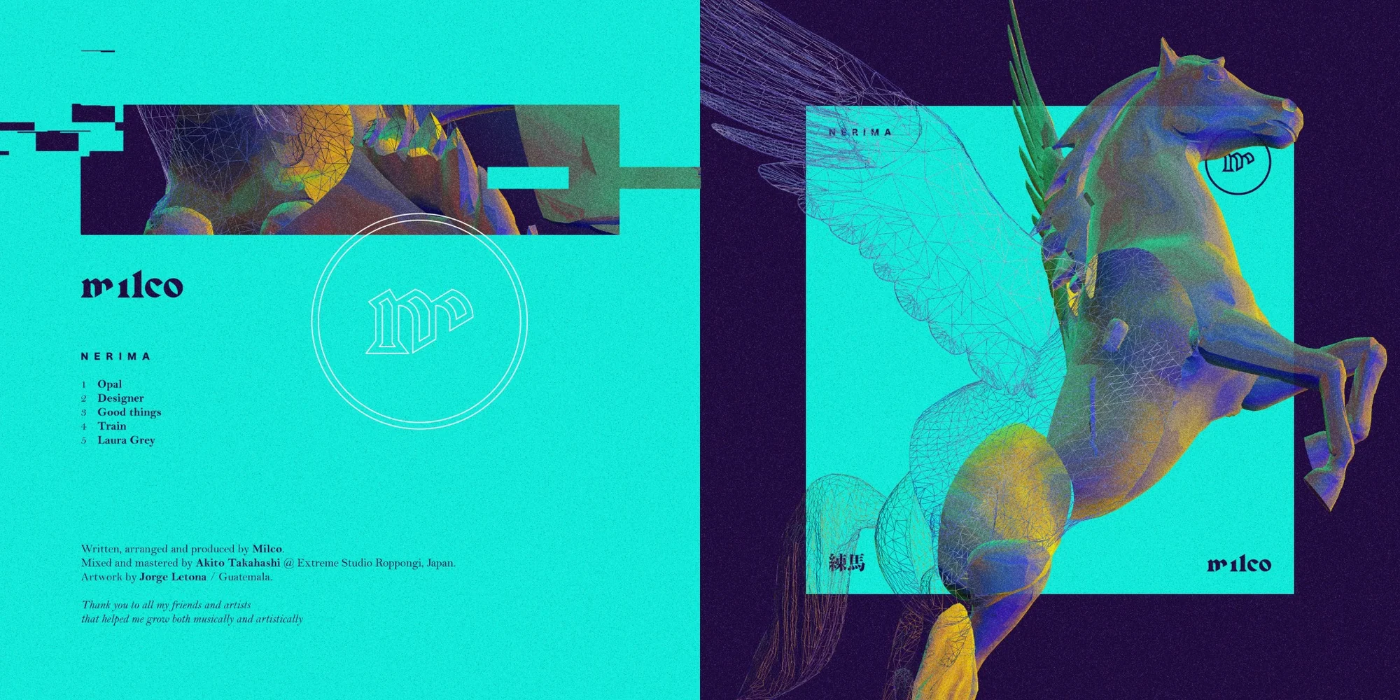
The custom identity meets a reconstructed horse, wireframe structures and layered digital color. Teal and purple—already present in the initial conversation—dominate the system, while fragmentation and geometric overlays connect the image to the technical character of the music without illustrating it literally.La identidad personalizada se encuentra con un caballo reconstruido, estructuras wireframe y capas de color digital. El teal y el púrpura —presentes desde la conversación inicial— dominan el sistema, mientras la fragmentación y las superposiciones geométricas conectan la imagen con el carácter técnico de la música sin ilustrarla literalmente.
From identity to objectDe identidad a objeto
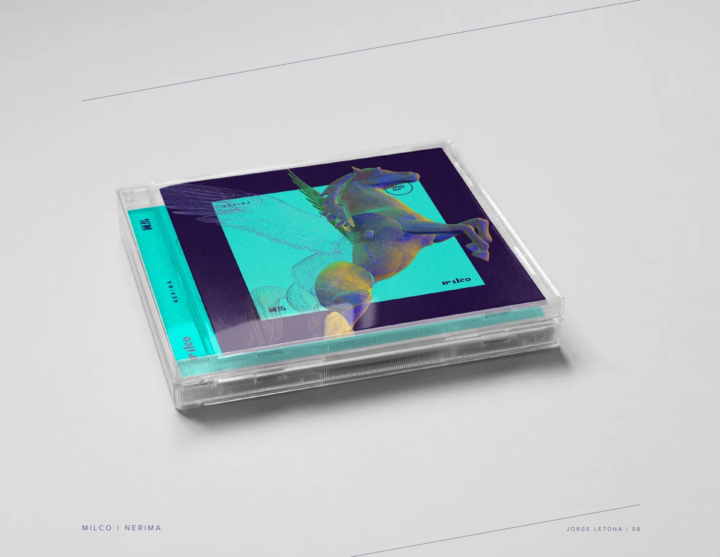
The system was conceived beyond a square digital cover. It extends across front and back, disc, booklet and packaging, allowing the horse, typography and geometric textures to change scale while remaining part of the same visual world.El sistema fue concebido más allá de una portada digital cuadrada. Se extiende al frente y reverso, disco, booklet y empaque, permitiendo que el caballo, la tipografía y las texturas geométricas cambien de escala sin abandonar el mismo universo visual.
Nerima
The visual identity was created to accompany the music. The video remains here as part of the project archive.La identidad visual fue creada para acompañar la música. El video permanece aquí como parte del archivo del proyecto.
BRAD
ELECTRO
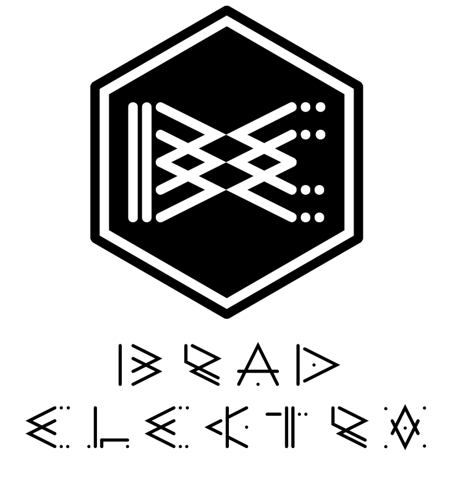
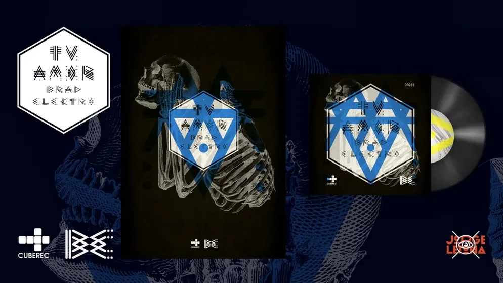
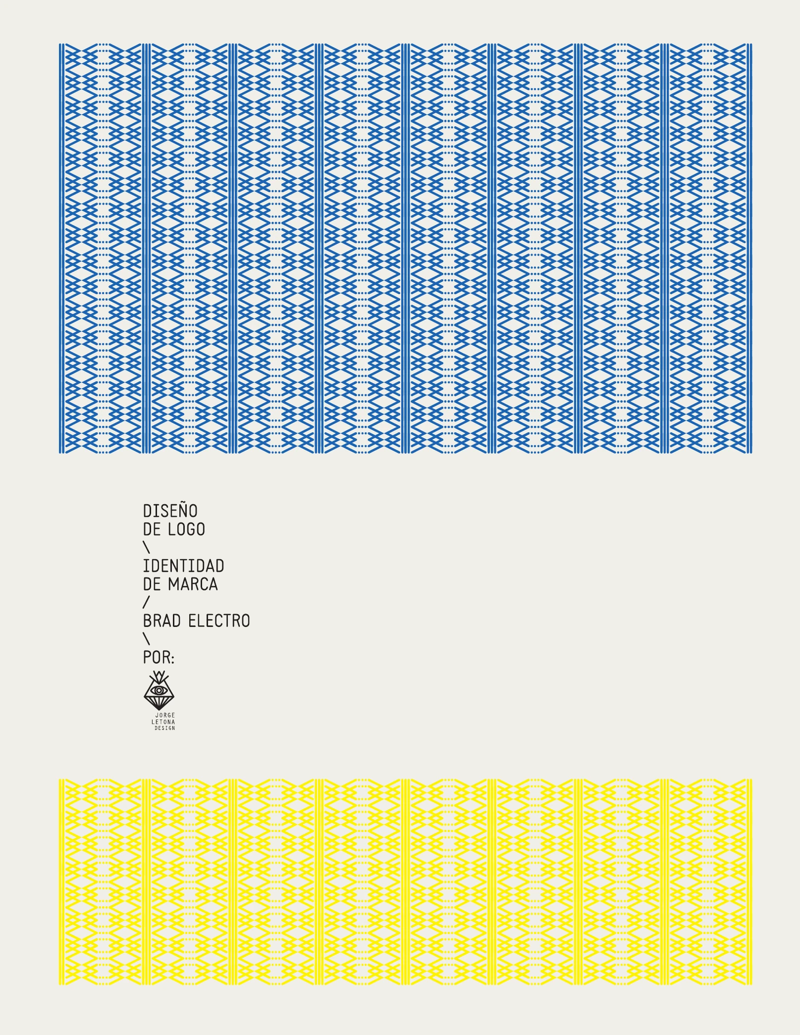
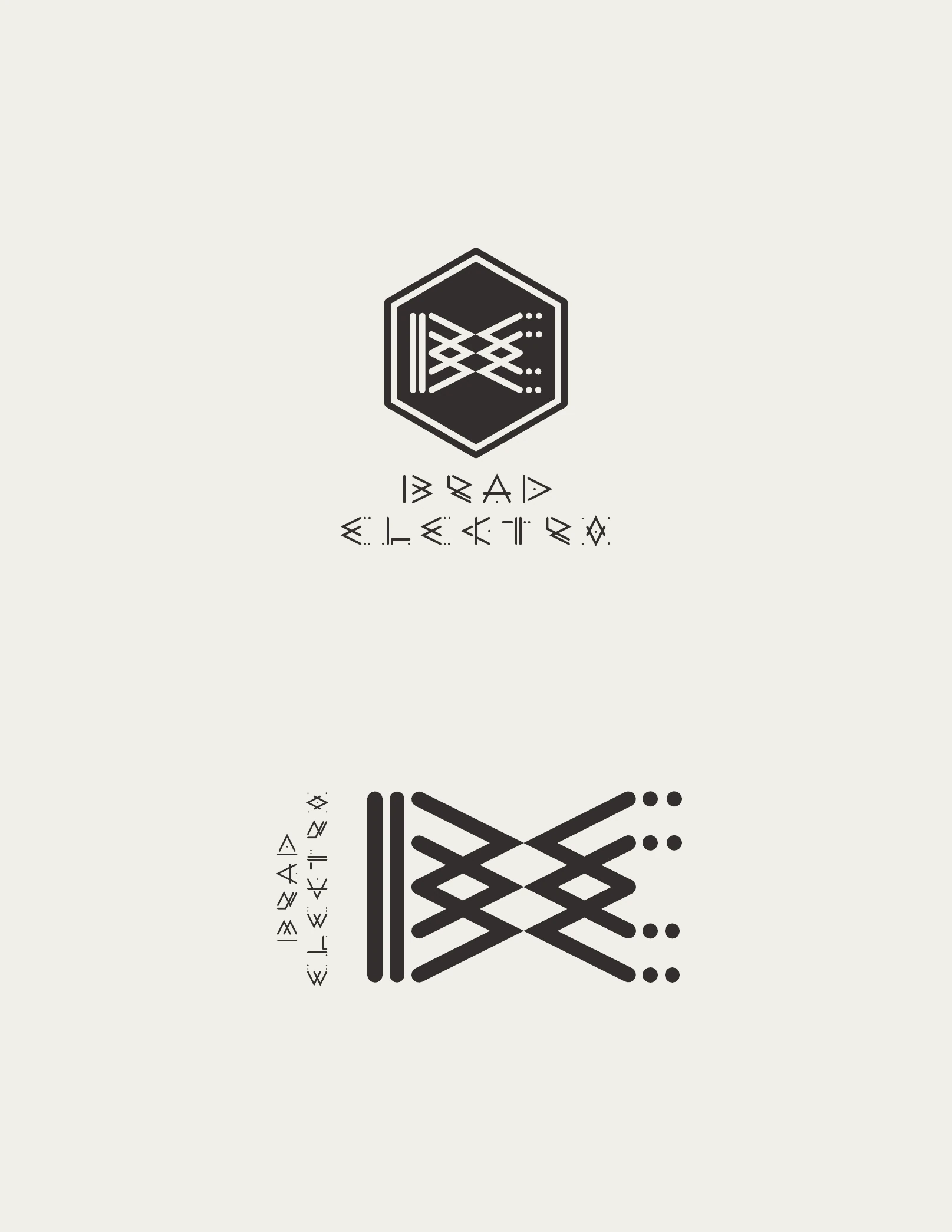
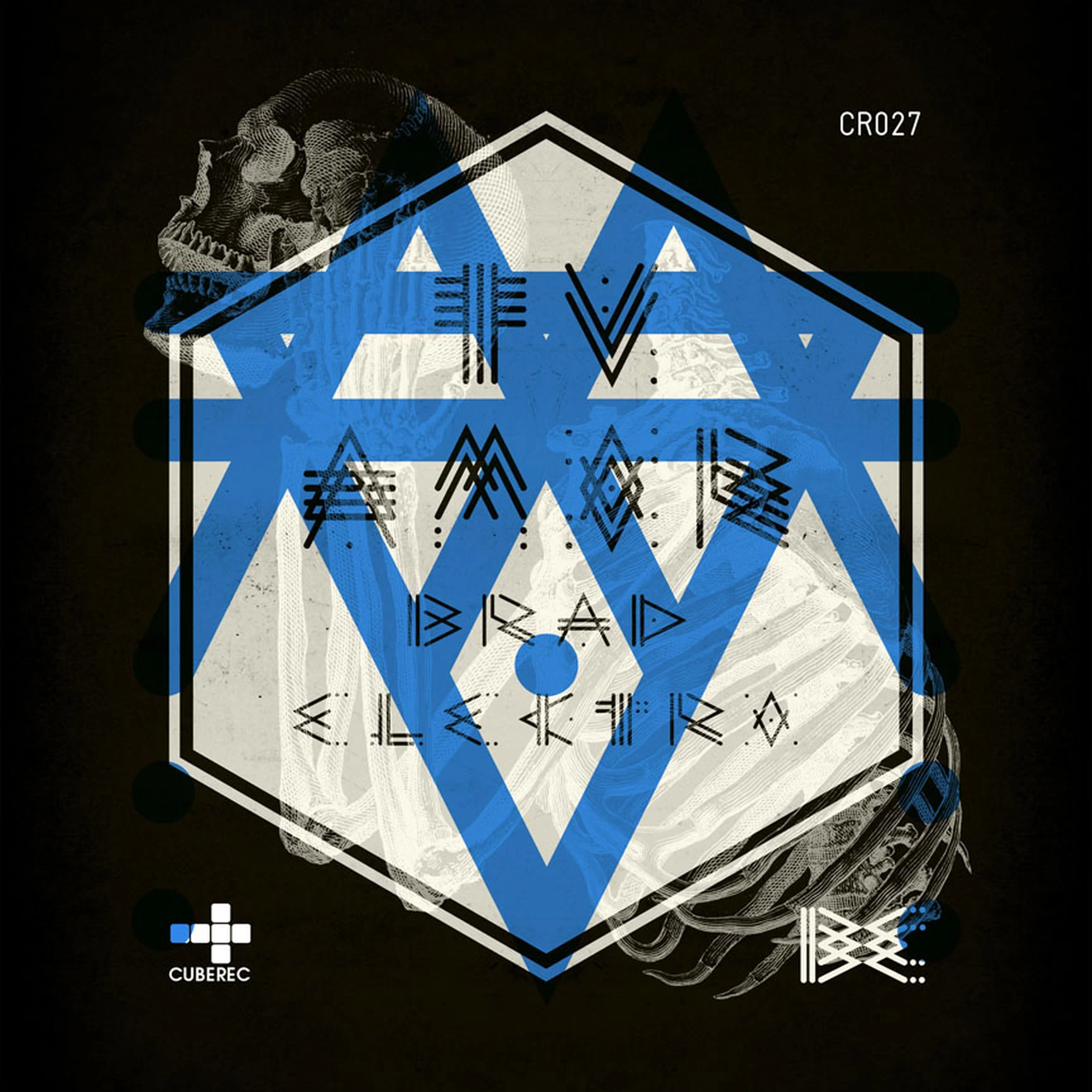
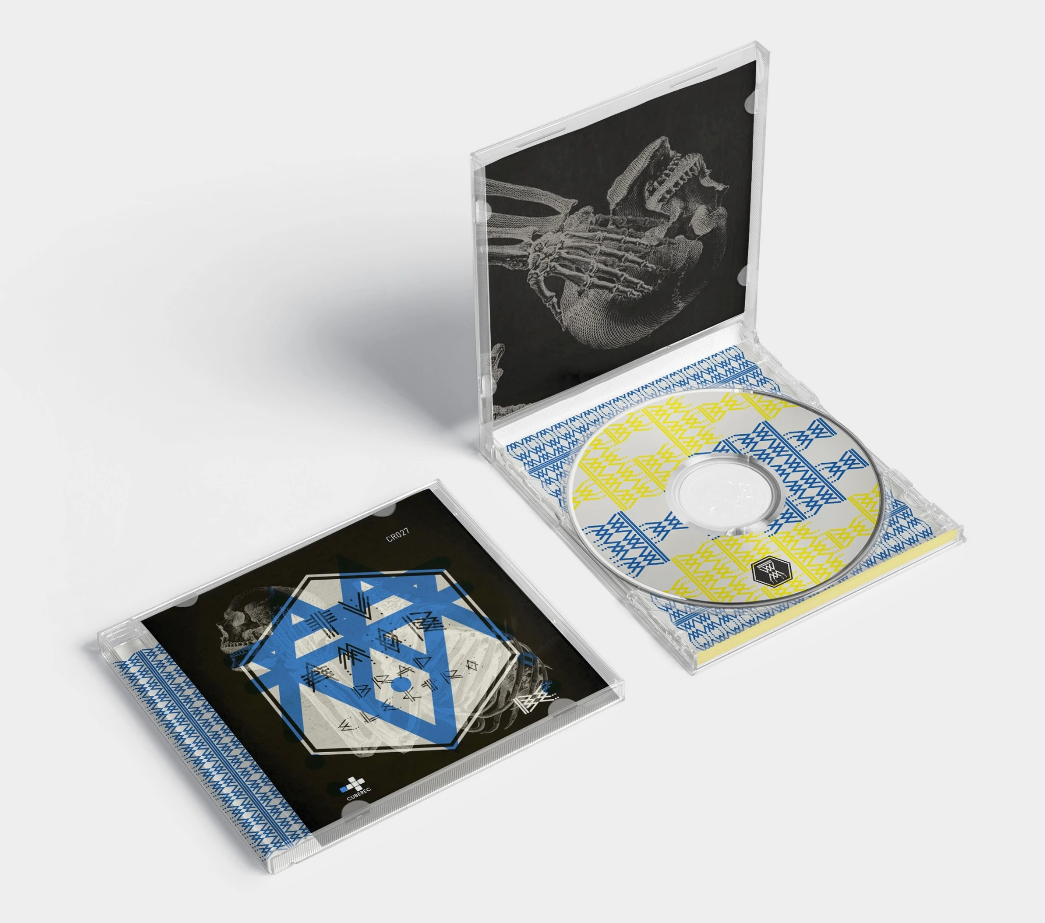
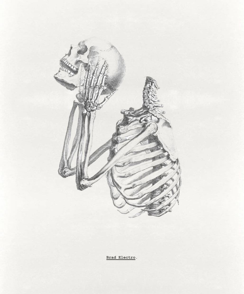
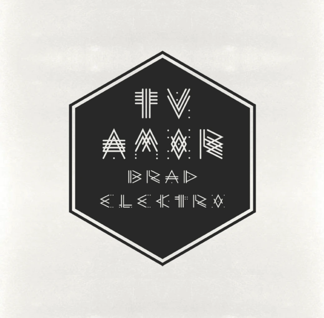
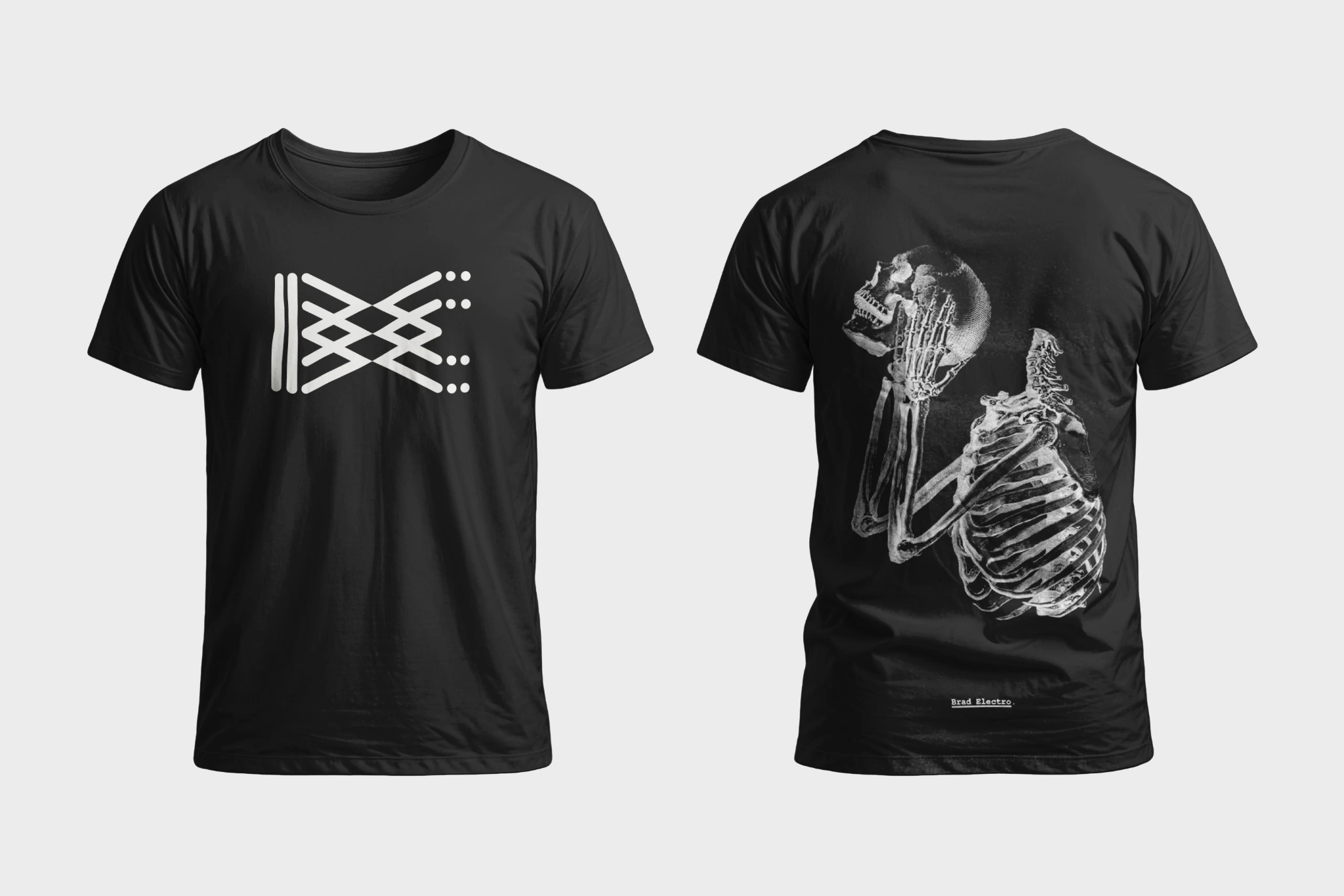
A visual identity developed for Brad Electro through a modular system of custom signs, geometric lettering and repeated linear structures. The language later expanded into the artwork for “Tu Amor”, connecting the artist’s identity with cover art, poster and apparel.Una identidad visual desarrollada para Brad Electro a partir de un sistema modular de signos personalizados, lettering geométrico y estructuras lineales repetitivas. El lenguaje se extendió después al arte de “Tu Amor”, conectando la identidad del artista con portada, póster y prendas.
BradElectro
BradElectro is an electronic music artist with roots in Chicago’s music and art scene. After studying art, he moved toward electronic music as another form of creative expression. By 2010 he had spent more than seven years performing live electronic music in clubs, underground parties and unconventional spaces, with residencies in Oakland and San Francisco. His music combines a strong interest in vocals and melody with a more experimental side influenced by his Chicago roots.BradElectro es un artista de música electrónica con raíces en la escena artística y musical de Chicago. Después de estudiar arte, encontró en la música electrónica otra forma de expresión creativa. Para 2010 llevaba más de siete años presentando música electrónica en vivo en clubes, fiestas underground y espacios poco convencionales, con residencias en Oakland y San Francisco. Su música combina un marcado interés por las voces y la melodía con un lado más experimental influenciado por sus raíces en Chicago.
A language made from linesUn lenguaje construido con líneas
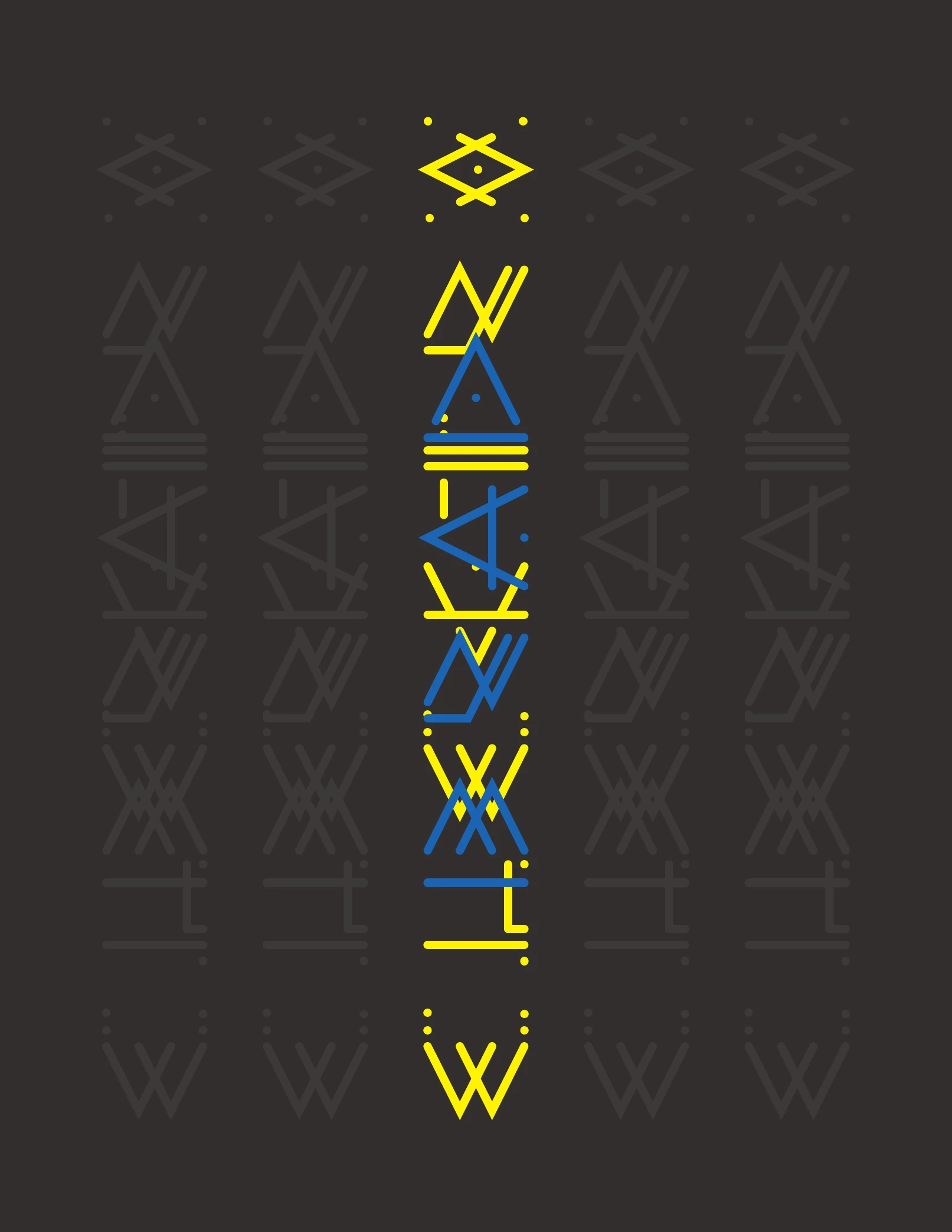
The identity is built from a reduced vocabulary of strokes, crossings and dots. Instead of relying on a conventional wordmark, the same construction logic generates the Brad Electro symbol, letterforms and repeating graphic structures.La identidad se construye con un vocabulario reducido de trazos, cruces y puntos. En lugar de depender de un logotipo convencional, la misma lógica constructiva genera el símbolo de Brad Electro, las letras y las estructuras gráficas repetitivas.
Signs become an alphabetLos signos se convierten en alfabeto
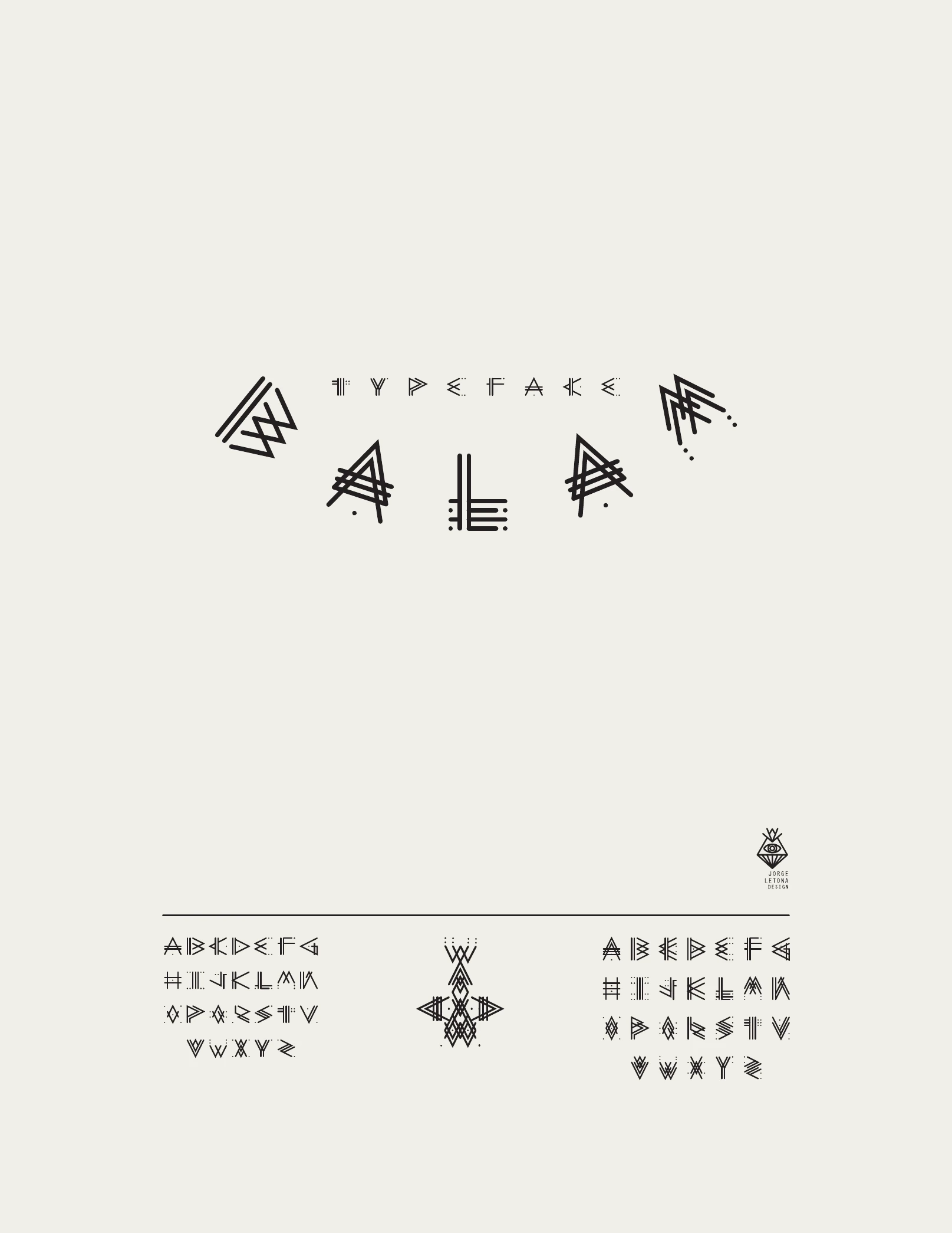
The modular construction expands into a custom display alphabet. Each character keeps the same thin-line geometry and small dot details, allowing typography to function as part of the identity rather than as a separate layer.La construcción modular se expande en un alfabeto display personalizado. Cada carácter conserva la misma geometría lineal y los pequeños detalles de puntos, permitiendo que la tipografía funcione como parte de la identidad y no como una capa separada.
From mark to patternDe marca a patrón
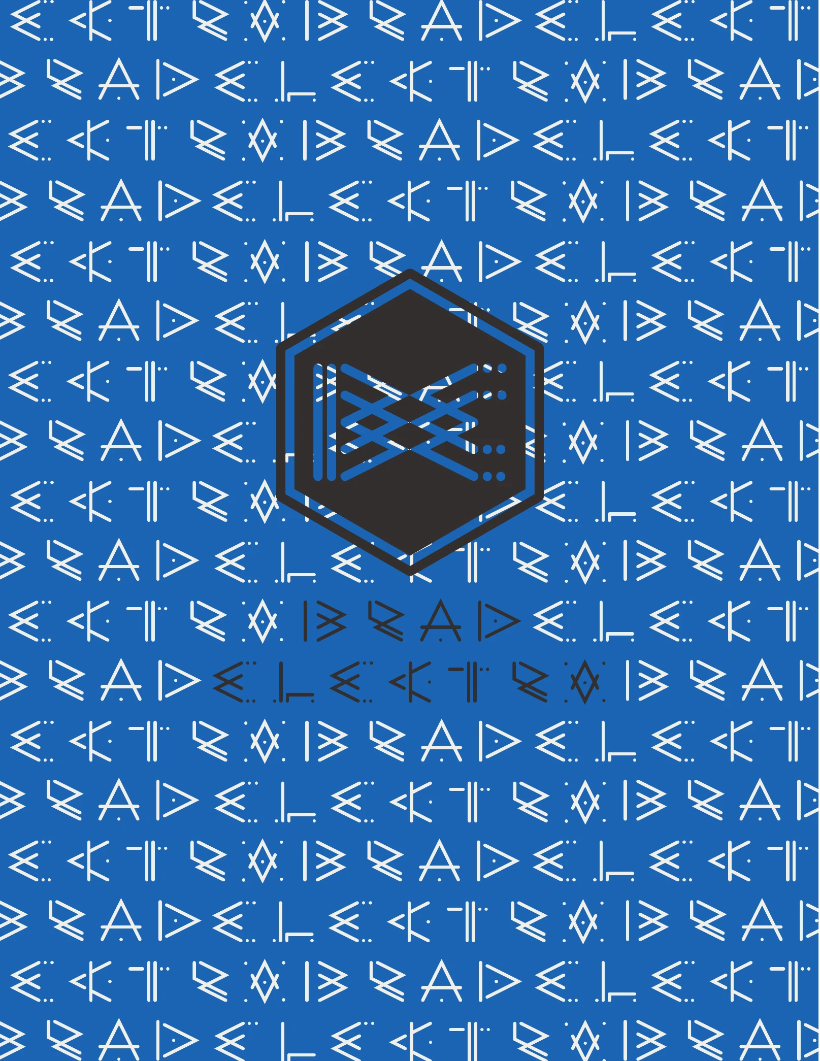
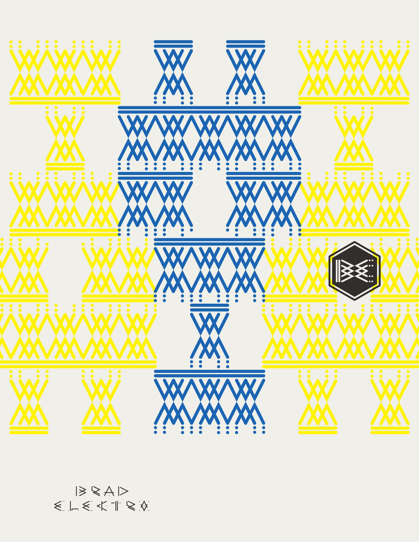
Repetition turns the individual marks into dense patterns and larger compositions. Blue, yellow, black and off-white create a flexible field in which the identity can shift between a compact emblem and an all-over texture.La repetición transforma los signos individuales en patrones densos y composiciones mayores. Azul, amarillo, negro y blanco cálido crean un campo flexible donde la identidad puede pasar de un emblema compacto a una textura completa.
Identity in motionLa identidad en movimiento
For “Tu Amor”, the system moves into a more expressive visual world. Anatomical imagery, geometric forms and the custom lettering are layered into the release artwork, while the same vocabulary extends into poster and apparel applications.Para “Tu Amor”, el sistema entra en un universo visual más expresivo. Imágenes anatómicas, formas geométricas y el lettering personalizado se superponen en el arte del lanzamiento, mientras el mismo vocabulario se extiende al póster y a las prendas.
TYPE
STUDIES
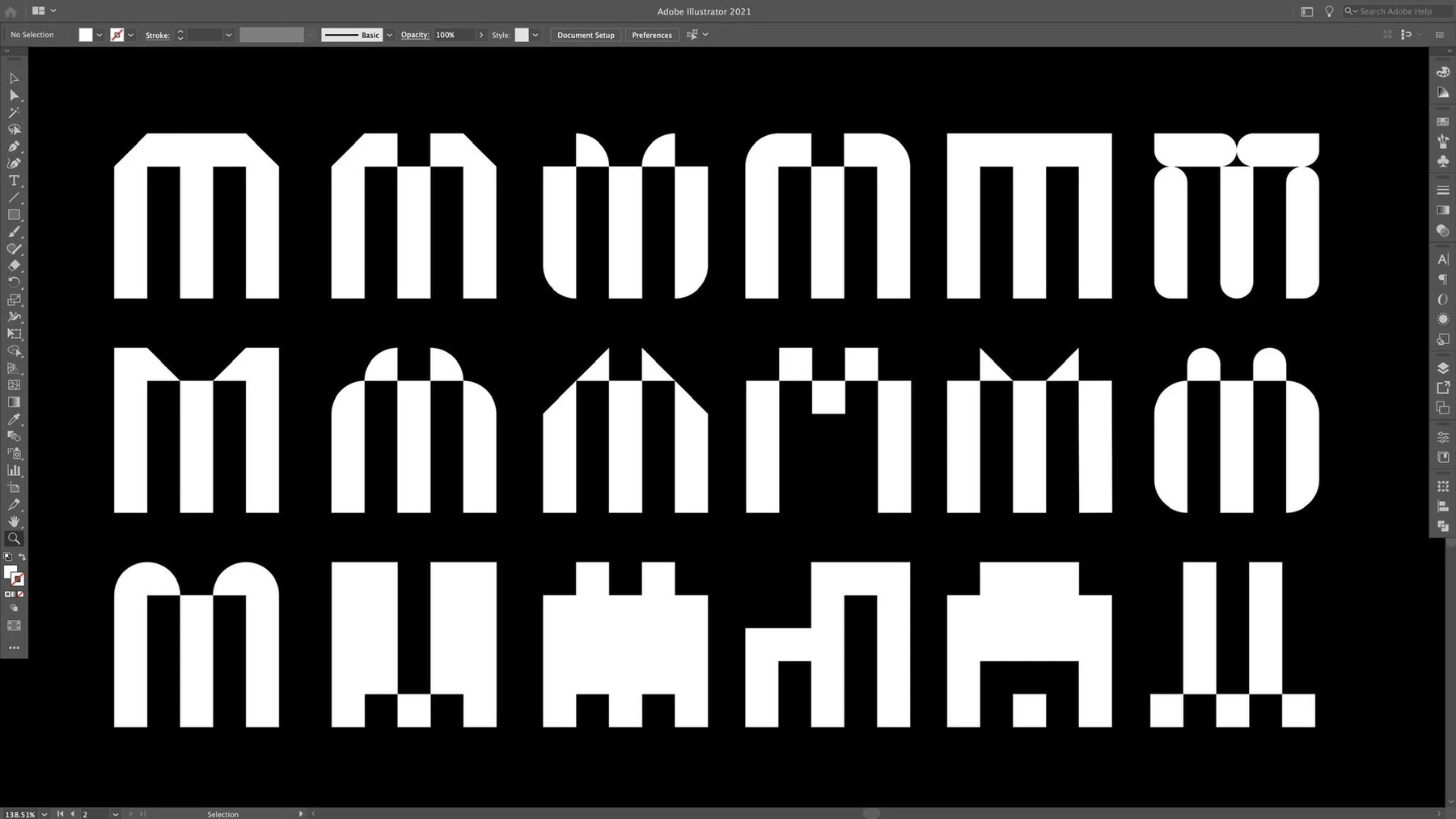
A working archive of custom alphabets, lettering systems and typographic experiments organized by project.
Un archivo de trabajo de alfabetos personalizados, sistemas de lettering y experimentos tipográficos organizado por proyecto.
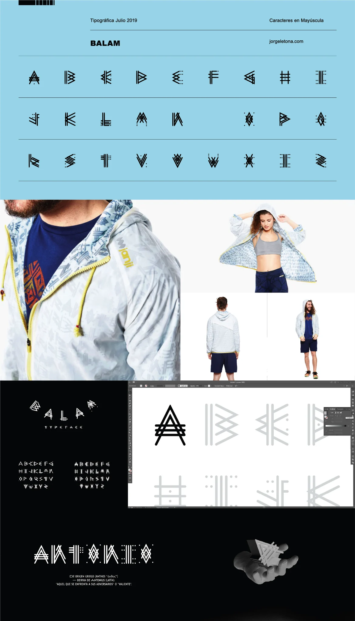
BALAM
A display-type study centered on angular construction, symbol-like forms and high-impact applications.
Un estudio tipográfico display centrado en la construcción angular, las formas de carácter simbólico y las aplicaciones de alto impacto.
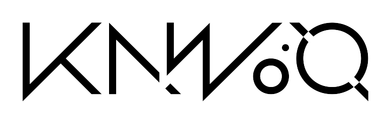
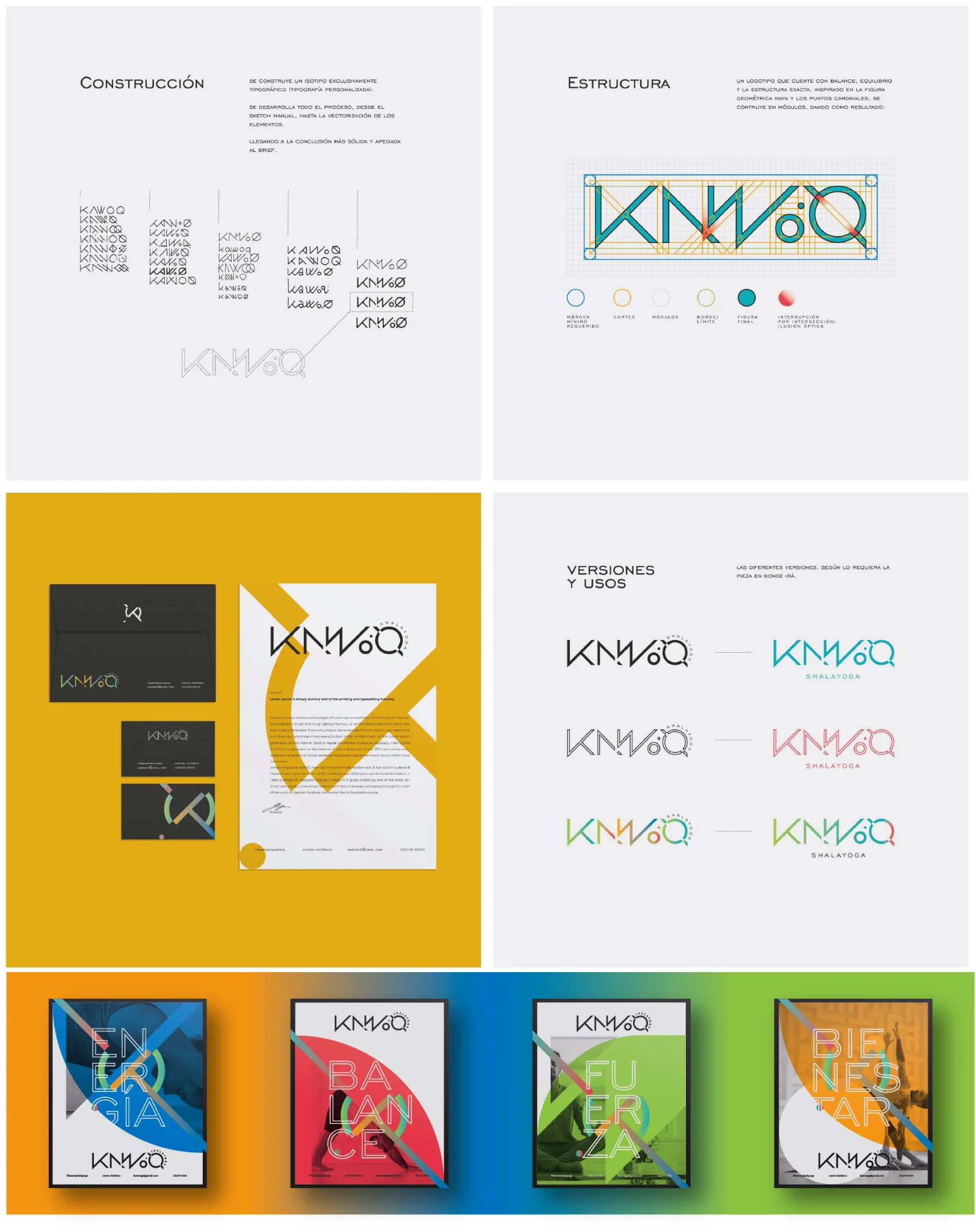
KAWOQ
A modular typographic system explored through construction studies, alternate forms and visual applications.
Un sistema tipográfico modular explorado mediante estudios de construcción, formas alternas y aplicaciones visuales.
ARQUITLÁN
A geometric custom alphabet developed as part of the visual identity for Arquitlán, an architecture and construction practice based in Sololá, Guatemala. The system extends the logo’s structural logic into regular and bold display alphabets.
Un alfabeto geométrico personalizado desarrollado como parte de la identidad visual de Arquitlán, estudio de arquitectura y construcción con sede en Sololá, Guatemala. El sistema extiende la lógica estructural del logotipo hacia alfabetos display regular y bold.
ARQUITLÁN ON FACEBOOK → ARQUITLÁN EN FACEBOOK →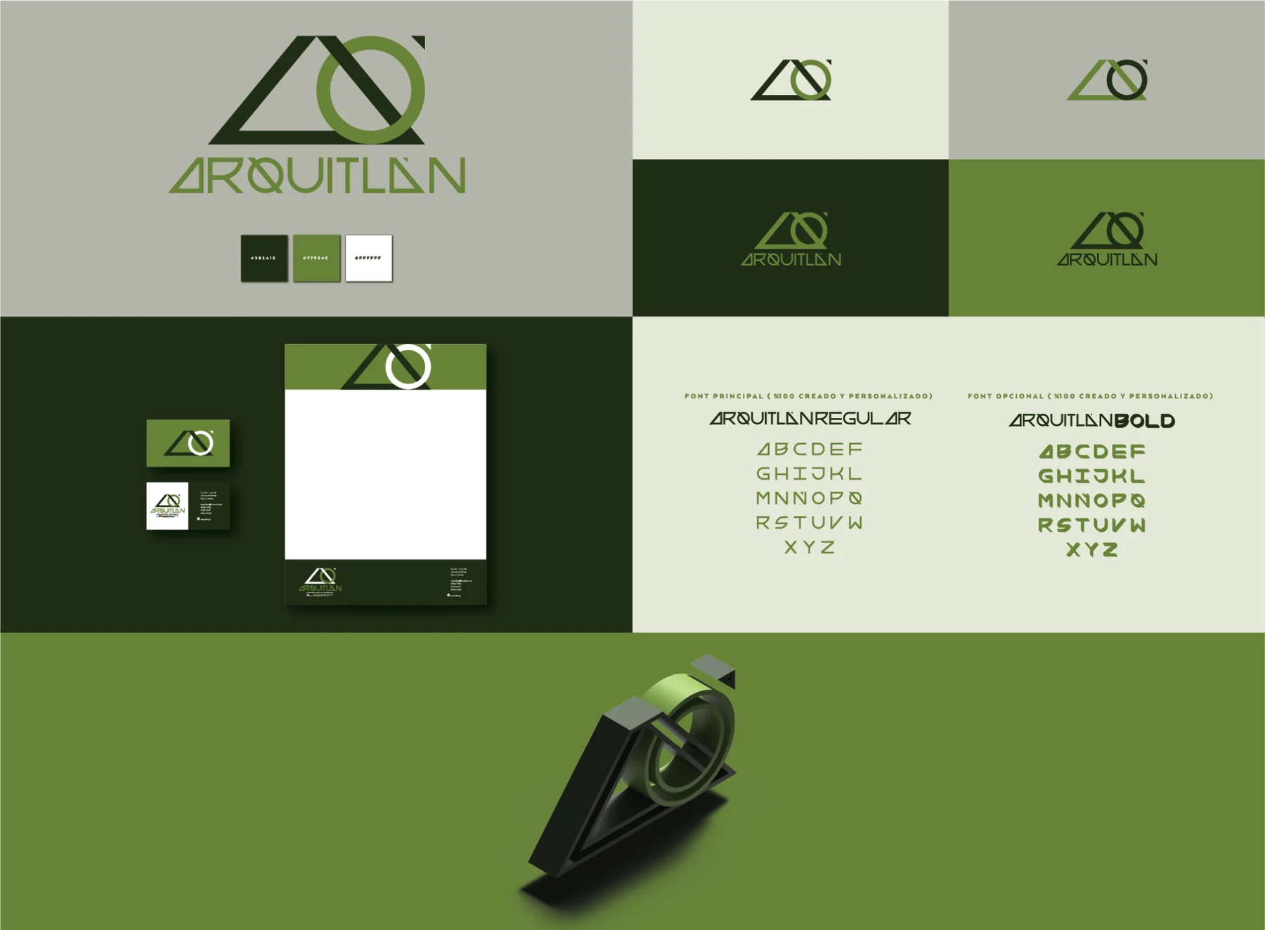
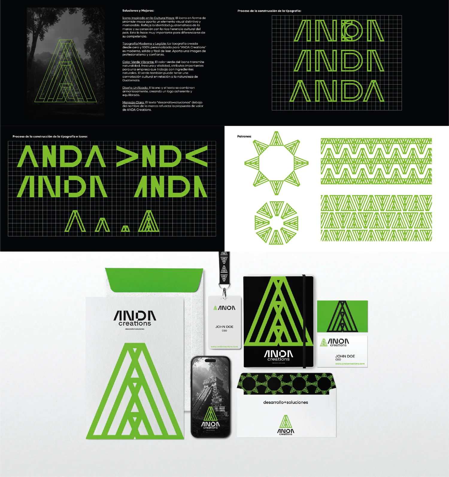
ANDA
ANDA Creations is a Guatemala-based corporation of specialized professionals dedicated to advising, promoting and developing cosmetic and hygienic products with high quality standards and superior benefits. This study develops a custom letterform system that expands into wordmarks, patterns and identity applications, aligned with a brand focused on creating solutions through high-end active and natural ingredients.
ANDA Creations es una corporación guatemalteca de profesionales especializados en asesorar, promover y desarrollar productos cosméticos e higiénicos con la más alta calidad y beneficios superiores. El estudio desarrolla un sistema tipográfico personalizado que se expande hacia wordmarks, patrones y aplicaciones de identidad, alineado con una marca enfocada en crear soluciones a partir de ingredientes activos y naturales de alta gama.
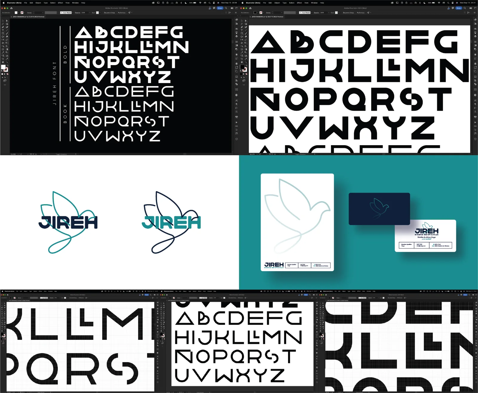
JIREH
JIREH is a design studio for office interiors and workspace development in Guatemala City. This custom typography study focused on creating a tailored letterform system for the brand identity, evolving from alphabet exploration and specimen testing into a refined logo application and visual stationery.
JIREH es un estudio de diseño de oficinas y desarrollo de espacios de trabajo en Ciudad de Guatemala. Este estudio tipográfico se centró en crear un sistema de letras personalizado para la identidad de la marca, desde la exploración del alfabeto y las pruebas de espécimen hasta su aplicación refinada en el logotipo y la papelería.
CCMAA FONT
A custom lettering system created for the 15 Festival at the Centro Cultural Miguel Ángel Asturias. Modular strokes, interruptions and circular constructions echo the same geometric language used throughout the festival identity, giving the event its own typographic voice.
Un sistema de lettering personalizado creado para el 15 Festival del Centro Cultural Miguel Ángel Asturias. Trazos modulares, interrupciones y construcciones circulares retoman el mismo lenguaje geométrico utilizado en la identidad del festival, dándole al evento una voz tipográfica propia.
VIEW FULL FESTIVAL PROJECT → VER PROYECTO COMPLETO DEL FESTIVAL →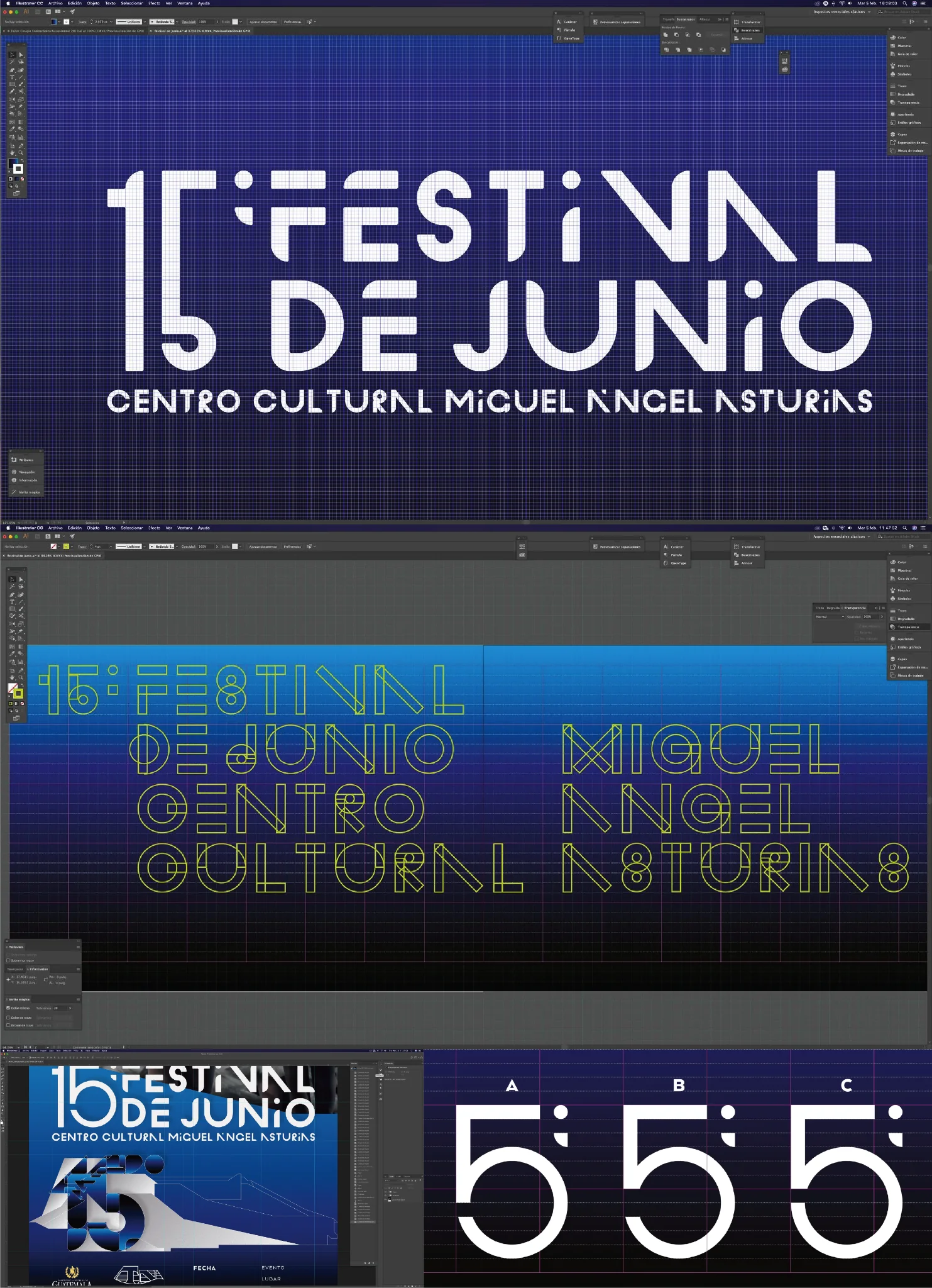
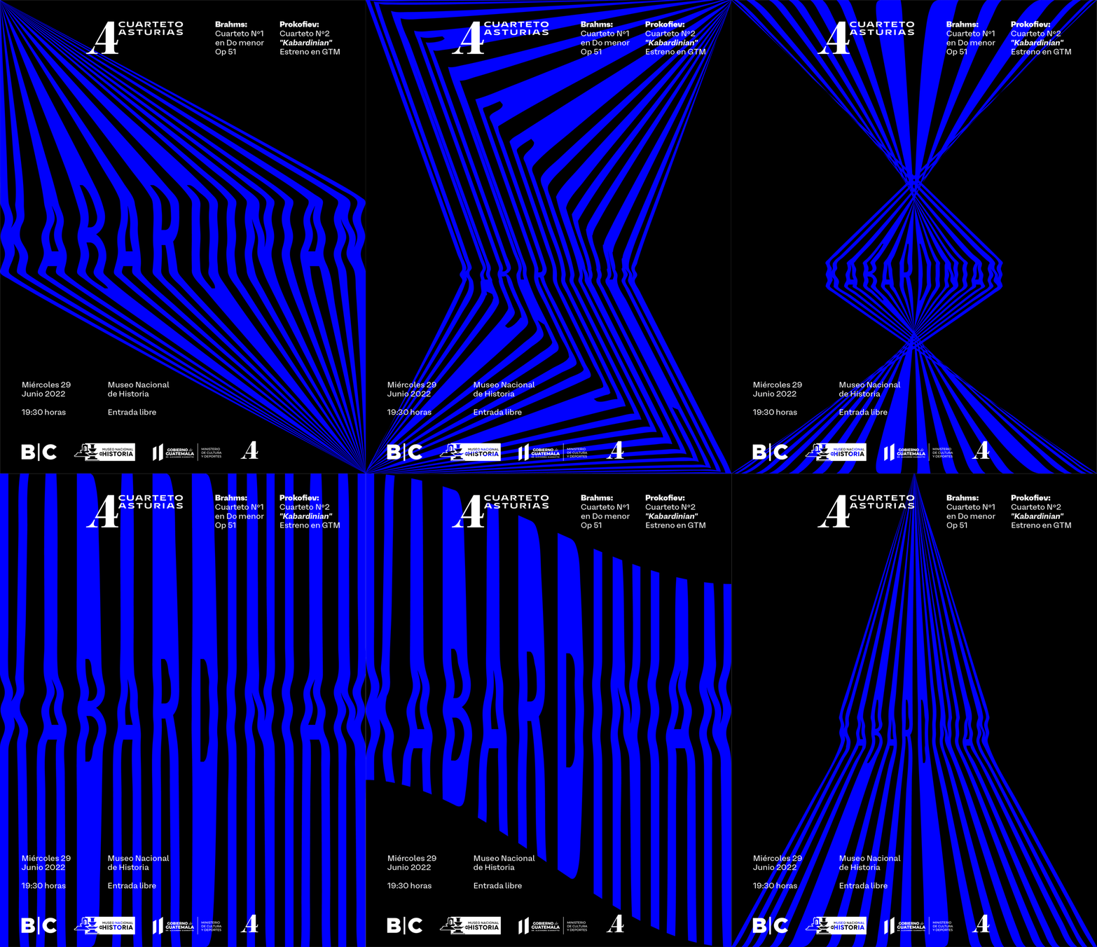
CUARTETO ASTURIAS
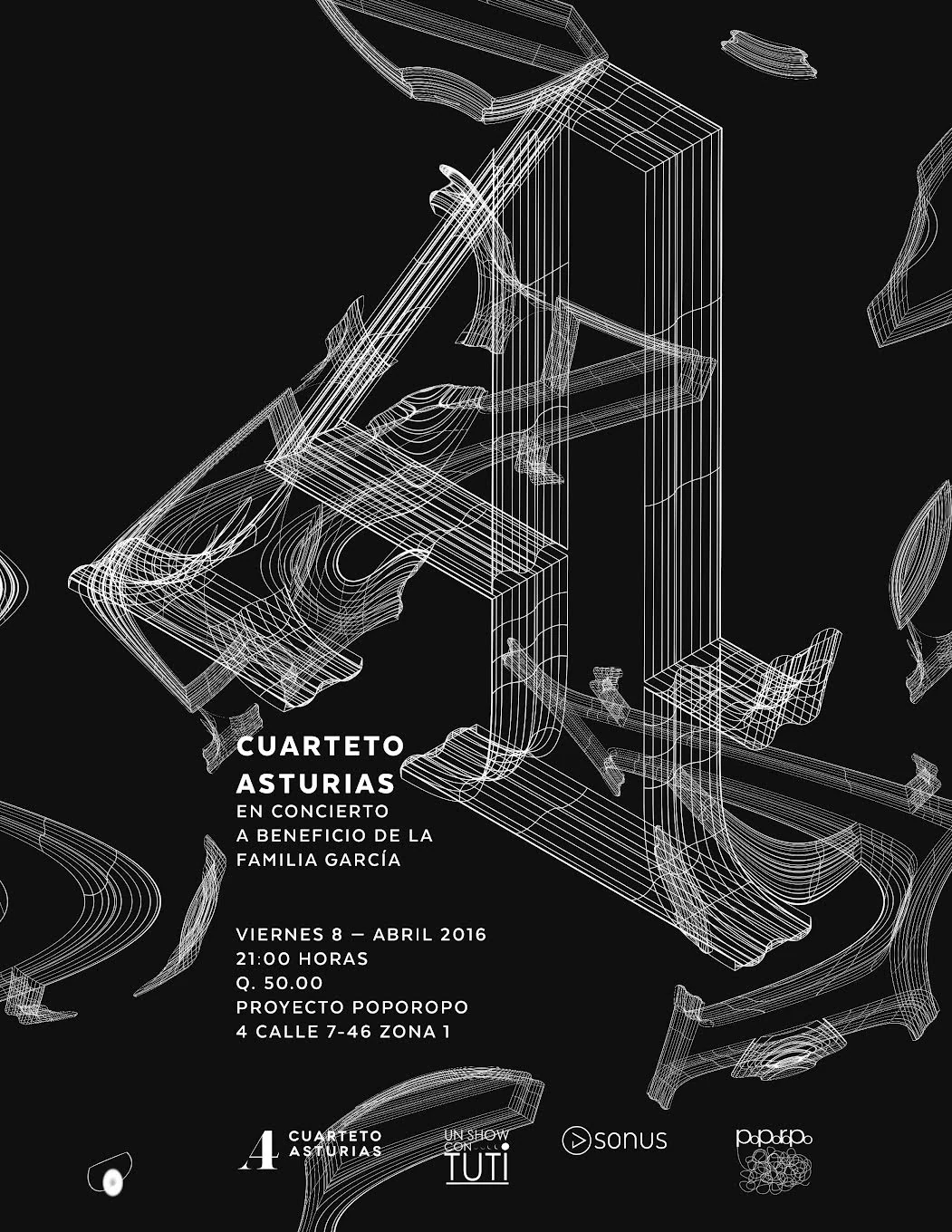
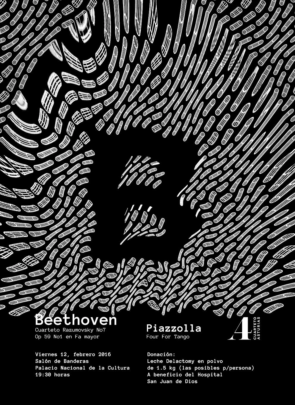
A series of event posters and identity explorations for Cuarteto Asturias, a classical string quartet from Guatemala City. The collaboration began with a new logo developed in 2012 and continued through typographic graphics, concert promotion pieces and an animated study.
Una serie de afiches para eventos y exploraciones de identidad para Cuarteto Asturias, un cuarteto clásico de cuerdas de la Ciudad de Guatemala. La colaboración comenzó con un nuevo logotipo diseñado en 2012 y continuó en piezas tipográficas, materiales de promoción para conciertos y un estudio animado.
VISIT INSTAGRAM → VISITAR INSTAGRAM →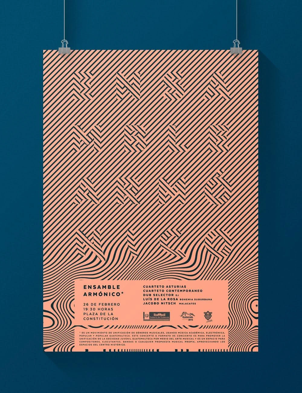
HUNAB-KU
The original type-design archive behind Hunab-Ku, shown here as part of the broader TYPE STUDIES continuum. The complete project documents the development of the typeface and its later applications in greater depth.
El archivo original de diseño tipográfico detrás de Hunab-Ku, mostrado aquí como parte del universo de TYPE STUDIES. El proyecto completo documenta con mayor profundidad el desarrollo de la tipografía y sus aplicaciones posteriores.
VIEW FULL HUNAB-KU PROJECT → VER PROYECTO COMPLETO DE HUNAB-KU →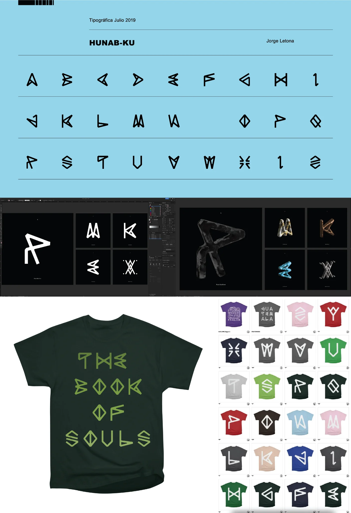
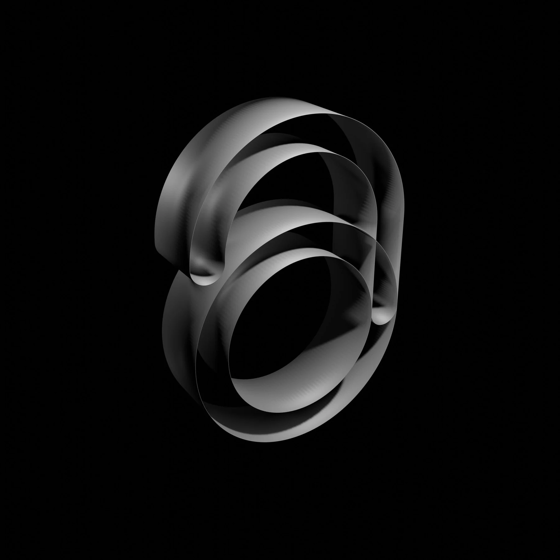
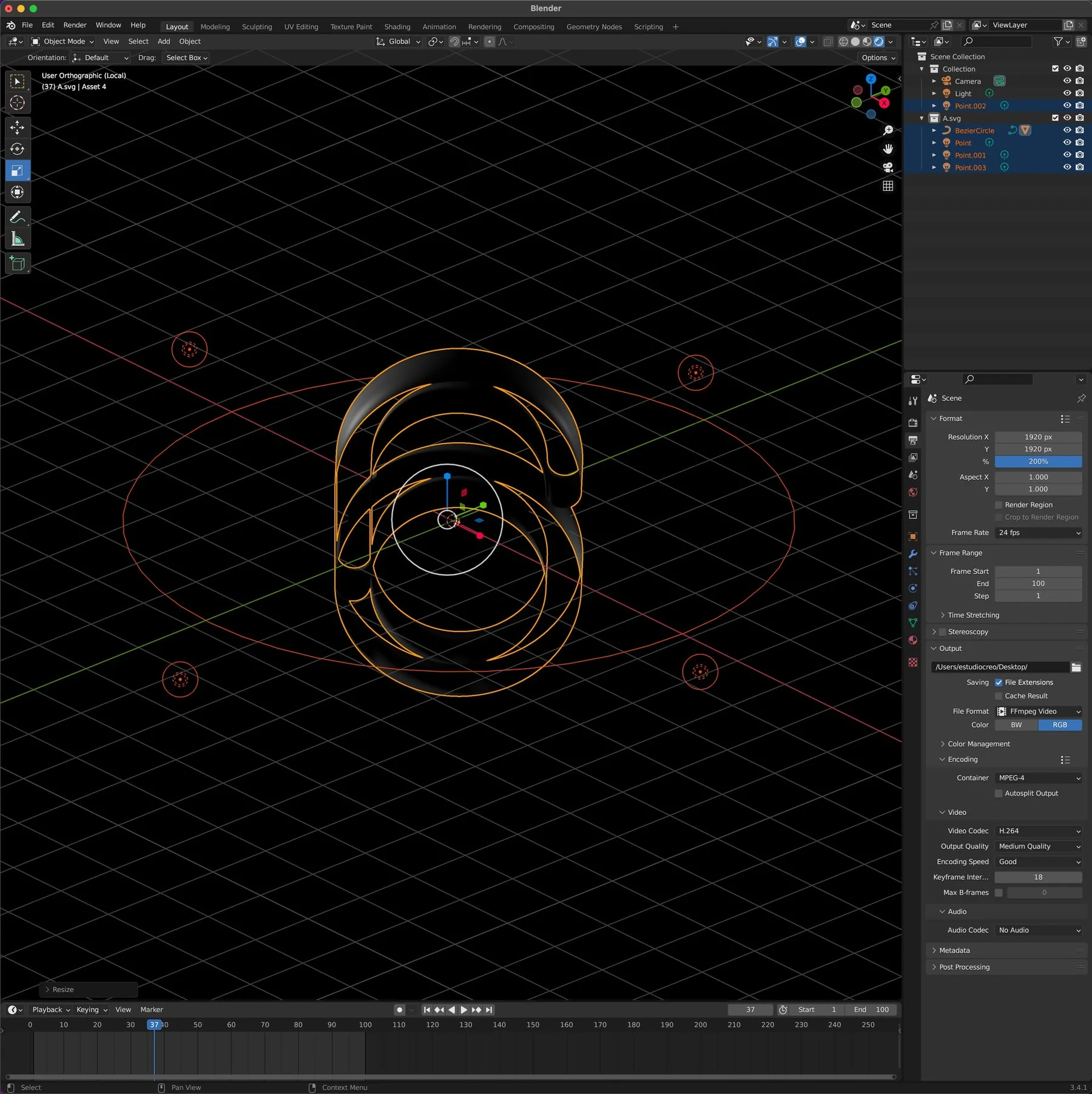
EXPERIMENTOS
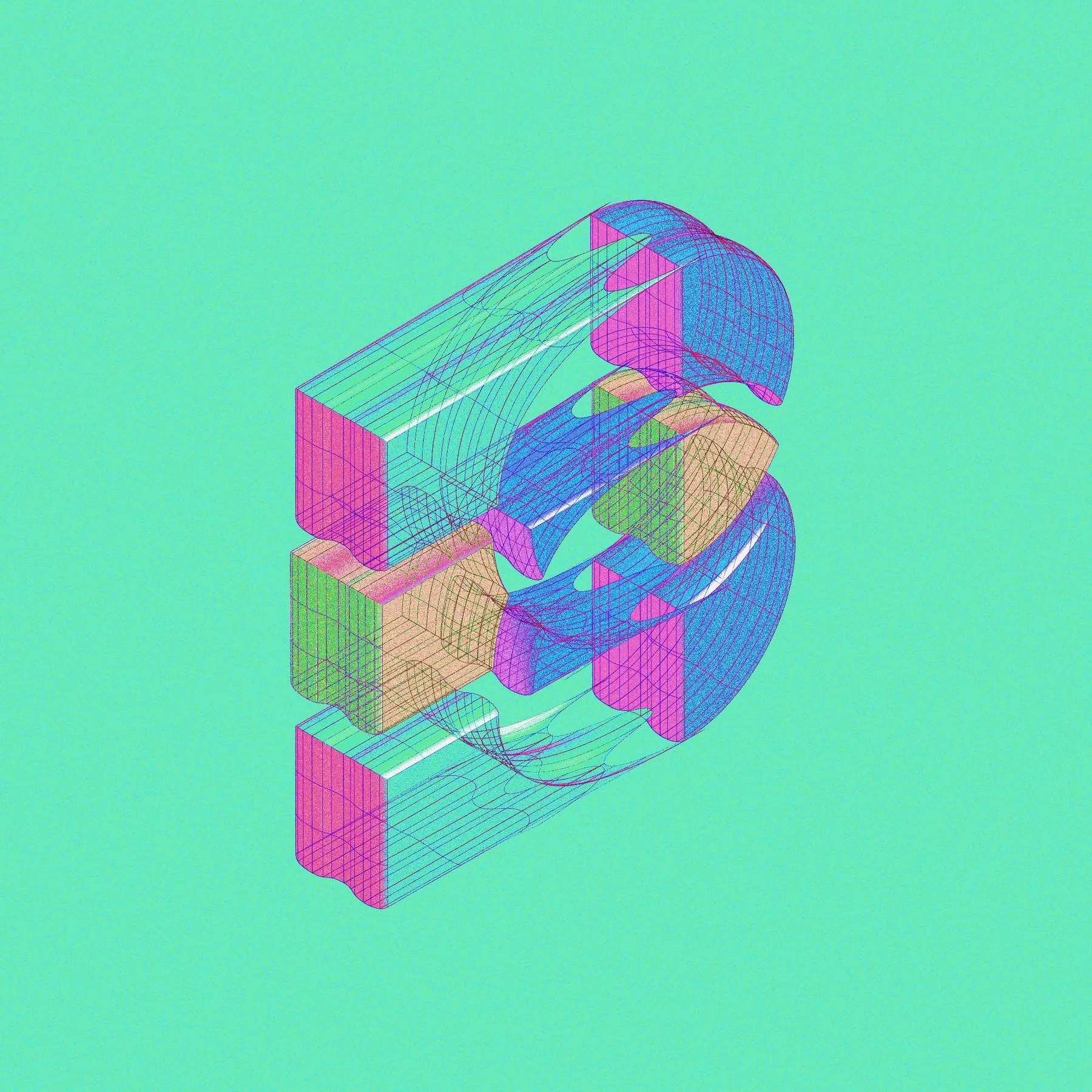
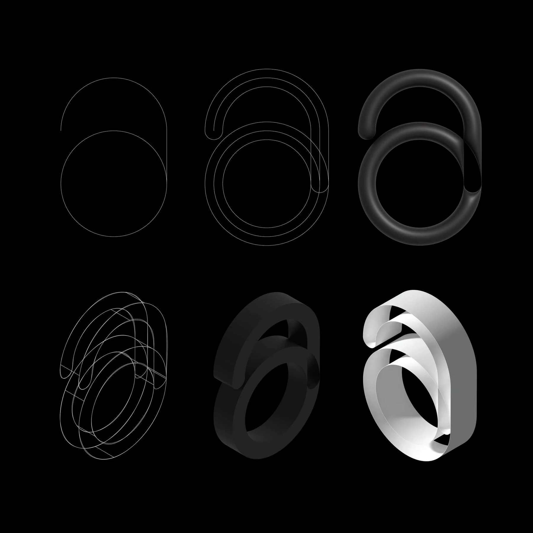
Independent digital studies that test volume, material, repetition and visual behavior outside a finished typeface.
Estudios digitales independientes que prueban volumen, materialidad, repetición y comportamiento visual fuera de una fuente terminada.
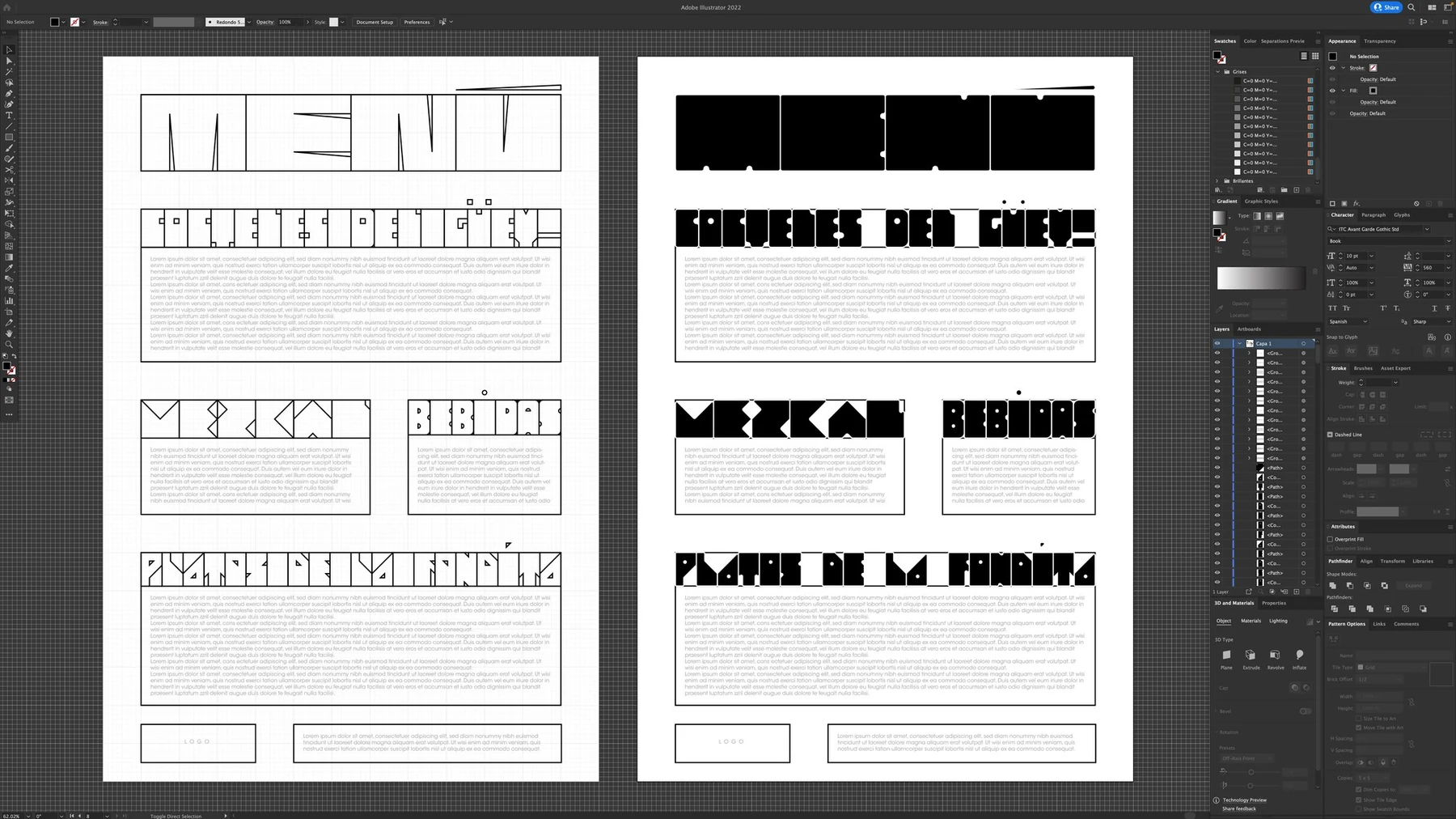
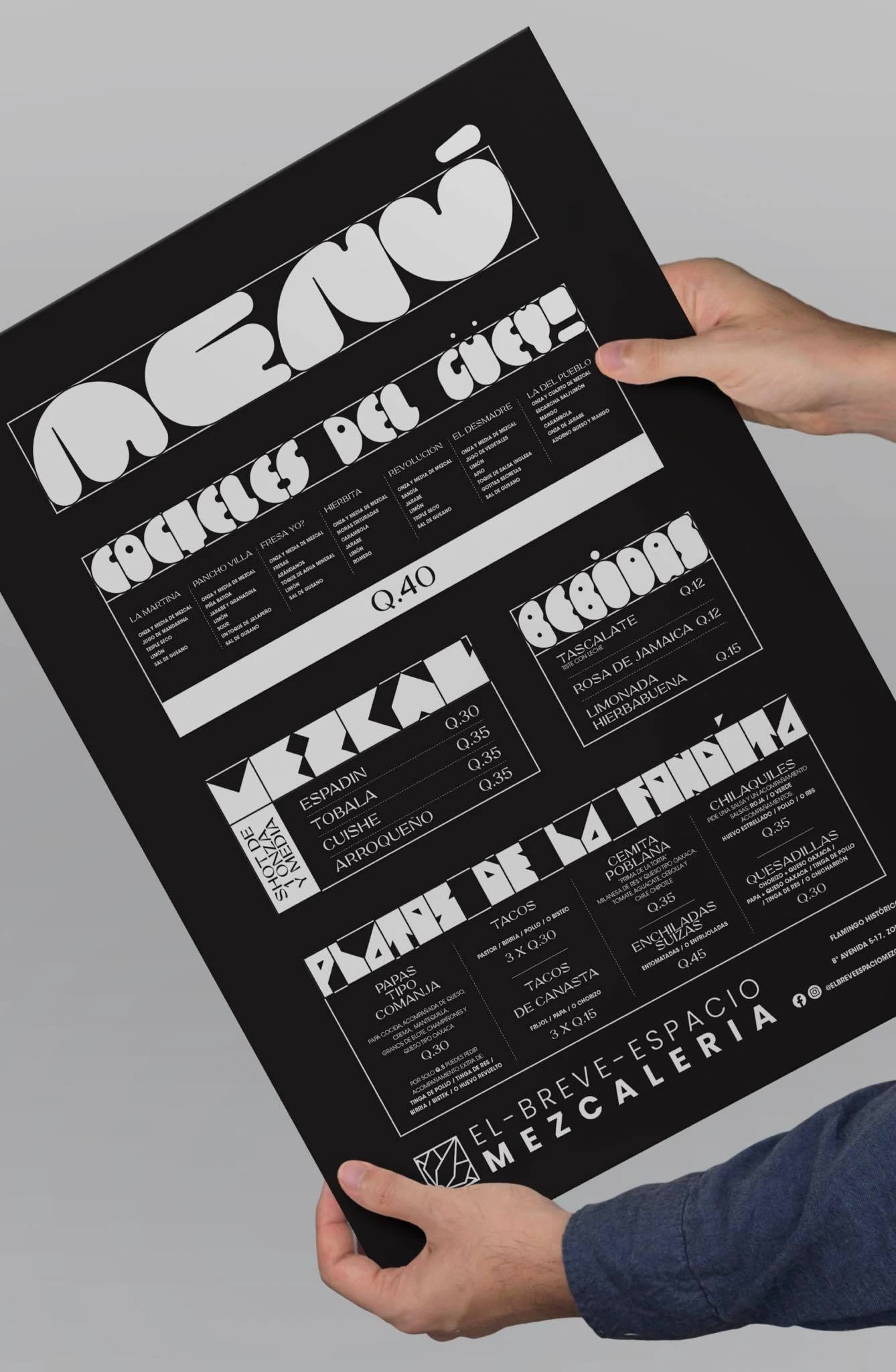
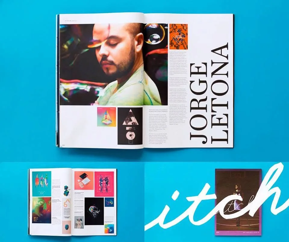
Selected interviews, type-design archives, features and distribution references documenting Jorge Letona’s typographic work over the years.
Selección de entrevistas, archivos de diseño tipográfico, publicaciones y referencias de distribución que documentan el trabajo tipográfico de Jorge Letona a través de los años.
I’m a Guatemalan graphic designer and visual artist working across typography, identity, art direction and visual experimentation.
My work moves between commissioned projects and personal explorations, often with an interest in music, culture and type.
Soy diseñador gráfico y artista visual guatemalteco. Trabajo entre la tipografía, la identidad, la dirección de arte y la experimentación visual.
Mi trabajo se mueve entre proyectos comerciales y exploraciones personales, con especial interés en la música, la cultura y la tipografía.
in mind? ¿Tienes un proyecto
en mente?
For commissions, collaborations, type projects or just to say hello.
Para proyectos, colaboraciones, tipografía o simplemente para saludar.
jorgeletona@gmail.comI also make experimental music.
También hago música experimental.